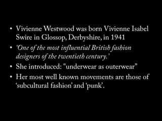
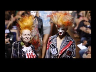
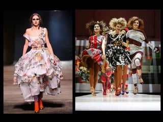
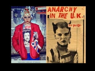
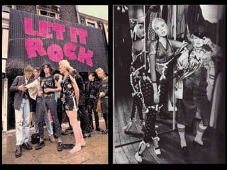
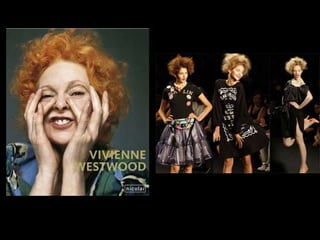
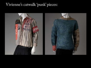
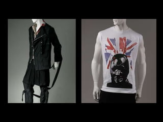
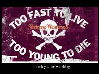
The document provides an overview of Vivienne Westwood's brand history and identity. It summarizes key moments such as the opening of her first store in 1971 and launches of notable collections. It also outlines core elements of the brand's identity such as heritage, rebellious attitude, and unique self-expression. The document then presents a new luggage product concept called "The Nomad", analyzing its design, packaging, positioning, and how it embodies Westwood's aesthetic values.
Vivienne Westwood é uma estilista inglesa nascida em 1941. Ela estudou moda em Londres e fundou lojas de roupas punk com seu marido Malcolm McLaren, vestindo bandas como os Sex Pistols. Westwood é conhecida por criar roupas com temas políticos, críticas sociais e erotismo, misturando cultura jovem com tradicionalismo britânico.
Vivienne Westwood was instrumental in creating the punk rock movement in England through her fashion designs and shop that promoted rebellion and nonconformity. While she broke from punk rock when it became mainstream, she reinvented herself as a highly innovative fashion designer with an avant-garde approach. Westwood's lack of formal training allowed her to be more creative and cut through conventional design rules. Her understanding of history and manipulation of fabrics created sculptural silhouettes that emphasized femininity in unconventional ways.
Vivienne Westwood is a renowned British fashion designer known for her punk designs. This document provides an overview of Westwood's brand including her various diffusion lines that target different audiences, from her high-end couture Gold Label to her more accessible Red Label line. It discusses Westwood's strong brand identity defined by her rebellious designs that make sociopolitical statements. The document also covers Westwood's marketing strategies such as fashion shows, exhibitions, and magazine advertisements that feature her designs and promote her environmental causes. Celebrities are involved to help spread Westwood's messages to wider audiences.
Vivienne Westwood is a British fashion designer born in 1941 in Glossop, Derbyshire. In the late 1960s, she met Malcolm McLaren who introduced her to the punk subculture, inspiring her designs. She studied art and taught school while designing. Westwood opened several fashion shops in the 1970s in London selling punk and new wave clothing and was twice named British Designer of the Year. She is known for designing affordable, distinctive clothing influenced by history and subculture trends.
Mary Quant was a pioneering British fashion designer who revolutionized 1960s fashion. She opened her first boutique, Bazaar, in 1955 in London, where she sold her affordable and youthful designs like the mini skirt and hot pants that came to define the era. Quant brought fashion to the masses and is credited with popularizing styles like go-go boots and shift dresses. She continued designing and expanding her brand for decades, leaving a significant impact on global fashion.
The document discusses two people, Tiff and Iskra. It mentions their names but provides no other details about them or what the document is about. The document is too short to extract any meaningful information beyond the names mentioned.
1. In what ways does your product develop or challenge forms of existing medi...jessspardoe
The document discusses how the student's magazine product challenges and develops existing media forms.
It describes taking inspiration from music magazines like NME and Rolling Stone for the bold header font and single portrait image on the cover. The contents page emulates a 1990s magazine by focusing on a background image and using consistent fonts. The double page spread follows the conventional three column layout and interviews a fictional artist about a recent event, resembling articles found in other magazines.
The document provides an analysis of magazine covers, contents pages, and double page spreads from various music and fashion magazines. Key points summarized:
1. Magazine covers are analyzed for color palette, font, image composition and how they represent the musical genre. Simplistic color schemes with 3-4 colors are most suitable for music magazines.
2. Contents pages organize information through section headers and discreet text listings. Images can attract readers if they take up 1/3 of the page.
3. Double page spreads examined layout, color palette, title/quote placement, and how photos represent the musical artist. Larger center images with minimal surrounding text look most like music magazine style.
This document discusses and analyzes several music album digipaks, including those for Red Hot Chili Peppers, Gorillaz, and Katy Perry. For the Red Hot Chili Peppers digipak, it notes the use of contrasting colors and close-up band images. The Gorillaz digipak features the band's cartoon characters against a simple white background. Finally, the Katy Perry digipak ties into her California Dreams tour through its candy-inspired visuals and inclusion of the artist herself.
This document analyzes and summarizes several music posters to gather inspiration for designing a poster for the band The Skeleton Boys. It discusses posters for the bands Foals, Marina & The Diamonds, and All Time Low. Key aspects discussed include font choice, image selection, color schemes, layout of text, and how the posters fit the style and image of each band.
The document discusses album cover artwork by Storm Thorgerson. It summarizes that Thorgerson is famous for his Pink Floyd album cover which features an eye-like design with earthly elements around the edge. It also mentions Thorgerson's cover for The Wombats album from 2011 and notes he has done landscape artwork. Finally, it states Thorgerson's cover for Biffy Clyro uses red and blue colors and the author wants to take inspiration from Thorgerson's style while adding their own twist.
The document discusses the design choices made for a magazine cover, including the use of a studded title font, Arial Narrow font against a black background, placement of barcode and pricing information, incorporation of brick patterns and color scheme throughout the cover and inside pages, sizing of the main photograph, and how the photograph and colors appeal to the target audience and fit the theme of indie acoustic music. The designer expresses liking the overall layout and feeling the magazine could be successful alongside similar publications but on a smaller scale initially.
I used Twitter and Facebook to promote my magazine and solicit feedback. On Twitter, people responded positively to the cover, contents, and layout. On Facebook, people complimented the outdoor photography and bright colors. I also used my school's Blogger site to ask for comments on my final draft from other students. Overall, social media helped attract an audience and confirm that my magazine fit the intended genre.
This document discusses changing the font style for the header titles of a magazine. The author has considered two dotted font styles - a square dotted font and a circular dotted font - for the headers, finding the circular one clearer. The chosen circular dotted font will be used for the front cover title and contents page title, while regular font will be used for articles and other text.
The photographer took test shots of band members in pairs to include in a draft magazine layout. They experimented with close-up and long-distance shots using a self-timer to capture different band members together. These test photos will help provide variation in shots for the final magazine production.
The document discusses test shots taken by the photographer to experiment with different hair colors and camera techniques for inclusion in band photos for a music magazine. The photographer used a tripod to take self-portraits with red, purple-tinted, and blonde hair to see if the effect would work well. One idea was to include an acoustic guitar in the pupil of an eye on the magazine cover to indicate it is music-focused. The photographer will need to check visibility at print size.
The photographer took test shots of a 17-year-old model against a white background for easy Photoshop editing. The model will be featured on the magazine cover as part of a band that will have additional photos inside. The photographer tried various close-up shots and favors the last one showing half the model's face to attract attention to the eye. The photos will be edited in Photoshop to match the magazine's color scheme.
This document outlines a color palette for a magazine. The color scheme is based around greyscales with bold purple and blue used to contrast, as the model has purple hair and blue eyes. These colors will be used on the cover and interior double page spread featuring the model. Orange and red may also be added to the contents page to vary the colors from just the main five. Examples from other magazines show the type of contrasting color combinations, including black and white photos with splashes of color.
The document discusses font and title research for a magazine called "Rewind" that focuses on music and fashion. It analyzes four favorite fonts, with a preference for a retro American style. The name "Rewind" connects to ideas of rewinding time in music and fashion. The title font will be white to stand out against colorful cover images, sized across the top like other magazines to create an eye-catching title.
The mood board shows covers from iD magazine that feature a single eye for inspiration. Bright bold colors and layouts with a single spanning image across double page spreads are also noted. Contents pages from music and fashion magazines provide ideas, including borders with images of interior content from ELLE and an abstract blue-black-white layout from Billboard.
This document profiles a young, creative audience between 16-25 years old who listens to music regularly, particularly indie and alternative genres. They enjoy going to music festivals and concerts, are inspired by bands like Arctic Monkeys and Mumford & Sons, and have interests in both music and fashion as shown by their idolization of music/fashion icons and keeping up with media through magazine reading.
This document analyzes magazine covers and double page spreads. It discusses elements like consistent color palettes, placement of titles, dates, and barcodes. It notes how covers attract attention through prominent images of famous people and eye-catching designs. Double page spreads are examined for continuity of images, fonts, and themes across the two pages. Consistency in visual elements is highlighted as important for linking different parts of a magazine issue.
The document outlines the different stages of film production and compares the process for three different types of production companies: Working Title (a large conglomerate), Warp Films (an independent British company), and American Hollywood studios. It discusses the ideas, financing, scripting, casting, shooting, post-production, marketing, release, and profits for films produced by each type of company. The major differences are that Working Title has abundant funding from its parent conglomerate, while Warp Films has a very limited budget as an independent company and must carefully plan every aspect, and American studios have virtually unlimited budgets to produce big-budget blockbusters with top talent and effects.
The document summarizes the preliminary work done for the front cover and contents page of a student magazine about fashion in college. For the front cover, the model is dressed casually to represent school fashion and holds a perfume bottle to represent fashion brands. The title is prominently displayed at the top in an eye-catching font. For the contents page, the same font and color scheme of grey is used to provide continuity. It features photos of two outfits and edits the model to appear balancing on a letter or holding a sign about an interview. The page ideas and pale blue bullet points were inspired by recent events at the student's college.
This document discusses various binary opposites and comparisons between different groups and concepts, including:
- Males and females are both portrayed as perfect in media to appeal to audiences.
- Older and younger people have different life experiences and ways of thinking due to changes over time.
- Ethnicity does not determine success or popularity in media and sports, only talent matters.
- Attitudes toward public displays of same-sex affection are still judgmental for most people.
L'IA connaît une croissance rapide et son intégration dans le domaine éducatif soulève de nombreuses questions. Aujourd'hui, nous explorerons comment les étudiants utilisent l'IA, les perceptions des enseignants à ce sujet, et les mesures possibles pour encadrer ces usages.
Constat Actuel
L'IA est de plus en plus présente dans notre quotidien, y compris dans l'éducation. Certaines universités, comme Science Po en janvier 2023, ont interdit l'utilisation de l'IA, tandis que d'autres, comme l'Université de Prague, la considèrent comme du plagiat. Cette diversité de positions souligne la nécessité urgente d'une réponse institutionnelle pour encadrer ces usages et prévenir les risques de triche et de plagiat.
Enquête Nationale
Pour mieux comprendre ces dynamiques, une enquête nationale intitulée "L'IA dans l'enseignement" a été réalisée. Les auteurs de cette enquête sont Le Sphynx (sondage) et Compilatio (fraude académique). Elle a été diffusée dans les universités de Lyon et d'Aix-Marseille entre le 21 juin et le 15 août 2023, touchant 1242 enseignants et 4443 étudiants. Les questionnaires, conçus pour étudier les usages de l'IA et les représentations de ces usages, abordaient des thèmes comme les craintes, les opportunités et l'acceptabilité.
Résultats de l'Enquête
Les résultats montrent que 55 % des étudiants utilisent l'IA de manière occasionnelle ou fréquente, contre 34 % des enseignants. Cependant, 88 % des enseignants pensent que leurs étudiants utilisent l'IA, ce qui pourrait indiquer une surestimation des usages. Les usages identifiés incluent la recherche d'informations et la rédaction de textes, bien que ces réponses ne puissent pas être cumulées dans les choix proposés.
Analyse Critique
Une analyse plus approfondie révèle que les enseignants peinent à percevoir les bénéfices de l'IA pour l'apprentissage, contrairement aux étudiants. La question de savoir si l'IA améliore les notes sans développer les compétences reste débattue. Est-ce un dopage académique ou une opportunité pour un apprentissage plus efficace ?
Acceptabilité et Éthique
L'enquête révèle que beaucoup d'étudiants jugent acceptable d'utiliser l'IA pour rédiger leurs devoirs, et même un quart des enseignants partagent cet avis. Cela pose des questions éthiques cruciales : copier-coller est-il tricher ? Utiliser l'IA sous supervision ou pour des traductions est-il acceptable ? La réponse n'est pas simple et nécessite un débat ouvert.
Propositions et Solutions
Pour encadrer ces usages, plusieurs solutions sont proposées. Plutôt que d'interdire l'IA, il est suggéré de fixer des règles pour une utilisation responsable. Des innovations pédagogiques peuvent également être explorées, comme la création de situations de concurrence professionnelle ou l'utilisation de détecteurs d'IA.
Conclusion
En conclusion, bien que l'étude présente des limites, elle souligne un besoin urgent de régulation. Une charte institutionnelle pourrait fournir un cadre pour une utilisation éthique.
MongoDB in a scale-up: how to get away from a monolithic hell — MongoDB Paris...Horgix
This is the slide deck of a talk by Alexis "Horgix" Chotard and Laurentiu Capatina presented at the MongoDB Paris User Group in June 2024 about the feedback on how PayFit move away from a monolithic hell of a self-hosted MongoDB cluster to managed alternatives. Pitch below.
March 15, 2023, 6:59 AM: a MongoDB cluster collapses. Tough luck, this cluster contains 95% of user data and is absolutely vital for even minimal operation of our application. To worsen matters, this cluster is 7 years behind on versions, is not scalable, and barely observable. Furthermore, even the data model would quickly raise eyebrows: applications communicating with each other by reading/writing in the same MongoDB documents, documents reaching the maximum limit of 16MiB with hundreds of levels of nesting, and so forth. The incident will last several days and result in the loss of many users. We've seen better scenarios.
Let's explore how PayFit found itself in this hellish situation and, more importantly, how we managed to overcome it!
On the agenda: technical stabilization, untangling data models, breaking apart a Single Point of Failure (SPOF) into several elements with a more restricted blast radius, transitioning to managed services, improving internal accesses, regaining control over risky operations, and ultimately, approaching a technical migration when it impacts all development teams.
Le Comptoir OCTO - Qu’apporte l’analyse de cycle de vie lors d’un audit d’éco...OCTO Technology
Par Nicolas Bordier (Consultant numérique responsable @OCTO Technology) et Alaric Rougnon-Glasson (Sustainable Tech Consultant @OCTO Technology)
Sur un exemple très concret d’audit d’éco-conception de l’outil de bilan carbone C’Bilan développé par ICDC (Caisse des dépôts et consignations) nous allons expliquer en quoi l’ACV (analyse de cycle de vie) a été déterminante pour identifier les pistes d’actions pour réduire jusqu'à 82% de l’empreinte environnementale du service.
Vidéo Youtube : https://www.youtube.com/watch?v=7R8oL2P_DkU
Compte-rendu :
Ouvrez la porte ou prenez un mur (Agile Tour Genève 2024)Laurent Speyser
(Conférence dessinée)
Vous êtes certainement à l’origine, ou impliqué, dans un changement au sein de votre organisation. Et peut être que cela ne se passe pas aussi bien qu’attendu…
Depuis plusieurs années, je fais régulièrement le constat de l’échec de l’adoption de l’Agilité, et plus globalement de grands changements, dans les organisations. Je vais tenter de vous expliquer pourquoi ils suscitent peu d'adhésion, peu d’engagement, et ils ne tiennent pas dans le temps.
Heureusement, il existe un autre chemin. Pour l'emprunter il s'agira de cultiver l'invitation, l'intelligence collective , la mécanique des jeux, les rites de passages, .... afin que l'agilité prenne racine.
Vous repartirez de cette conférence en ayant pris du recul sur le changement tel qu‘il est généralement opéré aujourd’hui, et en ayant découvert (ou redécouvert) le seul guide valable à suivre, à mon sens, pour un changement authentique, durable, et respectueux des individus! Et en bonus, 2 ou 3 trucs pratiques!