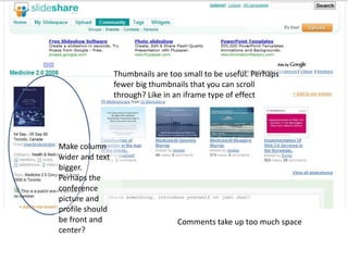
1. Thumbnails are too small to be useful. Perhaps fewer big thumbnails that you can scroll through? Like in an iframetype of effect Make column wider and text bigger. Perhaps the conference picture and profile should be front and center? Comments take up too much space
2. Comments are too big. The aligned right and aligned left elements leave a big white space and don’t create a hierarchy Side bar is not unified. Mixture of elements (text, links, pictures, bigger pictures) makes it a bit confusing. Needs a flow from top to bottom