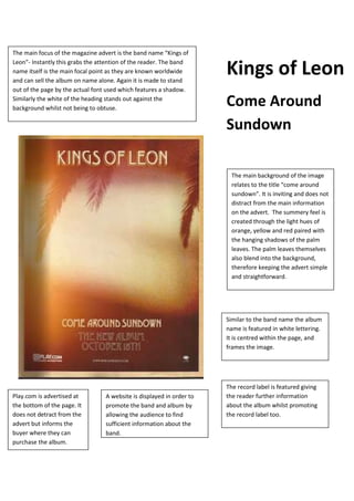
1. The main focus of the magazine advert is the band name “Kings of
Leon”- Instantly this grabs the attention of the reader. The band
name itself is the main focal point as they are known worldwide
and can sell the album on name alone. Again it is made to stand
out of the page by the actual font used which features a shadow.
Similarly the white of the heading stands out against the
background whilst not being to obtuse.
The record label is featured giving
the reader further information
about the album whilst promoting
the record label too.
Similar to the band name the album
name is featured in white lettering.
It is centred within the page, and
frames the image.
A website is displayed in order to
promote the band and album by
allowing the audience to find
sufficient information about the
band.
Play.com is advertised at
the bottom of the page. It
does not detract from the
advert but informs the
buyer where they can
purchase the album.
The main background of the image
relates to the title “come around
sundown”. It is inviting and does not
distract from the main information
on the advert. The summery feel is
created through the light hues of
orange, yellow and red paired with
the hanging shadows of the palm
leaves. The palm leaves themselves
also blend into the background,
therefore keeping the advert simple
and straightforward.
Kings of Leon
Come Around
Sundown