The document describes the process of creating a double page spread for a music magazine. It discusses choosing a large primary photo of the interview subject, Han-sun, playing the ukelele while laughing to capture a natural moment discussed in the interview. Photoshop was used to cut out the background and add a red border consistent with the magazine's color scheme. Quark layout software helped place the photo on one page alongside a quote, and add additional photos and a quote to the other page to fill space, while maintaining consistent fonts and style across the magazine.
2. Main Photo…
• When choosing the main photo for my double page spread, I
kept the main focus of Muse LIVE in mind. Looking back to my
front cover, Han-sun is the main focus of this issue so I
decided to make my double page an interview about Han-sun.
In addition, I also looked back to my research about music
magazines; seeing that a double page spread from a
professional magazine had an interview about Lana Del Rey, I
was inspired to have a similar layout. I wanted to have a large
photo on one side of the page, too, instead of the interview
taking up the majority of the double page.
4. Chosen photo
• I took photos of Han-sun with a ukelele while
walking around inside and outside. I took
photos while we were talking, and whilst she
was laughing so that I could have a more
natural/casual type of photo compared to the
front cover, also so that it looks like it was
taken during her interview. I also decided to
choose the photo with the ukelele and while
she was laughing, because in the interview we
talk about her ukelele in her new album.
5. Editing on Photoshop
• Using Photoshop, I edited the main photo. I used the Quick Selection tool
and also the magnetic lasso tool to cut the background out. The magnetic
lasso tool was mainly used to cut out the smaller details. I also outlined
the photo with a dark red to fit with the colour scheme of the magazine.
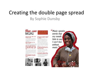
6. Quark
By using Quark, it has helped me with the layout of my double page spread. I made sure that the photo of Han-
sun was on the right side of the page, alongside with the quote. I also used Quark for the font of the text on the
page. Sticking to the same font I have used previously to fit with the style of the magazine. Furthermore, to
take up the space of the double page (because it looked quite empty) I included three different photos on the
bottom of the page of Han-sun, and also included a quote alongside the photo on the right page.
Same font
Title same
as
front
cover
+ contents
Colour coordination