Call Girls Service Nashik Vaishnavi 7001305949 Independent Escort Service Nashik
0008 colors in interior spaces
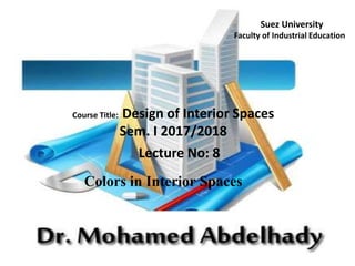
1. Course Title: Design of Interior Spaces
Sem. I 2017/2018
Lecture No: 8
Colors in Interior Spaces
Suez University
Faculty of Industrial Education
2. What is color?
color is how the eye perceives reflected light. The three main components of a color:
hue, value and saturation
Hue is where a color is positioned on the color wheel. Technically the hue is the
color which it a design element in itself.
Value is the darkness or lightness of a color and is a design element in itself.
Saturation is the intensity of a color.
3. Primary colors or pure colors
These are colors that cannot be created through the mixing
of other colors. They are colors in their own right. The
three primary colors are RED, YELLOW and BLUE.
Primary colors can be mixed together to
produce secondary colors.
Secondary Colors
(Orange, Green, and Violet) are those formed by the mixing of
two or more primary colors
Tertiary Colors
(Red-Orange, Yellow-Orange, Yellow-Green, Blue-Green,
Blue-Violet, and Red-Violet) are those produced by the
mixing of two or more secondary colors
4.
5.
6.
7.
8.
9.
10.
11.
12.
13. This is a simple one color show…. You can
transform a space using the same color in
varying intensities
from light to dark. This is what we call the
ombre look.
14.
15.
16.
17.
18. • Blacks and off blacks give
deep, dark value to the set-off
neutrals. Black sharpens and
adds richness to other colors
placed next to it. When used
generously, black may create
dramatic and theatrical settings,
but it might also cause feelings
of depression to some people.
19. • Whites and off-whites give interiors increased visual space.
Whitened backgrounds look light, spacious, and farther away.
Furnishings that are hues seem cleaner and crisper surrounded
with whites. This is an effective approach in retail
merchandising.
20.
21. • Used in large amounts,
browns can produce
either cavelike coziness
or a feeling of
oppression.
22. • Browns and beiges are
often considered neutrals,
even though they are
actually neutralized
colored hues and are
favored because of the
warm qualities that they
bring to an interior.
23.
24. • Many beautiful interiors are created using
achromatic whites, grays, and blacks
along with the brown/beige group. These
environments make fine backgrounds for
colorful artwork and accessories.
25.
26.
27. FACTORS THAT GUIDE color CHOICE:
• Association
• Cultural acceptance
• Private / personal reactions
Much of color choice is culturally biased. For
example, in Europe and the United States, black is
the color of mourning. In many tropical countries
and in East Asia white is the color of death. On the
other hand, white is the color worn by American
brides, while brides in much of Asia wear red.
28. HOW TO CHOOSE A color SCHEME:
1. PREFERENCE OF USERS
2. STYLE & PURPOSE
3. color IN NATURE.
29.
30.
31.
32.
33.
34.
35.
36.
37.
38.
39.
40.
41.
42.
43.
44. Meaning of colors
Designers have a large range of colors at their disposal and most
are well aware that certain colors are associated with feelings and
emotions. The diagram below show a number of popular colors
and the feelings/emotions to which they are associated. Designers,
companies and manufacturers use colors cleverly to promote a
certain feeling about their products.
45.
46. Reds: Excitement, High Energy, Stimulation, Provocative and Danger.
Pinks: Happy, Sweet, Youthful and Romantic.
Oranges: Friendly, Inviting, Energizing and Tangy.
Yellows: Warm, Sunny, Cheerful, Bright and Happy.
Browns: Rich, Rustic, Durable, Earthy and Stability.
Blues: Cool, Dependable, Soothing, Serene, and Quiet.
Greens: Fresh, Healing, Refreshing, Soothing and Natural.
Purples: Sensual, Elegant, Mysterious, Spiritual, and Regal.
Neutrals: Quality, Quiet, Timeless, Classic, Natural and Dependable.
Whites: Clean, Pure, Crisp, Pristine, Innocent, and Bright.
Black: Strong, Classic, Elegant, Mysterious and Powerful.
Impressions of Colors