Web-based Style Guides and Screenshot Automation <40 chars
•
20 j'aime•3,854 vues

The document discusses replacing Photoshop comps with web-based comps and style guides for responsive design mockups. It outlines problems with using Photoshop, such as design changes being time-consuming and the inability to represent responsive designs. The document then presents the benefits of using web-based comps and style guides, such as allowing for realistic rendering and representation of responsive designs. It also describes a workflow for creating web-based style guides using tools like Markdown, Jinja templates, PhantomJS, CasperJS, and Dexy.

Recommandé
Recommandé
Contenu connexe
Tendances
Tendances (20)
Similaire à Web-based Style Guides and Screenshot Automation <40 chars
Similaire à Web-based Style Guides and Screenshot Automation <40 chars (20)
Plus de Stephen Hay
Plus de Stephen Hay (20)
Dernier
Dernier (20)
Web-based Style Guides and Screenshot Automation <40 chars
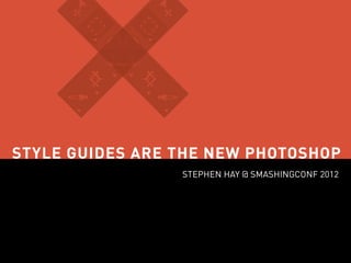
- 1. STYLE GUIDES ARE THE NEW PHOTOSHOP STEPHEN HAY @ SMASHINGCONF 2012
- 2. DESIGNING IN THE BROWSER Demonstrating our designs to clients as XHTML/CSS pages rather than as static Photoshop or Fireworks has streamlined our workflow and helped us to set and manage a client’s expectations better than ever before. Andy Clarke, “Time to stop showing clients static design visuals” (2008)
- 3. WALLS COME TUMBLING DOWN (2009) Coming up with new and better workflows Designing in the browser Learning to live with constraints Designing systems, rather than sites
- 4. PHOTOSHOP IS IMPRACTICAL FOR RESPONSIVE DESIGN MOCKUPS
- 5. PROBLEMS WITH “PHOTOSHOP” COMPS Design changes are time-consuming Too much manual work The image editor is a dependency Responsive design implies multiple and flexible layouts
- 6. REALITY (Screenshots by Adobe Shadow)
- 7. WEB TECH IS VERY PRACTICAL FOR RESPONSIVE DESIGN MOCKUPS
- 8. WEB-BASED COMPS: THE GOOD Doesn’t need to take much longer than Photoshop Automate trivial tasks Realistic presentation / real-life rendering State changes are easily visualized Free and open: everyone has a browser & editor No negative surprises for the client Possible prep for development They can be responsive
- 9. WE NEED TWO THINGS TO REPLACE PHOTOSHOP FOR COMPS
- 10. 1. Static Web-based Comps 2. Style Guides
- 11. STYLE GUIDES
- 12. STYLE GUIDES: THE GOOD No measuring State and breakpoint changes can be included Useful for future designers, devs & others Design consistency and maintainability
- 13. STYLE GUIDES IN THE WILD Apple Identity Guidelines
- 14. STYLE GUIDES IN THE WILD BBC GEL
- 15. ANNA DEBENHAM’S COLLECTION STYLE GUIDES, PATTERN LIBRARIES & TOOLS TO CREATE THEM http://gim.ie/fZyK
- 16. MY WEB STYLE GUIDE WISHLIST
- 18. Taking screenshots should be automated
- 19. Update code snippets automatically when mockup code changes
- 20. Update screenshots automatically when something changes
- 21. Elements/modules should not have to be physically split into separate files
- 22. Syntax highlighting for code
- 23. AM I TOO DEMANDING? Free-form writable Automated screenshot-taking Update code snippets automatically Update screenshots automatically No separate files for code snippets Syntax highlighting
- 24. I COULD NOT FIND A SINGLE TOOL TO DO THIS
- 25. Free-form writing DEXY + PANDOC (OR MARKDOWN) FILTER http://www.dexy.it/
- 26. Taking screenshots PHANTOM.JS + CASPER.JS http://casperjs.org/ http://phantomjs.org/
- 27. Code & screenshot updating JINJA TEMPLATES + DEXY’S IDIOPIDAE FILTER
- 28. Syntax highlighting DEXY’S PYGMENTS FILTER
- 29. THE COMMAND LINE http://www.flickr.com/photos/evdaimon/337754011/
- 33. hi.
- 34. How this works Web-based mockup Style guide content in Markdown Style guide screenshots taken, code snippets extracted HTML CSS SCREEN CODE
- 35. STEPS
- 36. 1 Create a web-based mockup Use HTML, CSS & when necessary, JavaScript Your goal is to represent the design in the browser Your goal is not to create production code Your CSS should be modular (it will end up in your style guide!)
- 37. SMACSS MAKE CSS MORE MODULAR WITH… A LUMBERJACK.
- 38. 2 Install Dexy & any dependencies If you’re a designer and can’t do it alone, ask a developer’s help. Before you ask for help, try going to the sites and following the instructions as best you can.
- 39. 2 Install PhantomJS & CasperJS If you’re a designer and can’t do it alone, ask a developer’s help. Before you ask for help, try going to the sites and following the instructions as best you can.
- 40. 3 Write your guide and use Jinja templates Use simple Markdown links to screenshots. Note the filenames you use.
- 41. 4 Script your screenshots with CasperJS Keep things easy by adding a new casper.then() for each screenshot. Code brevity is not the goal.
- 42. 5 Mark the CSS you want to export An export ends when another starts, or with @end.
- 43. 6 Run Dexy Wow, that command line stuff is hard.
- 44. DONE
- 45. Changes in design? Run dexy again. Well, okay. In some cases you might want to do dexy cleanup followed by dexy setup and then dexy.
- 46. This is not without a learning curve. But what is?
- 47. Choose what works for you. Hopefully something here will inspire you to find your own way. Experiment!
- 48. These are new times. The problems we have with responsive workflow should encourage us to examine and evaluate our processes and tools.
- 49. OPEN DEVICE LABS http://klick-ass.com/awesomeness/avoid-the-tamagotchis-a-list-of-open-device-labs/
- 50. Have fun. Make great stuff. KEEP LEARNING. Thanks! @stephenhay Special thanks to Ana Nelson