Introduction to User Experience Design 2/15/20
•Télécharger en tant que PPTX, PDF•
1 j'aime•183 vues

Introduction to User Experience Design workshop as presented by Robert Stribley on Saturday, 2/15/20 at the School of Visual Arts, Manhattan, NY

Recommandé
Recommandé
Contenu connexe
Tendances
Tendances (20)
Similaire à Introduction to User Experience Design 2/15/20
Similaire à Introduction to User Experience Design 2/15/20 (20)
Plus de Robert Stribley
Plus de Robert Stribley (17)
Dernier
Dernier (20)
Introduction to User Experience Design 2/15/20
- 1. Introduction to User Experience Design School of Visual Arts | 15 February 2020 Robert Stribley
- 2. Today’s presentation will be available on SlideShare following the workshop: www.slideshare.net/stribs
- 3. Robert Stribley Associate Creative Director, Experience Introductions 📷 ✍️ 📚 📻 🎥 ☕
- 4. About You • What’s your name? • What do you do for work? • What do you do for fun? • Coffee, tea or bottled water? Introductions
- 5. Goals for our workshop today: • Understand the basic concepts of user experience (UX) design • Review the basic deliverables a UXer develops within a project • Experience the general process and techniques used on a design project Introductions
- 7. Morning • History & Definition • UX Principles • Design Process • Agile • Deliverables • Our Project • User Research Agenda
- 8. Afternoon • Competitive Review • Card Sorting • Site Maps • Page Types • Navigation • Sketching • Break • Wireframes • Usability Testing • Responsive Design • Q&A Agenda
- 11. Image by Oliver Reichenstein on flickr
- 13. A Brief History of UX 1975 • Richard Saul Wurman coined the term “information architecture” to describe the field now more often described as “information design” 1994 • Argus Associates founded in Ann Arbor, MI, the first firm devoted to IA 1998 • First edition of Peter Morville and Lou Rosenfeld’s Information Architecture for the World Wide Web, affectionately known as “The Polar Bear” book 2000 • First IA Summit, Boston, MA – Defining Information Architecture History of UX
- 14. Partially adapted from: “A brief history of information architecture” by Peter Morville and Information Architecture: Designing information environments for purpose, edited by Alan Gilchrist and Barry Mahon A Brief History of UX 2002 • Boxes & Arrows, online journal for UX and design goes live • 3 new books on UX published, including Jesse James Garrett’s The Elements of User Experience 2014 • Capital One purchases Garrett’s UX-consulting firm Adaptive Path 2020 • The 20th IA Conference will be held in New Orleans, April 2020 History of UX
- 15. in•for•ma•tion ar•chi•tec•ture n. • The combination of organization, labeling, and navigation schemes within an information system. • The structural design of an information space to facilitate task completion and intuitive access to content. • The art and science of structuring and classifying web sites and intranets to help people find and manage information. • An emerging discipline and community of practice focused on bringing principles of design and architecture to the digital landscape. Information Architecture for the World Wide Web (1st Edition), p. 4, Rosenfeld and Morville Navigation Interaction Art/Science Discipline/ Community Defining UX
- 16. userscontent context IA Defining UX Information Ecology Diagram by Peter Morville and Louis Rosenfeld
- 18. Defining UX
- 19. metaphor: architectural plans Defining UX Flickr.com: Cornell University Library
- 20. UX Principles
- 22. 3 Clicks? A myth Designing for scent is more successful than designing for navigation. – Jared Spool, UIE If there is a scientific basis to the Three-Click Rule, we couldn't find it in our data. - User Interface Engineering, April 2003 Self Study “Designing for the scent of information” - Jared M. Spool, Christine Perfetti & David Brittan, User Interface Engineering
- 25. Tease users. Then draw them to the details.
- 26. “Progressive disclosure defers advanced or rarely used features to a secondary screen, making applications easier to learn and less error- prone.” - Jakob Nielsen Self Study “Progressive Disclosure” - Jakob Nielsen, December 4, 2006
- 31. “Designers can create normalcy out of chaos; they can clearly communicate ideas through the organizing and manipulating of words and pictures.” —Jeffery Veen, The Art and Science of Web Design
- 32. When information is clustered appropriately on a screen, users can scan and quickly come to terms with the intent of the content.
- 33. 1. Group features and content by type
- 34. 1. Group features and content by type 2. Position them according to an intuitive hierarchy
- 35. 1. Group features and content by type 2. Position them according to an intuitive hierarchy 3. Drop or demote the less important content
- 38. Reduce the field of view Once users commit to a path, remove irrelevant navigation
- 40. 1 2 3
- 41. The Tyranny of Consistency 5
- 42. Consistency is an important but sometimes over-rated tool It’s key in maintaining a coherent experience But develop an eye to know when to break from it
- 43. Clarity trumps consistency. – Steve Krug, Don’t Make Me Think
- 45. Related: Design pages so they’re scalable Suppress modules or sections of the page until they're needed Don’t labor to create content just to ensure every screen or element is “consistently” populated
- 46. Death of the Home Page 6
- 47. People may come to your homepage But more and more likely not They’re more likely coming from Google or social media Many sites report only 20% of visitors landing on their homepages Some as few as 10 or 5% • 88% of traffic coming to The Atlantic not hitting home page • More than 50% of visitors to the NYT not arriving at the home page Have you ever bought a book on Amazon.com because you saw it on the homepage?
- 48. More Important? • SEO* • Taxonomy • Metadata + Tagging • Mobile friendly *search engine optimization
- 50. There Is No Fold 7
- 51. iamthefold.com
- 52. Large Apple desktop monitor iPhone 6S
- 53. “Web users spend 80% of their time looking at information above the page fold. Although users do scroll, they allocate only 20% of their attention below the fold.” - Jakob Nielsen, “Scrolling and Attention,” March 22, 2010
- 54. “People will look very far down a page if (a) the layout encourages scanning, and (b) the initially viewable information makes them believe that it will be worth their time to scroll. Finally, while placing the most important stuff on top, don't forget to put a nice morsel at the very bottom.” - Jakob Nielsen, “Scrolling and Attention,” March 22, 2010
- 56. Consider the amount of attention an audience needs on a particular screen* *It may be zero
- 57. Recapping: • Scent of Information • Progressive Disclosure • Information Clustering & Hierarchy • Remove Paths Not Taken • The Tyranny of Consistency • Death of the Home Page • There Is No Fold • Know Your Audience
- 58. Design Process
- 59. Discovery Definition Development Design Process Design
- 60. Discovery Definition Development • Stakeholder Interviews • Business Requirements • Feature Prioritization Matrix • Competitive/Comparative Audit • User Research • Analytics • Site Inventory • Site Map Design Process Design
- 61. Discovery Definition Design Development • Personas • Content Audit • Card Sorts • Use Cases • Site Map • User Journeys • Sketching • Conceptual Wires/Design • Experience Brief Design Process
- 62. Discovery Definition Design Development • Site Map • Content Matrix • User Flows • Sketching • Concept Diagrams • Wireframes •Functional Specifications • Visual Design • Stakeholder Reviews • Prototype • Usability Testing Design Process
- 63. Discovery Definition Development • User Acceptance Testing (UAT) • Quality Assurance (QA) • Usability Testing Design Process Design
- 64. Design Process
- 65. Design Process
- 66. Design Process Self Study “Design Thinking 101” by Sarah Gibbons on July 31, 2016 -Nielsen Norman Group
- 67. Design Process Self Study “How to solve problems applying a Design Thinking, UX, HCD or any Creative Process from scratch V2” – Dan Nessler, February 6, 2018, Medium
- 68. Agile
- 69. What is “agile”? Relating to or denoting a method of project management, used especially for software development, that is characterized by the division of tasks into short phases of work and frequent reassessment and adaptation of plans. "agile methods replace high-level design with frequent redesign” —Oxford English Dictionary, contrast with “waterfall” Agile Methodology
- 70. What is “agile”? points stories epics scrum sprints standu p backlog backlog grooming kanban board Agile Methodology
- 71. Bug fixing for past sprints Sprint Diagram by Sasha Tsimbler Agile Methodology
- 72. Lean UX Agile Methodology “Lean UX … is less focused on deliverables than traditional UX. It requires a greater level of collaboration with the entire team. The core objective is to focus on obtaining feedback as early as possible so that it can be used to make quick decisions. The nature of Agile development is to work in rapid, iterative cycles and Lean UX mimics these cycles to ensure that data generated can be used in each iteration.” —A Simple Introduction to Lean UX, Interaction Design Foundation
- 73. Deliverables
- 75. Personas Definition TOP NEEDS Fast Fueling, Parking, Showers Minimal Out of Pocket Costs TOP NEEDS Safe and Clean Services Variety of Food Options TOP NEEDS Assurance (parking, dumping, fueling lanes) Saving Money on the Road PROFESSIONAL DRIVERS RVERS 4-WHEELERS
- 76. User Journeys Definition Self Study “An introduction to user journeys” - Jason Hobbs, September 6, 2005, Boxes & Arrows
- 80. Sketching > Wireframe > Design Design
- 83. Creative / Comps Design
- 85. Our Project
- 86. Our Project Events.com Events.com want to revamp their website to become the go-to online resource for people wanting to attend or promote a large variety of events across the United States. The experience should default to the city you’re in—New York—but allow users to change to other cities within the U.S. Promotion means you should also be able to create new events on the site.
- 87. Discovery
- 88. User Research User Research in Copenhagen’s Elderly Homes
- 89. “Through research, we aim to learn enough about the business goals, the users, and the information ecology to develop a solid strategy.” – Louis Rosenfeld & Peter Morville Discovery: User Research
- 90. Goal Identify patterns and trends in user behavior, tasks, preferences, obstacles. Methodology • Focus Groups • Surveys • Interviews Discovery: User Research
- 91. William James on User Research? “[I]n a delicate inquiry like this, little is to be gained by distributing circulars. A single patient with the right sort of lesion and a scientific mind, carefully cross-examined, is more likely to deepen our knowledge than a thousand circulars answered as the average patient answers them, even though the answers be never so thoroughly collated by the investigator.” – William James, “The Consciousness of Lost Limbs,” 1887 Discovery: User Research
- 92. Class Exercise: Survey Questions • How do you learn about events in NYC? • What type of events are you interested in? • What’s more important to you: – Price – Type of Event – Location – Date • Do you ever need to promote an event? • Do you ever invite people to an event? Discovery: User Research
- 93. Lunch
- 94. Afternoon • Competitive Review • Card Sorting • Site Maps • Page Types • Navigation • Break • Sketching • Wireframes • Usability Testing • Responsive Design • Q&A Agenda
- 95. Competitive Review image by brandon schauer
- 96. “This type of assessment helps set an industry ‘marker’ by looking at what the competition is up to, what features and functionalities are standard, and how others have solved the same problems you might be tasked with.” – Dorelle Rabinowitz Discovery: Competitive Review
- 97. Heuristic Evaluation … involves evaluators examining the interface and judging its compliance with recognized usability principles (the “heuristics”)—Wikipedia Self Study For a more detailed explanation of heuristic evaluation, see Jakob Nielsen’s Ten Usability Heuristics. Discovery: Competitive Review
- 98. Sample Usability Criteria These examples aren’t comprehensive. Appropriate criteria will depend on the project to be completed. Home Page • Elements are appropriately weighted and distributed • Information is clustered in meaningful ways Navigation • Navigation structure is concise and consistent • Paths to important information are intuitive and unobstructed Content • Content is content chunked appropriately • Headings and titles are scannable • Content is current. There are visible indications of content freshness. Design • Colors are appropriate for the Web. White space is used appropriately. Text is readable. Search • Search results are relevant and cleanly presented Functionality • Functionality and forms are efficiently designed Messaging • Errors messages are presented in clear language. Help readily available contextually to users • Appropriate channels are provided for user feedback Discovery: Competitive Review
- 99. Methodology • Review and analyze competitor sites according to particular criteria (heuristics) • Draw key findings, which can influence and guide IA through the design phase • Include a scorecard for high-level comparison of points across all sites Also: Comparative Reviews Discovery: Competitive Review
- 101. Competitive Review Our Competitors Discovery: Competitive Review
- 102. Key Findings • Search is fairly prominent on each site • Filtering on events is valuable, but not always easily available • Calendars are helpful, but not always prominent • Profiles and social features are handled with varying degrees of detail • Free events are often highlighted • Event detail pages may have maps, RSVP, sharing, rating, commenting functionality • Displaying other venues and restaurants adds utility • Option to add or promote an event isn’t always prominent Discovery: Competitive Review
- 103. Definition
- 104. Card Sorts
- 105. “There are often better ways to organize data than the traditional ones that first occur to us. Each organization of the same set of data expresses different attributes and messages. It is also important to experiment, reflect, and choose which organization best communicates our messages.” – Nathan Shedroff, Experience Strategist Definition: Card Sorts
- 106. Methodology • Grouping and labeling with index cards, post it notes • Two types: Open – Participants sort cards with no pre-established categories. Useful for new architectures Closed – Participants sort cards into predetermined, provided groups. Useful for fitting content into existing architectures • Online card sorts – e.g. OptimalSort Goals • Organize content more efficiently • Find names for categories based on users’ perspectives Self Study "Card sorting: a definitive guide" by Donna Spencer and Todd Warfel, Boxes and Arrows, 2004/04/07 Definition: Card Sorts
- 107. Case Studies: • Wachovia Wealth Management Group • American Red Cross • Mercedes Benz Definition: Card Sorts
- 108. Card Sort As individuals: • Take 5 minutes to think of all the events a person could attend • Write each event you come up with on a Post-It note Definition: Card Sorts 5mins
- 109. Card Sort Now, as a group: • Take a few minutes to organize your events into categories (group & label them) • Then we’ll share some categories Definition: Card Sorts 15mins
- 110. Characteristics & Findings • Looking for redundancies • Lumping and splitting • Outliers and miscellaneous items • Placing items in multiple categories • Categories versus filters – E.g. Free, Family, Outdoors • Unique but intuitive labels – E.g. Geeks, Relax, Fun With Strangers (flash mobs, brewery tours) Definition: Card Sorts
- 111. Next Steps With the results of a card sort we then can: • Build consensus • Refine terminology • Create a site map • Help define navigation Definition: Card Sorts
- 112. Definition: Card Sort Tools Post-It This free app from 3M lets you scan your Post-It Notes, organize and share them. Now with hand-writing recognition.
- 113. Design
- 114. Site Maps
- 115. Conceptual DesignDesign: Site Maps “A site map is a high-level diagram showing the hierarchy of a system. Site maps reflect the information structure, but are not necessarily indicative of the navigation structure.” – Step Two Designs
- 118. Site Map Tools: • Omnigraffle (Mac) • Microsoft Visio • InDesign • Sketch Design: Site Maps
- 119. Page Types & Templates The Mercator Atlas of Europe From The British Library
- 120. Home Page Category Page Details Page Examples: Design: Page Types & Templates
- 121. Navigation Navigation Bridge, USS Enterprise by Serendigity, Flickr
- 122. “Navigation refers to those elements in the UI that allow users to reach specific information on the site.” – Nielsen Norman Group Self Study The Difference Between Information Architecture (IA) and Navigation Design: Navigation
- 123. Types of Navigation • Site Structure – major nav • Hierarchical – product families • Function – sitemap, privacy • Direct – banner ad/shortcut • Reference – related links • Dynamic – search results • Faceted Navigation – filters results • Breadcrumb – location • Step Navigation – sequence through forms/results Self Study Adapted from Atsushi Hasegagwa’s The 7 Navigation Types of Web Sites Design: Navigation
- 124. Areas of Navigation • Global – universal header/footer • Local – left nav/right nav • Local content – text links, buttons Self Study Adapted from Atsushi Hasegagwa’s The 7 Navigation Types of Web Sites Design: Navigation
- 125. Self Study Adapted from Atsushi Hasegagwa’s The 7 Navigation Types of Web Sites Styles of Navigation • Rollover • Dropdown • Flyout • Tabs • Accordion • Hamburger Design: Navigation
- 127. Design: Navigation
- 129. Afternoon Break
- 130. Sketching Aerial Screw by Leonardo da Vinci, 1485-1487
- 131. “There are techniques and processes whereby we can put experience front and center in design. My belief is that the basis for doing so lies in extending the traditional practice of sketching. ” —Bill Buxton Design: Sketching
- 132. Attributes of a Sketch • Quick • Timely • Inexpensive • Disposable • Plentiful • Clear vocabulary • Distinct gesture • Minimal detail • Appropriate degree of refinement • Suggest & explore rather than confirm • Ambiguity Design: Sketching
- 133. - Stefan Klocek, “Better together; the practice of successful creative collaboration,” Cooper Journal “Ninja. Rockstar. Gifted genius. Many of the ways we talk about creative work (whether it’s design or development) only capture the brilliance of a single individual.” Design: Sketching Emphasizing Collaboration
- 134. Defining Collaborative Sketching • Rooted in Design Studio Methodology • Grew out of industrial design and architecture • No “rockstars” • Todd Zaki Warfel o Create. Pitch. Critique. o 6.8.5 (6 to 8 sketches in 5 minutes) • Different versions/methods but steps included to encourage outcomes Design: Sketching
- 135. Goals for Collaborative Sketching • To communicate your ideas effectively by visualizing them • To benefit from the participation of your colleagues • To quickly generate ideas and refine through iterations Design: Sketching
- 137. • Discuss the purpose of the specific experience you’re sketching • What does it need to accomplish? • What features are necessary? • How would you prioritize them? • Who’s the audience? • You’re not discussing layout or design • Just the problem you’re trying to solve • You’re not sketching yet Discuss Design: Sketching
- 139. Sketch • Sketch silently • Limit your time – 5,10 minutes • Sketch as much as possible, as many different ideas as possible • Don’t worry about mistakes or style • Emphasis is on the quantity of ideas, not the quality of the sketches Design: Sketching
- 140. Design: Sketching
- 141. Design: Sketching
- 142. Share • Review your work with your team • Keep it short – 60 seconds each • Offer your feedback to others • What you like • Questions about what didn’t work for you • You’re not grilling your colleagues and this isn’t a competition Design: Sketching
- 143. Iterate • Now sketch again if you need to • Or collaborate on a high-level wireframe (e.g. via whiteboard) • Then begin your wireframe with a more informed view, with more and better ideas • Iterate on your design Design: Sketching
- 144. Class Exercise: In teams, sketch your ideas. Event Detail Page 1. Take 15 minutes first to discuss what features belong here Remember, no sketching yet Design: Sketching
- 145. Class Exercise: In teams, sketch your ideas. Event Detail Page 1. Take 15 minutes first to discuss what features belong here 2. Time for silent sketching Design: Sketching
- 146. Class Exercise: In teams, sketch your ideas. Event Detail Page 1. Take 15 minutes first to discuss what features belong here 2. Time for silent sketching 3. Time for sharing your sketches Design: Sketching
- 147. Class Exercise: Did you come up with any differentiating ideas for an event page? Design: Sketching
- 148. Sketching Tools: The following apps are all for the iPad: • Adobe Ideas (Free) • Bamboo Paper (Free) • Muji Notebook ($3.99) • Penultimate (Free) • SketchBook (Free) • Paper (Free) • Adonit Forge (Free) Design: Sketching
- 149. Wireframes sculpture by Jaume Plensa, Yorkshire Sculpture Park
- 150. Wireframes “Web site wireframes are blue prints that define a Web page’s content and functionality. They do not convey design – e.g. colors, graphics, or fonts.” - FatPurple Design: Wireframes
- 155. Design a Home Page In your teams, create your final deliverable, a home page for Events.com 1) Discuss features needed for a homepage Design: Home Page
- 156. Design a Home Page In your teams, create your final deliverable, a home page for Events.com 1) Discuss features needed for a homepage 2) Sketch your ideas for a homepage individually Design: Home Page
- 157. Design a Home Page In your teams, create your final deliverable, a home page for Events.com 1) Discuss features needed for a homepage 2) Sketch your ideas for a homepage individually 3) Discuss your sketches again with your team Design: Home Page
- 158. Discussion Did you think to incorporate … 1) Filter by date, price, location? 2) City switcher? 3) Add an event? 4) What differentiates your design from others? Design: Home Page
- 159. Wireframing & Prototyping Tools: • Adobe XD • Axure • Figma • Invision Studio • Mockingbird (online, free) • Omnigraffle • Sketch • Visio Self Study Smashing Magazine: 35 Excellent Wireframing Resources Also: • Balsamiq • iPlotz • iMockups (iPad) • Omnigraffle (iPad) Design: Wireframes
- 160. Usability Testing Testing apps on the iPad by K2_UX
- 161. Usability Testing “Usability testing refers to evaluating a product or service by testing it with representative users. Typically, during a test, participants will try to complete typical tasks while observers watch, listen and takes notes. The goal is to identify any usability problems, collect qualitative and quantitative data and determine the participant's satisfaction with the product.” - usability.gov Design: Usability Testing
- 162. Types • Paper prototype • Clickable prototype • Full HTML • Eyetracking Design: Usability Testing Methods • In person/remote • Moderated/unmoderated • “Guerilla”
- 163. Responsive Design
- 164. Responsive Web Design “Rather than tailoring disconnected designs to each of an ever- increasing number of web devices, we can treat them as facets of the same experience. We can design for an optimal viewing experience, but embed standards-based technologies into our designs to make them not only more flexible, but more adaptive to the media that renders them. In short, we need to practice responsive web design.” – Ethan Marcotte, Responsive Web Design, A List Apart Self Study Ethan Marcotte: Responsive Web Design Design: Responsive Design
- 166. Responsive Design Characteristics • Think “mobile first” • Maintain content and features across devices • Adjust designs to display content effectively on various devices or resolutions • Reposition modules if needed but maintain hierarchies • Much more in my Guidelines for Responsive UX Design class Design: Responsive Design
- 167. Final Home Page Collaboration In your teams, create your final deliverable, a home page for Events.com Collaborate as a team on a final version of the home page Design: Final Exercise
- 168. Development
- 169. Books: • Information Architecture for the World Wide Web – Louis Rosenfeld, Peter Morville • Information Architecture: Blueprints for the Web – Christina Wodtke, Austin Govella • The Elements of User Experience – Jesse James Garrett • Designing Web Navigation: Optimizing the User Experience – James Kalbach, Aaron Gustafson • Design of Everyday Things – Donald Norman • Don’t Make Me Think – Steve Krug • Lean UX – Jeff Gothelf, Josh Seiden • Responsive Web Design – Ethan Marcotte Additional Resources Web Sites: • Alertbox • A List Apart • Boxes & Arrows • wireframes.tumblr.com
- 170. Further Studies: • School of Visual Arts • Continuing Ed classes • MFA in Interaction Design • The IA Summit • Interaction 19 (IXDA) • Pratt – Course in Information Design • Rosenfeld Media • General Assembly • Skillshare • The Information Architecture Institute • Nielsen Norman Group • User Interface Engineering Additional Resources Videos: • The Design Studio Method – Todd Zaki Warfel (Vimeo) • The Right Way to Wireframe – Russ Unger (YouTube)
- 171. Podcast Khoi Vinh
- 172. My article on how to find a UX job: UX: Your Guerilla Guide to Breaking In
- 173. My next class
- 174. Also Recommended
- 176. Q&A
- 177. thank you
Notes de l'éditeur
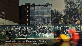
- Introduction to User Experience Design - Robert Stribley 15 February 2020 RIP ST. MARKS - Photo by Robert Stribley
- Preliminaries
- Introductions
- Introductions
- Workshop goals
- Agenda
- Agenda – Afternoon
- Agenda – Afternoon
- UX History
- User Experience
- The Spectrum of User Experience https://www.flickr.com/photos/formforce/3663684287/
- Walt Disney – The original user experience designer? https://uxmag.com/articles/walt-disney-the-worlds-first-ux-designer
- Brief History of UX
- Partially adapted from: “A brief history of information architecture” by Peter Morville Information Architecture: Designing information environments for purpose, edited by Alan Gilchrist and Barry Mahon
- Navigation, interaction design, art/science, discipline/community
- Background: Defining IA - Information Ecology Venn Diagram by Peter Morville and Louis Rosenfeld
- Background: Defining IA: skin/skeleton
- Oft-used examples like this of “users” creating their own paths
- Using architectural plans/blueprints as a metaphor for an IA’s work Flickr.com: Cornell University Library
- UX Principles Image from 10 Basic Principles of Visual Design by Jose Torre - https://blog.prototypr.io/10-basic-principles-of-visual-design-55b86b9f7241 – which is definitely worth a read
- Scent of Information
- If you were to take only one thing away with you today, it would be that the 3-click rule is bunk. Can actually make for a very cluttered site if you try to flatten content so it’s all available within three clicks Users will happily click away 5, 6, 7, 8 times without noticing, if there are clear paths to what they’re looking for, concise navigation, intuitive labels, etc. Background: Studies in “information foraging” in the early 90s at PARC (Palo Alto Research Center Incorporated) Better: a dynamic tension between reducing the number of clicks and providing strong scent to content
- Uniqlo Site
- Progressive Disclosure
- Reduce clutter, cognitive overload, so there’s less to process at once - Across multiple pages – or within a page or overlay
- “Progressive Disclosure” by Jakob Nielsen, December 4, 2006 Originated with studies in the 80s by user interface specialists Jack Carroll's lab work at IBM
- Progressive disclosure in an app – weather details Reduce clutter, cognitive overload, so there’s less to process at once - Across multiple pages – or within a page or overlay
- Mercedes Benz product information
- Mercedes Benz product information
- Information Clustering & Hierarchy
- Jeffery Veen quote from The Art and Science of Web Design
- When information is clustered appropriately on a screen, users can scan and quickly come to terms with the intent of the content.
- Information clustering
- Information clustering
- Information clustering Isn’t to say that you couldn’t have a lot of content on the page – e.g. Pinterest. But content is grouped logically, can be scanned easily.
- Mercedes Benz
- Remove paths not taken
- Seems simple, but a lot of sites could benefit from adhering to this principle
- Remove paths not taken
- Remove paths not taken
- The Tyranny of Consistency
- This is a “Know it when you see it” kind of problem – sometimes tough to put a finger on
- “Clarity trumps consistency.” - Steve Krug, Don’t Make Me Think Photo from Interview with Steve Krug: how to get DIY usability testing right by Oliver Lindberg - https://medium.com/the-lindberg-interviews/interview-with-steve-krug-how-to-get-diy-usability-testing-right-63dedddbd0ae Photo by Daniel Byrne - https://www.danielbyrnephoto.com/
- Varying dropdown styles on MBUSA.com are not “consistent,” per se, but tailored to the needs of the user and the content in each case.
- But be sure when you break with consistency, you do have a principle in mind for doing so
- Found this site by searching on Worst Home Page in the World. Clearly, it’s trying to be all things to all people. Instead, it looks like a dog’s breakfast.
- Jakob Nielsen wrote in 2002 that home pages are “the most valuable real estate in the world.” Sourcing: http://www.niemanlab.org/2012/08/coming-in-the-side-door-the-value-of-homepages-is-shifting-from-traffic-driver-to-brand/ 88% of traffic coming to The Atlantic not hitting home page More than 50% of visitors to the NYT not arriving at the home page Have you ever bought a book on Amazon.com because you saw it on the homepage?
- *Search engine optimization
- Note how the site offers plenty of scent
- There is no fold – Photo by Gavin Bell
- There is no fold - Iamthefold.com
- Simple illustration of dramatic difference in “the fold” using Brooklyn Brainery
- Jakob Nielsen, “Scrolling and Attention,” March 22, 2010
- Eyetracking tests by Nielsen Norman Group–Jakob Nielsen, “Scrolling and Attention,” March 22, 2010
- Know Your Audience
- Yes, your site typically has multiple audiences. But not all of them need to be addressed at once. Giving proper thought to who defines a site's audience helps clean out the chaff. Example: Placing find an event functionality in an area where a using is creating an event. Not necessary for that audience.
- Recap of UX Principles
- The Design Process Illustration from The teapot model: how to explain a fuzzy design process to anxious clients. https://blog.prototypr.io/the-teapot-model-how-to-explain-a-fuzzy-design-process-to-anxious-clients-4a2e8487bc87
- The Design Process
- 1. Discovery Stakeholder interviewers, Business requirements, Competitive & Comparative Audits, User Research
- 2. Definition Persona/Scenario Development, Content & Meta Data Audits, Use cases, Creative Brief, Mood boards
- 3. Design Sitemaps, Task Flows, Content Strategy, Sketching, Wireframes, Visual Design, Prototypes, Usability Testing
- 4. Development User Acceptance Testing, Quality Assurance Testing, Usability Testing, Site development
- The Design Process – Illustration from the Interaction Design Foundation
- Illustration from Design Thinking 101 by Sarah Gibbons on July 31, 2016 - https://www.nngroup.com/articles/design-thinking/ Nielsen Norman Group
- Illustration from Design Thinking 101 by Sarah Gibbons on July 31, 2016 - https://www.nngroup.com/articles/design-thinking/ Nielsen Norman Group
- Diagram from “How to solve problems applying a Design Thinking, UX, HCD or any Creative Process from scratch V2” by Dan Nessler February 6, 2018, Medium
- Agile Image from unsplash by Cam Adams / @camadams – Thousand Oaks, United States
- Deliverables
- Deliverables
- Sprint Diagram by Sasha Tsimbler
- Lean UX explanation taken from —A Simple Introduction to Lean UX, Interaction Design Foundation
- Deliverables Image of New Delhi newspaper delivery from the Financial Times
- Site map
- Personas
- User Journey https://www.toptal.com/designers/product-design/customer-journey-maps
- User Story – example taken from Requirements 101: User Stories vs. Use Cases https://www.stellman-greene.com/2009/05/03/requirements-101-user-stories-vs-use-cases/
- Use Cases – example taken from Requirements 101: User Stories vs. Use Cases https://www.stellman-greene.com/2009/05/03/requirements-101-user-stories-vs-use-cases/
- User Flows
- Wireframe
- Concept Diagram – I sometimes use a concept diagram just to show an outline of the content which would go on a screen so we can agree to content and hierarchy at a very high level before fleshing it out to be a true wireframe // you might call this a visual outline or something else. Sometimes I present this with the wireframes up front, as it’s easier to digest at a bird’s eye view than a wireframe.
- Wireframe Wireframe example from here: https://www.mockplus.com/blog/post/basic-uiux-design-concept-difference-between-wireframe-prototype
- Comps/Creative
- Wireframe Wireframe example from here: https://www.mockplus.com/blog/post/basic-uiux-design-concept-difference-between-wireframe-prototype
- Our Project Photo from Unsplash by Danny Howe @dannyhowe - https://unsplash.com/photos/bn-D2bCvpik
- Events.com
- Discovery
- User Research in Copenhagen’s Elderly Homes - http://www.localhiddenvariable.com/ciid/user-research-in-copenhagens-elderly-homes/
- Rosenfeld and Morville on user research
- User Research: Goals & Methodology
- William James on User Research and the advantages of one-on-one interviews. William James, The Consciousness of Lost Limbs, 1887 First published in Proceedings of the American Society for Psychical Research, 1, 249-258 I happened across this quote reading Oliver Sacks’ excellent book Hallucinations
- Class Exercise: Survey Questions
- Lunch break AP photo of men lunching on a construction beam from Sept. 29, 1932,
- Agenda – Afternoon
- Competitive Review
- Discovery: Competitive Review – or Audit
- Heuristics reviews can also be conducted on a single site, of course. For example, to review a client’s site and give them feedback on the existing site, as well as prioritized changes.
- Heuristics reviews can also be conducted on a single site, of course. For example, to review a client’s site and give them feedback on the existing site, as well as prioritized changes.
- We review each of these sites live during class: Eventbrite, NYCgo.com, Meetup
- Key Findings
- http://www.flickr.com/photos/cannedtuna/
- Nathan Shedroff is Program Director of the MBA in Design Strategy program at the California College of the Arts. His books include Experience Design 1, Making Meaning, and contributing to Richard Saul Wurman's Information Anxiety 2. Advisor for Rosenfeld Media
- Card sorts: Methodology and Goals - http://www.optimalworkshop.com
- Case Studies: These are stories I share from experiences at Wachovia and Razorfish
- Project Guidelines
- Project Guidelines
- Characteristics & Findings
- Characteristics & Findings
- Post-It app from 3M now with handwriting recognition
- Design
- Site Maps
- Defining site maps
- Site map for Red Cross
- Site map for Nextel Brazil
- Site map tools
- Page Types
- Examples: Home page, category page, details page/product page
- Navigation
- Navigation https://www.nngroup.com/articles/ia-vs-navigation – Nielsen Norman Group
- Adapted from Atsushi HASEGAWA’s The 7 Navigation Types of Web Sites http://www.slideshare.net/atsushi/the-7-navigation-types-of-web-site
- Adapted from Atsushi HASEGAWA’s The 7 Navigation Types of Web Sites http://www.slideshare.net/atsushi/the-7-navigation-types-of-web-site
- Adapted from Atsushi HASEGAWA’s The 7 Navigation Types of Web Sites http://www.slideshare.net/atsushi/the-7-navigation-types-of-web-site
- Mega Dropdowns
- Mega Dropdowns
- Power Footers
- Break
- Sketching
- Bill Buxton
- Attributes of a Sketch
- From Design Studio Methodology – Article by Will Evans http://www.uie.com/articles/design_studio_methodology/ Photo of Stefan from his Twitter profile No rockstars, two heads are better than one
- Defining collaborative sketching Todd Zaki Warfel, The Design Studio Method – see the video on Vimeo
- Sketching Methodology
- Sketching Process
- Discuss
- Discuss: Example of whiteboarded features and functionality
- Sketch
- Sketching Example
- Sketching Example
- Share
- Revise
- Class Exercise: Collaborative Sketching
- Class Exercise: Collaborative Sketching
- Class Exercise: Collaborative Sketching
- Class Exercise: Collaborative Sketching
- Sketching Tools
- Wireframes - sculpture by Jaume Plensa, Yorkshire Sculpture Park
- Defining wireframes
- Mercedes Benz Vans – Technology wireframe by SapientRazorfish
- Mercedes Benz Vans – Technology visual design by SapientRazorfish
- Mercedes Benz wireframe by Razorfish
- Mercedes Benz comp/visual design based on wireframe by Razorfish
- Final Exercise Home page characteristics: access different cities, add events, category nav, main nav, surfacing events in different ways, search/calendar/map/etc? Also, what can you offer as a differentiator?
- Final Exercise Home page characteristics: access different cities, add events, category nav, main nav, surfacing events in different ways, search/calendar/map/etc? Also, what can you offer as a differentiator?
- Final Exercise Home page characteristics: access different cities, add events, category nav, main nav, surfacing events in different ways, search/calendar/map/etc? Also, what can you offer as a differentiator?
- Final Exercise Home page characteristics: access different cities, add events, category nav, main nav, surfacing events in different ways, search/calendar/map/etc? Also, what can you offer as a differentiator?
- Wireframing Tools
- Usability Testing Image - Testing apps on the iPad by K2_UX
- Usability testing
- Usability testing methods Image from this article: “A guide to paper prototyping & testing for web interfaces” by Dan Nessler https://medium.com/digital-experience-design/a-guide-to-paper-prototyping-testing-for-web-interfaces-49e542ba765f
- Wireframes
- Defining Responsive Web Design
- Responsive design example
- Responsive design characteristics
- Home page collaboration
- Development
- Additional Resources
- Additional Resources
- Podcast
- IA Job article: https://medium.com/@stribs/ux-your-guerilla-guide-to-breaking-in-75eb3e221fc7
- Next class
- John Ewen’s Agile Design class
- Slideshare address: http://www.slideshare.net/stribs @stribs / stribley AT outlook.com
- Q&A
- Thank you!