Grid - Visual Guideline.pdf
•
0 j'aime•30 vues

The document provides guidelines for GRID's visual identity system, including specifications for colors, fonts, logos, and graphic elements. The visual identity helps maintain a unified messaging style. The logo and color palette establish GRID's unique brand attributes, and guidelines describe proper usage of these elements to prevent misuse and keep the visual identity professional. Graphic icons are also included that represent GRID's thematic areas simply and friendly.

Recommandé
Contenu connexe
Similaire à Grid - Visual Guideline.pdf
Similaire à Grid - Visual Guideline.pdf (20)
Plus de Suyog Shrestha
Dernier
Dernier (20)
Grid - Visual Guideline.pdf
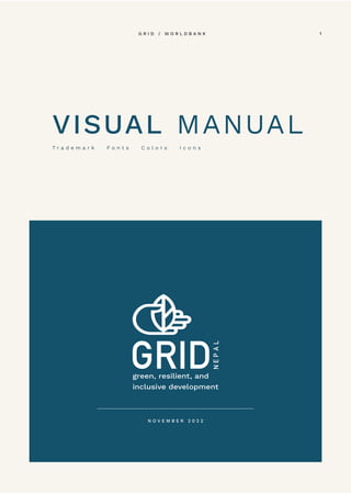
- 1. VISUAL MANUAL T r a d e m a r k F o n t s C o l o r s I c o n s 1 G R I D / W O R L D B A N K N O V E M B E R 2 0 2 2
- 2. About guideline This guideline describes the visual elements that represent GRID's identity. This includes our name, logo and elements like color, type, and graphics. The guideline helps us keep our messaging unified through consistency and style. The GRID visual Identity, including the logo, name, colors, and identifying elements, are valuable assets. Preventing unauthorized or incorrect use of the GRID visual identifier contributes substantially to keeping our messaging unified and professional. 2 G R I D / W O R L D B A N K
- 3. 3 G R I D / W O R L D B A N K
- 4. Visual System The visual system defines the unique and proprietary assets that bring the brand platform to life. 01 4 G R I D / W O R L D B A N K
- 5. Color Palette RGB 17 / 79 / 81 HEX 114f51 CMYK 90 / 51 / 58 / 36 RGB 124 / 178 / 66 HEX 7cb242 CMYK 58 / 10 / 100 / 0 70% Tint 70% Tint 50% Tint 50% Tint 5 G R I D / W O R L D B A N K
- 6. Color Alternative RGB 126 / 106 / 108 HEX 7e6a6c CMYK 49 / 55 / 48 / 15 RGB 45 / 67 / 68 HEX 647e8b CMYK 65 / 42 / 36 / 6 RGB 231 / 197 / 100 HEX e7c564 CMYK 10 / 20 / 72 / 00 For digital or print media it is recommended to use offwhite color for page background. Where this is not possible, a 20% tint of scondary colors is advised. RGB 247 / 243 / 237 HEX f7f3ed CMYK 2 / 3 / 5 / 0 70% Tint 70% Tint 70% Tint 20% Tint 20% Tint 20% Tint 6 G R I D / W O R L D B A N K
- 7. Note: When custom typefaces are not an option (e.g. email, PowerPoint, etc.), Trebuchet is the official alternate typeface. It is pre-installed on every computer. Typography System Primary Regular ABCDFEGHIJKLM abcdefghiklmopqrz 0123456789 Thin ABCDFEGHIJKLM abcdefghiklmopqrz 0123456789 Medium ABCDFEGHIJKLM abcdefghiklmopqrz 0123456789 Bold ABCDFEGHIJKLM abcdefghiklmopqrz 0123456789 Italic ABCDFEGHIJKLM abcdefghiklmopqrz 0123456789 Font Name: Work Sans (TT) 7 G R I D / W O R L D B A N K
- 8. Logo System The logo system defines the proper usage of the logo. This will help keep the logo consistent throughout. 02 8 G R I D / W O R L D B A N K
- 9. Logo Overview The GRID logo communicates the nature of its themes, sectors, and projects while also symbolizing the GRID narrative of an evolving view of development. This engages an integrated perception of sustainability, conservation, inclusivity, development, and economic growth. The guidelines around using the logo are meant to enable consistent usage, which can help the logo build equity and recognition over time. Clear Zone Our logo has a clear zone around it, to create prominence and to avoid interference. No text or graphic elements can appear in this area. This applies to both horizental and vertical logo. Color RGB 17 / 79 / 81 HEX 114f51 CMYK 90 / 51 / 58 / 36 RGB 124 / 178 / 66 HEX 7cb242 CMYK 58 / 10 / 100 / 0 Preferably, you must always reproduce the Grid logo in two shades of green on a white background. The specifications are as follows: WATERMARK OVERVIEW When Required, Graphic part of logo can be used as watermark at 5% opacity without altering the color of single color logo. (Refer: Page 11) 9 G R I D / W O R L D B A N K
- 10. Logo Usage Vertical Logo Main Logo Dark background Logo Black and White Logo Single Color Logo Vertical and horizontal logo variations provide flexibility for different spatial parameters and use cases. Smallest size of logo would be in the ratio of 2.5cm height. 1 0 G R I D / W O R L D B A N K
- 11. Logo Usage Horizental Logo Main Logo Dark background Logo Black and White Logo Single Color Logo Vertical and horizontal logo variations provide flexibility for different spatial parameters and use cases. Smallest size of logo would be in the ratio of 1.5cm height. 1 1 G R I D / W O R L D B A N K
- 12. Here are some examples of incorrect or ineffective use of the GRID logo. DO NOT place logo on top of a dark color. DO NOT change the color of the logo ther then specified in next page. DO NOT place logo on top of an image without negative space. DO NOT rotate the logo, squeeze the logo and rearrange elements of the logo. DO NOT place the logo on a busy background DO NOT use any effects in logo Incorrect Usage of Logo 1 2 G R I D / W O R L D B A N K
- 13. Graphic Elements Graphic elements represent individual thematic icons and patterns for design use.” 03 1 3 G R I D / W O R L D B A N K
- 14. Iconography Usage Other Icons These are our line drawing icons. They are familiar, uncomplicated, and friendly. Preferably, you must always reproduce the icons in one of following styles. Thematic Icons Usage Black Solid Background Black Stroke Color Grid Green Solid Background Grid Green Stroke Color 1 4 G R I D / W O R L D B A N K