
Recommandé
Contenu connexe
Tendances
Tendances (18)
Similaire à Essential information highlighted in eye-catching NME magazine spread
Similaire à Essential information highlighted in eye-catching NME magazine spread (20)
Plus de taurnknapp
Plus de taurnknapp (20)
Dernier
Dernier (20)
Essential information highlighted in eye-catching NME magazine spread
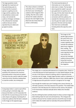
- 1. The large quotation marks The most essential pieces of high light the importance of information are in red; where as the quote being used, its The colour scheme is red black other text is in black. This has been shows that the musician’s and white, this is a link between done to grab the reader’s eye and opinion is significant to his the front cover reminding the persuade them to read the rest of image and the audience. Also audience which magazine their the copy. On the other hand, the red red symbolises violence and reading. Also the colour pallet text could be used to make a chaos, red reminds the attracts the readers attention connection with the audience, for audience of danger and blood. because the red it bight but the example the interviews name is in This reflected the intended black text also shows that the red, this give the reader some back audience because stereo article is informative. ground on the text and may make typically they are rebels and them feel more comfortable go agsinst society. knowing where the copy has come from. The image on the double page spread is The main purpose of a double page the same artist as on spread is to give a detailed insight into the front cover, this the musician’s opinion. The overall page creates repetition and is meant to drawn in the reader’s reminds the audience attention by using large font, large what music magazine images and the colour scheme . their reading. The musician on the front cover typically has the main article, this attracts the intended audience because they know that musician will be featured inside the magazine. A large, bold, black font is used for the The image use is a mid shot with element of a 3 quarter shot, I think it is quotation this enhances the musicians a mid shot because his facial expression is in clear detail however his leg personality which is loud and out spoken. are also in the frame to show his clothing, which is important for the The front size also used to make the reader musicians over all image. A large image has been used as a statement it notice the article, therefore leading them grasps the reader’s attention, NME have chose to have a whole page for to read the smaller, less striking text. a image because this particular musician is recognize for his image. Even though the models eyes aren’t looking at the camera directly, he still hold a presents in the shot, because of his position. The model holds presents in the shot because he is head on to the camera, the position A drop down letter is used to start off the on his hand show a laid back attitude which reflects the intended article, giving it a dramatic edge, also audience. because the letter is an O it associates the text with the musician because the O is the Also the clothing has been carefully chosen to show a certain image, the same shape as his glasses. By doing this it dark clothing make him seen evil and mysterious. This intrigues the shows the audience that the text is relevant audience because he has created a persona around the way he looks to the image on the opposite page. and it makes the readers want to read about the person behind the classes.
- 2. The title of the magazine is big bold The front cover consists of a colour and bright, its used to grab the pallet, this keeps a continuous flow readers attention. The title is in the through out the magazine. Also the top left corner because that is reader starts to associate certain where most people look first. colours with certain magazines All of the important All of the musicians information is around names are in red, this the edge, almost makes them stand framing Liams face. out.. By doing this the This is indicating that reader is able to have he is the centre of an insight into what attention in the music band are featured in industry at the the magazine, also a moment. small amount of text is The artists name is the under each head line largest text on the to sum up the article page, we instantly read it because we assume its important. Because The eye line is purposely the name is over the turned away front the images, the reader audience, this leads the automatically links the reader to look at the text with the images headlines down the there for assuming the right hand side. It gives most important article the musician a rebel is about the musician in attitude, this links with the image. The image is extremely eye-catching because it a the genre of the interpretation of the iconic john Lennon image. magazine and the Because the images is a mid shot the audience intended audience feels a connection to the musician even though he isn’t looking straight at the cameras. The black and white image fits with the colour pallet, it could also indicate the intended audience of that particular musician.
- 3. There are several different images; Lots of different font styles have been used, this shows individuality within this reflects the intended audience each artist also the intended audience who are interested in their image. think of them self’s as individuals. The Also because the genre is indie different styles of font also make the readers are meant to be messy and page look unorganised which is the content page reflects this persona. appealing to the reader. To gain more readers, this The largest image is the magazine has added a same musician that is on subscription box in the the front cover, the bottom right hand corner; magazine has done this to this is effective because emphasise how important this is where the reader that article is. It has also look last ensuring that been place in the centre of they see it. Also to the page because readers highlight the importance are drawn to the centre of of the subscription box, the page. lots of colours have been used compared to the Underneath each image is a rest of the page. quote, this gives the image meaning it also shows that there is a story about that To break up the page, musician. This is used to lines have been used. draw the readers in and get This helps the reader, them excited about the rest and stops their eyes from of the article. diverting around the page. For extra information that isn’t important, NME have The colour scheme on the content created a plus box. This page isn’t clear, because the only The page numbers are extremely large allows the reader to see bright colour is on the subscription compared to other contents pages the consistent features of box. The page is mainly black and (mojo). This is to ensure that the the magazine; it also white, so the reader’s attention isn’t reader notices the page number, but breaks up the page so it drawn to the musicians name but it has also become a signature feature doesn’t too busy. their face. This shows that in indie of the content page. The reader is music image is important because encouraged to look at these pages it’s how you’re recognised. because they feel that they are important because the page numbers are so big. The pages that aren’t as important are in a small font