
Recommandé
Contenu connexe
Tendances
Tendances (20)
En vedette
En vedette (20)
Similaire à Creating my contents page
Similaire à Creating my contents page (20)
Plus de tomgoodyear
Plus de tomgoodyear (20)
Creating my contents page
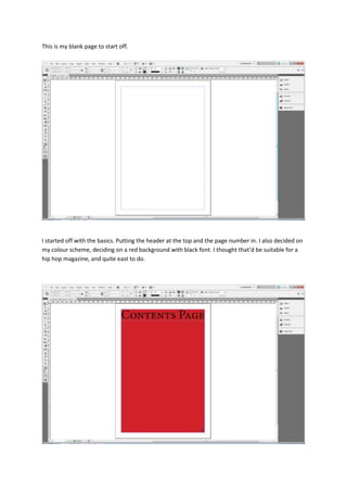
- 1. This is my blank page to start off. I started off with the basics. Putting the header at the top and the page number in. I also decided on my colour scheme, deciding on a red background with black font. I thought that’d be suitable for a hip hop magazine, and quite east to do.
- 2. I then inserted my two graphic features into my contents page. This is similar to my green contents page mock up because it has two graphic features, although the layout of the entire thing has changed. The reason I changed it is because I thought it would be easier to read in this format. Also I didn’t go with the conventional central image that seemed to crop up when I did my research section. This is because I want the reader to get a greater feel for the variety the magazine has to offer. I decided to put a callout in the middle of the page. This is because from my research I have seen that most conventional contents pages have a callout advertising their main article, so I put one in my one.
- 3. I then inserted my body copies into my contents pages and fitted it all together to give it the most attractive layout.