Contenu connexe Similaire à AI%20for%20Entomologists Similaire à AI%20for%20Entomologists (20) Plus de tutorialsruby (20) 1. ADOBE ILLUSTRATOR
A Tutorial for Entomologists
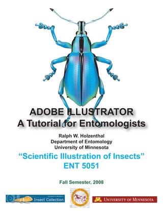
Ralph W. Holzenthal
Department of Entomology
University of Minnesota
“Scientific Illustration of Insects”
ENT 5051
Fall Semester, 2008
2. Scientific Illustration of Insects, ENT 5051 Fall Semester 2008
ADOBE ILLUSTRATOR
A Tutorial for Entomologists
Ralph W. Holzenthal
Department of Entomology, University of Minnesota
1980 Folwell Ave, room 219, St. Paul, MN 55108
holze001@umn.edu
Background: Digital Illustration Software Applications
This tutorial will demonstrate how to use Adobe Illustrator to produce detailed, black-and-white,
weighted lines drawings that have the quality of traditional pen and ink scientific illustrations.
The tutorial will also show how to use Illustrator to produce detailed “continuous tone”
illustrations in black and white and color using Illustrator’s “gradient mesh” tool.
Illustrator is a vector or object-oriented application. In Illustrator, mathematical expression or
vectors independently define objects (lines, curves, and shapes). Illustrator produces drawings
with smooth curves, sharp, crisp edges, and smooth changes in tone or color. Vector
applications are resolution independent. They have no defined resolution. The image can be
scaled up or down and printed at any size with no loss of clarity; their “resolution” depends only
on the resolution of the monitor or printer. Vector applications are represented by drawing
programs such as Adobe Illustrator, CorelDRAW, Inkscape, Canvas, etc., and by computer-aided
design (CAD) applications. The power of Illustrator lies in its “Pen” tool, but it offers many
other types of drawing tools and features that makes it high-powered application for scientific
illustration.
A second type of application, represented by Adobe Photoshop, can also be used to produce
digital scientific illustrations. Photoshop is a bitmap or raster-editing application. It offers an
incredible diversity of tools, filters, masks, etc. to subtly edit and change the color value of
individual pixels in bitmapped images. A bitmap is a virtual grid (or raster) of small squares,
pixels (or picture elements), used to represent an image (much like a mosaic of tiny colored
squares). Pixels are the smallest individual components of a digital image. Each pixel has a
specific size, location, and color value and is individually editable. Bitmapped images come
from capture devices (digital cameras, scanners), screen capture applications (SnagIt, Grab,
Screenshot Plus), and image-editing programs such as Adobe Photoshop, Canvas, Corel Painter,
GIMP, etc. Perhaps Photoshop’s most common application is in enhancing and retouching
digital or scanned photographs, but its tools can be used to create digital art from scratch.
Photoshop can represent subtle gradations of color and tone that are not possible in vector
applications such as Adobe Illustrator. However, bitmap images are resolution dependent. The
resolution of the image produced is dependant on the display device (computer monitor, printer)
and the inherent resolution of the bitmap image. An image displayed or printed above its defined
resolution becomes “pixelated.” Vector drawings can be “rasterized” and then edited in image-
editing applications, but once rasterized they lose their vector editing qualities. On the other
hand, bitmapped images cannot be “vectorized.” Although bitmapped images can be placed and
scaled within vector illustration files, they cannot be edited. File size also differs between the
Command (Mac) = Control (PC) 1 Last updated 21 October 2008
Option (Mac) = Alt (PC) © R.W. Holzenthal, 2008
3. Scientific Illustration of Insects, ENT 5051 Fall Semester 2008
two types of applications. Illustrator files are small (several kilobytes), while Photoshop files
can be quite large (10s of megabytes). The two applications are really complements of each
other. For graphs or illustrations with sharp edges and smooth transitions — such as weighted
line drawings of insect structural details — Illustrator is the preferred application, but for true-
to-life illustrations that resemble paintings, Photoshop is the application of choice. In the hands
of a skilled digital artist these are almost indistinguishable from illustrations produced with
traditional media.
This tutorial will focus only on Adobe Illustrator, but an equivalent tutorial will be used to
demonstrate the use of Adobe Photoshop to produce digital scientific illustrations. However,
producing illustrations in Photoshop depends on some knowledge of Illustrator, which is the
place to start.
Software versions: The primary software I use for my scientific illustrations is Adobe
Illustrator® and Adobe Photoshop® (older versions 10 or 7, respectively, or the latest CS, CS2,
CS3 “Creative Suites” versions are sufficient; Photoshop Elements® or other “lite” versions are
not adequate). Adobe just released CS4, but I have not yet purchased and used this version
(check Adobe’s website for details on the latest version, www.adobe.com). Students and faculty
are usually able to purchase this software through their academic institutions at very reduced
costs. If so, the “Creative Suite 3 Design Standard” bundle of software is a great bargain. It
includes Photoshop, Illustrator, InDesign, and Acrobat 8.0 Professional.
Command (Mac) = Control (PC) 2 Last updated 21 October 2008
Option (Mac) = Alt (PC) © R.W. Holzenthal, 2008
4. Scientific Illustration of Insects, ENT 5051 Fall Semester 2008
PART I: BASIC TECHNIQUES
PREPARING AND SCANNING THE PENCIL SKETCH
Like most traditional pen and ink illustrations in taxonomy, an Adobe Illustrator illustration
begins with a detailed, technically accurate pencil sketch of the study organism or its parts. In
entomology, this is usually done from a specimen observed under a stereo- or compound
microscope outfitted with a drawing tube (camera lucida) or ocular grid. Taxonomic and
revisionary studies of insects contain many illustrations of various views (e.g., lateral, dorsal,
ventral) of the male genitalia, head and thoracic structures, wing venation, or other parts.
Achieving an accurate, detailed pencil sketch is the most important step in the process! After the
pencil sketch is checked for accuracy and anatomical and rendering notes taken, the pencil
sketch is scanned on a flatbed scanner.
I scan using the import feature of Photoshop’s TWAIN interface on an Epson Perfection 2400
Photo scanner with the following settings: flat bed, black & white photo, 150 dpi, scale 100%
(these settings may have slightly different names depending on your scanner). You can also scan
using your scanner’s built-in scanning software. The scanned image(s) will be placed into
Adobe Illustrator as a template layer that will serve as the basis of the Illustrator drawing.
If using Photoshop, save the scan as a Photoshop document (.psd), grayscale (Gray/8) or a
grayscale .jpg file. The resolution can be 150 dpi or 300 dpi, but the latter results in larger file
sizes.
If the original sketch has several views on the same piece of paper, copy and paste each view
into separate Photoshop documents and save these to a single folder. To do this, use the
rectangular marquee or lasso selection tool to select the subset of the composite pencil sketch
scan. Then, with the selection active:
File > Copy (Command C)
File > New. . . (Command N) (name it)
File > Paste (Command V)
Save (Command S)
Continue to select, copy, and paste each view into a separate, new file saved to a single folder.
Now we are ready to move to Illustrator.
Command (Mac) = Control (PC) 3 Last updated 21 October 2008
Option (Mac) = Alt (PC) © R.W. Holzenthal, 2008
5. Scientific Illustration of Insects, ENT 5051 Fall Semester 2008
PREPARING FOR ILLUSTRATION
Open Illustrator.
Creating a new file:
FILE
New...
Name: name the document.
Artboard Size: For most people who work in the USA choose Letter. Notice that you
can select the units of the page dimensions (cm, inches, points, etc.)
Color Mode: for black and white line drawing it doesn’t matter which color mode you
select, but for color work select RGB (we’ll discuss RGB vs. CMYK later).
Saving the file as a page template for repeated use and setting margins:
Usually you will have more than one page of illustrations in your thesis or publication. Also,
you will have to place your illustrations within the margin limits set by the publisher. For
example, thesis requirements usually ask for 1.5 inches left margin and 1 inch top, bottom, and
right margins. You can create a set of guides and save them in a template file for repeated use.
NOTE: creating template files is not an available feature in Illustrator 10 and earlier, but became
available starting with the CS series.
VIEW
Show page tiling (Printers can’t print to the very edge of a page; page tiling shows the parts
of the page that can accept ink by the selected printer. This isn’t very important, but I
find it informative.)
On the Tools palette (if the Tools palette is not visible, select it under Window) select the
Rectangle tool, then double click anywhere on the Artboard. A dialog box will appear allowing
you to set the size of the rectangle. To accommodate thesis margins create a box 6 X 9 in.
Leave the rectangle “selected.” If it becomes deselected, click on it with the Selection tool
(black arrow).
WINDOW
Align palette. Open the palette menu(the little sideways triangle on the upper right) make
sure Align to Artboard is selected
Center the rectangle horizontally and vertically using the align tools
Then under Window, select Transform and on the rectangle symbol on the left, select the center
left square, then for the X coordinate type in 1.5 in and hit the Return key. In fact, you can
position and size any shape all within the Transform palette if you prefer.
Command (Mac) = Control (PC) 4 Last updated 21 October 2008
Option (Mac) = Alt (PC) © R.W. Holzenthal, 2008
6. Scientific Illustration of Insects, ENT 5051 Fall Semester 2008
With the rectangle at the correct size and position, keep it selected (or reselect it) and under
VIEW select Guides. . ., Make guides.
Finally, go to FILE, Save as Template. . . and name the template. Notice that it has the
extension .ait (Adobe Illustrator template). Now, whenever you need to create a new plate of
illustrations, you can select New from template. . . and use this file for additional plates. You
can create different templates for different journals and save them in Illustrator’s Template
folder.
Placing the scanned pencil sketch into Illustrator:
From the Edit menu, open a “New. . .” or a “New from Template. . .” file.
In the new document, under File
Place. . .
Navigate to the folder containing the files of your scanned pencil sketches.
Make sure LINK and TEMPLATE are both checked in the dialog box and then select
Place.
Go to the Layers palette (under Window menu, Layers). You will see that a Template
Layer was created as well as a Layer 1.
Continue to place one by one all of your scanned pencil sketches onto the Artboard that
will serve as the first plate of illustrations in your publication. Each placed pencil sketch
will appear as a Template [template layers have the “triangle, box, circle” icon next to
them rather than the “eye” icon].
In the Layers palette “unlock” each template. In the Toolbox palette, select the Selection
arrow (black arrow). By clicking on the image of the pencil sketch or the template
“target” button in the layers palette, a red “bounding box” appears (it should have open
adjustment squares at the corners and at the midlengths of the 4 sides); if a bounding box
does not appear, select “Show Bounding Box” from the View menu. If you placed more
than one document on your Artboard, they will stack one on top of each other. You can
drag the images around to uncover them and see them all by selecting or targeting each
separately.
Very likely, your images will be imported into Illustrator larger (or smaller) than the boundaries
of the Artboard. You will need to scale them down (or up). When you have a template layer
selected, go to Object, Transform, Scale. You get a pop-up window with scale properties.
Select Uniform and the appropriate scale, e.g., 75%, 50%, etc. Also select Preview, then OK.
Scale the individual template layers as appropriate to the size of the Artboard. Don’t crowd
them, but on the other hand, don’t leave too much white space between individual views. If you
want all your drawings throughout your publication to be scaled at the same size, be sure to
record the percent reduction or enlargement used.
With the Selection arrow (black arrow) select other templates and scale those. You can select all
templates by holding down shift key while selecting additional template then scale all at once.
Command (Mac) = Control (PC) 5 Last updated 21 October 2008
Option (Mac) = Alt (PC) © R.W. Holzenthal, 2008
7. Scientific Illustration of Insects, ENT 5051 Fall Semester 2008
In the Layers palette, if you double click on a template, a Layer Options pop-up window
appears. You can rename the template and also dim or enhance intensity of template image. I
usually leave this alone (the default is dim to 50%), but in the Transparency palette (under
Window), I adjust the opacity of the template background when a part of one template overlaps
and obscures a part of another. I usually set “opacity” to 50%-75% so I can see behind
overlapping images when needed.
You can move selected templates (or any object or path) on the Artboard by dragging into
position with the selection arrow or you can move with the arrow keys on the computer’s
keyboard after the item is selected. Set the selectivity of the increment of movement as follows:
Edit
Preferences
General...
Keyboard Increment: [I have it set to 0.005 cm; this is your choice, but a small
increment is recommended for fine adjustments of position.]
Regardless of the increment you set, if you hold down the shift key while moving with
the arrow keys, the object moves by a factor of 10.
With a template layer selected, you can also scale by dragging with selection arrow on a corner
or side. But first, under View, select Show bounding box if the bounding box is not active
(otherwise a red border with solid corner squares shows around the template). The solid squares
become open and you can drag them to change the size of the template. However, this scaling
will not be proportional. To get proportional scaling, hold down the shift key while dragging.
If you scale this way, make sure separate illustrations of the same specimen are scaled the same
amount.
To rotate a template, hold the selection arrow just to the outside of a corner of the bounding box
and drag to rotate to desired position, or better use the Rotate tool.
Rotate tool—select the object you want to rotate. Select the Rotate tool from the Toolbox.
Notice the default position of the rotation point in the center of the object. Drag to rotate the
object around the rotation point or change the position of the rotation point by clicking in a
different location anywhere on the Artboard. This tool is more versatile than using the bounding
box to rotate objects.
Once the templates are scaled, positioned, rotated, etc. lock them as needed. They cannot be
modified or moved when they are locked.
Setting preferences:
In addition to setting the keyboard increment settings, there are a number of other settings to be
aware of in Preferences, including the following IMPORTANT PREFERENCES SETTING:
Command (Mac) = Control (PC) 6 Last updated 21 October 2008
Option (Mac) = Alt (PC) © R.W. Holzenthal, 2008
8. Scientific Illustration of Insects, ENT 5051 Fall Semester 2008
If you intend to copy and paste Illustrator “paths” into Photoshop for further rendering (i.e., to
produce a color illustration in Photoshop), you must do the following in Adobe Illustrator [In
fact, go ahead and set up the preferences as described below whether or not you intend to import
paths into Photoshop, it will not affect your Illustrator drawing]:
Under the Illustrator pop down menu
Preferences
File handling and Clipboard…
Then under Clipboard on Quit make sure Copy As: PDF and AICB (no
transparency support) and Preserve Paths are checked.
Most of the preferences can be left as the default factory settings, but you may want to change a
few. Setting preferences here becomes universal within the application and thus applies to any
new document you create.
Under Units & Display Performance, set the General units to Centimeters or Inches, and
Stroke and Type to Points. Under Display Performance, Hand Tool, slide the cursor over to
the left, Full Quality or near full quality.
Learning and using short-cut key-strokes:
IMPORTANT KEY-STROKES!
Command-Z This is a very important key-stroke. It sequentially undoes previous actions.
So if you do something wrong, you can undo it with this key-stroke. By holding down Shift-
Command-Z you can redo an action. You can set the number of undos in the Edit menu,
Preferences, Units & Undo. Set the minimum level to 50. [Best to also set your units to
Centimeters and Stroke and Type to points at this time.]
OTHER USEFUL SHORT-CUT KEY-STROKES
Z magnifying lens to zoom up (hold down the Option key to zoom
down) or select the magnifying lens and drag across the page to
zoom in on that section
V selection (black) arrow
A direct selection (white) arrow
P pen
N pencil
line segment tool
B paint brush
+ add anchor point
- delete anchor point
X toggles the fill and stroke colors
R rotate tool
Shift C convert anchor point
Command (Mac) = Control (PC) 7 Last updated 21 October 2008
Option (Mac) = Alt (PC) © R.W. Holzenthal, 2008
9. Scientific Illustration of Insects, ENT 5051 Fall Semester 2008
Command Z undo (the second most important key-stroke!)
Shift Command Z redo
Command S Save (the most important key-stroke!)
Command + zooms in
Command – zooms out
Command 0 (zero) scales view of Artboard to window (double click the hand tool icon
for the same effect)
Command 1 scales view to 100% (double click the zoom tool icon for the same
effect)
Tab hides palettes and Toolbox
Shift+tab hides palettes only
H or Space bar hand tool
Caps lock turns any drawing tool into crosshairs
Shift+Command B shows or hides the bounding box
Command C copy
Command V paste
Command F paste in front
Command B paste in back
Command G group
Shift+Command G ungroup
Shift+Command ] bring to front (all the way, relative to the other objects in its layer)
Shift+Command [ send to back (all the way, ditto)
Command ] bring forward (one level, ditto)
Command [ send backward (one level, ditto)
Command J join
Option+Command J average
And from any tool or selection, if you hold down the Command key, the Selection (black)
arrow appears or the Direct-selection (white) arrow appears depending on which of these
was selected previously.
If you pause the selection arrow over any of the tools in the Toolbox palette, a “tooltip”
appears with the tool name and it’s key-stroke short cut (in parentheses). Some tools or
functions do not have short-cut keys.
CAUTION: Do not inadvertently press Command H or select Hide Edges from the View
menu. You will not be able to see or select the path lines or anchor points on your paths or
objects (see below). Also, make sure Snap to Grid and Snap to Point in the View menu are not
selected.
Command (Mac) = Control (PC) 8 Last updated 21 October 2008
Option (Mac) = Alt (PC) © R.W. Holzenthal, 2008
10. Scientific Illustration of Insects, ENT 5051 Fall Semester 2008
BEGINNING THE ILLUSTRATION
Creating layers:
Return to the Layers palette. Select the palette menu in the upper right of the palette and choose
New Layer. . .
Name: typically we name the layer for the view and/or structure, i.e. dorsal Xth,
ventral, lateral, phallus, etc.
Color: choose a color you can see easily, not too dark, not too bright, so you can
distinguish it against the line you are drawing and whether the anchor points
are open or filled (red, green, blue, magenta, cyan, orange, and teal work well
on black stroked lines).
Leave the other settings as they are (default)
For each different template, make a New layer via the same procedure and choose a different
color.
LAYER MANAGEMENT IS IMPORTANT!
Before and during laying down paths with the pen tool, be sure the proper layer is selected, i.e.,
if you are laying down paths for a particular structure, make sure that the layer you created for
that structure is selected. All of the paths for a structure or view, should be in the layer you
established for that structure or view.
Turning on the Ruler and Grid, and Adding Guides:
You may find it useful to show rulers and the grid to help orient yourself on the page and to
place paths and objects on the page. Under View, select Show Rulers and Show Grid. The
ruler units will be those you set under Preferences > Units and Display Performance. You
can change the color, style, and number of grid squares in Preferences > Guides and Grid.
You can turn any path or line segment into a Guide by selecting it and under View, choose
Guides, Make Guides. Once set, guides can’t be moved and will not print. You may find
guides useful for orienting lines and objects on your Artboard. You can also drag horizontal and
vertical guides off the ruler when it is showing. With the selection, tool drag horizontal guides
off the horizontal ruler down to any position you want to have them. Drag vertical guides off the
vertical ruler. It is a good idea to make all your guides in their own separate layer (name it
“Guides”). If you want to get rid of the guides you simply delete that layer.
If you are working with graphs, cladograms, or other illustations that require evenly spaced
vertical of horizontal lines or fixed points, Snap to Grid and/or Snap to Point under the View
menu are very useful tools, but unless you need these options, keep them unselected.
Command (Mac) = Control (PC) 9 Last updated 21 October 2008
Option (Mac) = Alt (PC) © R.W. Holzenthal, 2008
11. Scientific Illustration of Insects, ENT 5051 Fall Semester 2008
Creating paths:
Use the Pen tool to begin laying down “anchor points” along the path you want to stroke.
Make sure the Stoke is active on the Toolbox (toggle X) and turn off the Fill (select Fill and then
select the red slash icon). Select the Pen tool (P), click, hold, and drag the first anchor point
slightly as you establish it, as you do a set of direction lines will appear. Continue to establish
additional anchor points along the path in the same way. If you hold and drag the anchor points
as you lay them down, you can change the curvature of the path to fit the line you want to trace
via direction lines. Pulling on the direction lines with the selection tool changes the length and
direction of the curve on either side of the anchor point.
As you lay down a path, the bounding box will appear or not depending on whether you select
Show Bounding Box or Hide Bounding Box under the View menu. I prefer to have it hidden
and show it only when I want to resize a path or object.
As you lay down additional anchor points, you adjust the curvature of the path by dragging a bit.
However, occasionally a weird curve will appear, especially if the former curve you laid down
was long, and you follow it with a short curve. To adjust for this, Command-Z the path segment
away, select the selection arrow, click away form the line to deselect, get the pen tool again, go
back to the last anchor point, click on it then lay down the next anchor point. The curve should
be more “normal.” If you keep the direction line short and along the same line as the path, you
can usually avoid this problem. Try not to make the direction lines very long (longer than the
previous line segment) to change the curvature; if you need a more curved line, lay down
additional anchor points. On the other hand, don’t make a curve by laying down many, closely
spaced anchor points. This defeats the POWER OF THE PEN. Experiment and practice and
you’ll learn the right technique. The power of Illustrator lies in the pen tool, but it is
the most difficult tool to master. However, you must master it as 80% of Illustrator’s function
lies in the creation and editing of paths.
You can add an anchor point along any part of a path by first selecting the path then using the
Add-anchor-point tool (under the pen tool). Similarly you can delete an anchor point with
Delete-anchor-point tool. + and – are short-cut key-strokes, respectively. Remember, P is the
shortcut key for the pen tool. In the Preferences under General, there is the option to Disable
Auto Add/Delete. By default, Illustrator lets you add anchor point anywhere along the path by
moving the pen tool to where you want it and clicking in a new anchor point. Likewise, if you
place the pen tool over an existing anchor point and click you can delete it. You may choose to
turn off the Auto Add/Delete setting (I work with it turned off) and add or delete anchor point
using the add and delete tools.
The Convert-anchor-point tool (open, tailless arrow; shortcut Shift-C) changes a smooth
anchor point to a corner point. This is useful for making sharp turns or corners. To convert it
back to a smooth point, simply select the corner point with the convert anchor point tool, hold,
drag, and adjust the direction lines accordingly.
Once a path is drawn, use the Selection (V) arrow (black arrow) to select it. Notice that all of
the anchor points are dark (filled). You can then drag and move the entire path to another place.
Command (Mac) = Control (PC) 10 Last updated 21 October 2008
Option (Mac) = Alt (PC) © R.W. Holzenthal, 2008
12. Scientific Illustration of Insects, ENT 5051 Fall Semester 2008
What if you want to move the position of just one anchor point? Select the path using the
Direct-selection (A) arrow (white arrow). Notice that the anchor points are white (open). Now
you can select any individual anchor point and move it. By holding down the shift key, you can
select several anchor points and move them together. Or you can use the Direct Select Lasso
tool to select several anchor points, then go back to Direct-selection arrow to move selected
points.
Under View in the menu bar, you can choose either Outline or Preview. The former will show
you the outline of the path, the latter shows you the actual stroke (I work in preview 99% of the
time). You can also show Preview of individual layers by holding down the command key while
clicking on the layer’s visibility icon (the little eye icon).
Stroking lines:
Select the Stoke tab in the palette dock (choose Stroke from the Window menu if it’s not
already visible in the dock). Turn off the fill on the Tools palette! Select the path with the
direct selection tool and then stroke the path at the desired line weight. I commonly use .25 pt
for tiny structures, membrane, or other fine lines. 0.5, 0.75, 1 and 1.5 are for other lines. I
generally do not use above 1.5. You will need to print your drawing a few times to gauge the
proper line stroke. Indicate on a sample drawing the stoke size used for different lines and
effects and use these stroke sizes uniformly throughout your different plates. You can change
the color and opacity of the stroke, but for line drawings, make sure they are 100% opacity and
100% black.
On the stroke palette, select the middle Round Cap of the cap selections and Round Join below
it. This makes your endpoints appear more like they were made with an ink pen. In order to
change the endpoints, remember that the path has to be selected.
Drawing “free-hand” lines:
Pencil tool—the pencil tool is used for drawing “free hand” lines, but it is not as controllable as
the pen tool. However, in certain cases the pencil tool is essential. Set the “tolerance” of the
pencil tool by double clicking on the tool icon and adjusting the settings. Setting the
tolerance at 0.5 lets you make much more squiggly lines than with it set at 20. Experiment to
get the effect you want. You can smooth, average, simplify, or outline stroke (see these
features below) a pencil drawn path. Selecting each anchor point with the direct selection
tool (while arrow) allows you to adjust the direction lines of the anchor point. The pencil
tool is very useful for drawing irregular lines, such as membrane. The use of a digital
palette and electronic stylus make this a more accurate tool.
Path Eraser tool—the path eraser tool, grouped with the pencil tool in the Toolbox, lets you
erase parts of paths, but it does not work on shapes or objects. Select the path you want to
erase and drag the eraser tool over the part you want to erase. You can also use the eraser
Command (Mac) = Control (PC) 11 Last updated 21 October 2008
Option (Mac) = Alt (PC) © R.W. Holzenthal, 2008
13. Scientific Illustration of Insects, ENT 5051 Fall Semester 2008
tool to cut a path (just like the scissors tool, see below) by simply clicking on that part of the
selected path you want to cut.
Modifying paths:
You can smooth, roughen, or simplify lines as well as average or join anchor points or cut
segments of a path.
Smooth—use the Smooth tool under the Pencil tool. Select the path and trace along the
anchor points using the Smooth tool to smoothen the path (you are actually just eliminating
anchor points).
Simplify—Select the path. Go to Object on the menu bar, then to Path, then to the pop-up
window Simplify. . . Select Preview, then move the Curve Precision slide to see how the
path behaves. The closer to 100%, the closer to the original path shape.
Roughen—Select the path. Use the Pencil tool along the path to roughen.
Join—You can only Join “endpoints,” either on the same path (which then closes the path)
or to join two separate paths. Use the Direct selection tool (white arrow) to select the path(s)
then by holding down the shift key, select the endpoints to be joined. Then Object > Path
> Join or Command J.
Averrage—You can average two or more anchor points using the Average tool. Object >
Path > Average or Option+Command J and select the axis along which to average (this
works best when averaging only a few points more or less along the same axis).
Cut—Use the Scissors tool to cut a path into two or more segments.
Shapes:
Creating shapes in Illustrator is easy. The various shape tools in the Toolbox are:
Rectangle tool (M)
Rounded rectangle tool
Ellipse tool (L)
Polygon tool
Star tool
Flare tool
Shapes can be filled with color or pattern and the stroke of the perimeter can also be edited for
size and color. When you select a shape tool and click on your Artboard, a dialog box appears
allowing you to preset the dimensions of the shape. You can also change the degree of
roundness of the corners, the number of polygon sides, star points, etc. Highly geometrical
shapes usually don’t apply to biological structures, but they come in handy on occasion (I
haven’t found a use for the flare tool yet). You can also change the size of shapes via the
Command (Mac) = Control (PC) 12 Last updated 21 October 2008
Option (Mac) = Alt (PC) © R.W. Holzenthal, 2008
14. Scientific Illustration of Insects, ENT 5051 Fall Semester 2008
bounding box, by scaling, or by selecting anchor points with the direct selection tool. Holding
down the shift key scales proportionally.
Knife tool—This tool, docked with the scissors tool, is used to cut filled shapes. Select the
shape and drag the knife tool across the part want to cut, then select that part and remove it
by hitting the delete key. Or, you can move the cut off part to another location. Be sure to
select the shape you want to cut; if not, everything that the knife passes will be cut.
Eraser tool (Shift+E)—This is a new feature in CS3, also docked with the scissors tool.
This is a very nice tool that allows you to erase both filled shapes and single paths. It acts
like a brush in that you can change the angle, roundness, and diameter of its tip. To get a
dialog box of settings, double click of the eraser tool’s icon in the Toolbox . To quickly
change the diameter, hit the square bracket keys: [ to decrease diameter, ] to increase
diameter. You can use the Eraser to split and divide shapes and each of the resulting pieces
in editable! If you do not select an object, every object the eraser passes over will be erased;
to avoid this, select the object, then apply the eraser.
ADDING DEPTH AND DETAIL
Making weighted lines:
Outline stroke— is a very important tool in Adobe Illustrator for varying the width of a line
along its length to create a “weighted line.” When converting a line with outline stroke,
Illustrator turns the single stroked path into a closed shape. Anchor points become established
around the periphery of the shape and these can be individually selected and moved to vary the
width or taper the ends of the new shape. In previous versions of Illustrator (CS2, CS, 10)
outline stroke functioned easily. To outline a stroke:
Select the stroked path.
Then Object > Path > Outline Stoke.
Once the path is outlined, use the Direct-selection tool to select it again. Then, by selecting
individual open anchor points and dragging them (or by use of the keyboard direction arrows),
you can change the thickness of the stroke or taper the ends. Holding down shift allows you to
select several anchor points to drag all at once (or use the Lasso tool). Note that once a path is
stroked, it becomes a filled shape and cannot be converted back to a path! Also, to get nicely
tapered lines, make sure Round Cap and Round Join are selected when stoking the original line.
Remember: if you return to the pen tool after outlining a stroke, be sure to turn off the fill again
and reset the end caps.
Solution to Adobe Illustrator CS3 “Outline stroke” problem
In CS2 and earlier versions, one could simply use the direct selection tool (white arrow) to
select the shape and drag out individual anchor points to change its width. With CS3, this
Command (Mac) = Control (PC) 13 Last updated 21 October 2008
Option (Mac) = Alt (PC) © R.W. Holzenthal, 2008
15. Scientific Illustration of Insects, ENT 5051 Fall Semester 2008
feature seems to have been corrupted. Now, when you select an anchor point, and drag, you
will notice that there is a second (sometime multiple) anchor points “hidden” beneath the one
you dragged. The result is a very angular extension of the shape. One solution is to drag
across the anchor point to select those below at the same time, but this in a poor workaround.
A more “elegant” solution (but not perfect, until Adobe fixes this bug and returns the function
to its pre-CS3 condition), is the following:
1. Draw a line with the pen tool (or other drawing tool).
2. Select the line.
3. From the Menu bar select Object > Path > Outline stroke.
4. Select the path with the Selection tool (black arrow)
5. In the Pathfinder palette (under the Windows menu), option-click on the upper left icon
(Shape modes: Add to shape area) (you must select with the Option key held down!).
6. Now, with the Direct selection tool you should be able to select an anchor point and pull
it out to the desired width (you can use the keyboard direction arrows to move the anchor
point also).
This is still not as good as the Outline stroke function prior to CS3, but it is a solution that
takes only a couple of extra clicks. With any luck, Adobe will address this bug in future
versions of the program (still not fixed in version 13.0.2)
Weighted lines with calligraphic brushes:
You can also use certain preset or custom designed Calligraphic brushes (see below) to make
weighted lines, but these offer less control and less of an ability to finely edit than with the
outline stroke technique.
OTHER VERY USEFUL BASIC FUNCTIONS
Dashed Lines—Select the stroked path. On the Stroke palette, select Dashed Line. Select the
Dash and Gap point size to best balance with the stroke weight. Hit the Return key to set the
point sizes selected. Record these so you use them uniformly in your plates. Well-balanced
dashes and gaps for line strokes are:
Line dash gap
0.25 pt 0.50 0.75
0.50 0.75 1.0
0.75 1.00 1.5
1.00 1.50 2.0
Creating exact copies of paths, shapes, or other objects—Select the path with the Selection
tool (black arrow), hold down the Option key, and click and drag an exact copy of the object.
Or, select the path, then Edit, Copy (Command C), Paste in Front (Command F) or Paste
in Back (Command B), and drag the copy off the top of the original (or the original off the
top of the copy) with the selection tool or move it off with the key board arrows. Or, select
the path, drag a copy with the selection tool with Option down and position the copy in
Command (Mac) = Control (PC) 14 Last updated 21 October 2008
Option (Mac) = Alt (PC) © R.W. Holzenthal, 2008
16. Scientific Illustration of Insects, ENT 5051 Fall Semester 2008
relation to the original where you want it. Then by repeatedly hitting Command D, you
duplicate the path in the same relative position.
Putting a white “shadow” behind a stroked path
Select the stroked path (don’t deselect until after). Copy and Paste in Back. If desirable, under
the Stroke palette, select a larger weight, e.g., 0.5 to 1 pt larger than your stroke. Open the Color
Palette and select white for the stroke color (you can also do this through the Tool palette). Use
the keyboard direction arrows to reposition the white stoked path if necessary.
Illustrating bilaterally symmetrical structures:
For bilaterally symmetrical structures you only need to draw half of the image, duplicate that
half, and then “reflect” the duplicated half.
In the layer you want to reflect, Select All (Command A) of the individual paths you want to
duplicate. You can unlock the template and select it also, if necessary. Then Object > Group
(Command G). Go to Object again, Transform > Reflect. . . Select the Axis (usually
Vertical) and the Angle (usually 90°). You can check Preview if you wish. Then Copy. Now
use the arrow keys to move the reflected image so that it aligns in the position you want or you
can drag with the selection tool and fine-tune the position with the arrow keys. It might be
useful to Show Bounding Box to help you align or you can use the Align palette (under
Window menu) to help you align the two images. You can also draw think (0.25 stroke)
registration guide lines to help you align the two halves. You can then Ungroup
(Shift+Command G) both sets of paths for additional editing of individual paths.
You can run into the problem of having your reflected composite image appear too symmetrical
and hence look unnatural. To avoid this, just very slightly change the position or shape of a few
paths on one side or the other to break up the symmetry. Use the direct selection tool to do this.
Again, here is where your artistic eye comes into play.
Scaling:
Scaling objects to different sizes in easy. Simply select the object, then from the Menu, Object
> Transform > Scale. Notice that objects can be scaled Uniformly or Non-Uniformly by
percent. You can choose to Scale Stokes and Effects or not. If I am scaling something to a
small percentage (ca. 5-10%), I usually do not scale strokes and effects, but if I am greatly
rescaling something, especially if it has stipples or crosshatches, I turn on Scale Strokes and
Effects.
You can also use the Scale (S) tool to quickly scale objects (your setting for Scale Strokes and
Effects also affects the Scale tool). Hold down the Shift key to scale proportionally and set the
axis of scaling where you wish.
Command (Mac) = Control (PC) 15 Last updated 21 October 2008
Option (Mac) = Alt (PC) © R.W. Holzenthal, 2008
17. Scientific Illustration of Insects, ENT 5051 Fall Semester 2008
Command (Mac) = Control (PC) 16 Last updated 21 October 2008
Option (Mac) = Alt (PC) © R.W. Holzenthal, 2008
18. Scientific Illustration of Insects, ENT 5051 Fall Semester 2008
PART II:
“Advanced” Techniques
Simple fills and gradients:
Simple fills— Fills work best in closed paths, so if you draw a complex shape with the pen tool,
be sure to close it (notice that when you move the pen tool over the starting anchor point a small
circle appears. Clicking at this time will close the path.) To close a shape drawn with the Pencil
tool, you will have to Join the endpoints as explained above. Or you can draw a shape with any
of the shape tools - Rectangle, Rounded Rectangle, Ellipse, or Polygon tool (key-stroke M) in
the Toolbox. Simply select the shape, bring the Fill swatch on the Toolbox forward (click to
activate), and select a color from the Color palette (there are 4 color modes in Illustrator: RGB,
CMYK, HSB, and Web Safe RGB) or a grayscale % fill from the Grayscale ramp. You can
fine-tune the color by sampling from the color or grayscale ramp, by using the sliding controls,
or by typing in a percentage or value. You can quickly return to black or white by clicking the
little patches to the right of the color/grayscale ramps on the color palette.
You can also fill with any of the numerous preset color combinations located in the Swatch
pallete.
Note also that you can toggle between Fill or Stoke in the toolbox by hitting the X key. And you
can return to black and white by clicking on the Default Fill and Stroke icon (key-stroke D).
Simple gradients—Like fills, gradients work best on closed paths or shapes. Simply select the
shape, open the Gradient palette, and click on the Gradient Fill to fill the shape with a gradient.
Notice that within the Gradient palette you can select between Radial and Linear gradients and
you can change the angle of a linear gradient.
The Gradient Tool (key-stroke G) (docked in the Toolbox) is the quickest and easiest way to
change the “highlight” of the gradient. Select the shape containing the gradient, select the
Gradient Tool, and drag across the selected shape to change the angle or position of the gradient
highlight.
You can also make more complex “simple gradients” by manipulating the controls on the
gradient slider at the bottom of the gradient palette. On the bottom set of controls you can set
the color and number of different colors in your gradient and with the top set of controls you can
set the “location” of transition between colors. It’s easier to show you how these work than to
try to explain in words. Note: once you custom design a simple gradient, you can save it for
later use in your file by simply dragging the gradient fill preview square to the Swatches palette.
(You can also do this with custom colors; more about Swatches later).
Command (Mac) = Control (PC) 17 Last updated 21 October 2008
Option (Mac) = Alt (PC) © R.W. Holzenthal, 2008
19. Scientific Illustration of Insects, ENT 5051 Fall Semester 2008
Crosshatch fills:
Crosshatch fills are very useful for filling shapes to indicate structures that lie below other
structures. There are several ways to make crosshatch fills, but the easiest is to use the
customized Crosshatch swatches (provided, in both black & white and color). These designs
were modofied from a 3rd party Plug-in provider, Hotdoor, Inc.
(http://www.hotdoor.com/index.html), and are used mostly in architectural drawings. The
crosshatch swatches are saved in separate Adobe Illustrator files called Crosshatches.ai and
ColorCrosshatches.ai. To activate this swatch, quit the Adobe Illustrator application (save your
work!) and locate the Adobe Illustrator application folder on the computer’s hard drive in the
Applications folder. Open the Adobe Illustrator folder and locate the Presets folder and then
the Swatches folder within it. Drag the Crosshatches.ai and ColorCrosshatches.ai files into the
Swatches folder, re-launch Illustrator and open your file. To locate the crosshatch swatches
palette, go to Window > Swatch Libraries > Crosshatches or ColorCrosshatches. Open
the options buttons and check Persistent.
Using the custom crosshatch swatches:
1. Draw the shape you want to fill with a crosshatch, keep the shape selected or select it.
Open the “Crosshatch” swatch palette from the “Open Swatch Library” under the main
Swatch palette menu options and click on the desired swatch pattern.
Using preset pattern fills from the swatch library:
Illustrator CS3 comes with a set pre-designed pattern fills. These are used primarily in
architectural drawings, but you may find a pattern that is useful in your illustrations. There
are even stipple fills!
1. Under the Swatch palette options menu, Open Swatch Library > Patterns > Basic
Graphics and select either the Basic Graphics_Dots, Basic Graphics_Lines or Basic
Graphics_Textures swatch.
Blending objects:
Another useful tool in certain situations is the blend (not to be confused with blending modes!)
function to insert a series of paths (or objects) between a pair of paths (or objects). The blend
tool “morphs” the shapes together through a series of transitions (fixed steps or fixed distances).
Select the paths for “blending.” Then Object > Blend. Under Blend Options select the
Specified Steps or Specified Distance for Spacing. Then back under Blend, select Make (or
Option+Command+B). You will have to experiment a bit to get the desired effect.
You can Expand the blend, Ungroup, and then move or edit individual parts with the
selection arrows.
The objects in the blend will be laid out in a straight line between the two original endpoint
objects. If you want to fit them to a curved line, draw a curved line with the pen tool, make sure
Command (Mac) = Control (PC) 18 Last updated 21 October 2008
Option (Mac) = Alt (PC) © R.W. Holzenthal, 2008
20. Scientific Illustration of Insects, ENT 5051 Fall Semester 2008
it is on top of the blend (Bring to front), select both the blend and the curve, then Object >
Blend > Replace Spine. Notice the different Orientation options.
You can also blend the color between two or more objects. For example to get a highlight on a
sphere, draw a circle with the ellipse tool. Fill it with a color. Draw a small while circle on top of
it. Fill it with white. Select both. Under Object > Blend > Blend Options, select Smooth
Color.
Clipping mask:
A clipping mask is an object whose shape masks another object or artwork so that the latter fits
within the borders of the mask. It is very useful for “filling” complex objects, including text,
with complex fills.
What is nice about clipping masks is that each of the objects is fully editable. By using the direct
selection tool (white arrow) you can select individual parts of the mask and change the color,
stroke, fill etc. On the other hand, the full original objects are still present, only masked, so the
size of the illustration is the same as the unmasked objects (look at the file in Outline format).
Using the “Clipping Mask” to make crosshatch fills:
1. Draw the shape you want to fill with a crosshatch.
2. Draw a +45°, -45°, or 90°line spanning the maximum width of the object. Use the line
segment tool to do this. By holding down the shift key and dragging in the desired
direction as you draw, you can pop the line to fixed 45° positions).
3. Stroke the line to the desired weight and color. You can also dash the line if desired.
4. Select and drag the line to just beyond one side of the shape or the other. With the line
still selected, hold down the Option key and drag a copy of the line to just outside the
other side of the shape.
5. Select the two lines and blend them using the Blend option. Object > Blend > Blend
Options. . ., and set the Specified Steps or Specified Distance to get the desired effect
(you may have to try a few different time to get the effect you want - use Command Z to
go back and start again).
6. Make sure the shape is on top of the blend: select the shape, Object > Arrange >
Bring to Front.
7. Select the shape and the blend, then Object > Clipping Mask > Make.
8. To restroke the path of the shape, select just the path with the direct selection tool (white
arrow) and turn the stoke back on. You can also edit the path as well (change its stroke
weight, color, etc.) while it is selected with the direct selection too. You can edit the fill
by selecting the object with the selection tool (black arrow) and Object > Clipping
Mask > Edit Contents.
Command (Mac) = Control (PC) 19 Last updated 21 October 2008
Option (Mac) = Alt (PC) © R.W. Holzenthal, 2008
21. Scientific Illustration of Insects, ENT 5051 Fall Semester 2008
Digital stipples and crosshatching:
I have not discovered a digital stipple fill that allows you to follow the contours of a complex
shape to capture the effects of light and shadow on the shape (if you do, PLEASE let me know).
I stipple digitally “by hand” just as you would do with pen and ink on paper, except I have
created a few digital stipple calligraphy brushes (0.25 pt, 0.5 pt, 0.75 pt, 1 pt, 2 pt round). These
are located in the Setae.ai custom brush file provided for download (follow the same installation
procedures as described for the Crosshatch files above, except place this file in the Brushes
folder in the Presets folder). Use the Brush tool to apply the stipples. I set the Brush tool icon to
crosshairs to more accurately place the stipples (setting Caps Lock when the brush tool is active
changes the icon to crosshairs; this works on any drawing tool).
Similarly, I also crosshatch “by hand” using the Pencil (N) tool. Set the Tolerance Fidelity
level to 20 and stroke out short, 0.25 or 0.5 pt lines. Be careful not to “hook” the ends of the
crosshatch lines. Using the Line () tool gives you more control over the straightness of the
hatch lines and their angle (hold down the Shift key to constrain the angle to multiples of 45°).
Digital stippling and crosshatching are no different than traditional pen and ink stippling or
crosshatching. It takes time and skill. Each stipple or crosshatch, no matter how many 1000s,
has a proper place and purpose. I constantly Zoom in and out to see that the effect of the
stippling is what I want. I also print frequently throughout the process to check for the proper
effect.
Text:
Illustrator handles text very nicely. If you need to add text to your illustration you may add it
within an already established layer or create a new layer for it. It is probably better to put text in
a new layer. If the text is in the layer with your stroked paths, if you have to scale your drawing,
you will also scale the text (or you will need to deselect the text). If you keep text in a separate
layer, the font size you select for the text can be maintained even if you have to scale the layers
containing your stroked illustration.
To add text to a new layer, select New Layer... from the Layers palette and name it. Select the
Type tool (T) from the Toolbox, click on the Artboard and type your text. To change or modify
font, size or style, under Window, Type, choose Character from the Character palette which
has all the tools for modifying your text.
If you add text to an existing layer, make sure the correct layer is selected, then follow the same
procedure.
You can do much more with text in Illustrator than the simple labeling we usually use with
scientific illustrations. See the Illustrator manual, the Help file, or a 3rd party how-to manual.
Command (Mac) = Control (PC) 20 Last updated 21 October 2008
Option (Mac) = Alt (PC) © R.W. Holzenthal, 2008
22. Scientific Illustration of Insects, ENT 5051 Fall Semester 2008
Using brushes and making custom brushes:
Illustrator comes equipped with a large library of Brushes for making complex strokes on paths.
Go to Window > Brushes to open the brushes palette. Then click on the palette menu to access
the various libraries under Open Brush Libraries. Of particular use are the Calligraphic
brushes, which you might find helpful for making weighted lines. The diameter, degree of
roundness and angle of the “tip” of the brush can be varied to affect the stroke and mimic a true
calligraphy brush. Use the Brush tool to directly stroke out a brush, but you can also use the pen,
line, or pencil tool to create a stroke and then apply a brush stroke to it (select the path, then
select the brush stroke from the palette to apply to it).
There are four basic brush types: Calligraphic, Scatter, Art, and Pattern. You can create
custom brushes in any of these types depending on your needs and save these in your own
custom brush library. You can create any type of simple (e.g., dashed line or single stipple) or
complex brush (e.g., complex colored arrow or a complex multicolored pattern) as follows:
1. Draw the object on the Artboard using any of the drawing tools.
2. Select all of the components of the intended brush and Group them (Command G)
3. From the Brushes Palette options menu choose New Brush, name the brush, select the
brush type and the brush parameters. Each brush type has different parameters. These
are self-explanatory after you play with them a bit. Save the brush and it will appear in
the brushes palette.
When created this way, your new brush will only be available in the current document. To
create a permanent library of brushes available to all new documents, open a new Illustrator file
and create your brush (or series of new brushes in it). The new brush(es) will appear in the
brushes palette. Trash all of the old, preset brushes in the brushes palette in this new file such
that only your new brushes appear in the brushes palette. Select and clear the Artboard of the
brushes or test brushes you created. Name and save the file to the Desktop. Quit the Illustrator
application. Navigate to the Adobe Illustrator application folder itself, open it and find the
Presets folder, and within it the Brushes folder. Drag or copy your new brush library to the
Brushes folder.
After adding brush strokes to your illustration, turn off the brush by going back to the Brushes
palette and click the Remove Brush Stroke icon down at the bottom.
CAUTION! Keep an eye on the Fill and Stroke selections on the Toolbox menu bar. If the fill
is selected, any time you lay down a stroke, it will be filled (or partially filled across the
endpoints of the stroke). Turn the Fill off by selecting the Fill box, then select the None tool
(the square with the red slash across it). You can toggle back and forth between Fill and
Stroke (X). Since Illustrator remembers the last action you performed, you may end up
filling the next stroke you laid down if the previous action you performed included a fill.
This is sometimes especially a problem when the background fill is white; this causes parts
or your illustration or template layer to be partially covered by the white fill you
inadvertently applied to subsequent strokes. Again, pay attention to the Fill/Stroke selection
to avoid this problem.
Command (Mac) = Control (PC) 21 Last updated 21 October 2008
Option (Mac) = Alt (PC) © R.W. Holzenthal, 2008
23. Scientific Illustration of Insects, ENT 5051 Fall Semester 2008
Making and Drawing Setae
1. Draw a vertical line using the Line segment tool (hold down the shift key to force it
to vertical). Stroke at 0.25 pt.
2. Select and Copy the line segment and Paste in back (Command B). Don’t move the
lines at this point!
3. Using the Direct Selection tool, drag across the apex of the line segments to select
both endpoints. Join the endpoints (Command J or Object > Path > Join).
4. Select an endpoint at the base of the line. Move it to the right with a few hits on the
right arrow key. Now select the other endpoint and move it to the left the same
number of increments. Now select those endpoints and Join them. The purpose is to
make a perfectly symmetrical, vertical, long, narrow triangle.
5. Fill with black or white using the Fill tool. At this point you may also want to round
the bottom of the triangle (i.e., the seta). Add an anchor point in the middle of the
short base and use the direction line to round out the base.
6. Turn off fill, then draw an oval using the Ellipse tool. This will be the setal socket or
alveolus. You may fill the ellipse with white if you wish.
7. Move the ellipse (alveolus) to the base of the seta and center the seta in the alveolus
using the Align palette tools. Make sure the seta is in front of the alveolus by using
the Bring to front or Send to back option under Object > Arrange.
8. With the Selection tool select both the seta and the alveolus and Group them
(Command G).
9. Select the Brushes palette
10. From the upper right option button, select New Brush > New Art Brush then Name
the brush (e.g., long black seta, peg-like seta, etc.) and for Direction select the
upward pointing arrow (from the base of the seta to the apex). This newly created
brush will appear in your brushes palette.
To stroke a seta, select the Paintbrush tool, select the brush, and brush out a seta. You can also
use the pen tool to draw a seta. Draw a line, leave it selected, and click on the setal brush in the
Brushes palette to turn it into a setae. Using the pen tool gives you a little more control over the
position, length, and direction of the seta than does the brush tool. If using the pencil tool to do
this, set the tolerance to 20.
After brushing all setae, turn off the brush by going back to the Brushes palette and clicking the
Remove Brush Stroke icon down at the bottom.
You can create a dedicated library of setal brushes and save them for use throughout the
application (see the setal library provided on the course website and CD). As explained above,
to create a permanent library of setae available to all new documents, open a new Illustrator file
and create your setae one at a time. The new setae will appear in the Brushes palette. Trash all
of the old, preset brushes in the Brushes palette in this new file such that only your new setae
appear in the Brushes palette. Select and clear the Artboard of the setae or test setae you created.
Name and save the file to the Desktop. Quit the Illustrator application. Navigate to the Adobe
Command (Mac) = Control (PC) 22 Last updated 21 October 2008
Option (Mac) = Alt (PC) © R.W. Holzenthal, 2008
24. Scientific Illustration of Insects, ENT 5051 Fall Semester 2008
Illustrator application folder itself, open it, find the Presets folder, and within it the Brushes
folder. Drag or copy your new seta library to the Brushes folder. When you restart the
application your setal library will be available (if it’s not visible, go the Brushes palette menu
and Open Brush Library to find it). You can create new swatch libraries the same way, but
place these in the Swatches folder in the Presents folder.
You will notice that if you try to brush out a very long seta (or a very short one), the alveolus
may be distorted. This is because you are stoking out the setae beyond (or below) the length you
established for it when you created it. To compensate for distortion due to length, you need to
create setae of different lengths (e.g., very short, short, long, very long) and add them to your
setal library. To do this easily (and to easily modify other setae) you can take a seta that meets
your needs and use it as a template for making additional shorter or longer setae.
1. Go to your Setal brush palette and drag the little thumbnail of your preferred setae to
the desktop.
2. Zoom in to see the seta at larger magnification, if needed.
3. Select it with the Selection tool (black arrow).
4. Ungroup it (Shift+Command+G).
5. Notice that a framing box appears around the setae. Select just it and delete it (Delete
key).
6. Now with the Scale command or with the Direct selection tool (white arrow) modify
your seta accordingly. If you scale up or down, you may want to change the stroke
back to .25 pt.
7. Group everything again and create a new seta as described above.
If you are working in color, you cannot stroke out a setae, select it, and change its color. If you
created a seta (a brush) with a black stroke that is the permanent color of that brush. If you need
colored setae, you have to create new setae in the stroke or fill color you want. I do this “on the
fly” when I need colored setae in a drawing; I do not have a library of colored setae.
Putting a white “shadow” behind a seta:
Select the setae. Copy and Paste in Back. Under the Stroke palette, select a larger weight,
depending on the size of you setae. Turn off the Brush tool under the Brush tab, then under
Stroke, deselect Fill, and choose white for the stroke color.
Aligning and Distributing Objects and the “Pathfinder” Palette:
The Align Palette is very useful for aligning object on your Artboard. It is self-explanatory,
other than to realize that objects can be aligned relative to the Artboard or relative to themselves.
Select either “Align to Artboard” or “Use Preview Bounds” from the palette menu to change
align mode. Of course, to be aligned, objects must be selected.
Command (Mac) = Control (PC) 23 Last updated 21 October 2008
Option (Mac) = Alt (PC) © R.W. Holzenthal, 2008
25. Scientific Illustration of Insects, ENT 5051 Fall Semester 2008
The Align palette also allows you to evenly Distribute Objects relative to themselves or the
Artboard in much the same way. You can even select the distance of the spacing.
The icons on these palettes are self-explanatory.
The Pathfinder Palette is also useful and works with 2 or more overlapping shapes. Again, the
icons should be self-explanatory. Explore this palette by drawing two different shapes, such as
an ellipse and a rectangle, filling each with a different color, and overlapping them. Select both
and explore the various Shape Modes and Pathfinders (Undo - Command Z - to return to your
original pair of shapes before testing different modes). In Shape Modes, clicking Expand
eliminates and/or merges the clipped or overlapping shapes into a single shape. In Pathfinders
mode, you can separate the compound shapes by choosing Object > Expand > Ungroup.
Transparency and Blending Modes:
Transparency changes the opacity of an object so that you can “see through” it to the object
below. Access the Transparency Palette from the Window menu and move the slider to the
desired opacity or type in an opacity percentage.
Blending modes, which are an integral part of Photoshop, have also been incorporated into
Illustrator in the Transparency palette. You will probably never need to select a different blend
other than the default “Normal.” This function offers the ability to “blend” colors from one
object with the object(s) below it. There are 16 blending modes in Illustrator (up to 25 are
available in Photoshop). Access “About blending modes” in Illustrator Help to learn more
about blending modes or simply overlap two objects with different fill colors and see the effect
of the different modes.
Changing the “Stacking” Order of Layers and Object Within Layers:
Having the ability to change or reorder the position of one layer with respect to another in the
Layers palette is a very useful function. Simply grab the layer in the palette and drag it to a new
position, above or below the other layers.
To move paths or objects within a layer, therefore changing their stacking order on the Artboard,
select the object and use any of the Arrange commands under the Object menu to change the
relative position, or use the key-stoke commands:
Shift+Command ] bring to front (all the way, relative to the other objects in its layer)
Shift+Command [ send to back (all the way, ditto)
Command ] bring forward (one level, ditto)
Command [ send backward (one level, ditto)
Command (Mac) = Control (PC) 24 Last updated 21 October 2008
Option (Mac) = Alt (PC) © R.W. Holzenthal, 2008
26. Scientific Illustration of Insects, ENT 5051 Fall Semester 2008
Selecting similar objects, fills, stokes, etc.:
The Select menu offers a number tools for selecting similar objects, such as similar stroke
weights, fill colors, text, etc. The features are self-explanatory. Simply select one of the objects,
then use the Select menu feature of choice to select all the other objects with similar attributes.
This is a very useful feature! Of particular use is the select Stray Points under the Object
option of the Select menu options. This is useful for cleaning up isolated single anchor points,
which may cause problems if they lie outside of the Artboard and you export your file as a TIFF
file.
Gradient Mesh:
Finally, we get to a really outstanding feature of Illustrator for creating continuous tone
illustrations with true-to-life shape and tonal details. It is a rather straightforward tool, but takes
some getting used to. It can create very dramatic results.
The tool works only on filled objects (grayscale or color) and it works best on closed paths or
nearly closed paths. In fact, a gradient mesh illustration is begun quite differently than a simple
line or weighted line illustration, and one cannot be converted into the other. A gradient mesh
illustration begins as a series of closed, often overlapping, paths or shapes that together represent
the subject of the illustration, much like the individual tiles in a mosaic or the areas in a “paint-
by-numbers” set represent an image. Because the shapes in a gradient mesh illustration often
overlap, their “staking order” within a layer and the order of the layers themselves are important.
But let’s start with the basics:
1. Draw a shape with one of the shape tools or a closed path with the pen tool.
2. Stroke it with a 2 pt red stroke.
3. Fill it with black.
4. Select it.
5. Under the Object menu, choose Create Gradient Mesh. . . Notice the options in the
pop-up menu. Choose the number of Rows and Columns, start with a small number 3 X
3, 4 X 4 (you can add more later). Under Appearance, notice the effect that Flat, To
Center, and To Edge has on the gradient of the object (be sure the Preview button is
selected). I work almost exclusively with To Center and with Highlight set to 100%.
Exploring the pop-up menu options should make it obvious how the gradient mesh
works, but the real power of the tool comes in the ability to add additional mesh lines and
to edit individual anchor points at intersecting mesh lines. [Why did I have you add a red
stoke to the shape? Notice when you added the gradient mesh, that red stroke on the edge
disappeared. I’ll get back to this later.]
Editing individual mesh anchor points—If you select your object with the selection tool (black
arrow), notice that the paths of the gradient mesh are visible, but these cannot be edited.
However, selecting the object with the direct selection tool (white arrow) creates open and
hence editable anchor points. By selecting individual anchor points, you can move them and,
Command (Mac) = Control (PC) 25 Last updated 21 October 2008
Option (Mac) = Alt (PC) © R.W. Holzenthal, 2008
27. Scientific Illustration of Insects, ENT 5051 Fall Semester 2008
more importantly, change their grayscale value or color. Notice, though that it is best to click
right on the edge of the shape where there are no edge anchor points. Doing this will ensure that
all the anchor points are “open” or unselected. If you select within the object, you will likely
also select the 4 anchor points that bound the spot where you clicked.
To select multiple anchor points, hold down the shift key while selecting.
With anchor points selected, check to see that the Fill in the Toolbox is active (on top), and then
slide the grayscale slider in the Color palette to the desired value (or type in a %). Notice the
effect on your gradient mesh. Or, you can switch to color and add a new color from the color
spectrum or by moving the sliders. Again, the effect should be obvious.
You can also move anchor points after selecting them and you can change the angle of the path
around the anchor point with the standard direction control toggles. These adjustments can have
subtle or dramatic effects on how the gradient fill is distributed between the anchor points of the
grid mesh.
Using the gradient mesh tool—Once you create a gradient mesh of a certain grid dimension,
you cannot go back to Create Gradient Mesh. . . from the Object menu to modify the number of
mesh lines. For this you need to use the Mesh Tool (U) in the Toolbox.
1. Select your object.
2. Select the Mesh Tool.
3. Click on a horizontal mesh line to add a new vertical mesh line or click on a vertical
mesh line to add a new horizontal line. If you click off of a mesh line, you will add a
new set of vertical and horizontal lines. To remove mesh lines, hold down the Command
key while in the mesh tool (notice the little “plus” sign becomes a “minus” sign) and
click on the line.
The ability of add mesh lines, move anchor points, and change the value or color at individual
anchor points will allow you to create illustrations with subtle or complex qualities of light,
shadow, and other surface details for your specimen. This in combination with standard simple
lines, weighted lines, brush strokes, changes in transparency, etc. will allow you to create very
nice, complex illustrations.
Gradient mesh tips:
1. You can have as many as 50 X 50 mesh lines, but I rarely use more than 10 or so.
2. You can add anchor points along a mesh line with the Add Anchor Point tool (+), but
while these anchor points can be selected and moved, they cannot be edited for color
(they assume the color that was in place where they were added).
3. Don’t try to make very complex starting shapes; when you add mesh lines you will get
strange, loops and curves in the vectors. Keep your shapes simple and use multiple
adjacent or overlapping shapes to create a complex structure.
4. Try to use precise percentages of grayscale in multiples of 5 or 10%. This will make it
easier to edit if you need to change the overall tone of your illustration. For example, if
Command (Mac) = Control (PC) 26 Last updated 21 October 2008
Option (Mac) = Alt (PC) © R.W. Holzenthal, 2008
28. Scientific Illustration of Insects, ENT 5051 Fall Semester 2008
you set several anchor points at 10% grayscale and decided that those were too light, you
can select one, go to Select > Same > Fill Color to select and change them
universally. Same goes for color, but with color you will want to be more precise so see
the next 2 tips.
5. You can use the Eyedropper tool (I) to quickly select colors from within your illustration
to apply to selected anchor points: Select an anchor point, hit “I” to get the Eyedropper,
sample a color, and your selected anchor point will convert to that color. If you place the
Eyedropper exactly on top of an open anchor point you will get that exact color, even
though the anchor point is white. The Eyedropper works especially well for matching the
color of over lapping shapes to make seamless transitions.
6. Consider making swatches of your colors. After you find a color that matches exactly the
color on your specimen, simply open the Swatch palette and drag the Fill square off the
Color palette or off the Toolbox into the Swatch palette. The new color swatch will be
automatically named “New Swatch Color 1.” Double click on the name to get the
Swatch pop-up menu where you can change the name of the color from this default name.
7. You may need to change the stacking order of your layers and the objects within your
layers, especially of overlapping shapes. This is particularly true in arthropods that have
overlapping segments, plates, and/or appendages represented by different overlapping
shapes in your illustration, but it is certain to apply to other organisms as well.
8. Remember the red stoke that disappeared when we did our gradient mesh in the example
above? When applying gradient meshes to objects, any stroke applied to the object will
be eliminated when the mesh is created. The only way I have found to retain the stoke
(and you may want to retain it depending on your illustration; I usually do on outside
edges) is to duplicate your shape before you fill it and before you apply the gradient
mesh:
a. Select the shape, Copy > Paste in Back
b. Select the top shape, apply the fill and gradient mesh. When you are finished. . .
c. Select the gradient meshed shape and Send Backward or Send to Back
Drawing Compound Eyes
Set-up:
1. If you are working in Adobe Illustrator, quite the application (save your work).
2. Drag a copy of the file “Hexagons.ai” (available for download from the course website
or CD) to your desktop.
3. Open the “Adobe Illustrator” application folder located on your hard drive (not the
application itself, but the folder containing the application).
4. Open the “Presets” folder.
5. Open the “Swatches” folder.
6. Drag the Hexagons.ai file into the Swatches folder.
7. Launch the Adobe Illustrator application and open your document or create a new
document.
8. If a new Hexagon palette does not appear on the desktop, go to Window > Swatch
Libraries > Hexagons.
Command (Mac) = Control (PC) 27 Last updated 21 October 2008
Option (Mac) = Alt (PC) © R.W. Holzenthal, 2008
29. Scientific Illustration of Insects, ENT 5051 Fall Semester 2008
9. From the Hexagon palette option menu, select Persistent.
Procedure:
1. Draw to the correct size (or about 25% larger, if desired) the outline of the compound eye
or draw a circle or a simple ellipse to meet the approximate size of the eye (you can
adjust the shape of this ellipse later). Stroke the outline or ellipse at 0.25 pt. Do not fill.
2. Next, draw a Rounded Rectangle so that it is a little larger than the linear dimension of
the eye. Stroke the rectangle as desired. Select and fill the rectangle with one of the
Hexagon swatches.
3. Make sure eye outline is on top of the filled rectangle. Use Object > Arrange > Bring
to Front to make sure the eye outline is on top of the rectangle. Align the two objects
horizontally and vertically using the Align palette with Use Preview Bounds selected.
4. From the main menu choose Object > Envelope Distort > Envelope Options…
5. Set the following parameters:
a. Anti-Alias
b. Clipping Mask
c. Fidelity: 50%-100% (experiment)
d. Distort Appearance
e. Distort Pattern Fills
6. Return to the Artboard and make sure BOTH the eye outline and the rectangle are still
selected, then Object > Envelope Distort > Make with Top Object
7. Select the compound eye, then go to the Window menu and select the Appearance
palette. Under the Appearance options menu, choose Add New Fill. A solid black fill
should appear over the “envelope.” If the fill is not black, change it to black from the
Color palette. In the Appearance palette select the fill “layer” (with the pointed finger),
then in the Transparency palette, change the opacity to about 70-85%.
8. With the compound eye envelope still selected, choose Gradient for the fill option and in
the Gradient palette, choose Radial. Then with the Gradient Tool, drag across the eye
from the upper left to the lower right to set the highlight. You can also readjust the
opacity of the gradient on the Transparency palette as well as the play around with the
gradient sliders on the Gradient Palette to get the effect you want.
9. Under Appearance, select the Stroke “layer”. Turn the stroke back on (if it’s off) in the
Toolbox and pull the opacity back up to 100% in the Transform palette, then stroke at a
desired weight, but probably no heavier than 0.5 to 0.75 pt (this will change the stroke
weight of the hexagons). Make sure that the stroke “layer” is on top of the fill “layer” in
the Appearance palette by dragging it above if necessary.
Command (Mac) = Control (PC) 28 Last updated 21 October 2008
Option (Mac) = Alt (PC) © R.W. Holzenthal, 2008
30. Scientific Illustration of Insects, ENT 5051 Fall Semester 2008
10. If you need to adjust the shape of your compound eye, especially if you drew a simple
ellipse, deselect then reselect with the direct selection tool (while arrow). You can then
individually adjust the anchor points to change the shape and/or add new anchor points
with the Add anchor point tool (+) and adjust those.
Another (easier?) way of adding a general gradient to an envelope distorted compound
eye fill:
1. Draw the shape of the compound eye as indicated above, but copy it (Copy> Paste in
Front) and move the copy off to the side.
2. Continue with steps 2-6 as above.
3. Go back to the copy you made of the eye outline in step 1 and fill it with a radial
gradient. Use the gradient tool to move the highlight to the desired position, but do not
lower the opacity.
4. Move the gradient filled eye outline over the distorted compound eye and use the align
tools to align vertically and horizontally.
5. In the Transparency palette select one of the blending modes to see if it gives the
desired effect. For black and white, Hard Light or Soft Light seems to work well, but
for colored fills, another blending mode might give you the desired effect. You can also
adjust the opacity now.
NOTE: The Envelope Distort function turns your objects from vectors to bitmapped (raster)
images. As such, they become resolution dependant. You will want to draw your eye to its
correct size (or slightly larger) at the start. If you attempt to increase its size later, you will affect
the quality of the image.
As a bitmapped image, your file will be larger. Changes and edits to the compound eye image
will take longer to process. Be patient. Also, your illustration will also take longer to print now
that it contains a raster portion.
Using “Appearance” and “Graphic Styles” to make wing veins:
The Appearance palette lets you apply multiple stroke attributes, fills, opacities, etc. to a single
path or object without change the underlying path. Appearance gives you great flexibility in
creating path and object effects. Read one of the reference manuals cited below for more
complete information on appearances. The Graphic Styles feature lets you save appearance
attributes you create and apply them to other objects. You can use appearance attributes to
create the look of wing veins.
1. Draw a path with the pen tool. Make sure the fill is turned off, the stroke color is black,
and the end caps are round. The stroke weight does not matter at this point.
2. With the path selected, open the Appearance palette, double click on “Stroke” and change
the stroke to 1. Make sure the fill is off.
Command (Mac) = Control (PC) 29 Last updated 21 October 2008
Option (Mac) = Alt (PC) © R.W. Holzenthal, 2008
31. Scientific Illustration of Insects, ENT 5051 Fall Semester 2008
3. With the path still selected, open the palette options menu and “Add new stroke.” This
stroke feature will be stacked on top of the previous one. Change the color of this strike
attribute to white and the weight to 0.5, also with the fill off.
4. Open the Graphic Styles palette and drag it out of the dock.
5. Reselect the double stroked path you created, go to the Appearance palette and drag the
little square next to the word “Path” to the open field of the Graphic Styles palette.
Double click on the new graphic style icon you just created and in the “Graphic Style
Options” dialog box name it “Wing Vein 1”.
6. Assuming you have a pencil sketch or photograph of an insect wing placed as a template
in your file, open a new layer and draw the wing venation as single stroked paths (stroke
size does not matter at this point). At branches and endpoints of lines, make sure there is
a little overlap of the lines.
7. When you are finished drawing all of the wing vein lines:
a. Select them all
b. Group them (Command G)
c. Open the Graphic Styles palette
d. Select the “Wing Vein 1” graphic style
If necessary, you can fine-tune the position of veins with the direct selection arrow and the lines
will remerge. However, I have not yet discovered how to weight these lines or vary the
thickness along the length. Also, if the lines are too thin (or thick) for your application you will
have to use Appearance to create a new graphic style, or you can create a graphic style library of
wing veins of different weights. This library can be saved to the Graphic Styles folder in the
Presets folder of the application, making it available for future use. Check out the course website
or CD for a Wing Vein graphic file that I created.
Swatches:
The Swatch palette is a great tool for quickly selecting fill and stroke colors, patterns, or
gradients. The Swatch palette comes with a wide range of standard color libraries for precise
selection of colors; pattern and gradient libraries are also available. The Swatches palette is also
very useful for saving custom colors you painstakingly designed for your illustration.
Use the Color palette to design a custom color:
1. Open the Color palette and double click on the Fill swatch icon.
2. Use the color slider and color wheel to precisely create a custom color. You can also
use the Eyedropper tool (I) to sample a color from within your illustration or from a
photo you placed in your illustration.
3. After you are satisfied with the correct color, click OK.
4. Simply drag the fill swatch icon with the new color into the Swatch palette or open
the Color palette option menu and select “Create new swatch. . .” for more options.
Command (Mac) = Control (PC) 30 Last updated 21 October 2008
Option (Mac) = Alt (PC) © R.W. Holzenthal, 2008
32. Scientific Illustration of Insects, ENT 5051 Fall Semester 2008
You can save all of you custom color swatches to a file, copy it to the Swatches folder in the
Presets folder (as demonstrated above), and have it available for future use.
Saving and exporting files:
As you work with your Illustrator drawing, it will be saved in its native Illustrator format,
indicated by the extension .ai. Always save and keep an archived copy of your file in this native
file format! This will ensure that Illustrator’s full set of features is active for the file.
Illustrator can save your file in only a few other formats, including eps, pdf, ait, svg (scalable
vector graphic), and svgz (compressed svg). It can also save in a number of Web compatible
formats (gif, jpeg, png-8, png-24, swf, svg, wbmp). I rarely save to these formats.
On the other hand, Illustrator can open (import) and Export files in many (almost 30) different
file formats, however when you Export, most formats convert the vector drawing into a
bitmap image, such that it is no longer editable as a vector drawing:
For more information see:
Illustrator Help. . . > Contents. . . > Importing, exporting, and saving. . .
Most publishers will ask for your digital illustrations or photographs as TIFF files. TIFF is a file
format that uses compression algorithms that do not lose data (i.e., “lossless” compression),
unlike others, notably JPEG, that use “lossy” compression.
To save your Illustrator file as a TIFF file, go to:
File > Export. . . > Format: TIFF (tif) > Export
Select the Color Model (Grayscale for B&W), Resolution (at least 600 dpi for final versions to
send to the journal), and with Anti-Alias and LZW Compression checked. Byte Order is
dependent on the recipient’s machine (usually IBM PC).
If you have any paths or objects outside of your Artboard (e.g., scribbles in the margins), or
outside of the border you set for your illustration, these will also be converted in the TIFF export
and will appear in the rasterized/bitmapped image, even though these do not appear when you
print your file as an Illustrator document within the Illustrator application. Be sure to remove
these extraneous paths before you export to TIFF. You can use Select > Object > Stray
Points to remove any isolated anchor points. TIFF files can be opened in Photoshop, but appear
as a single rasterized image.
Command (Mac) = Control (PC) 31 Last updated 21 October 2008
Option (Mac) = Alt (PC) © R.W. Holzenthal, 2008
33. Scientific Illustration of Insects, ENT 5051 Fall Semester 2008
GENERAL HELPFUL HINTS
Save your file often and keep a back-up!
Don’t get carried away with using too many different stroke weights within a drawing. Limit
yourself to no more than 4 or 5.
Similarly, don’t use too many different kinds of dashed lines, gradient types, or cross hatches.
Learn the key-stroke short-cuts! They help save time over selecting the tool with the mouse.
After you stroke a path or fill (solid or gradient), the next path you stroke will have the same
stroke or fill characteristics as the previous path (Illustrator “remembers” what it did last and
applies the same fill and stroke to your next path or object). Use the selection tool to click on a
path that has the characteristics you want. Then stroke the new path. Or pay attention to the Fill
and Stoke tools on the Toolbox and toggle to the one you want and/or deselect using the None
(the square with the red slash through it) tool.
You will still need to have an artistic aesthetic to get an attractive drawing. Varying the stroke
weight, thus producing weighted lines, especially along the bottom edges of appendages or
segments, will give your illustration more perspective and depth. How you render delicate
structures and deal with transparent and overlapping structures also is important. Adding small
details makes for a more realistic drawing.
Of course, you will want your illustration to be perfect. However, you can end up fiddling with
it forever. This is especially true at higher zoom levels, above 800% for example. Small
imperfections at this magnification will be insignificant in your actual print size.
Remember, nothing substitutes for a carefully rendered and accurate pencil sketch of the
actual specimen. This is the most important step and happens before you even approach the
computer.
Command (Mac) = Control (PC) 32 Last updated 21 October 2008
Option (Mac) = Alt (PC) © R.W. Holzenthal, 2008
34. Scientific Illustration of Insects, ENT 5051 Fall Semester 2008
REFERENCES
Alspach, T. 2007. Illustrator CS3 Bible. Wiley Publishing, Inc. Indianapolis, Indiana. 711 pp.
Hodges, Elaine R.S. (Editor). 2003. The Guild Handbook of Scientific Illustration. John Wiley
& Sons. New York, New York. 640 pp.
Steuer, S. 2007. The Adobe Illustrator CS3 WOW! Book: Tips, Tricks, and Techniques from
100 Top Illustrator Artists. Peachpit Press. Berkeley, California. 548 pp +CD-ROM
Weinmann, E. and P. Lourekas. 2007. Visual Quickstart Guide: Illustrator CS3 for Windows
and Macintosh. Peachpit Press. Berkeley, California. 456 pp.
Acknowledgments
I am very grateful to Aysha Prather, J. Marie Metz, Frank Ippolito and the students in ENT 5051,
“Scientific Illustration of Insects,” for teaching me these techniques. Desi Robertson, Lourdes
Chamorro, Patina Mendez, Greg Setliff, Roger Blahnik, Steffen Pauls, and Janet Moe also
contributed suggestions and offered help. Greg Setliff provided the beautiful weevil used as the
subject for the cover illustration. This material is based upon work supported by the National
Science Foundation under Grant Nos. 9971885 and 0117772, the University of Minnesota Insect
Collection, and the Department of Entomology, University of Minnesota.
Command (Mac) = Control (PC) 33 Last updated 21 October 2008
Option (Mac) = Alt (PC) © R.W. Holzenthal, 2008