1.
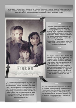
The names of the main actors are placed on the top of the poster. However since the colour used for the
font is similar to the background colours and the font size is quite small, it causes the names not to be
seen very clearly. This might suggest that these actors are not so well known.
The way the image of the actors are
presented, resembles a family
photograph hanging on a wall or a
Polaroid photo. This might suggest that
this photo frame has been put on the
same place that the previous owners of
the house hanged their family’s photo,
which could imply that the problem lies
in the house.
Another thing it could suggest is that the
other family is trying to take over the
current family’s space.
The tag-line is placed above the film title
because it functions as a prelude to the
meaning of the film title. The tag-line
starts by directly addressing the viewer,
asking them what they would do to be
perfect, hinting that the film will revolve
around somebody doing something
extreme to achieve perfection. Then the
film title expands on that by suggesting
that the method used by that person is
somehow related to putting themselves
into another’s shoes-in their skin.
At first sight the photos appears to be of only one
family however after taking a closer look you realise
that there are two different families that look slightly
alike. The effect applied to the photos cause it look The institutional information is placed at the bottom
as if someone who is disorientated is looking at a of the poster away from the rest of the information
single image but instead sees double since they are on the poster. Apart from the film title, which is in
unable to focus. This could suggest that the peace black, the writing on the rest of the poster is grey.
in that family has been disrupted by something. This is done so that the film title and tag-line act as
Which is this case will be the main source of a caption for the photograph, and a description of
disequilibrium in the film. what is happening.