
Recommandé
Contenu connexe
Dernier
Dernier (20)
En vedette
En vedette (20)
Magazine Analysis Billboard
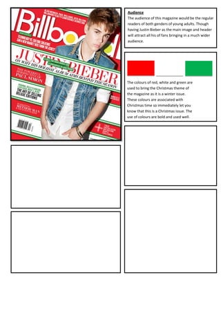
- 1. Audience The audience of this magazine would be the regular readers of both genders of young adults. Though having Justin Bieber as the main image and header will attract all his of fans bringing in a much wider audience. Colour Pallet The colours of red, white and green are used to bring the Christmas theme of the magazine as it is a winter issue. These colours are associated with Christmas time so immediately let you know that this is a Christmas issue. The use of colours are bold and used well. Mast Head The masthead of ‘Billboard’ is in the same colour of white as it always is with the centre of the ‘O’, ‘A’ and ‘R’ all coloured in. I find this very effective as it Layout gives it it’s own identity. The masthead is placed The layout is set with Justin in the middle but in a way of behind the image of Justin Bieber which shows weaving through the cover line. The cover line is in the middle layering and that Justin is the main aspect. It also over the top of Justin, and the rest of the text is placed goes to show that people already realise it says around the sides, mainly on the left side but also some on the ‘billboard’ without actually having to see the whole right. The cover is set out into horizontal strips with each title, so shows it is already a well known magazine. containing different cover lines. In the bottom left hand corner is the barcode, this is very efficient to place it here as it is easy to view. I think this layout is very effective as it’s Cover Lines different to most others and very eye catching. The main cover line says ‘Justin Bieber, on why his holiday album aims beyond the season’, this is a good catching cover line as the fans of Justin will Images want to read more. Also the wording used of Only one image is used which is a mid shot of Justin Bieber ‘beyond the season’ comes through as a bit of a placed in the middle of the cover. He is standing with his play on words as it is for the winter season. The hands in his pockets and his head tilted to one side a bit. He is other cover lines state of ‘The powerful perspective dressed in all white except from his denim jacket to bring out of Paul Simon’ which uses alliteration which brings a bit more colour. The lighting looks very realistic, and the an English technique of getting the readers image could have been cut out. There is a shadow placed interested. The fonts used are quite basic and very behind him which makes it look more 3D and realistic. easy to read, in the colours of white, black and green depending on what background it is on so it can be clearly read.