
Recommandé
Contenu connexe
Tendances
Tendances (20)
Similaire à Sketches
Similaire à Sketches (20)
Plus de chrissiebishop
Plus de chrissiebishop (20)
Dernier
Dernier (20)
Sketches
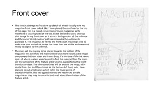
- 1. Front cover • This sketch portrays my first draw up sketch of what I visually want my magazine front cover to look like. I have placed the masthead on the top of the page; this is a typical convention of music magazines as the masthead is usually placed at the top. I have decided to use a close up shot image for my front cover as it attracts both genders of the audience and the use of direct mode of address persuades the audience to purchase it. The image has to fit into the front cover, meaning I need to make sure that around the image the cover lines are visible and presented neatly to appeal to the audience. • The main sell line is going to be placed towards the bottom of the magazine; this will make the main sell line look more visible as the image overpowers the front cover and is very busy; it's also one of the the sweet spots of where readers would expect to find the main sell line. The main sell line will consist of the feature artist's name, supported with a short introductory text. The other cover lines will be around the image, all in similar fonts but in different sizes. At the bottom left hand side, I have planned to put artist names which fall in the music genre of indie/alternative. This is to appeal more to the readers to buy the magazine as they may like an artist and read about them instead of the feature artist.
- 2. Contents page • This is a rough sketch of the idea of what I want my contents page to look like. I have thought of following this type of layout as It looks busy and not so over complicated. I put the contents title towards the left of the page because the readers automatically read from left to right therefore it will be the first thing they see – I have also put the most important features on the left hand side for the same reason. I also chose to use a wide variety of images to keep the contents page looking interesting and professional. I chose to feature a mini review as it gives the reader a taster of one of the big reviews inside, hence making the more intrigued to read on.
- 3. Article • The double page spreads sketches are a rough idea on how I want them to look. For the first double page, I am thinking of having an image on the left hand side followed by an introductory paragraph to which the rest of the article follows. The second double page spread will feature a wide range of different images as well as pull quotes. There will be box outs on the final double page spread so that reader doesn't get put off with the amount of text, which also makes the article look less tedious and more professional.