1. Digipak Analysis: Mcfly - Motion In The Ocean
Genre:
Pop/Rock
Star Image/Star Persona:
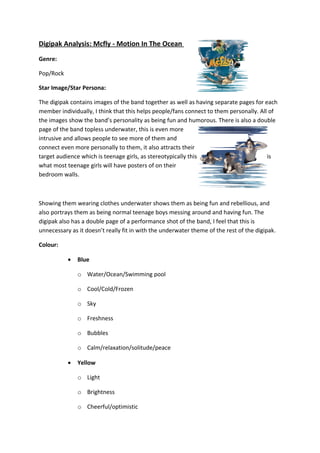
The digipak contains images of the band together as well as having separate pages for each
member individually, I think that this helps people/fans connect to them personally. All of
the images show the band’s personality as being fun and humorous. There is also a double
page of the band topless underwater, this is even more intrusive and allows people to see
more of them and connect even more personally to them, it also attracts their target
audience which is teenage girls, as stereotypically this is what most teenage girls will have
posters of on their bedroom walls.
Showing them wearing clothes underwater shows them as being fun and rebellious, and
also portrays them as being normal teenage boys messing around and having fun. The
digipak also has a double page of a performance shot of the band, I feel that this is
unnecessary as it doesn’t really fit in with the underwater theme of the rest of the digipak.
Colour:
•
Blue
o Water/Ocean/Swimming pool
o Cool/Cold/Frozen
o Sky
o Freshness
o Bubbles
o Calm/relaxation/solitude/peace
•
Yellow
o Light
2. o Brightness
o Cheerful/optimistic
o Uplifting
o Fun
o Clarity
o Confidence
o Youthful
o Lively
The colour scheme for the digipak is yellow and blue. The blue is to exaggerate that it’s
underwater which also links to the title of the album ‘Motion in the Ocean’ as it mentions
‘ocean’ and also shows pictures of the band underwater. I think that the use of yellow
portrays the band’s liveliness and cheerfulness and shows their fun-side.
Visual Narrative:
I think that the digipak links in very well to the title of the album, being called ‘Motion in the
Ocean’ and having an ‘underwater’ theme to the digipak is very clever and also looks ‘fun’
and ‘humorous’. It is very colourful which creates a cheerful, uplifting atmosphere which
also matches the tone of the music on the album. It shows them as being fun and rebellious
teenagers which is also reflected in their music.
Typography and Composition:
The fonts used are consistent, there are just two fonts used in the digipak. One of these is
for the name of the band ‘McFly’ which is a yellow, ‘fish-like’ font, it looks as though it could
be fish in the water which links to the underwater theme again. The other font is quite a
simple font, which is bold and also uppercase is used throughout which makes it clearer and
more ‘loud’ which fits in with the ‘feel’ of the band.