
Recommandé
Contenu connexe
Tendances
Tendances (18)
En vedette
En vedette (20)
Similaire à Kerrang
Similaire à Kerrang (20)
Dernier
Dernier (20)
Kerrang
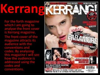
- 1. Kerrang For the forth magazine which I am going to analyse the front cover is Kerrang magazine. The front cover of the magazine attracts its audience with the conventions and codes. By analysing this magazine I will see how the audience is addressed using the codes and conventions.
- 2. Kerrang magazine overview: Publisher: Bauer Media Audience: Group Editor: James McMahon Circulation: 43,033 Readership: 396,000 Frequency: weekly First Issue: June 1981 Country: United Kingdom From the front cover of this magazine, I would assume that the target audience is of fans for rock and indie music. They may also enjoy reading information about the subject. From the cover i assume that this magazine has predominately male readers. This audience may also enjoy reading about fashion. I will analyse the target audience for Kerrang magazine using this link below: http://www.bauermedia.co.uk/Global/mediapacks/Kerrang.pdf This link shows the Demographic statistics and detailed information about KERRANG’s target audience. This link is to KERRANG magazine’s media pack.
- 3. • Information on the target audience: • They are predominantly from the social group ABC1 with 52% • The average age is 22 • Heavy rock fans • Attracts an audience aged 17-24 year olds • Predominantly male • Most likely to spend £200 a year on albums • They also enjoy reading about music, films, games technology and politics • They will be dedicated music fans with 5.5 times more likely to attend a rock gig • Audience profile: • Age: 22 • Gender: Male • Ethnicity: British • Geographic's: London
- 4. Who are the core audience? • The core audience for this magazine targets 17-24 years old. From looking at the front cover, I can most defiantly see that this is true as it is presented with a sophisticated manner yet, engaging the audience. What are the attitudes, values and lifestyle of the audience? • The audience will have an active social life by going to watch films, going to the latest concerts (mainly rock) and having the latest and going to main events. The audience will predominantly listen to rock music, while maybe being in a band themselves. Their friends, hobbies, attitudes and trends will be based around this. The target audience rejoice in their own individuality, where this magazine engages towards them. The target audience will be extremely loyal to their favourite bands. The way they look and the clothes they wear are integral to communicating ‘his identity’ to the world. They will be very technology savvy with a desire to have the latest technology. This target audience for KERRANG magazine will influence the ideas of the mainstream society. Why is this audience attractive to advertisers? • The target audience for KERRANG are predominantly influenced by rock music. Their individuality has been shown within this magazine with the use of language. The audience have many interests. Therefore, they will be interested in the advertisements within the magazine, provided they are related to their interests.
- 5. Codes, conventions and mode of address • The front cover of the magazine attracts its audience with the conventions and codes. By analysing this magazine I will see how the audience is addressed using the codes and conventions.
- 6. Masthead • The masthead is scratchy which fits in with the rock feel from the magazine. It is in capitals which are very dominating. The white masthead stands out from the rest of the magazine. The masthead looks like it has been smashed which reinforces the idea that this magazine is predominantly on the rock subgenre of music. The white typography contrasts with the rest of the magazine, helping to create an identity for the magazine. Their appears to be a slight drop shadow used in the masthead which also helps it to stand out, appealing to the rock based target audience. The usage of this style for the masthead will appeal to its trendy rock fans. The masthead appears to be engaging its audience which shows connotations of identity and loyalty for its audience.
- 7. • The dominant image overlaps the Image masthead is shot with a mid- close up of a well known artist. The artist has been shown to be pushing forward or to be punching a sign. This will engage the target audience as the artist is from a rock band. The way the artist is shown to be punching, reinforces the idea of the rock subgenre. The image is very engaging to the audience due to the shot used to take the photo. The image is backed up by the heading in which the artist is promoting. It instantly puts its own tag on the magazine engages the individuality of its target audience. The artist is shown to be wearing red which follows the house style of the magazine creating an individual unique identity for the magazine appealing to its audience.
- 8. Banner • The banner or boost helps to sell the magazine. It is bold and fits in with the colour scheme. The colours red and white are used within this banner which follows the house style of the magazine. The colour black has been used for the background which contrasts with the colours used for the boost. This further helps it to stand out from the magazine. This banner is situated at the top of the magazine which is a convenience for the target audience as it is easily read, and will be the first thing they will see on the shelves, potentially attracting new members of the target audience.
- 9. This is a pug used in the magazine near the top. This will instantly help to attract its target audience as it is stating a competition within the magazine appealing at rock fans. The boost helps to sell the magazine by offering special edition posters with the magazine. The posters are aimed at the rock fans with posters on well known rock bands. This will attract more people to buying the magazine. The idea that the same colours are used in this advertisement acts as anchorage in supporting the magazines house style and also holding a rock feel to the magazine.
- 10. Strap-lines • This strap-line uses the colours red and white which follows the main house style of the KERRANG magazine. This headline acts as anchorage supporting the dominant image of the front cover. The bands name ‘Paramore’ are well-known to the target audience. The title has used the same font as the masthead of the magazine. This reinforces the idea of rock genre, while also supporting the image as it looks like the artist has smashed it up with her punching. The topography has been positioned on a black background which contrasts with the colours used. This creates a unique identity for the magazine e, while also highlighting the main article within the magazine. This will appeal to its target audience.
- 11. “PULL QUOTE” • The pull quote used in this headline attracts the target audience by stating what will be in the magazine. The pull quote used here is related to a rock band aspect which acts as anchorage for the rest of the magazine. This also follows a main house style for the magazine , keeping the identity of the magazine. • This headline is situated in the top right corner of the magazine. The font of this type has used thick block letters which creates a bold look to the font. This will draw the audience’s attention into reading it. It also reinforces the idea of the rock music subgenre, as it is very powerful, appealing to the main diverse target audience.
- 12. Other • The ‘Plus’ headline has also used the same colours of the rest of the magazine, following its own identity. The artists listed in the plus section, are predominantly from the rock music subgenre. The usage of this will attract rock fans instantly to the magazine, as the whole style fits in with the genre ‘rock’ . • The barcode on the magazine uses many pound signs which suggest that this well-known magazine gets exported across the world. Many people will buy this magazine as it very well-known through its radio, TV and online website, many new people from the core audience of 17-24 year olds will be attracted to this magazine.
- 13. Representation of social class: • From the front cover, I will consider the issues from analysing the headlines and conventions of this magazine front cover. The dominating headline and dominant image suggests that this magazine will have predominately male readers. The front cover also reinforces the idea of new trends amongst the rock culture, showing many diverse ways of the rock subgenre from ‘emo to thrash’ as stated on kerrang’s media pack. The house style of red, white and black helps to create an identity for the magazine. The idea that the magazine uses informal language shows that the magazine is very loyal to its customers and engages them with their own language, and in some cases slang is used within the magazine. The artists stated on the front cover also reinforce the rock music subgenre.