

Recommandé
Contenu connexe
Tendances
Tendances (20)
En vedette
En vedette (20)
Similaire à Colour schemes
Similaire à Colour schemes (20)
Plus de Naomi Barbagallo
Dernier
Dernier (20)
Colour schemes
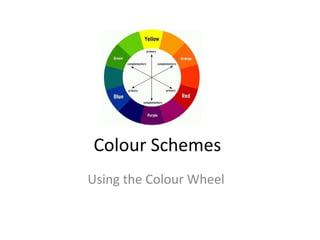
- 1. Colour Schemes Using the Colour Wheel
- 2. Complimentary Colours • Complimentary colours are opposite of one another on the colour wheel. • Complimentary colours bring out the best in each other and can create a dynamic effect in your art work.
- 4. Colour Intensity • Colour intensity refers to the brightness or dullness of a colour. • All of the colours on the colour wheel are intense and bright. • Colour intensity can be lowered by adding a small amount of the complimentary colour.
- 5. Tint • A tint is created by adding white to a colour. • On a value scale, one end should be the original colour and the other end should be white.
- 6. Shade • A shade is created by adding black to the original colour.
- 7. Analogous Colours • Colours that are located close together on the colour wheel.
- 9. Monochromatic Colour • Monochromatic colors are all the colors (tints, tones, and shades) of a single hue.
- 11. Colour Scheme Review • Complimentary colours are opposite of one another on the colour wheel and can create a dynamic effect . • Colour intensity is the brightness or dullness of a colour. • A tint is created by adding white to a colour. • A shade is created by adding black to the original colour. • Analogous colours are colours that are located close together on the colour wheel. • Monochromatic colors are all the colors (tints, tones, and shades) of a single hue.