ICT Role in 21st Century Education & its Challenges.pptx
Horror Film Poster Analysis
1. Supernatural Horror
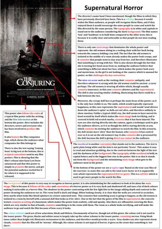
The dir ector’s name hasn’t been mentioned, though the films in which they
have previously directed have been. This is a sell line, because it would
widen the films audience, as people will recognise these films, and if they
enjoyed them it would encourage the same people to come and watch the
film directed by the same person. The typography is in white and capitals to
stand out to the audience considering the dark background. The film names
‘Saw’ and ‘Insidious’ is in bold fonts compared to the other texts, this is
because it is really clear and noticeable so that people do not miss reading
them.
There is only one main image that dominates the whole poster and
represent- the old women sitting in a rocking chair with her back facing
towards the camera, holding a toy doll. The fact that the old women is
isolated in the middle of a room already makes the poster look creepy, and
it connotes that people want to stay way from her, and therefore illustrates
that something is wrong with her. This is also shown through the fact that
she is turning her head away from us, making the audience believe that
something is different about her face, which makes the poster look scary
and mysterious. As the girl is not looking at the camera which is unusual for
poster, so this challenges the key convention.
The mise-en-scene such as the rocking chair connotes antiquity, and
therefore whatever is wrong with the old women could be ancient- a curse
perhaps. The old women is wearing all white which, though usually
connotes innocence, in this case connotes absence and the supernatural.
The doll is also wearing similar clothing, illustrating that there could be a
link between the two.
Moreover, the creepy doll face is perhaps the main focus of the poster; as it
is the only face visible to us. The smile, which would typically represent
happiness, in this case represents the supernatural and would ‘send shivers
down the audience’s spine’ as dolls are not alive, and therefore unlikely to
show emotion. Unlike a typical child’s toy, the doll seems to have moved its
head around by itself which makes the main image look terrifying, and is
covered in bold red scratch marks, connotes that it has been injured. The
eyes are also staring directly into the camera, again a technique used to give
the audience shivers, as it is as though the doll is staring directly at you,
which connotes its inviting the audience to watch the film. In this scenario,
the doll seems more ‘alive’ than the human, who connotes it has control
over as it is sat on the old women’s lap. It also connotes she is processed by
the doll, because the doll is giving direct eye contact to the audience.
The masthead is another convention that stands out to the audience. The text is
quite plain being white and the font is not particular ‘brave’. This makes it easy
to read and attention grabbing, due to the contrast between the light of the text
and the darkness of the background. The typography of the masthead is bold, in
capital letters and is the biggest font size in the poster; this is so that it stands
out form the background and the intimidating main image what gets to the
audience most in the poster.
At the bottom of the poster we see a tagline says ‘Based on the true case files of
the warrens’, to some this can add to the total scare factor as it is supposedly
real, which represents the supernatural horror genre. This is a sell line which is
used to get more people to the watch the film.
This poster also follows the codes of
a typical film poster with the writing,
and the film information at the
bottom the poster. Here includes the
directors, actors and everyone who
has been involved to produce the
film.
It also feature the film companies
logo, which shows the audience what
companies the film belongs to
There is also the text saying ‘Coming
Soon’ in big text at the bottom, this is
a typical convention used in any film
posters. This is showing that the
film’s release date hasn't yet been
announced and that this poster is
simply to promote the movie, and get
the potential audience excited for it
for when it is supposed to be
released.
The background of this poster is very easy to recognise as horror poster, it is also intimidating for the audience to look at let alone the main
image. This is because it follows all the codes and conventions of a horror poster as it is very dark and shadowed off, and uses a lot of dark colours
making it noticeable as a horror film. The shadows in the poster contrasting with the few light bits in the image adding depth and contrast to the
poster drawing the audiences eye in. The room itself is dark and dingy. When looking closely, it is clear that the walls are covered in scratches,
dirty marks what looks like blood splatters in a lower saturated tone. This connotes that something scary is going to happen, as the old women is
isolated in a room by herself with a unusual doll that looks as if its ‘alive’. Due to the fact that the genre of the film is supernatural, the concrete
texture connotes a setting of a basement, which makes the poster look realistic, cold and spooky. Also there are silhouettes covering the floor,
which are very similar to that of hands, connotes something is in the room with them. The room as a whole looks terrifying, and will make the
audience to go and watch the film because of how scary it looks.
The colour schemes used are of low saturation, bleak and lifeless. Uncommonly of horror, though not of this genre, the colour red is not used in
the teaser poster. The greys, blacks and whites seem to largely take up the colour scheme in the teaser poster, connoting sorrow. Using bleak
tones rather than bright red, illustrates seriousness to the audience, and therefore would provoke a scare. Grey shades can also represent storm
clouds, connotes that the film will be ‘stormy’. Although, the colour scheme is not typical of horror, it gives us the sense that something is ‘not
there’.