Presentation by Andreas Schleicher Tackling the School Absenteeism Crisis 30 ...
Power point edit
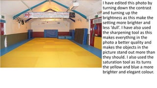
1. I have edited this photo by
turning down the contrast
and turning up the
brightness as this make the
setting more brighter and
less ‘dull’. I have also used
the sharpening tool as this
makes everything in the
photo a better quality and
makes the objects in the
picture stand out more than
they should. I also used the
saturation tool as its turns
the yellow and blue a more
brighter and elegant colour.
2. For this image I have selected different sections
and edited them, for an example I selected the
clothing of the fighter and turned the contrast all
the way down and then selected the face which
would have a different amount of contrast set. I
also turned the brightness up on the whole image,
and then selected the face and turned it up
slightly on that. I also sharped the image as it
makes the boxer stand out more than it usually
would.
3. In this image I used the
smart blur tool to slightly
blur out the background as
its not important. I then
selected the two fighters on
the floor and turned down
the contrast and the
brightness up as its clearer to
see, I also sharpened them
to make it stand out more
and also make it more
clearer.
4. In this image I have taken away
the background as it doesn’t
have any impact on the image.
I also sharped in the image to
make it stand out more, turned
up the brightness on just the
fighters hands and turned up
the contrast slightly on the
fighters gloves.
5. There was a white balance
problem with this image which
made the colour of the image
have a lot of orange and yellow
‘tint’. I turned down the
saturation levels, turned up the
brightness and turned down the
contrast to make it look like a
good photo to use. After I
applied the edits I then
sharpened the image which
made it clearer to see.