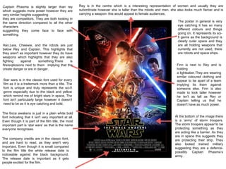
1. Rey is in the centre which is a interesting representation of women and usually they are
subordinate however she is taller than the robots and men, she also looks much fiercer and is
carrying a weapon- this would appeal to female audiences.
Captain Phasma is slightly larger than rey
which suggests more power however they are
very similar heights suggesting
they are competitors. They are both looking in
the same direction compared to all the other
characters
suggesting they come face to face with
something.
Han,Leia, Cheewie, and the robots are just
below Rey and Captain. This highlights that
they aren't as important however they do have
weapons which highlights that they are also
fighting against something.There is
fire/explosions next to them implying that the
create danger or are in danger.
Star wars is in the classic font used for every
film as it is a trademark more than a title. The
font is unique and truly represents the sci-fi
genre especially due to the black and yellow
which remind me of bright stars in space. The
font isn't particularly large however it doesn't
need to be as it is eye catching and bold.
The force awakens is just in a plain white bold
font indicating that it isn't very important at all.
Even though it is part of the film title, the most
important part is ‘star wars’ as that is the name
everyone recognises.
The company credits are in the classic font,
and are hard to read, as they aren't very
important. Even though it is small compared
to the film title the white release date is
noticeable against the black background.
The release date is important as it gets
people excited for the film.
At the bottom of the image there
is a ‘army’ of storm troopers.
The storm troopers appear to be
protecting something as they
are acting like a barrier. As they
are in space this suggests they
are protecting their ship. They
also looked trained military
suggesting they are a defence-
possibly Captain Phasma’s
army.
Finn is next to Rey and is
holding
a lightsaber.They are wearing
similar coloured clothing and
appear to be apart of a team
implying its them against
someone else. Finn is also
made to look taller however
he isn't as tall as Rey or
Captain telling us that he
doesn't have as much power.
The poster in general is very
eye catching it has so many
different colours and things
going on. It represents its sci-
fi genre as the background is
clearly outer space and they
are all holding weapons that
currently are not used, there
are robots and space ships.
2. Looking at this poster now it is obvious how much technology has improved.
A long time ago in a galaxy far, far away.. is in such a average font and isn't
actually eye catching however it does straight away tell you the genre of star
wars:sci-fi. The background is definitely outer space however compared to the
new force awakens poster there is no intriguing colours or anything- the poster
actually looks quite dull.However this could be purposely to imply that the story
involves darkness and battles; which it does.
In the background there is a space station which is being attacked by
an army of planes. This tells us that someone gets defeated.
Darth Vader is the background of the image more or less. It is a close up and his
face is right behind Luke and Leia which infers that he has the most power.
He has a robotic face and it looks evil suggesting that he is the enemy.
Luke looks heroic as he is standing on a rock above Leia. He is holding a
light saber up above him like he is praising it, this suggests that he has
won something. It also suggests that he may have defeated Darth Vader
as some of the light goes through the background photo of Darth Vader.
Leia looks like she is fierce, she is holding a gun and the wind is pushing
back her dress making it look like a cape. Her and Luke are in all white
matching- possibly indicating that they were on a mission as a team.
C3PO&R2D2 are in the background and look very small. This implies
that they don't have much importance or aren't valued. Telling us that
maybe they aren't treated well or are treated like slaves which they
were. They had a ‘master’ and were told what to do. They are looking
at Luke and Leia suggesting they are on their side.
Star wars is very small and positioned in the corner. It isn't of a
unique colour but it is a unique shape and font. Compared to the
updated star wars logo it doesn't at all represent a brand or a trend
it just looks quite plain and boring.
The credits aren't in the typical company credits font
as its more than likely that this font wasn't around at
this time. The transition from the image to the credits doesn't flow
as suddenly the page goes white.It is obvious that this is the least
important part of the page as it has no excitement to it.
3. The tag line is quite intimidating not
only on the character but the
audience. The world will be watching-
the simplicity of the font contrasts the
extreme statement, it suggests the
world in desperation
watching/hoping/relying on
something. Or it could mean the
world is judging and is against you.
The background looks like a fire
exploding, like a blur of danger. It is
telling us that something bad has
happened. It could alsorelate to the
blur of normality and how different the
situation in the film is to real life. Fires
also represent danger, war, pain ect..
telling us that the film includes these
things.
The iconic mocking jay- the hunger
games ‘slogan’ is centred in-between
the title. It is a important part because
as soon as you see that symbol you
think of the hunger games. In this case
t is representing peace being destroyed
as it looks like it is on fire.
The actual film title ‘The hunger games’
is in all capitals- possibly to suggest
that it is more
than just a ‘thing’ it is important. It is
also in gold, a colour associated with
winning- linking to the concept that the
hunger games can only have one
winner no bronzer or silver.
Like star wars force awakens the
release date is made quite large
compared to the credits. This is to
create excitement and a buzz
around the release date and so it
becomes something everyone is
anticipating.
Only one character is shown,
Jennifer Lawrence, indicating
that the story is all about her.
This would intrigue female
audiences as a women is the
main character- therefore the
production are using star
power to gain a wider
audience. However she does
look in danger as she is by
herself and there is fire which
tells us maybe she has to do
something alone.
The image is full size, taking up
the whole entire poster yet is a
close up which is really effective
as it puts all the focus on her facial
expression and her surroundings
making people question what is
going to happen.
4. Don’t let go seems quite obvious at first but when you question it,
it is actually ambiguous. Allowing the audience to have their own
interpretations and imagination making the poster more
interactive. In this case with the background being darkness with
just the world at the right hand side the term could mean don't let
go of home suggesting that the astronaut should have never
travelled to outer space and is now stuck- however there is many
different interpretations. The words are very spaced out
highlighting the isolation of space.
With debris around and just a astronaut alone in outer
space naturally you question why they are on their own and
begin to empathise which is important and the audience will
already be building relationships with characters without
even watching the film. The debris suggests something has
gone wrong. The bright light in the background could be
help coming or it could represent hope. However the
astronaut still looks helpless and subordinate. As the
astronaut is in a suit you cant tell if its is male or female
which opens up the film to both genres.
Sandra Bullock and George Clooney are both
in the same font as the tag line which suggests that
they are just important telling us that the poster is
using star power to promote the film. They are both very big
names.
Gravity is the name of the film and this has been made
noticeable by the brightness of the word compared to everything
else on the poster. It is also ironic as the astronaut seems be
being pulled out into space and away from earth which is the
reverse of gravity. The simplicity of the font actually makes the
title more noticeable as it is organised and neat.