
Recommandé
Contenu connexe
Tendances
Tendances (17)
En vedette
En vedette (14)
Similaire à Cover page analysis
Similaire à Cover page analysis (20)
Plus de FaaizaFeroz
Dernier
Dernier (20)
Cover page analysis
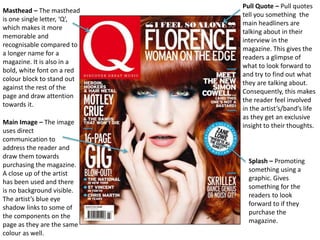
- 1. Masthead – The masthead is one single letter, ‘Q’, which makes it more memorable and recognisable compared to a longer name for a magazine. It is also in a bold, white font on a red colour block to stand out against the rest of the page and draw attention towards it. Pull Quote – Pull quotes tell you something the main headliners are talking about in their interview in the magazine. This gives the readers a glimpse of what to look forward to and try to find out what they are talking about. Consequently, this makes the reader feel involved in the artist’s/band’s life as they get an exclusive insight to their thoughts.Main Image – The image uses direct communication to address the reader and draw them towards purchasing the magazine. A close up of the artist has been used and there is no background visible. The artist’s blue eye shadow links to some of the components on the page as they are the same colour as well. Splash – Promoting something using a graphic. Gives something for the readers to look forward to if they purchase the magazine.
- 2. Masthead – The main image is overlapping the masthead, which draws more attention towards the headlining artists rather than the name of the magazine. However the three letters, ‘NME’ are easy for customers to remember if they are intending to purchase this magazine more than once. It is also in a bold, red font and is outlined twice: the first time in white and then once more in black. This enables it to still stand out even though it is not the main focus of the cover page. Splash – Promoting something using a graphic. Gives something for the readers to look forward to if they purchase the magazine. Pull Quote – Pull quotes tell you something the main headliners are talking about in their interview in the magazine. This gives the readers a glimpse of what to look forward to and try to find out what they are talking about. Consequently, this makes the reader feel involved in the artist’s/band’s life as they get an exclusive insight to their thoughts. Main Image – The image uses direct communication to address the reader and draw them towards purchasing the magazine. The background used is a studio background, which has been set up to make the artists look clear and sharp. It is also plain so that nothing distracts from the main image.
- 3. Main Image – The image uses direct communication to address the reader and draw them towards purchasing the magazine. The background used is a studio background, which has been set up to make the artists look clear and sharp. It is also plain so that nothing distracts from the main image. Masthead – The Masthead consisting of the 2 letters, ‘A P’, is a lot more noticeable than having the entire 2 words: ‘Alternative Press’. Having the entire 2 words would make the title appear longer and would be less memorable to the intended readers. Also, using ‘A P’ allows the magazine to be more recognisable since it is short and catchy. They used ‘A P’ in red to draw attention to the title of the magazine and make it stand out against the rest of the text. Pull Quote – Pull quotes tell you something the main headliners are talking about in their interview in the magazine. This gives the readers a glimpse of what to look forward to and try to find out what they are talking about. Consequently, this makes the reader feel involved in the artist’s/band’s life as they get an exclusive insight to their thoughts. Promotion – As an extra promotion this magazine offers exclusive deals for buying customers only to make them feel as if they are getting something back when they purchase the magazine.