2. Business card research
A business card is a way for a business owner to showcase their company and is usually how a
customer gains their first impression of a company. When looking into different business cards,
there are specific elements that stayed the same throughout all of them, which have allowed
them to look professional and keep their business successful. Throughout my research into
looking into existing business cards, most products have their logo in the centre of their card on
one side and on the other all personal details such as:
• Contact details
• Business information
• Digital profile account names
Another key component that should be considered when making a business card is colour theory.
Business owners need to take into consideration what colours will draw in the audience, for
example yellow represents warmth and happiness which allows the audience to be drawn to the
companies such as McDonalds. When making a card it is also important to not overwhelm your
audience with too much information about the business and add to keep the card as professional
as possible.
2
3. Presentation title 3
Example 1
One example that I looked at was a business card for a dog walker,
what stands out to me from this card is the bright white text on the
dark background which allows all the important information to stand
out to the customer. Another key element that stood out to me was
the bright white dog, which allows the customer to see what their
business is actually about. I think that it important to notice that this
business card I very minimal and doesn’t overwhelm the audience
with information about the business, they have only included:
• Their full name
• Phone number
• Email address
• Website name
By locating their business name within two lines at the top corner it
allows the customers eyes to be drawn towards the key part of their
business and start to build an opinion of the company
4. Example 2
Presentation title 4
Another example that I looked at was for a managing director, what
stands out to me within this business card is the bright blue on the
white background. This would instantly draw the audiences attention to
the blue which is on the left of the card, this would direct the audiences
eyes towards the right hand side out of instinct as though they were
reading a book. Like the previous one the business card includes
information such as:
• Phone Number
• Email
• Website name
• Location of business (differs from previous card)
By using the same shades of blue within their logo it shows consistency
within their business and when looking into colour theory: blue
represents loyalty, trust and confidence. This allows customers to feel
like they can trust their business. Unlike the other card, they focus one
side on their business information and the other completely on their
logo to allows the audience to not feel to overwhelmed with
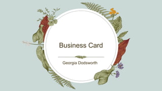
5. First Draft
Presentation title 5
Georgia Dodsworth
Tel: 07467947506
Email: Pjdoddsy2246@icloud.com
Web:
https://www.createbritain.com/Profiles/g
eorgiadodsworth
When starting the process of creating my own
business card I created 3 drafts before I was
happy with the final product. Wanting to keep my
business card minimalistic and as professional as
possible I decided to have a dark background but
wanted my test to stand out. However when
looking at this design I believe that people who
are unaware of how it is a media company may
not be able to see what the company is about.
However, with wanting to stick with the theme of
the company being named after my dog I
decided in my next draft to involve an icon that
would indicate that it is a media company. One
thing that I do like about this business card is the
colour scheme and how the text matches the
logo which shows consistency within the
business.
6. Second Draft
Presentation title 6
After looking at my previous business card I took
into consideration adding a camera logo to my
image but I couldn't think of how to incorporate
both the camera and the dog into one logo.
However, I also changed the colour scheme to see if
I liked how it fitted my brand and I decided that it
didn’t fulfil the vision that I had for my business
card/ logo. One thing that I also wanted to improve
was as this was generated I was limited to different
tools and was unable to change the ‘Slogan Text’
that was underneath the company name. As said
previously I wanted to keep my card minimalistic
however, I believe that this design wouldn’t catch
any customers eye as it has no information to the
company, as the template didn’t offer to design the
back. The blue colour scheme once again shows
loyalty, trust and confidence and I like how the text
gradients into a different shade of blue as well as
matching the camera logo. Furthermore, within my
business cared customers now can get a general
idea of what the company is about rather than
having no indication of what the company is.
7. Final Product
Presentation title 7
When looking back on my previous drafts, in the
next steps on completing my final product I
combined different elements of each draft that I
liked and what would create the best final
product. On the back of this card I added all of
the businesses information as well as adding the
skills that I specialise in within the industry so
customers can decide whether they think that I
would be the right fit for them. One thing that is
different is the overall logo, I made this logo by
incorporating two google images that would
show both the film industry and my brand being
inspired by my dog. I also decided to add the
brand name in the centre of the card to allow my
audience to be drawn to the text. For the front
of my card I took inspiration from the previous
cards that I looked into as they all looked
professional and unbusy.
Poppy Productions
8. Presentation title 8
Feedback
After making all of my drafts I showed them to a small
group of people and sent them a google survey to
complete about my business card. what they liked and how
I could improve. When looking at my survey results I am
happy to see that some people wouldn’t change anything
about my final product and with my logo that I had made. I
am also happy with the professional comment as that was I
was trying to achieve.
Some improvements that could be made all involved the
text, whether that was text placement or the size of the
text. By gathering feedback this has allowed me to see how
I could improve future creative products that I will make.