1. Anchorage text
The anchorage text advertises the girl group and gives an
insight into what the article inside is going to be like. It also
gives those who may not be familiar with them a brief
description of who they are.
Masthead
The masthead is partially covered by the main
image. This is because it is a recognisable
magazine to its niche market and does not
need to be fully shown. The title itself is an
indication that it belongs to the classical music
genre and also people may be familiar with the
classic fm radio station and know that their
output is classical music. It is bold but simplistic
with the “f” being in red and not capitalised
like all the other letters. It is elegant and
sophisticated much like the genre itself.
Slogan
This slogan is used because it makes this magazine stand out above
other classical magazines. The word “favourite” is coloured red to
emphasise that it’s the most popular. Its used in the header position
because it stands out and is next to the puff and the masthead so is
very likely to be seen. It is a unique selling point of the magazine and
convincing.
Puff
The items on offer here are 2 free CDs. The images of the discs are featured at the
bottom of the page and it eases readers fears if the CDs are not enclosed. The CD’s
are Christmas classics and very relevant for this December issue. A puff entices the
audience to purchase this magazine because it offers them something extra along
with the contents inside. This gives it an advantage over other magazines.
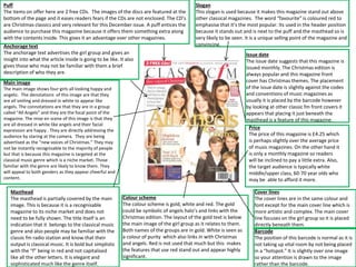
Main image
The main image shows four girls all looking happy and
angelic. The denotations of this image are that they
are all smiling and dressed in white to appear like
angels. The connotations are that they are in a group
called “All Angels” and they are the focal point of the
magazine. The mise en scene of this image is that they
are all dressed in white like angels and their facial
expression are happy . They are directly addressing the
audience by staring at the camera. They are being
advertised as the “new voices of Christmas.” They may
not be instantly recognisable to the majority of people
but that is because this magazine is targeted at the
classical music genre which is a niche market. Those
familiar with the genre are likely to know them. They
will appeal to both genders as they appear cheerful and
content.
Issue date
The issue date suggests that this magazine is
issued monthly. The Christmas edition is
always popular and this magazine front
cover has Christmas themes. The placement
of the issue date is slightly against the codes
and conventions of music magazines as
usually it is placed by the barcode however
by looking at other classic fm front covers it
appears that placing it just beneath the
masthead is a feature of this magazine.
Price
The price of this magazine is £4.25 which
is perhaps slightly over the average price
of music magazines. On the other hand it
is only a monthly magazine so readers
will be inclined to pay a little extra. Also,
the target audience is typically white
middle/upper class, 60-70 year olds who
may be able to afford it more.
Barcode
The position of this barcode is normal as it is
not taking up vital room by not being placed
in a “hotspot.” It is slightly over one image
so your attention is drawn to the image
rather than the barcode.
Colour scheme
The colour scheme is gold, white and red. The gold
could be symbolic of angels halo’s and links with the
Christmas edition. The layout of the gold text is below
the main image of the girl group as it relates to them.
Both names of the groups are in gold. White is seen as
a colour of purity which also links in with Christmas
and angels. Red is not used that much but this makes
the features that use red stand out and appear highly
significant.
Cover lines
The cover lines are in the same colour and
font except for the main cover line which is
more artistic and complex. The main cover
line focuses on the girl group so it is placed
directly beneath them.
2. Rule of thirds
This has been used for a clear and concise
layout of the contents page. The three columns
separate the information well and provide both
a visual and written image.
Masthead
The masthead is used again at the top of
the contents page as it is one of the codes
and conventions of magazines. It also
helps with branding as Classic fm becomes
more recognisable the more you see it.
Images
The images relate to the articles in the magazine
and also show readers important people or
venues that will be talked about later on. This
can provide familiarity to those unsure. The
images have a Christian theme for example
stained glass windows and church choirs. This is
part of the mise en scene. This is to engage the
predominately Christian target audience. There
are borders around the images to separate the
different articles. Interestingly there is no main
image.
Offer
The offer is used as an incentive to
readers to purchase all the
following magazines. They want to
build a loyal fan base and keep the
readers engaged in their magazine.
They will save money by doing so
rather than purchasing every issue
individually. This is one of the pages
later in the magazine so intrigued
readers will turn to this.
Date
The date is clearer than it was on the front cover
however it is in the same position which gives the
magazine consistency.
Colour scheme
No gold is used this time so
the colour scheme is slightly
different. White and red are
still prominent . For the
contents black is used as a
description for each feature.
Features
Many of the features are
linked to the classic fm radio
station as that is what they
are most famous for and also
because it is a good
marketing tool for branding.
A lot of features are shown in
this contents page to show
the depth of the magazine.
Using images is a good way to
further highlight the articles.
The page numbers all feature
to make it easier for the
audience to find a particular
article.
3. Traditional
This double page spread may appear a little bland and muddled in its
layout. However for the target audience of mainly older people they are
not fussed about bright colours and lots of creativity. Classical music dates
back centuries and the history of it is vast. It is also in this day and age one
of the only genres that has a depth and diversity about it.
Headline
The headline is a play on words
because it is about a
documentary. This is something
that becomes clear once you
have read the article so it acts
as a good reason to read the
text so you can understand the
title. The title creates the
intrigue. It is also a piece that
focuses on a documentary film
about Ralph Vaughan Williams,
one of Britain's most famous
composers. Readers may have
seen this and enjoyed it or this
article could encourage them to
see it as well as the new
documentary being released.
Article text
You can tell this article and magazine is for an older target audience because there is a
lot of text and typically older people enjoy reading and like articles that are in depth
and rich in detail. It is accompanied with a montage of pictures but the quantity of
text is not compromised. The text is separated into lots of columns and looks familiar
to a newspaper which the elderly like to read. The font is simple and easy to read. All
the language is sophisticated and it features no slang because the target audience are
likely to not like that. The drop cap, the large letter at the start of the article helps the
reader locate where the article starts.
Sub-heading
This offers a foretaste into
what the article is all about.
Ralph Vaughan Williams is a
name that will be fondly
remembered by fans of the
classical music genre.
Grab quote
This quote highlights the effect of the documentary on how you
listen to Vaughan Williams’ music. Fans of his will enjoy this
article and be desperate to watch this film. This quote
advertises the film very well and readers will be eager to see if
they feel the same way.
Captions
A few of the images
are accompanied with
captions to help the
audience understand
what is being shown in
the picture.
Use of space
The top of the double page
spread is used purely for
images and the bottom half
for text. Often the text and
images are integrated but
this can sometimes be
unclear and the older target
audiences often prefer it to
be separate because it is
much easier to focus on
them individually.
Overall impression
The double page spread
looks neat and
appealing. The images
being black and white
give a traditional feel to
the article and along
with the design helps
the article look
interesting.