
Recommandé
Contenu connexe
Tendances
Similaire à My media evaluation
Dernier
Dernier (20)
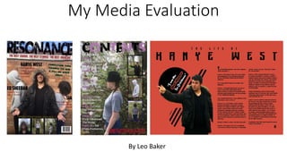
My media evaluation
- 1. My Media Evaluation By Leo Baker
- 2. What conventions have I used, challenged or developed?
- 3. Magazines that have influenced the production of my magazine are Kerrang!, Q and NME. These magazines follow typical music magazine conventions. These magazines are primarily rock, pop and R’n’B orientated so I have tried to mix these genres together to make a unique magazine. However, unlike these magazines my target audiences are not mid 20 year olds but young teenagers to older teens/early 20s (13 to 21).
- 4. I used the conventional big masthead so people will look at it and remember it. I used black text(urban jungle) because it stands out against the blue sky and brown rooftop. I have used black because it is a gender neutral colour which means that it the magazine is targeted towards both male and female audiences, which is what I was going for.
- 5. Another convention I used was the cover lines on the cover. Magazines normally use cover lines to explain what stories are in the magazine. I have used these to full effect. I have also made the text look thinner and made it a different colour so it contrasts with the bigger bolder text of the main cover lines, which makes it stand out to the audience more. Also by using the text ‘American Captain’ I challenged the typical convention because this text makes my magazine look more modern and intelligent which matches with some aspects of my magazine e.g. Pop and R’n’B. Another convention I used is the puff. I have used this to try to make my magazine important in the market and this make it my magazines unique selling point. I have made the text thick and red so it stands out against the cream colour of the roof. The text ‘Longshot’ also makes the text stand out and because it is an unconventional text for a magazine, it makes this magazine stand out amongst others. This makes the reader enticed to the magazine as it is different.
- 6. Another convention I have continued is the use of pull quotes. This convention helps entice the reader straight away as it gives a little insight of what is to come in the article. This convention is normally used in magazines because the text makes reading the article more fun to read. Instead of using it in the actual article I have put the pull quote next to a picture of ‘Kanye West’ so it is the first thing the readers see when they open the page, this makes the reader see it and makes them feel more intrigued to read the article. Most magazines have lots of variations when it comes to locations, models, costumes and anything else to do with mise-en-scene. This is so the magazine can appeal to all kinds of readers. In my magazine I have tried to make most of the images look urban so it creates a unique look compared to other magazines by having the photo-shoot in a wood land area/alleyways and such, I would say the best shot would be the woodland shots as they bring a natural look to the magazine. I have challenged the convention by not using studio shots and instead having a theme with my magazine, whilst having more divisive photos.
- 7. How does my media product represent particular social groups?
- 8. Through my research some social groups were represented within music magazines as trouble makers and lazy(teenagers), sophisticated and glitzy(young adults/adults), unfashionable and ‘weird’(old people). In contrast, in my magazine, I have portrayed young adults as normal, everyday people with different characteristics and personalities that define them instead of the dramatic portrayal that the media put out. This means my magazine has challenged the representation of social groups in a good way as I have portrayed them as normal people, as celebrities are just normal like us. Hopefully this might make people disbelieve the stereotype.
- 9. In my magazine, the social group that is shown the most is young adults/adult. I have included many things to make this evident in the magazine so I could target the audience of teenagers; as this is what they requested via my market research. I have presented teenagers as people who are mature and confident. This represents the stereotypical ‘older teenager’ attitude shown in media. This idea is reinforced in the use of black clothing as black is shown as a mature colour and one that is also considered masculine as darker colours are associated more with men in media. For example a black jacket, black shirt and black jeans are worn in my magazine. This social group are also represented as independent people who love to go out and do things, which can be reflected from my interview with ‘Holly Payne’. This means I have reinforced the idea of a teenager in a positive way as it shows they are confident and mature
- 10. Most of my audience are teenagers, which is quite a specific age range. Because of this I have represented their age group through the use of my font, Broadway, in my double page spread as it is easy to read and entices the reader as it is a unique font. I have used slang such as ‘frontin’ in my article which represents teenagers as people who mostly use slang ,which can help them relate to the article. I have also represented age in my magazine through the poses that I have used. Theses photos portray teenagers as independent people who don’t want to fit into the crowd. This can help the audience relate to the magazine as their age is portrayed this way and also challenges what a teenager should act like. I have also portray teenagers as being modern, This is shown through the clothing of my models. An example of this is shown in the image below with ‘Sia’ wearing fashionable clothing and is presented looking deep in thought in a woodland area. This can represent in a way that teenagers always seem to constantly think about their future.
- 11. What kind of institution may distribute your media product and why?
- 12. When I was researching magazines that already existed, I found NME was being published by Time Inc. UK who sell about 350 million magazine copies each year. They hope to adapt and innovate their magazines, making sure their products are relevant and appealing to anyone who needs to know what’s going on in the world. Because of these aims I would like to publish my magazine with a publisher like this. Another reason I would publish with this publisher would be that NME readers may like to read my magazine as our magazines are similar but it might also dissuade them because of this reason as well.
- 13. Time Inc. UK is quite a big institution by their own as they own over 60 over brands from NME to Instyle magazine so this will help my magazine become well known. Because Time Inc. UK is a owned subsidiary of Time Inc and they have many websites this means that the company has quite a bit of variation of media which can also attract a more varied audience.
- 14. Who would be the audience for my magazine?
- 15. In my magazine my audience are teenagers/early adults of both genders and this is shown through the writing as it is not formal but is interesting to read. This means that I have a young audience as the content of my magazine is written so they wouldn’t get bored reading it. Because of this, the reader feels as if they are on the same wavelength as the writer as they might share the same opinions. The colour scheme and the font make it easy for younger audiences to read through the magazine and orange appeals to both male and female audiences as it is a bright and noticeable colour.
- 16. I have used bright, stand out colours like pink and orange to give the magazine an exciting feel which would attract younger audiences and both genders as pink is stereotypically feminine while orange can be view more as a masculine colour. The costumes that are worn by the models are shown to be quite different to one another. This may reflect a larger audience that like the magazine and may also enlarge the target audience of just teenagers. It also shows how unique the magazine is which might widen audiences as they might like the style. The photos that I have taken were taken in a woodland area. This can suggest that the audience are artistic and that they can relate to the models as the social group in this magazine are represented this way too.
- 17. When I was preparing my magazine I decided the audience for my project and I stuck with it throughout the process of making the magazine. When I was doing my research, I found most of the people who took my survey were young people which I took into account when making my magazine.
- 18. The primary target for my magazine would be any teenager who has a interest in rock, pop or R’n’B. These people would definitely keep up with the latest music, love being with their friends and love wearing the latest fashion. These people are normally working class/middle class and this can be reflected in the writing and the photos taken in the magazine. The photos show the age of the audience because they are shown looking mature. This audience doesn’t really have a dress code or any brand that they like, they just like keeping up with the latest fashion trends.
- 19. How did you attract/address your Audience?
- 20. First of all, I attracted my audience in my magazine by the photography. In the production, I aimed for my photos to look mysterious and eye catching. I used Photoshop to edit the photos so I could create a unique image for each celebrity. By making them look this way, it might make the reader inspired to dress like the celebs and maybe behave like them as well. To the left there is an example of a edited photo I created. This attracts the audience as the celeb in the model is directly looking at the camera. This makes the audience feel addressed to and targeted by the magazine, so they might feel attracted because of this.
- 21. Another way I attracted the audience was by advertising that they could win a ps4 or a Xbox on the front cover in the middle right. The text is in green and in capitals so it catches the audience’s eye. It would also catch the audience’s eye because they could have the chance to have the latest technology without paying for it. When I did my research I found out people would pay about £2-£2.99 for a magazine which shows that a lot of people like to buy magazines cheaply. I have made my magazine cheap so it can appeal to more people and because it is a weekly magazine; it will be affordable for everyone so more people will buy this and I would attract more people as well. Also my research showed that people are mostly interested in eye catching images on the cover. I made sure to do this on the front cover of my magazine with the models doing poses. I also used the weather to my advantage as the brightness of the day made the cover stand out. I also used Big text on the cover so it can be clearly read by anyone.
- 22. To attract the audience, I used many different colour schemes. I mainly used stand out colours such as black, pink, orange. This attracted the fashionable teenage audience as these would be the kind of colours they would like in their teenage years. I have made the structure look appealing so the audience would be interested in reading it. The text is black so it contrasts with the orange background, which makes it easier to read. They are also gaps in-between so it breaks down the amount the audience have to read and makes it easier for a audience that are really in to reading a lot of text at once as they might get bored easily. I also used pull quotes to attract the audience. On the double page spread, I used the quote “I am the best rapper in existence” which attracts the audience as it sounds really opinionated and as the teenage audience like gossip this catches their eye, which may interest them to read the article.
- 23. What did you learn about technology?
- 24. When I was making/planning my magazine, I used software that I was familiar with such as Microsoft word and PowerPoint. These were useful when planning as it was easy to organise and structure my work in a way that is understandable. I have also used micro technology such as Survey monkey to use for research purposes. I have also used software that I wasn’t familiar with such as Photoshop and Indesign, both of which was used making my cover, contents page and double page spread.
- 25. I used technology through using the website ‘Survey Monkey’ for my research. I have never used this before. I found out that it was easy to use and a good way to find responses from people. I also learnt how to upload videos on YouTube and how to post a link to my blog. I used a questionnaire to get my information. I presented mine as multi choice and written answers. Alongside survey monkey, I used the website blogger to create my blog and post my blogs.
- 26. Photoshop On Photoshop I also learnt how to create different layers so It would be easier to organise my work. I did this by right clicking on new layer. Before I started to create my pages, I didn’t know how to use Photoshop but in the process of making the pages, I learnt many things like using the quick selection tool; which I used to select a part of a image to go onto another image. Also I learnt how to use the gradient tool to change the colour of the background(e.g. black to white, here is an example(unfortunately, I wasn’t able to use this in my final product) I also used the eye dropper tool to get a previous colour from past work and put on current work. This has helped me as I didn’t have to make a blended colour when I started again.
- 27. When I was drawing my plans for the magazine I found out that if I didn’t use technology to create my magazine, it would’ve been more difficult then with technology. If I had to do without a software, I wouldn’t have used Microsoft word and instead would have hand written most of the draft. The technology approach is better though as it is easier to use and more organised. Also, I would of found that making my magazine without using Photoshop or InDesign as I could do many tasks at once on both software(although I found Photoshop easier to use as the editing options are easier to understand than InDesign) and I could edit them at any time to make it look professional/like an actual magazine.
- 28. Looking back at your preliminary task, what do you feel you have learnt in the progression from it to the full product?
- 29. Here are 2 images from my preliminary task to create a college magazine for students to read. Both of these images look really basic and have no creativity whatsoever. This was from around the time that I had no experience with Photoshop or InDesign. This really contrasts with the current images that I have created.
- 30. I have learnt to be organised when making a magazine e.g. In my college magazine, the clothing didn’t really suit the magazine which mad it look amateurish whereas in my music magazine, I made sure to organise my actors in what they should wear and how they should pose so it would fit the genre of my magazine. For my photography plans; I didn’t really stick to it as it didn’t really fit the look I wanted for the magazine but it gave me a platform to work from to improve my ideas. Another area I improved was the research process. At the beginning, I didn’t really know about the different publishers there are or what the different institutions of media were. I didn’t do any research for the college magazine task on who would read my magazine while for my final product I used Survey monkey to find out who my audience was, which made it easier to figure out how to design my magazine for my audience. I also analysed current magazines so I would know what kind of conventions they use. I also wrote a draft of my article/interview so I would know the basis of what I would be writing and then improve on it from time to time. I also researched how Kanye West would talk so I would the kind of things he would say and how he would say them.
- 31. I also improved the look of my magazine by improving the way my photographs look. I learnt how to use different angles and composition so it made them look more unique than other magazines(it also shows variety of shots that I used as well). When I took my first photographs for the college magazine, I didn’t look up how the composition and angles of the shots I was taking affected the photo, which made the photo look too bright. However, I made sure to take my next photo partly in the shade so it would be clear who was in the photo and made sure my background didn’t look blurred. I decided to take my shot in a alleyway so it would fit the theme of my magazine and it made my image look cleaner than the image before, which makes it look more presentable to audiences..