ICT Role in 21st Century Education & its Challenges.pptx
Digi pak and magazine analysis
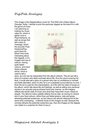
1. DigiPak Analysis
This image is the Digipak/album cover for This Wild Life’s Debut Album
Clouded, firstly, I decide to pick this particular digipak as the band fit in with
the genre of music
I am planning on
making my music
video for, which is
lighter rock to
Post-Hardcore, as
well as songs that
tell a story or
message, which
the acoustic Post-
Hardcore/Pop-punk
band do.
What I find most
interesting about
this digipak, is it’s
images and use of
colours, having
quite faded
colours, and hand
drawn artwork,
which I think is
used to tell a
story, as a lot can be interpreted from the album artwork. The art can tell a
story of a person who feels confused about life, thus the cloud covering his
face, it could also tell a story of a person who has no confidence in himself,
and feels alienated, which is why he is on a pedestal surrounded by no-one. I
think the art is used for this interpretation, as it fits with the style of songs on
the album, which talk about life and feelings, as well as telling very personal
stories in an acoustic pop-punk/post hard-core manner, so the imagery
reflects the bands style of music and what they hope their music means to
people. The albums colour palette reflects this as well, as having no vibrant
and in your face colours, rather than just faded greens, reds and greys,
attracting potential audiences, as the colours are almost relaxing but at the
same time contrasting, , it attracts those to the images as well, because the
contrast attracts the potential customers eye, then the images on the digipak
can relate to a customer for them to buy it.
Magazine Advert Analysis 1
2. Weezer – Pinkerton Album Release Poster
My first Magazine advert analysis
is of Weezer’s album Pinkerton.
Weezers style of music could be
categorised as an early form of
pop-punk, which went to
influence a lot of the bands that I
have already researched as the
band have already stretched over
20 yeas of playing and have
reached international fame.
The colours of the background
are dark grey/black, this is so it
matches the background of the
album, and gives reference and
causes correlation to the album
cover which is set to the middle
left of the poster, so that if a
potential customer saw the album
after seeing this poster, they
would think of the colour
schemes and think back to the poster, and potentially buy the album.
The poster’s tagline “One ‘El of an album.” Is used for comical reference of
one of the more popular songs on the album, “El Scorcho”, which was
released earlier as a single, this tagline could attract previous fans of Weezer
as of the comedic tagline typical of Weezer’s style, or people who had heard
the song on the radio (As this poster is from a time before Social Media) when
the single was played to their new album, as, any fans who may of previously
heard El Scorcho as a single, may want to buy the album, and listen to a song
they already like, as well as find the bands new songs. As well as this, it has
subtext in which it talks about which singles released are on this album, as
well as a price, so if the tag line can interest a viewer to the poster, they can
see the songs on it to attract them to buy it as well.
The album cover is put to the left of the poster, to comply to “The Rule of
Thirds” in which the focus of an image is put off-centre, to make the image
more interesting, if the image is more interesting it may attract potential
audience to look at the advertisement, because they’ll be coaxed in my
interest of the off put focus.