2. In what ways does your media product use, develop or challenge
forms and conventions of real media products?
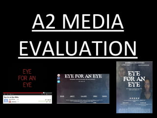
The Mise en Scene
suggest that the genre of
the film is horror due to
the close up of the
female character as we
can see her feared facial
expression. The smoke
could also suggest the
wind which is not only a
film convention but a real
life ghost encounter story
convention.
The colour scheme for the
poster is very simple but
striking to look at. The
colour grey and blue are
used mostly throughout the
poster but in different
shades, as well as using the
colour white. This can be
similar to The Woman in
Black film poster due to the
minimal text and the colour
scheme.
3.
4. As the website opens, there is an automatic pop
up on the webpage which shows you the official
trailer via a YouTube video. This then shows a
good way to promote the film, as it straight away
gives you the option to watch the trailer before
you even look around on the website.
Alike to The Woman in Black website, mine will also includes a gallery page which allows
the viewer to see different pictures taken from the film. This is another good way of
promoting the film because it allows the viewer to see some freeze frames of the actual
film which makes the viewer more interested and feel more in tune with the film.
Furthermore, it
will be complying
with codes and
conventions of
film websites
because most of
them have a
synopsis of the
film to give the
reader an insight
to what the film
is about.
5. The website for Final Destination 5 first comes up with a striking image of the skull then
immediately breaks out and goes into this image here. Then as you can see at the bottom
there are different tabs where the audience can look at the trailer, synopsis as well as
photos and clips form the film.
This then shows that Saba and I might not want to set up our website like this as this really
highlights the horror side of the film as it can be quite frightening, however, it does clearly
show the genre and meaning of the film within the website which therefore shows that the
website is very eye catching and memorable towards an audience, which we would also like
to do for our audience.
6. Saba and I have used and looked at many trailers
from the horror/ thriller genre. We have watched
trailers such as The Woman in Black, The Grudge,
Final Destination and Gone. By looking at these
trailers they have helped us to see what we can
include.
Horror is a film genre seeking to elicit a negative
emotional reaction from viewers by playing on the
audience's primal fears. They often feature scenes
that startle the viewer, and the macabre and the
supernatural are frequent themes. Thus they may
overlap with the fantasy, supernatural, and thriller
genres.
7. How effective is the combination of your main product
and ancillary texts?
The fonts on the trailer are similar and so this
can then show that my texts show consistency
and fluidity which can therefore create a better
and stronger brand image. This can also attract
audiences because they will know where and
what the film is about..
Looking at the trailer and the other two texts, it
is evident that they are from the same film
brand as I have made sure the fonts, the
background colour and the colour schemes have
been kept to a certain image.
8. What have you learnt from audience
feedback?
The fonts I used for the names and slogan I quite simple however, effective as I didn't want
to use too many fonts as this would be distracting. Furthermore, the font I used for the
title suggests a haunting film and is striking to the eye.
The use of the stars also indicates the poster looks more professional. However, as this is my first
draft I am still going to put in images one of the killer and one of ‘Heidi’ the main character as
this will make the story seem more clear as well as raising questions for the audience.
9. What have you learnt from audience
feedback?
I have experimented with a billing box at the bottom
of the page which follows conventions, I have
adapted the transparency of your images to they are
more subtly incorporated
I have also added media icons as this is crucial and
from looking at other film’s websites they also have
this.
Also, I have equally moved the component
parts so that the content is less heavily
weighted at the top of the webpage. This
webpage seems clear and carries on the
brand image of my poster and the website as
I have used a picture of the killer as well as
using tabs so that people can click on them.
10. What have you learnt from audience
feedback?
For our trailer, we have received
both positive and negative
feedback. The main concern for our
trailer was that it lacked pace
therefore the main problem was we
had to cut scenes and put them
together so that it increased pace
and emphasises the thriller and
chase side of the film.
Also, we had to re-shoot some scenes so
that we can see of what the female lead is
doing before the killer is there. As well as
including a car scene so that the audience
can see that it is a race against time which
increase pace and also helps the audience
raise questions therefore this can show our
trailer is following conventions.
11. How did you use media technologies in the
construction & research, planning & evaluation
stages?
Research & Planning:
We first researched the horror genre to find it is a story in which the focus is on creating a feeling of
fear. Such tales are of ancient origin and form a substantial part of the body of folk literature. They can
feature supernatural elements such as ghosts, witches, or vampires, or they can address more realistic
psychological fears.
I then had to see what the conventional settings, camera angles and iconography that are used in the
horror genre e.g.
Basements/ Attics/ Lofts
Isolated communities
Hospitals
Camera Angles:
High/ Low Camera Angles ( Affect – Power)
Jump cuts
Iconography:
Low Key Lighting ( High Key to emphasis shadows)
Blood
12. Blogger, Slideshare & Animoto:
In Blogger, I have learnt to firstly upload new
posts and also designing my blog to make it more
eye catching and more attractive. It enables me
to showcase all my work that I have made so
anyone can see my work.
Slideshare is useful as this could be seen as an
easier way to upload presentations of my work
to embed them into blogger as this doesn’t take
long and it makes the presentations look
pleasant and readable. On Animoto we were
able to share mood boards so that we can see
other types of horror films so that we can see
what we would like ours to include.
13. Saba and I decided that throughout the
trailer we wanted to have a mixture of
diegetic and non diegetic as we want to have
some of the characters talking as well as
having non diegetic sound which will
hopefully be music that creates suspense and
a thrilling sound as this can relate to the
husband’s chase against time to save his
wife.
From looking at freemusicplay.com, I thought
that is was very useful and easy and simple to
find what type of music genre and the
subgenres because for example there was
the ‘Style’ of music as well as the ‘Feel’ of the
track as I thought that the feel of
suspense/terror would fit with the genre of
our trailer the most.
Soundtrack Research - Sound
Cloud
14. Motion:
On Motion Saba and I were able to experiment with
different fonts as there were a lot of options. However, for
our first draft rough cut trailer the font was a live font
meaning that it moved and then developed into what it
wanted to say. But, from looking at audience feedback they
were not keen on this font as the pace was too slow and
was hard to read.
We then found another font with white writing and was
bigger and bolder so that it was more visible however, we
then showed this to other audiences and they said the font
did not link well with the horror genre and looked like a
western themed font.
15. Final Cut Pro, Dreamweaver & Photoshop
On Final Cut Pro we were able to use this to log and capture
and edit the footage for our trailer. Saba and I found that
editing was a challenge as we faced many problems such as our
footage being unable to be captured on Final Cut Pro and also
we had problems with Final Cut Pro actually opening.
We then had to use Dreamweaver to make our website go live.
Dreamweaver was useful as we could see how the buttons work
and also to make sure that it worked when we put our trailer on
it.
Use of spot healing
brush to take away
pimples or blemishes.
16. Photoshop:
In Photoshop I created my poster
and website. I have learnt to
blend and fade images so that
they blend into the background
and well as use the crop tool to
cut images.
To blend the
background I used the
pen tool to pick a
point then blend the
colour when pressing
the paint brush.
The Mise en Scene shows a close up of the female protagonist with only her face shown on the poster, while in the background there is smoke in which another face appears from. Also, there is minimal text on the poster which pushes the main focus onto the main female character showing he will play a significant role in the movie. Cold areas are a common haunting type of place to set a horror story and the face in the wind, the poster does follow these conventions. Also, there is minimal text on the poster which pushes the main focus onto the main female character showing he will play a significant role in the movie. There is a consistent design on the text because on the film title there is a rugged line that looks like it has almost been scratched this can also be seen on the tag line, release date and actor’s name. This then gives shows continuity throughout the poster and this can also build a strong brand identity for the film. From looking at these film posters, I believe that this will give me and Saba a clear idea on how we would like our film poster to look like as we like the idea of the main character having a close up and also showing a glimpse of our killer character as well to show the audience that the genre is likely to be a suspenseful thriller however, with some horror aspects in it.
In The Woman In Black and the Gone poster one similarity between them is they both have close ups of their faces which can show either they are the main character and tells the audience the film will be revolved around them or to emphasise the fact that they are in fear of something as their faces shows they are frightened of something which can entice the audience to watch the film. From looking at these film posters, I believe that this will give me and Saba a clear idea on how we would like our film poster to look like as we like the idea of the main character having a close up and also showing a glimpse of our killer character as well to show the audience that the genre is likely to be a suspenseful thriller however, with some horror aspects in it.
The website also has a synopsis page where it gives a brief overview of what the story is in the film. This way the viewer can feel more in tuned with the storyline and even if they don’t watch the trailer they will still be able to know what the film is about through the synopsis. The synopsis is like a trailer in the sense that it raises questions for the viewer and this makes the viewer want to see the movie more. I think I will include a synopsis in my website as it will give an overview to the viewer as to what my film is about.
For example, from looking at The Grudge trailer it is clear that they do not expose the villain at all so it keeps the audience interested. We adapted this to our trailer as we show fast cuts of the villain and then a creepy image of her at the very end as a shock factor for the audience as this can also follow and break conventions and not many films do this in their trailer only The Woman in Black.
Looking at other film’s website’s such as The Woman in Black as they have also used same fonts and colour schemes. This will then enforce branding as I have included a billing box, name of the film and also the slogan as this will increase the sense of branding between the teaser, poster and website. and from looking at other film brands it will be complying with codes and conventions of film websites because most of them have a synopsis of the film to give the reader an insight to what the film is about.
This is the first draft of my film poster. The background I chose is a blue, white and red and these colours connote evil vs. good and the highlights of red suggests violence and death. I then received feedback from peers and my teachers where they said to put in images of the killer and of the female lead as well as shrinking the strap line. I have used the feedback and have mist the image of the victim. As she is now blended into the background, particularly at the neck and also I have considered and changed ‘deadly past’ to ‘deadly fantasy’ as this would make more sense (fantasy reality, where past present/future, which sounds odd).
Included a car chase Quick cuts More of sofia
From looking at Soundcloud.com, I found a song called “Death Star” as this song really captured and represented the horror/ thriller side of the film and so it was very effective because they added suspense and the “thrill” side of our trailer and also fits in with the storyline and the genre.
From this feedback we decided to use a normal font instead of a live font and then experiment with the red and white colour as this can also symbolise good vs. evil and emphasises it is a horror trailer.
However, after this was resolved we found editing useful and now we have started to make the narrative on Motion so that we can finally have a first draft finished so we can then see what we need to polish and work on to make our trailer better. In Photoshop, I have learnt how to overlay a certain part of the text to make it seem more professional and eye catching. For these two images I used a spot healing brush which took away any pimples or blemishes that were on the images. Also, I have learnt to blend the background for the stars and the images to fade them in and make the picture look professional.
These tools helped me to create a professional looking poster and website as I was able to put in all the necessary components to make up a good poster and website.
Looking at my three texts I believe I have created a portfolio that fits well with the genre and lives up to audiences expectations therefore it creates a well branded combination and the use of the specific fonts and images display the genre well and also helps the audience understand the story as the poster as well as the trailer will hopefully do this.