Beginners Guide to TikTok for Search - Rachel Pearson - We are Tilt __ Bright...
Product Research
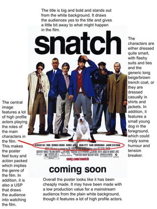
1. The central image features a lot of high profile actors playing the roles of the main characters in the film. This makes the poster feel busy and action packed which implies the genre of the film. In addition, it is also a USP that draws the audience into watching the film. The title is big and bold and stands out from the white background. It draws the audiences yes to the title and gives a little bit away to what might happen in the film. The characters are either dressed quite smart, with flashy suits and ties and the generic long beige/brown trench coat, or they are dressed casually in shirts and jackets. In addition, it features a small young dog in the foreground, which could imply some humour and tension breaker. Overall the poster looks like it has been cheaply made. It may have been made with a low production value for a mainstream audience from the plain white background, though it features a lot of high profile actors.
2. http://www.youtube.com/watch?v=Q8jbt0wBkMI Introduction Sound- Non diagetic soundtrack starts off very slow and explodes into loud drums and guitars. It then quietens when the characters start speaking. It implies how action packed the film is with the fast paced trailer. Info- features generic conventions of a crime, gangster film such as; guns, disguises, violence, gambling etc. The introduction, includes a lot of dramatic camera angles and shots, with extreme fast paced close ups of characters, that then zoom out to feature a different character. In addition, the scenes switch from smartly dressed, suited guys to bare knuckle fights and scenes of a diamond. Problem Sound- it stills features the same soundtrack, though it is more quiet and seems to be more of a background noise as characters talk and interact with one another. Info- the diamond has been stolen, therefore the scenes show a lot of arguing and conflict between characters and more violence. In addition, it features various gangs and main characters from those gangs that try to locate the diamond. The scenes don’t slow down and switch and weave between one another to give the audience a sense of action and adrenaline running through the trailer. Development Sound- the non diagetic soundtrack changes to a upbeat wild western track, to introduce the main characters and gives it a comical and relaxed feel to it. Info- the main actors are introduced in a 2-3 second still shot, stylised in a old fashioned wild western poster. This entices the audience to come watch the film as it may feature an actor they are fond of. The last scene is much longer than most of the scenes featured in the trailer and the soundtrack ends while the scene is shown. It ends on a comical note as the characters that interact with another cannot fully understand each other. Snatch trailer
3. The colour used is very monochrome and simple. The background is completely black, while the text and image are white, giving it a sleek and expensive feel to it. There is a single piece of colour; which is the red rose pinned on the main character portrayed in the poster. The colour, implies violence and blood and it gives the poster a sinister, serious feel to it. The single character used creates a sense of power and authority, from the straight head on posture, making him look intimidating. The tagline gives a sinister and serious tone to the poster, which contrasts with the British poster, as being a more violent and stern film. It gives more of a sense of loyalty and strong bitter rivalries between the gangs. The neutral simplicity of the poster draws the audience in because it looks like it has a high production value and it looks like it is aimed at a more wider audience, though the poster looks quite sinister.
4. http://www.youtube.com/watch?v=5DO-nDW43Ik Introduction Sound- the non diagetic soundtrack is very slow and sombre. The instruments playing are violins and trumpets. Info- the shots shown are black screens with an actor’s name on it. It then fades into that actor in his role, then it fades into another title screen introducing another actor etc. Development Sound- the soundtrack develops further into what sounds like classic slow paced Italian music. The track carries on playing, like it is telling a story and it’s pace doesn’t speed up or slow down till the end when the song finishes. Info- it mainly features Marlon Brando’s character playing the dominant ‘godfather’ role. He holds a lot of power as we see other characters coming to him for help. There is a little bit of violence, which features a shoot out between 2 characters. The trailer features shots of typical family life, dining as a family, dancing with his wife etc. It shows a lot of compassion within the trailer, which contrasts with the violence and fast action paced trailer of the British trailer. The trailer looks more professional and sleek. The scenes don’t flash by and are evenly paced, so the audience get a sense of what it is like being part of an Italian mafia. Overall, this trailer doesn’t feature a problem that usual trailers of any genre have. It tells more of a story of Marlon Brando’s character and it focuses around him. The distributors haven't given anything away to the audience, which can draw them in as they may be curious as to what happens in the film. The Godfather trailer
5. Use of images The shot used isn’t the typical publicity shot a magazine would use for its cover. The image is a simple forward facing headshot, with the main character staring straight out at the audience, making it more engaging and eye grabbing. The image itself is very detailed and seems to look more like a photograph belonging to a gallery. Use of colours The colours are all monochrome and very dark, giving it a serious tone to the magazine. The masthead is a dull bronze colour which matches the serious tone. In addition, the dull colour doesn’t distract the audience from the central image and the impact it has on the audience. Use of coverlines There is a lack of coverlines which implies the central image must have an impact on the audience. The company assumes the audience recognises the actor/film hence; ‘ The Greatest Movie Of All Time’ and the classic style it is presented in. In addition, there might also be more in depth coverage inside the magazine to entice the audience to buy it. Use of language The language that is present is somewhat exaggerated that is simple and understandable to a wide range of audiences. In addition, it implies confidence within the magazine company as well as the audience. Representational issues The simplicity of the image and lack of text implies that the magazine cover is a tribute to the fans of the film. Use of font Mainly in sans-serif, making it very bold and masculine. The coverline underneath is written in italic serif making it stand out from underneath “The Godfather.” It makes the audience form a view of the coverline and gives them a reason to read the magazine and explore others opinions of it.