The document discusses Goodwin's theories about conventions in music videos and relates them to the student's own music video, digipak, and magazine advertisement that were created. The student incorporated several of Goodwin's theories into their projects, such as including multiple costume changes and showing the lyrics through visuals in the music video, maintaining a theme of everything being hand-drawn across all pieces, and using common design conventions like showing the artist in the advertisements.
1. One of Goodwin’s theories is about music and genre. The genre can affect
the look of the music video as well as the magazine advert and the digipak.
For example; a pop song will usually feature a performance in the video.
This can be with dancing, singing or with an instrument.
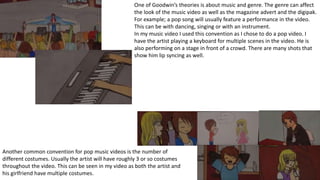
In my music video I used this convention as I chose to do a pop video. I
have the artist playing a keyboard for multiple scenes in the video. He is
also performing on a stage in front of a crowd. There are many shots that
show him lip syncing as well.
Another common convention for pop music videos is the number of
different costumes. Usually the artist will have roughly 3 or so costumes
throughout the video. This can be seen in my video as both the artist and
his girlfriend have multiple costumes.
2. Another one of Goodwin’s theories is about intertextuality. This is when a media
text references another media text. For example; Madonna uses Marilyn
Monroe’s ‘Guys prefer Blondes’ for her ‘Material Girl’ video.
In my music video there is a reference to Vogue magazine as there is a girl
holding one before it was taken from her hands. This also fits in with another of
Goodwin’s theories about the lyrics matching the visuals.
There is a theory of the music matching the visuals in Goodwin’s theories.
This is done with clapping for example. The hands will clap with the
music. I have done exactly this for my video.
Another way this theory can be shown is with instruments playing in sync
with the music. Again I have done this by showing the artist playing a
keyboard.
3. Goodwin had a theory about music videos showing the lyrics. This is done by acting
out the lyrics for example; I have done this with the line ‘bites her lip’ and shown a
scene where the girlfriend bites her lip.
The same was done for the line ‘shakes them hips’. There was a shot of the girl’s
hips. This also relates to the theory by Laura Mulvey of the Male Gaze. She said
that media is made through the eyes of a male. This means that the camera will
often focus on the female body in a similar way to the picture to the right.
4. Another theory of Goodwin’s was the level of intimacy that record companies
what the artist to have. This is done through close ups on the artist to give an up
close and personal feel for the audience. It is also done through the use of a
motif, an item or image that the artist is recognised for.
In my video I have used many different close up shots of the artist to give this
level of intimacy.
Goodwin’s theory of voyeurism can be seen in most videos. It’s common to see in
pop songs as the video is usually performance based and the artist is nearly always
singing into the camera. Voyeurism can also be shown as looking at the female body
as well, linking in with Laura Mulvey’s theory of Male Gaze.
Multiple shots in my video have the artist looking into the camera along with a few
shots the focus on the girl’s body.
5. In my video I used a time lapse. This is because throughout the video there is the
theme of everything being drawn. There are a couple of shots where we see the
artist with a pencil and paper drawing the girl. The time lapse is supposed to
resemble him drawing at his table. This is a theme that I have kept for all 3 tasks.
I made sure that the artists had the same clothes as in the time lapse to make it look like he
was the one drawing. He’s also left handed for the same reason.
Black hoodie
Left handed
6. For my digipak, I made sure to stick with the theme of everything being
drawn. I did this by having one of the pictures show the artist drawing at
his table. For the front and back cover I had the artist holding a pencil to
show that he likes drawing. With him being drawn and cut out, he would
be small. This is why he has a pencil in his hands that is clearly too big
for him.
The other pictures in the digipak relate to the video. The top left one is
similar to the scenes near the trees as this is the same costume. The top
middle is both the artist and his girlfriend together like the end of the
video and the top right one relates to his performance in front of the
crowd as it looks like he is setting everything up.
Existing digipaks have a colour scheme that will relate to one of the
music videos on the album. For mine I used mainly black, white, red and
blue as these are the main colours we see the artist wearing.
The front cover of most digipaks will show the artist. I have copied this
convention and shown the artist on the front.
The back cover shows the track list in the same font used on the front
for the name of the artist.
The disk design uses
the same theme of
hand drawn pictures.
The pictures relate to
the video and the
rest of the digipak.
7. For the magazine advert I used the same colour scheme as the digipak.
The album image takes up the majority of the page as this is a common
convention for magazine adverts.
Many existing adverts use the convention of showing the artist in the
advert as well as the album cover. I decided to copy this convention for
my advert. Since the theme is hand drawn, I could have the artist doing
pretty much anything. I decided to have him next to the album since he’s
small enough to do so.
For the text at the bottom I used the colours white and blue to match the
album cover. The text isn’t in line either as the text on the cover for the
title is out of line.
At the bottom is the website address as most magazine adverts have the
website at the bottom so that the artist’s audience can find out more
information such as competitions and concert tours. Again this text is in
the same colour and font used on the rest of the magazine advert and on
the digipak.
The background colour is a very dark blueish-black as this is the
background colour for my digipak and is the same colour used in the
beginning and end of the music video.