
Recommandé
Contenu connexe
Tendances
Tendances (20)
Similaire à Psychological Thrillers Poster Analysis
Similaire à Psychological Thrillers Poster Analysis (20)
Plus de amyhowesmediastudies
Plus de amyhowesmediastudies (12)
Dernier
Dernier (20)
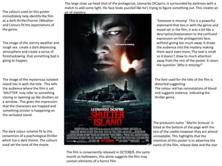
Psychological Thrillers Poster Analysis
- 1. The colours used on this poster immediately help identify the film as a dark thriller/horror. (Weather and Colours fit the expectations of the genre. The image of the stormy weather and rough sea create a dark depressing atmosphere and create a sense of foreshadowing that something bad is going to happen. The image of the mysterious isolated island ties in with the title. This tells the audience where the film is set. ‘SHUTTER’ may refer to something closing or opening up like shutters on a window.. This gives the impression that the characters are trapped and something sinister is happening on the secluded island. The dark colour scheme fit to the convention of a psychological thriller which has a dark theme. The colours used set the tone of the movie. The large close up head shot of the protagonist, Leonardo DiCaprio, is surrounded by darkness with a match to add some light. His face looks puzzled like he’s trying to figure something out. This creates an air of mystery. The producers name ‘ Martin Scrouse’ is listed at the bottom of the page with the rest of the credits however they are almost unreadable. This highlights that the intention of this poster is to advertise the name of the film, release date and the star. The film is conveniently released in OCTOBER, the same month as Halloween, this alone suggests the film may contain elements of a horror film. ‘Someone is missing’. This is a powerful statement that ties in with the genre and mood set in the film, it acts a bit like a description/explanation to the confused expression on the protagonists face, without giving too much away. It draws the audience into the mystery making them want even more. The text is small so it doesn’t draw to much attention away from the rest of the poster. It raises the question ‘Who is missing?’ The font used for the title of the film is distorted suggesting The colour red has connotations of blood and suggests violence, indicating the thriller genre.
- 2. The actress has very pale flawless skin making her seem almost doll like. The crack in her face is emphasised because of the massive contrast between the smooth skin and sharp crack. She resembles a porcelain doll that’s extremely fragile and has been broken, resembling a broken doll. The crack seems to go quite deep, it think this foreshadows a crack within showing her mental instability. The Viewers attention is drawn to the models eyes as they are looking directly at the camera. This makes it seem like she is making direct eye contact with the viewer. The image used features the main protagonist in the film. It fills up most of the page and is placed in a very central position this suggests that the story is focused on this character. The black contrasts with the bright pale colour of her skin makes it seem more bold. The title is positioned in the centre of the page in line with the actors collar bone implying that she is the black swan in the film. The clean elegant style of the font against the contrasting background conforms to the genre: drama. This mirrors a possible dark and intense storyline.