
Recommandé
Contenu connexe
Tendances
Tendances (19)
En vedette
En vedette (9)
Similaire à Reseach nme anaylsiss
Similaire à Reseach nme anaylsiss (20)
Plus de asmediac14
Plus de asmediac14 (20)
Dernier
Dernier (20)
Reseach nme anaylsiss
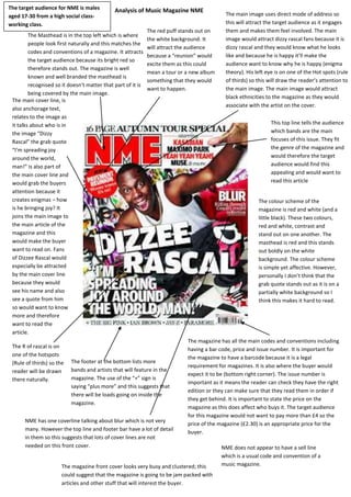
- 1. Analysis of Music Magazine NME The Masthead is in the top left which is where people look first naturally and this matches the codes and conventions of a magazine. It attracts the target audience because its bright red so therefore stands out. The magazine is well known and well branded the masthead is recognised so it doesn’t matter that part of it is being covered by the main image. The main image uses direct mode of address so this will attract the target audience as it engages them and makes them feel involved. The main image would attract dizzy rascal fans because it is dizzy rascal and they would know what he looks like and because he is happy it’ll make the audience want to know why he is happy (enigma theory). His left eye is on one of the Hot spots (rule of thirds) so this will draw the reader’s attention to the main image. The main image would attract black ethnicities to the magazine as they would associate with the artist on the cover. The main cover line, is also anchorage text, relates to the image as it talks about who is in the image “Dizzy Rascal” the grab quote “I’m spreading joy around the world, man!” is also part of the main cover line and would grab the buyers attention because it creates enigmas – how is he bringing joy? It joins the main image to the main article of the magazine and this would make the buyer want to read on. Fans of Dizzee Rascal would especially be attracted by the main cover line because they would see his name and also see a quote from him so would want to know more and therefore want to read the article. The R of rascal is on one of the hotspots (Rule of thirds) so the reader will be drawn there naturally. The colour scheme of the magazine is red and white (and a little black). These two colours, red and white, contrast and stand out on one another. The masthead is red and this stands out boldly on the white background. The colour scheme is simple yet affective. However, personally I don’t think that the grab quote stands out as it is on a partially white background so I think this makes it hard to read. The magazine has all the main codes and conventions including having a bar code, price and issue number. It is important for the magazine to have a barcode because it is a legal requirement for magazines. It is also where the buyer would expect it to be (bottom right corner). The issue number is important as it means the reader can check they have the right edition or they can make sure that they read them in order if they get behind. It is important to state the price on the magazine as this does affect who buys it. The target audience for this magazine would not want to pay more than £4 so the price of the magazine (£2.30) is an appropriate price for the buyer. The footer at the bottom lists more bands and artists that will feature in the magazine. The use of the “+” sign is saying “plus more” and this suggests that there will be loads going on inside the magazine. This top line tells the audience which bands are the main focuses of this issue. They fit the genre of the magazine and would therefore the target audience would find this appealing and would want to read this article The magazine front cover looks very busy and clustered; this could suggest that the magazine is going to be jam packed with articles and other stuff that will interest the buyer. The red puff stands out on the white background. It will attract the audience because a “reunion” would excite them as this could mean a tour or a new album something that they would want to happen. NME does not appear to have a sell line which is a usual code and convention of a music magazine. NME has one coverline talking about blur which is not very many. However the top line and footer bar have a lot of detail in them so this suggests that lots of cover lines are not needed on this front cover. The target audience for NME is males aged 17-30 from a high social class- working class.
- 2. The mast head is on the contents page exactly the same as it is on the front cover but this time it is smaller in size. This reminds the target audience of the name of the magazine and therefore builds on the branding of the magazine. The title of the page (code and convention) tells the reader what the page is set to do – tell the reader what is in this edition of the magazine. Reader can quickly find out what bands are mentioned in the magazine and find out quickly which page they are on. It allows the reader to find the bands they are most interested in and skip straight to articles relating to them. NME have broken the codes and conventions of magazines because in most magazines the page numbers are bigger than the text on the contents page but in NME this is not the case. It is the same size as the article title but they are smaller than the header of the group of articles. However the page numbers are in a different colour (red) so this makes them stand out next to the article names. Advert promotes there magazine so helps with their branding and also it is a suitable advert because if the reader is reading this magazine then they would probably be interested in getting a subscription as it would be cheaper and also get delivered straight to their house instead of them having to go the shop. It also means that they would never miss an edition. The contents page is laid out in the way most magazine’s are. It has used three columns and put the content on the page into these three columns. It has used the same colour scheme as the front colour so this makes the front cover and contents page link. The “PLUS” makes it sound like the magazine is packing extra content into the magazine which would make the buyer feel that they were getting more than their money’s worth which would be appealing to the buyer. The contents page gives more information about articles in the magazine than the cover lines and gives the page number that the whole article is on. This will attract the reader to the main articles in the magazine rather than to the smaller articles. The date of the edition allows the audience to make sure they are staying up to date with the magazine editions and are reading the editions in order if they’ve gotten behind. It also allows them to find the specific magazine if they want to refer to a specific article at a later date in time. The features are grouped under headers; this allows the magazine to have regular articles which builds routine into the audience’s reading. The middle column gives a few more page numbers and more features in a little bit more depth. It allows the audience to get a bit more detail on a few of the articles. The contents page has not used that many images. It uses one in the middle column which relates to the text below it and there is an image relating to the advert. NME does not include an editor’s message which means it kind of loses some of its personal touch. It also does not include any social media links which stops the magazine being able to reach out to their online audience.
- 3. The headline of the article is the largest text on the page and is bold to draw the reader’s attention to the article. It also gives a clue to the reader what the article is going to be about. The image takes up the left hand page of the double page spread (code and convention) and adds a visual appeal to the image. It breaks up the amount of text on the page as the image taking up so much space actually encourages the audience to read the article. The in-direct mode of address causes enigmas - suggests that Dizzee Rascal may be shy and that the article is talking about his personal life, or that he is looking back over his shoulder because the article is talking about his past. There is a stand first underneath the title of the article and this gives a small introduction to the main article, this helps to engage the reader in the article before they’ve even read it. The text of the article is split into columns because this makes it easier to read because it visually looks like there is less to read whereas if it was all in one big paragraph the reader would not want to read it as it would look like it would take ages to read. The columns make the text look more appealing to the reader. The smaller images at the bottom of the right hand page are related the article and add a visual message to the audience about Dizzee Rascals article. The bottles are beer bottles which have connotations of a party this could suggest to the reader that his life has been a party; it also has connotations of a male drink. The “have a nice day” sticker suggests that Dizzee Rascal wants people to have a good day this would show that he is a nice caring person. The drop capital visually indicates to the reader that the main article has begun. It also makes the text look more interesting. The page number at the bottom of the page connects the article to the contents page and allows the magazine to flow. The reader can find the article again easily if they put it down as they will know what page to find. NME have not included any large visible quotes in this article which is a common code and convention of a double page spread. A code and convention of magazine is to give credit to the person who wrote the article and to the person who has taken the photos for the article.