Seal of Good Local Governance (SGLG) 2024Final.pptx
Kerang contents page analysis - Nicole Hickman
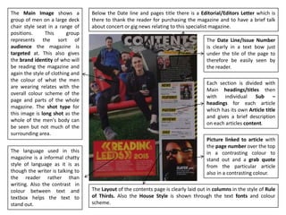
1. The Layout of the contents page is clearly laid out in columns in the style of Rule
of Thirds. Also the House Style is shown through the text fonts and colour
scheme.
Each section is divided with
Main headings/titles then
with individual Sub –
headings for each article
which has its own Article title
and gives a brief description
on each articles content.
The Main Image shows a
group of men on a large deck
chair style seat in a range of
positions. This group
represents the sort of
audience the magazine is
targeted at. This also gives
the brand identity of who will
be reading the magazine and
again the style of clothing and
the colour of what the men
are wearing relates with the
overall colour scheme of the
page and parts of the whole
magazine. The shot type for
this image is long shot as the
whole of the men's body can
be seen but not much of the
surrounding area.
The Date Line/Issue Number
is clearly in a text bow just
under the tile of the page to
therefore be easily seen by
the reader.
Picture linked to article with
the page number over the top
in a contrasting colour to
stand out and a grab quote
from the particular article
also in a contrasting colour.
Below the Date line and pages title there is a Editorial/Editors Letter which is
there to thank the reader for purchasing the magazine and to have a brief talk
about concert or gig news relating to this specialist magazine.
The language used in this
magazine is a informal chatty
style of language as it is as
though the writer is talking to
the reader rather than
writing. Also the contrast in
colour between text and
textbox helps the text to
stand out.