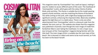
1. This magazine cover by ‘Cosmopolitan’ has a well set layout, making it
easy for readers to access different parts of the cover. The masthead of
‘Cosmopolitan’ is pink, which goes with the colour theme of white,
blank, pink and blue. This theme is suitable due to the model wearing
aspects of pink and blue, and also matching the theme of the beach.
The white writing on the pink, with a light blue background shows a
significant contrast, enhancing the important titles. Black also amplifies
against the light blue as it is a bold colour. There is only one other
advertisement from ‘Cosmopolitan’ which is a discount code from the
website ‘the ionic.com.au’. This website also shows that this magazine
was published in Australia. Even though the main image of model Kim
Kardashian West is over taking the masthead, it is not a major issue
due to buyers of the ‘Cosmopolitan’ magazine being familiar with the
title itself. The main image of Kim is suitable due the main topic of the
beach. She is dressed in a bikini and seems to be much tanned, as if she
has been to the beach herself.
2. Main image is the main topic of the magazine, will be effective due to
well-known celebrity making more people purchase.
Emphasised that it is a new magazine and may be impressed due to
celebrity on the front cover.
Stance of celebrity proves why he is on the cover of a sports magazine.
Main title relates to the main image, seems to be an interview.
List of 3, will attract readers.
Price is bold, making it clear.
Colour theme: Red, white and black
Matches fighters gloves and shorts
I like this magazine cover as it is colour co-ordinated, however there are
aspects of the colour blue making certain things stand out catching the
reader’s eye.
3. Graphology –
The layout of this magazine is very contextual which may attract readers due to
so much information. This will attract readers as it does not look like a boring
magazine. The copy is at the side to show the importance of the main image.
Typography –
The masthead is continuous throughout each issue of vogue, therefore it would
continuously have the same font, but may change the colour to match the colour
palette. The font is always in capital letters, but main titles are enlarged just
slightly to recognise the importance of certain things.
Mode of Address –
Due to there being two models presented on the front cover, it is direct and
indirect address. As Kim is looking directly at the camera, whilst Kanye is looking
at Kim. This proposes the marriage aspect as it shows Kanye’s devotion.
Mise En Scene –
The setting of this magazine is very neutral, to go with the stereotypical theme of
a wedding. The costume is for a wedding, as it is a Kim and Kanye special. The
actors used is Kim and Kanye as it is their wedding, and it was one of the most
talked about events of the 21st Century. This is a mid shot.
Colour Palette-
Neutral theme, with dark aspects.
4. Graphology –
The layout of this magazine is formal as there is hardly any
information on it. People may find this classy as there is only
two main titles, focusing on what the main focus is.
Typography –
The masthead is continuous throughout every issue of Vogue.
There is hardly any text on this magazine, but all text shown is
in the same font.
Mode of Address –
The mode of address is direct as the model is looking directly
at the camera towards the audience. This is a close up shot.
Mise En Scene –
The setting of this magazine is very neutral as it only has
aspects of white and peach. This cover may appear to be very
summery. The model seems to be dressed in either a white
cloth or a towel, which is covering everything expect for one
ear, her face and her hair. This white cloth or towel merges in
with the white background.