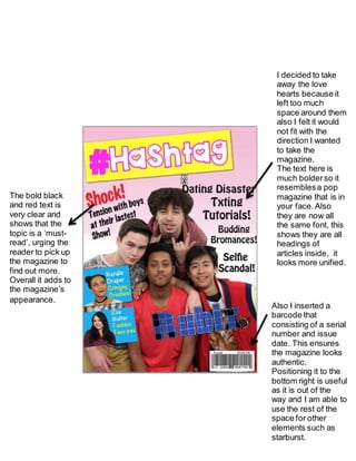
The designer removed heart shapes from the magazine layout because they took up too much space and did not fit the bold, in-your-face direction they wanted to take. They made all article headings the same bold font for unity and inserted a barcode with serial number and issue date to make the magazine look authentic, positioning it out of the way at the bottom right to free up space for other elements. The bold black and red text catches the reader's eye, suggesting urgent must-read topics and urging them to learn more.
1. I decided to take
away the love
hearts because it
left too much
space around them
also I felt it would
not fit with the
direction I wanted
to take the
magazine.
The text here is
much bolderso it
resemblesa pop
magazine that is in
your face.Also
they are now all
the same font, this
shows they are all
headings of
articles inside, it
looks more unified.
Also I inserted a
barcode that
consisting of a serial
number and issue
date. This ensures
the magazine looks
authentic.
Positioning it to the
bottom right is useful
as it is out of the
way and I am able to
use the rest of the
space for other
elements such as
starburst.
The bold black
and red text is
very clear and
shows that the
topic is a ‘must-
read’, urging the
reader to pick up
the magazine to
find out more.
Overall it adds to
the magazine’s
appearance.