![Proposal ,[object Object],[object Object],[object Object],[object Object],[object Object],[object Object],[object Object]](data:image/gif;base64,R0lGODlhAQABAIAAAAAAAP///yH5BAEAAAAALAAAAAABAAEAAAIBRAA7)
Recommandé
Contenu connexe
Tendances
Tendances (20)
En vedette
En vedette (20)
Similaire à Media, short film project research
Similaire à Media, short film project research (20)
Dernier
Dernier (20)
Media, short film project research
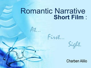
- 1. Romantic Narrative Short Film : Charben Alilio At… First… Sight.
- 7. Wong Fu Productions: HK: the one days Another short that inspired me was also from Wong Fu Productions, it was their ‘HK the one days’ collection which are little love stories in which they filmed in their home city of H ong Kong. They mixed both the American convention of romance with the Asian representative and added subtitles to give it a more legitimate Asian heritage feel to it. I also researched this short for my preliminary work last year as it gave a lot of inspiration for types of shot and the how to get the playful love story without it looking like a romantic comedy. It is beautifully made and the simple shots such as the two shots used for their playful conversation is used to maximum effect. I love the feel of this short and I hope of creating the same effect for my piece. I also hope to achieve a simple yet memorable logo/ title for my film. Since I cannot do this on imovie alone I will have to use another software to make it.
- 9. Textual analysis: Film poster Black and white photo, not common for movie posters, perfect for Independent films or shorts. Makes it more eye-catching because its different. Big red title, the only colour on the poster, eye-catching and readable. Worn out font like the poster side, goes with the poster. Red connotes romance or danger. Male and female protagonist in a romantic pose suggest that its going to be a romantic film mostly about them. The male is more dominant in the picture, suggest he is the main protagonist. Names of the actors that are going to be in the film, mostly famous ones, intrigues the audience. Production companies and Director placed next to the title. Usually place on the bottom of the poster, different and eye-catching. Tag line to give a glimpse of what the film is about. Sometimes confusing thus making the audience want to find out more. Tells the audience when they will be able to see the film .
- 10. Textual analysis: Film poster Name of the two protagonist on the poster, the main actors and there for the protagonist. Usually includes other actors included in the film, but this poster has a certain niche audience who knows these actors. Also connotes that the actors have worked on other films together. Female protagonist dressed stereotypically girly which shows that this will be more of a film aimed at women. She also looks soft and elegant which could connote romance. Title is bold and readable. The different fonts and colours used adds an extra eye-catching effect. It also separates the words “miss” and “like crazy” mimicking the separation of the characters in the poster. Male protagonist looks very clean and smart much like the stereotypical male protagonists in chick flicks of whom the female protagonist falls in love with. Other actors in the film, probably below with the production companies and director because it’s a big cast.
- 12. Textual analysis: Film magazine Colour theme: White, yellow, monochrome, red. Big magazine title so that the audience knows which magazine they are picking up. Usually changed the colour or the style to represent the film it is featuring. Name of feature film the second largest writing, to attract the target audience, it also shows which film the actors on the front cover will be in. Cover lines to make the audience feel like their getting more for their money. Protagonists hugging each other, connotes there will be some sort of love story between them. Facial expression are not happy, which connotes some sort of tragedy in the story of the film which they are in Cover lines to make the audience feel like their getting more for their money. Barcode and price are very small so that the audience doesn’t look at the price straight away.
- 13. Textual analysis: Film magazine Big magazine title so that the audience knows which magazine they are picking up. This issue has had its title changed to the colour and the style of the film to represent the type of film kick-ass is, the colour is red which connotes danger this connotation is further developed as the font looks like they have been made by blood splatters A sneak-peek to the years most prominent films is a cover line no reader can resist. The title of the feature film is bold and in neon green writing, neon green connotes nuclear waste which can link with the super hero genre of the film. The protagonist looks beaten up and bloody connoting that the feature film is of the action genre, he is also wearing peculiar clothing much like a super hero like of the cartoons behind him which connotes that it is going to be a super hero movie. Cover lines to make the audience feel like their getting more for their money. The word “collectors’” suggest importance and value thus it intrigues the audience more.