
Recommandé
Contenu connexe
Tendances
Tendances (16)
En vedette
En vedette (20)
Similaire à Recipe Card Evaluations
Similaire à Recipe Card Evaluations (20)
Plus de cloestead
Plus de cloestead (20)
Dernier
Dernier (20)
Recipe Card Evaluations
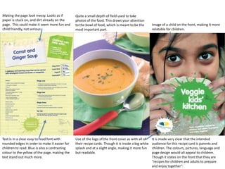
- 1. Making the page look messy. Looks as if paper is stuck on, and dirt already on the page. This could make it seem more fun and child friendly, not serious. Text is in a clear easy to read font with rounded edges in order to make it easier for children to read. Blue is also a contrasting colour to the yellow of the page, making the text stand out much more. Quite a small depth of field used to take photos of the food. This draws your attention to the bowl of food, which is meant to be the most important part. Use of the logo of the front cover as with all of their recipe cards. Though it is inside a big white splash and at a slight angle, making it more fun but readable. Image of a child on the front, making it more relatable for children. It is made very clear that the intended audience for this recipe card is parents and children. The colours, pictures, language and page design would all appeal to children. Though it states on the front that they are “recipes for children and adults to prepare and enjoy together”.
- 2. They have used a list format for the instructions, and have used wide spacing between each line to make it easier for children to read. On this recipe card they have used a lot of the colour green. Usually this colour is associated with the earth, plants and vegetables. This colour could have been used for the recipe cards to signify how the company is promoting eating healthy and vegetarian, and being environmentally friendly. Lots of bright and contrasting colours on this page making the food look more exciting to children. Small pictures that look like child’s drawings, making it seem more child friendly. Use of the word ‘Kids’ rather than children’s making it seem more informal and friendly.
- 3. Things people will want to see most such as calories and fat content are in orange. The orange used is the same as in the logo. So using it for the recipe cards will remind the reader of the brand. Main colour scheme is white and orange with some grey. This is because the logo is orange and white. Ingredients and method laid out in a list format making instructions clear and readable. Includes serving size and cooking time on the front so that people are mindful of adjustments they may need to make before they proceed. Again, the camera has been set to quite a small depth of field to take photographs of the food. This seems to be quite conventional of food photography. Title and subtitles in orange, making you remember the brand and highlighting the most important things. The intended audience for this recipe card would perhaps be adults, as the layout and colour scheme and font is basic. The recipe card only gives information in the clearest simplest way, and only includes one image. This recipe card doesn’t resemble the children’s recipe card at all.
- 4. As this is a Christmas recipe, they have made use of festive gold colours. This could be to get people thinking more about Christmas and feeling festive. They have used Christmas decoration shapes to contain certain information about the recipe, separating it from the rest of the page showing its importance. They have also used these Christmas decoration shapes to highlight the numbers in the list. As with all the other recipes, this one has used a list format to make it clear and readable. Again the photograph has been taken using a small depth of field, making the background blurry and the objects close up clear. This will have been used to draw attention to the food that they want the audience to be looking at. Making it clear that it is a Christmas by using phrases like “deliciously festive”. Around Christmas time people will be looking up idea for what to do for Christmas dinner, so by using this language it will drill the idea to use this recipe into peoples heads. As with all the vegetarian societies recipe cards, they have included their logo on the front to remind people of the brand and to conceder using more of their recipes, getting more involved or donating to them. They have sectioned off parts of the recipe by starting a line with gold writing. The gold seems to as if it is being used to section off parts of the recipe card. As well as using Christmas decoration shapes, they have incorporated gold festive patterns, with swirls, bells and gold and white sparkles. The pattern at the bottom of the cover between the image and the text has been used to separate the image and title from the main text. I think this recipe card was mainly aimed at adults as they are the ones usually thinking about what to cook for Christmas dinner. Though there are patterns and shapes on the card, they seem to be more sophisticated rather than child like, showing that they were not trying to appeal to children.
- 5. From looking at the font of the title and some of the text I can see that they have tried to make this recipe card look more formal. The flicks at the end of each letter and the fact its in italics gives a more formal impression. Text sectioned off within labels are in purple and white. Recipe card includes a large picture of the food to tempt people into making the food, and show them what it should look like. The main colour used on the card so beige. This could be to reflect the colour of the food as it is mostly beige other than the apple skins. The card features their website in the bottom corner to remind people to visit it. They have made the layout neater by sectioning off different parts of the text. As well as the different font separating the ingredients from the method there are lines above the texts sectioning them off. A label within the picture that says “Chef George Duban” may make the audience have more faith in the recipe. The title “Chef” would suggest that they know about food, so if they created the recipe then that would suggest that it is good. As with most recipes, the instructions are laid out in a list format to make instructions clear.
- 6. Title and the Youtube logo loom hand drawn. This gives the recipe book a much more friendly feel. It seems very personal, as if they have drawn it out just for you. The cartoon of the dragon coming out of the noodles illustrates the title perfectly, as it is called “dragon noodle soup”. This will have been used to appeal to the creative side of people, and to add a little humor. The type of dragon featured in the cartoon is the type that is normally associated with Asia, and as this is an Asian dish the image is very fitting. The image at the bottom shows someone eating the noodles. Though you cannot see who is picking up the food, you can see the chopsticks are raised about to dig into the food. This seems more informal than an image of still food, as it is suggesting just to get stuck in and eat rather than concentrating on presentation. Text is in a plain font making it clear and not too fancy. The general theme of this recipe is informal and a bit rough and ready, so fancy text isn’t needed. This recipe is set out a little less like a list. Though they do list the ingredients they don’t separate the method into sets. This makes it slightly more effort to read than if the method was set out like a list. The writer has used chatty informal language in the first few lines. For example “slurp” and “sesame-y” are informal words, that maybe would typically used when talking to friends.