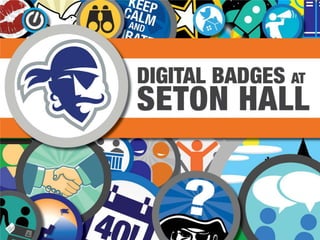
Digital Badges Preconference workshop NMC 2013
•Télécharger en tant que PPTX, PDF•
0 j'aime•651 vues

Michael Soupios, Danielle Mirliss and Chris Petruzzi conducted a three hour long preconference workshop on the use of digital badges at the New Media Consortium 2013 conference held in Hilton Head, South Carolina on June 4-7.

Recommandé
Contenu connexe
Similaire à Digital Badges Preconference workshop NMC 2013
Similaire à Digital Badges Preconference workshop NMC 2013 (20)
Plus de Danni M
Dernier
Dernier (20)
Digital Badges Preconference workshop NMC 2013
- 3. Digital Badges at Seton Hall Key Concepts for Digital Badges • Transportability – multiple learning spaces – shifting time and the non-linear education • Granularity – string it all together – paint a more meaningful picture
- 4. Digital Badges at Seton Hall Practical Examples • MOUSE & the MOUSE Corps • NYC BOE DIG/IT • RIT - Just Press Play • Purdue University - Passport • Educause ELI Annual Conference • Pirate Patch: A Digital Badge Initiative
- 6. Digital Badges at Seton Hall Pirate Patch: A Digital Badge Initiative • The Goals • The Standard • The Platform and the Players • The Pilot and the Data • The Post-Pilot Mess • The New Directions
- 8. Digital Badges at Seton Hall Gamification • What is it? • The Good and the Bad • User / Student Motivations • The Strategies • The Hits and Misses
- 10. Digital Badges at Seton Hall Small Group Time • Classroom level • Program level • Student engagement • Career building • Informal learning
- 12. Digital Badges at Seton Hall Time to Roll Your Own • Metadata • Criteria • Graphic Design
- 13. Digital Badges at Seton Hall • Instantly Recognizable
- 14. Digital Badges at Seton Hall Drawing Inspiration
- 15. Digital Badges at Seton Hall 3 Keys to Logo Design • SIMPLE • APPROPRIATE • MEMORABLE
- 16. Digital Badges at Seton Hall Speed, Efficiency, On Time
- 17. Digital Badges at Seton Hall Icon Packs
- 18. Digital Badges at Seton Hall Keys to Badge Design • Scalable (Vector Based) • Instantly Recognizable • Fits the Content • Simple Design
- 20. Digital Badges at Seton Hall Where Do We Go From Here? • From Exercise to Practical Application • The Goals • The Standard • The Platform and the Players • The Pilot • The Data
- 21. Digital Badges at Seton HallThanks!
Notes de l'éditeur
- Need to think in terms of design. Design is not only the beauty and form of an object….but its also the FUNCTION. It needs to be functional, and work in a whole slew of different use cases.
- When thinking about a badge or a patch…think of it as something a bit more common and easy to understand. Icons and Logos are ALWAYS instantly recognizebale (the good ones), and evoke a feeling and message that the creator and the brand it is intended for, are looking to get across. So when we see the Nike Swoosh we see
- Instantly evokes feelings of performance, speed, and forward motion…perfectally representative of a performance sports brand.Simple LogosIn a very practical sense, a complicated logo isn’t easy to reproduce. What may look great on a sheet of paper becomes a bit more blurry when printed on a small business card and suddenly resembles a smudge when printed on a pen. A complicated logo is also more difficult for your customers, current and potential, to remember. Think of the most famous logos that instantly pop into your head; the Nike swoosh, Coca-Cola’s simple red script, McDonald’s golden M, Volkswagen’s VW in the blue circle, etc. All of these logos are simple, easy to recognize, and remember.Appropriate LogosA logo should be appropriate for the company it’s representing, this doesn’t necessarily mean it should be obviously tied to it though. Imagine the lettering used in the ToysRUs logo used by a law firm, not appropriate at all. And, although the ToysRUs logo doesn’t actually have any toys in it, it’s very appropriate for the company with its childlike script and bright colors. Examine your logo design to see if it conflicts with your company image or message in any way or if it’s complementary and appropriate.Memorable LogosAnd that obviously brings us to our next point. You want your logo to be remembered. You want people to see that logo and instantly know who you are. There is no question when you see the swoosh that it belongs to Nike or that the green mermaid is Starbucks. By sticking to the above keys of keeping your logo simple and appropriate you move much closer to achieving a memorable logo. After all, if your logo isn’t memorable then how will people ever associate it with your company and all that you have to offer?
- Depicts speed and efficiency in a rather brilliant way…The HIDDEN ARROW!
- Icon Packs are a great resource to use for your badge design. They’re usually vector based so they can be scalable to any size without loss of resolution. Also since computer icons are made to be recognizeable at as little as 50pixels x 50 pixels they are PERFECT to use for badges.Packs can be bought online. Usually seen at smashing magazine, web design ledger, and other design based blogs and aggregators.
- Scalable – needs to be able to be seen at 100pixels and 100 inches.Instantly recognizebale– the badges on the web are rather small, and need to be instantly recognizable so the user knows what they are receiving.Fits the content – a badge designed for the seminary or for the catholic mission will obviously be different from a badge designed for athletics or Greek life.Simple Design – Simplicity is key in both logo design and icon design, for the very reason of versatility and scalability, badges should follow the same notion.