![[object Object],[object Object],[object Object],[object Object],[object Object],[object Object],"...the Public Art Fund provides a unique platform for an unparalleled public encounter with the art of our time"](data:image/gif;base64,R0lGODlhAQABAIAAAAAAAP///yH5BAEAAAAALAAAAAABAAEAAAIBRAA7)
Recommandé
Recommandé
Contenu connexe
Similaire à Information Architecture: Design Project
Similaire à Information Architecture: Design Project (20)
Dernier
Dernier (20)
Information Architecture: Design Project
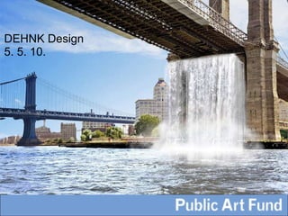
- 1. Group A Public Art Fund Website Redesign DEHNK Design 5. 5. 10.
- 4. User Needs Jeffrey King, Researcher: “ My work on Liz Craft’s catalog raisonne is nearly complete, but I need information on her PAF piece before I can send this to my editors." Susan Todd, Potential Donor: “ I want to donate my time and money with confidence, and feel like I’m making a difference.”
- 15. Or maybe a Talk...
- 20. How to visit a project?
- 23. Translating text to image
- 33. DEHNK you very much.
Notes de l'éditeur
- Met with representatives of PAF to discuss goals for the site, other websites they liked and who typical users might be. This provided valuable information that helped us develop goals. Goals: Make images front and center. Utilize wealth of images in the archive. This may also help promote archive. Hope this will bring site more in line with the strategy of PAF. PAF does not have location in the traditional sense. For Patrons the site is its home. Making the site a destination will help to extend mission to the web. Also want to keep design simple, so it requires little maintenance, but can be easily updated to keep content fresh.hope
- Throughout process focuses design on typical users of the site. Art Enthusiast: primarily interested in what's new, when the next even will be and where she can find exhbitions. Journalist: is also interested in what's new, but wants detail: great images, artist bios and press releases.
- Researcher: likely interested in past exhibitions. Primarily interested in the archives. Donor: wants to know about PAF to see if its a match. Wants to know how her donation is used and wants donating to be easy.
- Also reviewed comparative arts web sites to see how they tackle issues related to design of the homepage, navigation and features such as search. Used this information to assess PAF's site among its peers and to develop a clear direction in the design.
- This is the current home page We wanted to find a way to make the visual aspect bigger and more fun to use On a typical screen, some of the lower content is cut off In our redesign, we fit all these objects into one sliding content browser... (next slide)
- This is our homepage design. The main feature of this page is the sliding featured content browser. This would include both current projects and upcoming events. The user can scroll through the images using the arrows on either side. If a user hovers the mouse over one of these images, some information about the project or event is revealed. If the user clicks on the image, he/she is brought to a page with more information. In the upper left corner, we added links to social media sites, a donation button, and a search tool. We decided to consolidate the current and archived projects into one area of the site. Next, I will show you how a user will locate an archived project...
- This is the current archive page. There is a lot of content here that we thought would be more accessible if it could be made both browsable and searchable.
- To find an archived project from the home page , a user would select projects from the main navigation.
- This is the projects page. It defaults to current and upcoming projects, which can be browsed using the sliding viewer. To find a project from, say, 2008, you can choose to browse the projects by date in the lower left.
- erin Next, the you would select the 2005-2009 date range from the drop down.
- This page will contain all projects from that date range. They can be browsed by scrolling through.. Once you find the project you'd like to view, click on it. It will bring you to the individual project page.
- This is an example of an individual project page. Again, you can scroll through the project images. To view more details about the project or an an artist's bio, you can select one of the options above the image and the content will fill in to the space where the image is.
- we've focused on making the art more visible, but we were also intent on delivering textual information in a visual way as well apart from keeping the site's presentation consistent, it also makes PAFs programming findable
- Talks page as it is currently. a large block of text to scan through only a single image to help users decide if they want to see a related talk
- using the sliding image viewer, the PAF can show case individual speakers with: -images of the artists' work -images of the artist themselves (name to a face) -or inhouse graphic design (PAF doesn't have to surrender their graphic identity) features: hover reveal and clickable images
- once user has selected talk from sliding viewer they come to an individual talk page. here they can: -see more of that artist's work -learn more about the artist and what the talk with cover, note on full series -find downloadable content: video/audio from other events, reviews, etc.
- they can also buy tickets on the same page. once users have decided they want to attend, why make them click away from the content they're interested in? features: separate buttons for single/series talks. still encourages users to participate more
- currently, users click and scroll through static pages to locate written directions why not use a visual navigation tool that many people are already familiar with
- google maps modified for our purpose, now includes: zoom tool (map stick click and drag) directions icon, to print directions to all current exhibitions weather widget, to pop up local weather all art appears as a pinpoint on map. clicking on pinpoints reveals info about that piece. this pop up is linked to the individual page for that project.
- what to do with pages that are, out of neccesity completely text oriented. PAF attempts to lighten the text with images on their about page, but the links seem random and are dominated/out of balance with statements
- promote projects by including prominant images everywhere...
- so even in cases where text is unavoidable, images break up the visual space and make it seem less cluttered.
- katie Before we were able to perfect our redesign we performed a series of tests to ensure that our labeling and design features were clear and usable. We used two testing methods: Open Card Sorting and Paper Prototyping For our Open Card Sort We wrote words on index cards that correspond with different areas of the site and asked participants to organize them and apply labels to their groupings. The purpose of this task is to determine how users mentally classify the cards, and the vocabulary they use to describe them. When patterns emerged during the card sort, we gained ideas for organizing the information. We used this data to guide a prototype of our design. We created a set of tasks and tested the prototypes on people who fit into our user types: Researcher, Potential Donor, Hipster, and Journalist.
- katie: Responses: Our testers had very positive things to say about our redesign Jeffrey the researcher remarked that he was not used to being on an art website with "Actual Content", and was impressed with the search functions Susan the donor responded well to the visual design of the About page, which is normally very text heavy. She thought separating the various topics into categories and assignming them a visual element made the page more interesting.
- davida taking what was best in the old site and making it more robust. making it simpler for each user to get what they want immediately, regardless of their web skills -- the content is immediately accessible.
- davida the 5 templates 1. the sliding image 2.basic info page 3. the store. 4. interactive map 5. goings on all pages are slight variants on these themes, making it simpler to construct and simpler to maintain we envision changes in the goings on page to be paramount minimum maintenance to create exciting, dynamic changes easily.
- davida the organization has no physical home for the public