SlideShare une entreprise Scribd logo
1  sur  9
The colour of the masthead is red which is bright and
vibrant that attracts the reader attention because it
stand out from the rest of the background and the image
and text itself.
There is a information skyline above the masthead that
is in blue which makes the reader want to look at it
because it’s a bright blue which automatically the reader
will look at the colours that stand out the most.
The preview image of the magazine on the information
skyline has light green colours that stand out on the
actual cover page because the colours in the main image
and words are very dull and tonal such as black, white
and greys so the colour of the preview magazine on the
information skyline stands out on the cover page. The
colours of this cover gives the impression that the
magazine uses music that isn’t pop related as if it was
about pop music, it would bright and light colours not
blacks and greys on the cover.
The image and words fit together well because the main
cover line that says “Arctic Monkeys” links to image as
the image is of Arctic Monkeys. The fonts that are used
are bold. The cover line stands out the most as it is the
main story of the magazine and because it relates to the
image.
The fonts are in capitals so it stands to the reader
because its bold and one of the cover lines which is the
Richard Branson one has a quote underneath that is
pulled out from the article. This shows the reader what is
inside and it makes the reader want to read on to know
more about it.
The image is of Arctic Monkeys. This represents to the
target reader that enjoys that genre of music that listens
to Arctic Monkeys and it relates to the main story of
them talking about their music career but and insight of
their lives.
The pose, hair and make up that Arctic Monkeys are doing creates an edgy
impression to the reader. It creates a rebellious look that suggests that they do their
own thing and have their own style compared to some groups and bands in the
music industry
The words such as the cover lines suggest that there is a lot inside the magazine and
is packed full of music. It also suggests that there is something for everyone with
different music interests
They suggest the interest of the reader by included different music artists not just
Arctic Monkeys.
From a distance, the words such as the cover lines are noticeable because the sizes
are a big size so its clear enough to read. However, the colour of the words are a
light colour so they stand out from a distance because the background/image are
dark colour so using the contrast of the colour compliment each other.
The cover stands out on a shelf because the “Q” with the red background is clear
and bright. The words stand out from a shelf because they stand out from the cover
and they are a large size fonts so they become noticeable.
The masthead of the contents page is
bright red that automatically attracts the
readers attention because it stands out
brightly from the white background
The font of the contents title is big and noticeable that shows clearly to
reader that it is the contents page. The title is a san serif font
The date of the magazine is in a serif font and a smaller size
so it doesn’t over power the title f the contents
The page numbers are in a san serif
font and is made bold and black and a
bigger size so it draws the readers
attention of where everything is
clearly
This font is a serif font because it is a sidebar
that has additional information so it isn’t as
important as the main information on the
other column with the page numbers
There are text boxes that show what the images is. They use
text boxes because it stands to the reader because of the
colours they use. They use colour such as white text in a black
box or black text with a green box.
The image and words work well
together as the page numbers are
based on the music artist and the
images are of music artists as well
This font is a serif font and the colour links to the masthead title as they
both have black. They have used a serif font and put it in capitals because
they are music artists that are well known so this grabs the readers
attention because people know of them well so they want to now about
and the reviews of it which suggests that it is new material released by
them
The images include Arctic
Monkeys from the cover page
as it is the main story. It also
includes other bands /groups
that link to the contents page The font below the page number and titles are serif. This is so that it
makes the headings and page numbers stand out more and attracts
the readers attention.
The colours in this double spread are very
different. There are very bright colours such
as blue, red, purple and green. These are
colours create a lively mood for the reader
and it creates a good impression on the
reader.
On the article, it includes a red sidebar which
is red. By using red for the sidebar it shows
that Q Magazine sticks to the same sort of
colour when it comes to background and text.
It relates back to the contents page and the
cover page as the mastheads on them are red
as well. It shows that the company stick to the
same colour so it all fits well. There is a pull
quote on the second page of the article and it
is in red so it stands out from the rest of the
article and they chose red because it sticks to
the logo of the magazine.
There is also a drop cap at the beginning of
the article . This enhances the look of the
page. The page and words are the arranged
around the drop cap. The drop cap has a red
background and the letter is white which
relates back to the Q
The words and images fit together by using
images that relate to the words which the
images are images of Metallica and the words
in the article is about them.
The fonts on the title of “Enter Cameraman”
is in sans serif font and is a big size because it
is the main heading. Below the heading it has
a sentence that tell you what it is about. It is
in a serif font so it don’t stand out more than
the heading. This fit with the images because
it shows the image of their feature film and
the sentence tells the reader that. There are
also a caption for the images so that fits in
well because its showing what the images
represent and what it is.
The images are features of Metallica’s new film. It represents what features in their film.
It is like a preview and an idea to the reader of what the film is like so its trying to set a
good impression of the film to the reader.
The pose of these images are a rock style pose. This is because they are performing
which it wasn’t a planned pose because it was taking during the performance.
The other images on the second page, have more of a creative outlook and the costumes
present the images well and show detail of what is included. This suggests to the reader
that there is a lot going on in these images and is busy.
The masthead is red. This suggests to the reader that the
magazine is good because red is vibrant colour so it creates
a lively impression.
The colours such as the blue, yellow and pink in the image
gives the impression that it includes all different types of
music because when you see bright colours such as yellow
and pink it suggests pop music. However, there are dark
colours in the image such as grey, black and white that also
suggest the type of music that is included in the magazine.
The image is of David Bowie. This represents that he is back
again. The image gives this impression because he is in a
suit. This suggests to the reader that he trying to make a
good impression again.
The pose, hair and make up suggest that he is trying to get
into the modern ways. His facial expression suggest that he
is confused or is looking at the way music has become and
he is trying to get into the way music has become. The pose,
hair and make up suggest to the reader that he has made a
change for his come back to be successful and able to be as
big as he was before.
The text box under the mast head suggest to the reader
that the magazine is better. This persuades the reader to
read the magazine because the word “new” suggest s that
its better and has much more to give than it did previously.
This magazine cover uses language features such as “…” to create suspense
and when they say “again!” it creates a sense of sarcasm so its li9ke that he
has tried before and it hasn’t worked and so he's back again or it could
suggests that David Bowie is really successful and can still carry on. The
magazine also has a slogan near the barcode that says “The past, Present &
Future of Music” this suggests that this magazine are for people of all times.
The cover has used cover lines to suggest the interests of readers. They have
included different music artists listed so it shows that there are different
variety of music available for people to enjoy.
There are no puffs or buzz words to make the magazine stand out.
There are also no different fonts to pick out what the main cover lines are or
to compliment the look of the magazine
The cover from a distance is not readable. This is because the font is pretty
small and it a sans serif font so its quite a simple look.
The cover would not stand out on a shelf because the words aren’t bold and
not different sizes for the cover lines.
This cover does not give a good indication of what is inside this magazine
because there are just different words placed randomly so there is no actual
theme running through this magazine.
This magazine is designed for people that are interested in different kinds of
music and people that want to know a lot about music and what is going on.
The publisher of this magazine is Martin Mull.
This magazine would be seen in mainly newsagents or supermarkets that sell
a variety of music magazines.
The masthead of the contents page is on the
left side and is in capitals. The colour of the
title is black. By having a black title it stands
out to the reader.
Using the magazine logo on the contents page.
Uses a text box to put other stories that was not on the
cover to stand out. Uses a red background and white text.
Sticks to the same style as the NME logo.
The page number are just in
little section and the colours
are related back to the red,
white and black
The image and the words fit well together as with
the images they use, there are words with them.
The fonts that are used in the contents page is sans serif
fonts. The fonts are quite simple and the sizes are not that
big.
The images don’t relate back
to the cover page
The Images that are featured in the
contents page is Jake Bugg, David Bowie
and Mia. The represents that there are
music artists from the past, present and
future
The language that is used is a lot of Rhetorical
Questions. This attracts the reader to read on and
find out more by reading the rest of the magazine
Has a contributors column at the bottom of the
page. This represents what kind of people take part
in creating the magazine.
The headings and different
sections in the columns
suggests that there is a lot
going on such as interviews,
reviews and picks from NME.
The gives ideas to the reader.
The reader would not be able to identify the contents with a
glance because it is not clear that is the contents page
because it does not specifically say that this is the contents
page and also because the majority of the page number are
in small font and don’t stand out at all.
The cover and the contents image do not relate to each other as
the feature of the magazine is on the left hand side of the of the
contents page so it does not attract the reader with the main cover
stories.
The colours in double spread article
are mainly light green, brown, black
and yellow.
These colour create a relaxing
mood so the reader can just sit
there calmly and read it.
The impression that the colours
present is that is not in this country
which isn’t because of what the
title says.
The words and the image fit
together well as they relate to the
same topic as the image is of the
singer from The killer and the it is
taken In China and the article is
talking about it.
The fonts that have been used are
the sans serif fonts because its
quite a simple article. There are
also pull quotes from the article
that has been put into a bigger
sized fonts so the reader can pick it
up easily. They have picked these
up so that it sound more interested
and breaks up the article a bit so it
does not just in one block.
There is a drop cap at the beginning
of the article to draw the readers
attention and then the rest of the
words a arranged around the drop
cap.
The image represents the group
touring in China and it is seen as a
crisis as they have took the picture
in landscaped area.
The pose of the Brandon Flowers in this image is quite laid
back and relaxed. It suggests to the reader that he is
thinking because he is looking at the view and thinking
about the tour. It suggests to the reader that Brandon
Flowers is just as normal as the readers as he is dressed
casual and sitting very casual.
The title creates a dramatic feel to the article as its got
“Crisis” in it. This suggests to the reader that there is
something wrong with the group or tour.
The suggest the interest of the readers in this article by the
underlined text under the title. The people that would be
interested in this article are people that are interested in
tour, group/bands and get insight of what it is like to be on
tour in the music industry.
The size and layout is a relative normal size and the layout
is the same layout as what most magazines tend to go with
so it is readable from a distance.
There is also a side bar on the double spread that is in a
bright pink colour which draws the readers attention
because the colours are bright compared to the double
spread article itself because the colours are quite pale.
The double spread page addresses the reader to grab their
attention by the title “China Crisis” because they both begin
with “C” which sounds quite dramatic.
The language feature they use in this double spread page
such as using phrases such as “They’re the lost dogs” . This
exaggerates the point that they deserve more recognition
for their music
The words such as the title does not give indication of what's inside the article because it does
not really talk a lot about the “China Crisis” because it talks about all different things as well as
the touring in China.
The masthead is red. This creates a rock and rebellious
impression and mood to the reader. The masthead is
in a sans serif font.
The image is of Bring Me The Horizon. They represent a todays
rock group. They represent rock bands to be quite serious apart
from the member at the front that seems to be joking sort of
person.
The cover includes greens, yellows, white
and blacks in the image , side bars and text.
This creates a lively mood to the reader.
The cover title is a bright yellow colour. The font is a serif font. The cover
line stands out from the image that attracts the audiences attention
because the cover line bursts out from the image. The cover line also has
a pull quote from the article inside the magazine. This attracts the reader
to read more into the magazine.
There is a free gift that comes with the
magazine. On the CD there is a puff that
says “Free” this attracts the reader to
buy the magazine because people that
are interested into rock music would find
this a good gift because it has music they
are interested in.
There is sidebar on the cover.
There are different kinds of fonts
that attracts the readers attention
because the they are bold and
colourful.
The size and layout is clear enough to see from a
distance because the colour is bright and vibrant and
the fonts are a big size. The cover will stand out on a
shelf because the colours stand out and the text is very
creative and all the fonts are different to each other.
There is also a text box bottom right of the page that has a
green background with yellow and white text. This suggests
to the reader that there is lots of different music artists.
This magazine cover gives a good indication of what's inside
because the masthead give away that clue that it is for people that
are into rock music
Used different fonts to make the
cover lines stand out. However,
the colours also helps as the white
and yellow font stand out from the
magazine
There is a pull quote to show what content is included in
the Double Page Spread. Gives the audience an insight
of the interview.
The contents page is a
double spread page.
The contents page also
includes a editors note
as well on the left hand
side of the contents
page. The editors note
makes the audience
feel that they are more
involved in the
magazine company and
it feels more direct.
The right hand side of the page has the
page numbers and the headings and
information on that page.
The page numbers are in bold sans serif
font in black because this attracts the
readers attention because it stands out
from the red background . The red
background of the page numbers attracts
the readers attention because it the rest
of the background is white so the red
stands out.
The headline are yellow and the red
compliments the yellow because it means
the yellow creates a bright look to it.
There are lots of images that fit well with the words and
text. This is so the images break down the text. The use
of both images and texts to present the page numbers is
a good way to grab the readers attention because people
like to see images instead of words sometimes. By using
images, it gives a creative effect and adds a lot interest to
the contents page
There is a sidebar on the contents page which has a
black background. The black background
compliments the yellow and white text because it
makes it stand out more.
This is the flannel panel where there is information
on a subject. The subject is “19 new bands” It uses
a puff to attract the audience eyeFrom a distance, the
words are very
noticeable because
the colours of the
text are very vibrant
and bright that stands
out so people can
notice it. The images are scattered around the
contents page which are in frames and
are layered on top of each other to give
the style of a scrapbook
There are recognisable fonts as they are very similar to
the fonts that are used in the front cover. There is font
in the right side of the page that is yellow (refers back
to front cover)
Article features inside the
magazine. It also has a blurb
underneath the article
features because it gives the
audience an insight of what is
in the article and it means the
audience can just jumps to
that page if it interests them
Under the editors note
there is a picture of
the editor with a
caption saying that the
photo is the editor
The colours create and very rock
feeling in this this article. The
background colour is quite dark so
it creates a dangerous
atmosphere. The colour of the
text and cover title stands out
because they are light and the
background is dark
The image is of AFL which are a rock group. The
image and words work well together because the
text works around the image instead of the image
working around the text.
There is a pull quote from the article that has a bigger sized font. This
attracts the readers attention because if they are interested they can
read more
The title stands out and shows the reader what the article is
about. The title give a rebellious effect. This is because havok
means trouble or chaos
The writer of this article is by
Pete Withers.
There is a text box that includes a quote
or saying by Davey. By adding text boxes
it helps to break up information in the
article instead of having in one beg
column
The yellow heading help to break up the article a bit
more so the article doesn’t look like one big essay. This
attracts the reader more because then they don’t think
there is a lot of information and they can just read the
parts that interest them more
There is a littler image of AFL
that connects to the text box or
caption
The people that would be interested in this is
the people that are a fan of this group or are
interested in music groups in general and
wanting to know a bit on inside information on
the music group
The pose that the group is pulling is very serious. This suggests
that their music is very serious itself and they are serious about
their careers. Their hair styles shows the reader that they are a
rock group and the style is very dark coloured and simple

Contenu connexe

Tendances

Rolling stones power point o
Rolling stones power point oRolling stones power point o
Rolling stones power point ochewitt5
 
Media research 2
Media research 2Media research 2
Media research 2abbiestone
 
Music magazines analysis
Music magazines analysisMusic magazines analysis
Music magazines analysishsmedia16
 
Evaluation of my music magazine ‘volume’
Evaluation of my music magazine ‘volume’Evaluation of my music magazine ‘volume’
Evaluation of my music magazine ‘volume’Jessie Nelson
 
Existing Mastheads Analysis
Existing Mastheads AnalysisExisting Mastheads Analysis
Existing Mastheads Analysisellagreyx
 
Analysis of Music Magazines
Analysis of Music MagazinesAnalysis of Music Magazines
Analysis of Music MagazinesBeniboy39
 
Compare and contrast of two music magazines
Compare and contrast of two music magazinesCompare and contrast of two music magazines
Compare and contrast of two music magazinesleomatcham
 
Final magazine analysis
Final magazine analysisFinal magazine analysis
Final magazine analysisIsabelle Humm
 
Analysing magazines
Analysing magazines Analysing magazines
Analysing magazines TPS_OM
 
Feature Article Analysis
Feature Article AnalysisFeature Article Analysis
Feature Article Analysisellagreyx
 
Researching and analysing magazines
Researching and analysing magazinesResearching and analysing magazines
Researching and analysing magazinesabigailmusic
 
Textual analysis presentation
Textual analysis presentationTextual analysis presentation
Textual analysis presentationDarbySavage
 
Comparing magazine front covers
Comparing magazine front coversComparing magazine front covers
Comparing magazine front coversajeetrs
 
Similarities And Differences Between Different Magazines
Similarities And Differences Between Different MagazinesSimilarities And Differences Between Different Magazines
Similarities And Differences Between Different MagazinesMaaZe
 
Music Magazine Collarge2
Music Magazine Collarge2Music Magazine Collarge2
Music Magazine Collarge2alex
 
Music magazine double page spread
Music magazine double page spreadMusic magazine double page spread
Music magazine double page spreadSashawallen
 

Tendances (20)

Rolling stones power point o
Rolling stones power point oRolling stones power point o
Rolling stones power point o
 
Media research 2
Media research 2Media research 2
Media research 2
 
Music magazines analysis
Music magazines analysisMusic magazines analysis
Music magazines analysis
 
Magazine analysis
Magazine analysisMagazine analysis
Magazine analysis
 
Evaluation of my music magazine ‘volume’
Evaluation of my music magazine ‘volume’Evaluation of my music magazine ‘volume’
Evaluation of my music magazine ‘volume’
 
Existing Mastheads Analysis
Existing Mastheads AnalysisExisting Mastheads Analysis
Existing Mastheads Analysis
 
Analysis of Music Magazines
Analysis of Music MagazinesAnalysis of Music Magazines
Analysis of Music Magazines
 
Compare and contrast of two music magazines
Compare and contrast of two music magazinesCompare and contrast of two music magazines
Compare and contrast of two music magazines
 
Final magazine analysis
Final magazine analysisFinal magazine analysis
Final magazine analysis
 
Analysing magazines
Analysing magazines Analysing magazines
Analysing magazines
 
Feature Article Analysis
Feature Article AnalysisFeature Article Analysis
Feature Article Analysis
 
Researching and analysing magazines
Researching and analysing magazinesResearching and analysing magazines
Researching and analysing magazines
 
Textual analysis presentation
Textual analysis presentationTextual analysis presentation
Textual analysis presentation
 
Comparing magazine front covers
Comparing magazine front coversComparing magazine front covers
Comparing magazine front covers
 
Textanalysis
TextanalysisTextanalysis
Textanalysis
 
Similarities And Differences Between Different Magazines
Similarities And Differences Between Different MagazinesSimilarities And Differences Between Different Magazines
Similarities And Differences Between Different Magazines
 
Question 1
Question 1Question 1
Question 1
 
Question 1
Question 1Question 1
Question 1
 
Music Magazine Collarge2
Music Magazine Collarge2Music Magazine Collarge2
Music Magazine Collarge2
 
Music magazine double page spread
Music magazine double page spreadMusic magazine double page spread
Music magazine double page spread
 

Similaire à Magazine analysis research

Contents Page Analysis
Contents Page AnalysisContents Page Analysis
Contents Page AnalysisSav1509
 
Media research 2
Media research 2Media research 2
Media research 2abbiestone
 
Media research 2
Media research 2Media research 2
Media research 2abbiestone
 
Industry analysis
Industry analysisIndustry analysis
Industry analysisdammyalaka
 
Tasks 1 4 and hwk 2
Tasks 1 4 and hwk 2Tasks 1 4 and hwk 2
Tasks 1 4 and hwk 2charlie__97
 
Analysis of music magazines
Analysis of music magazines Analysis of music magazines
Analysis of music magazines George Eldridge
 
Analysis of music magazines
Analysis of  music magazinesAnalysis of  music magazines
Analysis of music magazinesBirteb
 
Product Research
Product ResearchProduct Research
Product Researchbossmanb
 
Magazine Analysis
Magazine AnalysisMagazine Analysis
Magazine Analysisasmediae13
 
Presentation2 (1)
Presentation2 (1)Presentation2 (1)
Presentation2 (1)dankyjosh
 
Front cover magazine analysis
Front cover magazine analysisFront cover magazine analysis
Front cover magazine analysisJessicaCheung1998
 
Analysis of professional contents page
Analysis of professional contents pageAnalysis of professional contents page
Analysis of professional contents pageAlister43434
 
Tasks 1 4 and hwk 1
Tasks 1 4 and hwk 1Tasks 1 4 and hwk 1
Tasks 1 4 and hwk 1charlie__1
 
Music magazine front cover analysis
Music magazine front cover analysisMusic magazine front cover analysis
Music magazine front cover analysisJessicaCheung1998
 

Similaire à Magazine analysis research (20)

Contents Page Analysis
Contents Page AnalysisContents Page Analysis
Contents Page Analysis
 
Media research 2
Media research 2Media research 2
Media research 2
 
Media research 2
Media research 2Media research 2
Media research 2
 
Magazine Analysis
Magazine AnalysisMagazine Analysis
Magazine Analysis
 
Billboard
BillboardBillboard
Billboard
 
Industry analysis
Industry analysisIndustry analysis
Industry analysis
 
Tasks 1 4 and hwk 2
Tasks 1 4 and hwk 2Tasks 1 4 and hwk 2
Tasks 1 4 and hwk 2
 
Analysis of music magazines
Analysis of music magazines Analysis of music magazines
Analysis of music magazines
 
Audience appeal
Audience appealAudience appeal
Audience appeal
 
Magazine covers
Magazine coversMagazine covers
Magazine covers
 
Analysis of music magazines
Analysis of  music magazinesAnalysis of  music magazines
Analysis of music magazines
 
Product Research
Product ResearchProduct Research
Product Research
 
Magazine Analysis
Magazine AnalysisMagazine Analysis
Magazine Analysis
 
Presentation2 (1)
Presentation2 (1)Presentation2 (1)
Presentation2 (1)
 
Front cover magazine analysis
Front cover magazine analysisFront cover magazine analysis
Front cover magazine analysis
 
Analysis of professional contents page
Analysis of professional contents pageAnalysis of professional contents page
Analysis of professional contents page
 
Tasks 1 4 and hwk 1
Tasks 1 4 and hwk 1Tasks 1 4 and hwk 1
Tasks 1 4 and hwk 1
 
Music magazine front cover analysis
Music magazine front cover analysisMusic magazine front cover analysis
Music magazine front cover analysis
 
Mojo
MojoMojo
Mojo
 
Reasearch
ReasearchReasearch
Reasearch
 

Plus de hsmedia16

Evaluation Question 4
Evaluation Question 4Evaluation Question 4
Evaluation Question 4hsmedia16
 
Evaluation Question 3
Evaluation Question 3Evaluation Question 3
Evaluation Question 3hsmedia16
 
Digipak research
Digipak researchDigipak research
Digipak researchhsmedia16
 
The storyboard for music video
The storyboard for music videoThe storyboard for music video
The storyboard for music videohsmedia16
 
What have you learnt about the technologies for the construction of this product
What have you learnt about the technologies for the construction of this productWhat have you learnt about the technologies for the construction of this product
What have you learnt about the technologies for the construction of this producthsmedia16
 
Inspirations for my photoshoot
Inspirations for my photoshootInspirations for my photoshoot
Inspirations for my photoshoothsmedia16
 

Plus de hsmedia16 (6)

Evaluation Question 4
Evaluation Question 4Evaluation Question 4
Evaluation Question 4
 
Evaluation Question 3
Evaluation Question 3Evaluation Question 3
Evaluation Question 3
 
Digipak research
Digipak researchDigipak research
Digipak research
 
The storyboard for music video
The storyboard for music videoThe storyboard for music video
The storyboard for music video
 
What have you learnt about the technologies for the construction of this product
What have you learnt about the technologies for the construction of this productWhat have you learnt about the technologies for the construction of this product
What have you learnt about the technologies for the construction of this product
 
Inspirations for my photoshoot
Inspirations for my photoshootInspirations for my photoshoot
Inspirations for my photoshoot
 

Dernier

Introduction to Nonprofit Accounting: The Basics
Introduction to Nonprofit Accounting: The BasicsIntroduction to Nonprofit Accounting: The Basics
Introduction to Nonprofit Accounting: The BasicsTechSoup
 
9548086042 for call girls in Indira Nagar with room service
9548086042  for call girls in Indira Nagar  with room service9548086042  for call girls in Indira Nagar  with room service
9548086042 for call girls in Indira Nagar with room servicediscovermytutordmt
 
Web & Social Media Analytics Previous Year Question Paper.pdf
Web & Social Media Analytics Previous Year Question Paper.pdfWeb & Social Media Analytics Previous Year Question Paper.pdf
Web & Social Media Analytics Previous Year Question Paper.pdfJayanti Pande
 
General AI for Medical Educators April 2024
General AI for Medical Educators April 2024General AI for Medical Educators April 2024
General AI for Medical Educators April 2024Janet Corral
 
Explore beautiful and ugly buildings. Mathematics helps us create beautiful d...
Explore beautiful and ugly buildings. Mathematics helps us create beautiful d...Explore beautiful and ugly buildings. Mathematics helps us create beautiful d...
Explore beautiful and ugly buildings. Mathematics helps us create beautiful d...christianmathematics
 
Key note speaker Neum_Admir Softic_ENG.pdf
Key note speaker Neum_Admir Softic_ENG.pdfKey note speaker Neum_Admir Softic_ENG.pdf
Key note speaker Neum_Admir Softic_ENG.pdfAdmir Softic
 
Interactive Powerpoint_How to Master effective communication
Interactive Powerpoint_How to Master effective communicationInteractive Powerpoint_How to Master effective communication
Interactive Powerpoint_How to Master effective communicationnomboosow
 
SOCIAL AND HISTORICAL CONTEXT - LFTVD.pptx
SOCIAL AND HISTORICAL CONTEXT - LFTVD.pptxSOCIAL AND HISTORICAL CONTEXT - LFTVD.pptx
SOCIAL AND HISTORICAL CONTEXT - LFTVD.pptxiammrhaywood
 
1029 - Danh muc Sach Giao Khoa 10 . pdf
1029 -  Danh muc Sach Giao Khoa 10 . pdf1029 -  Danh muc Sach Giao Khoa 10 . pdf
1029 - Danh muc Sach Giao Khoa 10 . pdfQucHHunhnh
 
Activity 01 - Artificial Culture (1).pdf
Activity 01 - Artificial Culture (1).pdfActivity 01 - Artificial Culture (1).pdf
Activity 01 - Artificial Culture (1).pdfciinovamais
 
Measures of Dispersion and Variability: Range, QD, AD and SD
Measures of Dispersion and Variability: Range, QD, AD and SDMeasures of Dispersion and Variability: Range, QD, AD and SD
Measures of Dispersion and Variability: Range, QD, AD and SDThiyagu K
 
Russian Escort Service in Delhi 11k Hotel Foreigner Russian Call Girls in Delhi
Russian Escort Service in Delhi 11k Hotel Foreigner Russian Call Girls in DelhiRussian Escort Service in Delhi 11k Hotel Foreigner Russian Call Girls in Delhi
Russian Escort Service in Delhi 11k Hotel Foreigner Russian Call Girls in Delhikauryashika82
 
Student login on Anyboli platform.helpin
Student login on Anyboli platform.helpinStudent login on Anyboli platform.helpin
Student login on Anyboli platform.helpinRaunakKeshri1
 
Paris 2024 Olympic Geographies - an activity
Paris 2024 Olympic Geographies - an activityParis 2024 Olympic Geographies - an activity
Paris 2024 Olympic Geographies - an activityGeoBlogs
 
Measures of Central Tendency: Mean, Median and Mode
Measures of Central Tendency: Mean, Median and ModeMeasures of Central Tendency: Mean, Median and Mode
Measures of Central Tendency: Mean, Median and ModeThiyagu K
 
Z Score,T Score, Percential Rank and Box Plot Graph
Z Score,T Score, Percential Rank and Box Plot GraphZ Score,T Score, Percential Rank and Box Plot Graph
Z Score,T Score, Percential Rank and Box Plot GraphThiyagu K
 
Unit-IV- Pharma. Marketing Channels.pptx
Unit-IV- Pharma. Marketing Channels.pptxUnit-IV- Pharma. Marketing Channels.pptx
Unit-IV- Pharma. Marketing Channels.pptxVishalSingh1417
 

Dernier (20)

Introduction to Nonprofit Accounting: The Basics
Introduction to Nonprofit Accounting: The BasicsIntroduction to Nonprofit Accounting: The Basics
Introduction to Nonprofit Accounting: The Basics
 
9548086042 for call girls in Indira Nagar with room service
9548086042  for call girls in Indira Nagar  with room service9548086042  for call girls in Indira Nagar  with room service
9548086042 for call girls in Indira Nagar with room service
 
Web & Social Media Analytics Previous Year Question Paper.pdf
Web & Social Media Analytics Previous Year Question Paper.pdfWeb & Social Media Analytics Previous Year Question Paper.pdf
Web & Social Media Analytics Previous Year Question Paper.pdf
 
General AI for Medical Educators April 2024
General AI for Medical Educators April 2024General AI for Medical Educators April 2024
General AI for Medical Educators April 2024
 
Explore beautiful and ugly buildings. Mathematics helps us create beautiful d...
Explore beautiful and ugly buildings. Mathematics helps us create beautiful d...Explore beautiful and ugly buildings. Mathematics helps us create beautiful d...
Explore beautiful and ugly buildings. Mathematics helps us create beautiful d...
 
Key note speaker Neum_Admir Softic_ENG.pdf
Key note speaker Neum_Admir Softic_ENG.pdfKey note speaker Neum_Admir Softic_ENG.pdf
Key note speaker Neum_Admir Softic_ENG.pdf
 
Advance Mobile Application Development class 07
Advance Mobile Application Development class 07Advance Mobile Application Development class 07
Advance Mobile Application Development class 07
 
Código Creativo y Arte de Software | Unidad 1
Código Creativo y Arte de Software | Unidad 1Código Creativo y Arte de Software | Unidad 1
Código Creativo y Arte de Software | Unidad 1
 
Interactive Powerpoint_How to Master effective communication
Interactive Powerpoint_How to Master effective communicationInteractive Powerpoint_How to Master effective communication
Interactive Powerpoint_How to Master effective communication
 
SOCIAL AND HISTORICAL CONTEXT - LFTVD.pptx
SOCIAL AND HISTORICAL CONTEXT - LFTVD.pptxSOCIAL AND HISTORICAL CONTEXT - LFTVD.pptx
SOCIAL AND HISTORICAL CONTEXT - LFTVD.pptx
 
1029 - Danh muc Sach Giao Khoa 10 . pdf
1029 -  Danh muc Sach Giao Khoa 10 . pdf1029 -  Danh muc Sach Giao Khoa 10 . pdf
1029 - Danh muc Sach Giao Khoa 10 . pdf
 
Activity 01 - Artificial Culture (1).pdf
Activity 01 - Artificial Culture (1).pdfActivity 01 - Artificial Culture (1).pdf
Activity 01 - Artificial Culture (1).pdf
 
Measures of Dispersion and Variability: Range, QD, AD and SD
Measures of Dispersion and Variability: Range, QD, AD and SDMeasures of Dispersion and Variability: Range, QD, AD and SD
Measures of Dispersion and Variability: Range, QD, AD and SD
 
Russian Escort Service in Delhi 11k Hotel Foreigner Russian Call Girls in Delhi
Russian Escort Service in Delhi 11k Hotel Foreigner Russian Call Girls in DelhiRussian Escort Service in Delhi 11k Hotel Foreigner Russian Call Girls in Delhi
Russian Escort Service in Delhi 11k Hotel Foreigner Russian Call Girls in Delhi
 
Student login on Anyboli platform.helpin
Student login on Anyboli platform.helpinStudent login on Anyboli platform.helpin
Student login on Anyboli platform.helpin
 
Paris 2024 Olympic Geographies - an activity
Paris 2024 Olympic Geographies - an activityParis 2024 Olympic Geographies - an activity
Paris 2024 Olympic Geographies - an activity
 
Measures of Central Tendency: Mean, Median and Mode
Measures of Central Tendency: Mean, Median and ModeMeasures of Central Tendency: Mean, Median and Mode
Measures of Central Tendency: Mean, Median and Mode
 
Z Score,T Score, Percential Rank and Box Plot Graph
Z Score,T Score, Percential Rank and Box Plot GraphZ Score,T Score, Percential Rank and Box Plot Graph
Z Score,T Score, Percential Rank and Box Plot Graph
 
Unit-IV- Pharma. Marketing Channels.pptx
Unit-IV- Pharma. Marketing Channels.pptxUnit-IV- Pharma. Marketing Channels.pptx
Unit-IV- Pharma. Marketing Channels.pptx
 
INDIA QUIZ 2024 RLAC DELHI UNIVERSITY.pptx
INDIA QUIZ 2024 RLAC DELHI UNIVERSITY.pptxINDIA QUIZ 2024 RLAC DELHI UNIVERSITY.pptx
INDIA QUIZ 2024 RLAC DELHI UNIVERSITY.pptx
 

Magazine analysis research

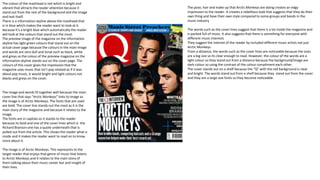
  • 1. The colour of the masthead is red which is bright and vibrant that attracts the reader attention because it stand out from the rest of the background and the image and text itself. There is a information skyline above the masthead that is in blue which makes the reader want to look at it because it’s a bright blue which automatically the reader will look at the colours that stand out the most. The preview image of the magazine on the information skyline has light green colours that stand out on the actual cover page because the colours in the main image and words are very dull and tonal such as black, white and greys so the colour of the preview magazine on the information skyline stands out on the cover page. The colours of this cover gives the impression that the magazine uses music that isn’t pop related as if it was about pop music, it would bright and light colours not blacks and greys on the cover. The image and words fit together well because the main cover line that says “Arctic Monkeys” links to image as the image is of Arctic Monkeys. The fonts that are used are bold. The cover line stands out the most as it is the main story of the magazine and because it relates to the image. The fonts are in capitals so it stands to the reader because its bold and one of the cover lines which is the Richard Branson one has a quote underneath that is pulled out from the article. This shows the reader what is inside and it makes the reader want to read on to know more about it. The image is of Arctic Monkeys. This represents to the target reader that enjoys that genre of music that listens to Arctic Monkeys and it relates to the main story of them talking about their music career but and insight of their lives. The pose, hair and make up that Arctic Monkeys are doing creates an edgy impression to the reader. It creates a rebellious look that suggests that they do their own thing and have their own style compared to some groups and bands in the music industry The words such as the cover lines suggest that there is a lot inside the magazine and is packed full of music. It also suggests that there is something for everyone with different music interests They suggest the interest of the reader by included different music artists not just Arctic Monkeys. From a distance, the words such as the cover lines are noticeable because the sizes are a big size so its clear enough to read. However, the colour of the words are a light colour so they stand out from a distance because the background/image are dark colour so using the contrast of the colour compliment each other. The cover stands out on a shelf because the “Q” with the red background is clear and bright. The words stand out from a shelf because they stand out from the cover and they are a large size fonts so they become noticeable.
  • 2. The masthead of the contents page is bright red that automatically attracts the readers attention because it stands out brightly from the white background The font of the contents title is big and noticeable that shows clearly to reader that it is the contents page. The title is a san serif font The date of the magazine is in a serif font and a smaller size so it doesn’t over power the title f the contents The page numbers are in a san serif font and is made bold and black and a bigger size so it draws the readers attention of where everything is clearly This font is a serif font because it is a sidebar that has additional information so it isn’t as important as the main information on the other column with the page numbers There are text boxes that show what the images is. They use text boxes because it stands to the reader because of the colours they use. They use colour such as white text in a black box or black text with a green box. The image and words work well together as the page numbers are based on the music artist and the images are of music artists as well This font is a serif font and the colour links to the masthead title as they both have black. They have used a serif font and put it in capitals because they are music artists that are well known so this grabs the readers attention because people know of them well so they want to now about and the reviews of it which suggests that it is new material released by them The images include Arctic Monkeys from the cover page as it is the main story. It also includes other bands /groups that link to the contents page The font below the page number and titles are serif. This is so that it makes the headings and page numbers stand out more and attracts the readers attention.
  • 3. The colours in this double spread are very different. There are very bright colours such as blue, red, purple and green. These are colours create a lively mood for the reader and it creates a good impression on the reader. On the article, it includes a red sidebar which is red. By using red for the sidebar it shows that Q Magazine sticks to the same sort of colour when it comes to background and text. It relates back to the contents page and the cover page as the mastheads on them are red as well. It shows that the company stick to the same colour so it all fits well. There is a pull quote on the second page of the article and it is in red so it stands out from the rest of the article and they chose red because it sticks to the logo of the magazine. There is also a drop cap at the beginning of the article . This enhances the look of the page. The page and words are the arranged around the drop cap. The drop cap has a red background and the letter is white which relates back to the Q The words and images fit together by using images that relate to the words which the images are images of Metallica and the words in the article is about them. The fonts on the title of “Enter Cameraman” is in sans serif font and is a big size because it is the main heading. Below the heading it has a sentence that tell you what it is about. It is in a serif font so it don’t stand out more than the heading. This fit with the images because it shows the image of their feature film and the sentence tells the reader that. There are also a caption for the images so that fits in well because its showing what the images represent and what it is. The images are features of Metallica’s new film. It represents what features in their film. It is like a preview and an idea to the reader of what the film is like so its trying to set a good impression of the film to the reader. The pose of these images are a rock style pose. This is because they are performing which it wasn’t a planned pose because it was taking during the performance. The other images on the second page, have more of a creative outlook and the costumes present the images well and show detail of what is included. This suggests to the reader that there is a lot going on in these images and is busy.
  • 4. The masthead is red. This suggests to the reader that the magazine is good because red is vibrant colour so it creates a lively impression. The colours such as the blue, yellow and pink in the image gives the impression that it includes all different types of music because when you see bright colours such as yellow and pink it suggests pop music. However, there are dark colours in the image such as grey, black and white that also suggest the type of music that is included in the magazine. The image is of David Bowie. This represents that he is back again. The image gives this impression because he is in a suit. This suggests to the reader that he trying to make a good impression again. The pose, hair and make up suggest that he is trying to get into the modern ways. His facial expression suggest that he is confused or is looking at the way music has become and he is trying to get into the way music has become. The pose, hair and make up suggest to the reader that he has made a change for his come back to be successful and able to be as big as he was before. The text box under the mast head suggest to the reader that the magazine is better. This persuades the reader to read the magazine because the word “new” suggest s that its better and has much more to give than it did previously. This magazine cover uses language features such as “…” to create suspense and when they say “again!” it creates a sense of sarcasm so its li9ke that he has tried before and it hasn’t worked and so he's back again or it could suggests that David Bowie is really successful and can still carry on. The magazine also has a slogan near the barcode that says “The past, Present & Future of Music” this suggests that this magazine are for people of all times. The cover has used cover lines to suggest the interests of readers. They have included different music artists listed so it shows that there are different variety of music available for people to enjoy. There are no puffs or buzz words to make the magazine stand out. There are also no different fonts to pick out what the main cover lines are or to compliment the look of the magazine The cover from a distance is not readable. This is because the font is pretty small and it a sans serif font so its quite a simple look. The cover would not stand out on a shelf because the words aren’t bold and not different sizes for the cover lines. This cover does not give a good indication of what is inside this magazine because there are just different words placed randomly so there is no actual theme running through this magazine. This magazine is designed for people that are interested in different kinds of music and people that want to know a lot about music and what is going on. The publisher of this magazine is Martin Mull. This magazine would be seen in mainly newsagents or supermarkets that sell a variety of music magazines.
  • 5. The masthead of the contents page is on the left side and is in capitals. The colour of the title is black. By having a black title it stands out to the reader. Using the magazine logo on the contents page. Uses a text box to put other stories that was not on the cover to stand out. Uses a red background and white text. Sticks to the same style as the NME logo. The page number are just in little section and the colours are related back to the red, white and black The image and the words fit well together as with the images they use, there are words with them. The fonts that are used in the contents page is sans serif fonts. The fonts are quite simple and the sizes are not that big. The images don’t relate back to the cover page The Images that are featured in the contents page is Jake Bugg, David Bowie and Mia. The represents that there are music artists from the past, present and future The language that is used is a lot of Rhetorical Questions. This attracts the reader to read on and find out more by reading the rest of the magazine Has a contributors column at the bottom of the page. This represents what kind of people take part in creating the magazine. The headings and different sections in the columns suggests that there is a lot going on such as interviews, reviews and picks from NME. The gives ideas to the reader. The reader would not be able to identify the contents with a glance because it is not clear that is the contents page because it does not specifically say that this is the contents page and also because the majority of the page number are in small font and don’t stand out at all. The cover and the contents image do not relate to each other as the feature of the magazine is on the left hand side of the of the contents page so it does not attract the reader with the main cover stories.
  • 6. The colours in double spread article are mainly light green, brown, black and yellow. These colour create a relaxing mood so the reader can just sit there calmly and read it. The impression that the colours present is that is not in this country which isn’t because of what the title says. The words and the image fit together well as they relate to the same topic as the image is of the singer from The killer and the it is taken In China and the article is talking about it. The fonts that have been used are the sans serif fonts because its quite a simple article. There are also pull quotes from the article that has been put into a bigger sized fonts so the reader can pick it up easily. They have picked these up so that it sound more interested and breaks up the article a bit so it does not just in one block. There is a drop cap at the beginning of the article to draw the readers attention and then the rest of the words a arranged around the drop cap. The image represents the group touring in China and it is seen as a crisis as they have took the picture in landscaped area. The pose of the Brandon Flowers in this image is quite laid back and relaxed. It suggests to the reader that he is thinking because he is looking at the view and thinking about the tour. It suggests to the reader that Brandon Flowers is just as normal as the readers as he is dressed casual and sitting very casual. The title creates a dramatic feel to the article as its got “Crisis” in it. This suggests to the reader that there is something wrong with the group or tour. The suggest the interest of the readers in this article by the underlined text under the title. The people that would be interested in this article are people that are interested in tour, group/bands and get insight of what it is like to be on tour in the music industry. The size and layout is a relative normal size and the layout is the same layout as what most magazines tend to go with so it is readable from a distance. There is also a side bar on the double spread that is in a bright pink colour which draws the readers attention because the colours are bright compared to the double spread article itself because the colours are quite pale. The double spread page addresses the reader to grab their attention by the title “China Crisis” because they both begin with “C” which sounds quite dramatic. The language feature they use in this double spread page such as using phrases such as “They’re the lost dogs” . This exaggerates the point that they deserve more recognition for their music The words such as the title does not give indication of what's inside the article because it does not really talk a lot about the “China Crisis” because it talks about all different things as well as the touring in China.
  • 7. The masthead is red. This creates a rock and rebellious impression and mood to the reader. The masthead is in a sans serif font. The image is of Bring Me The Horizon. They represent a todays rock group. They represent rock bands to be quite serious apart from the member at the front that seems to be joking sort of person. The cover includes greens, yellows, white and blacks in the image , side bars and text. This creates a lively mood to the reader. The cover title is a bright yellow colour. The font is a serif font. The cover line stands out from the image that attracts the audiences attention because the cover line bursts out from the image. The cover line also has a pull quote from the article inside the magazine. This attracts the reader to read more into the magazine. There is a free gift that comes with the magazine. On the CD there is a puff that says “Free” this attracts the reader to buy the magazine because people that are interested into rock music would find this a good gift because it has music they are interested in. There is sidebar on the cover. There are different kinds of fonts that attracts the readers attention because the they are bold and colourful. The size and layout is clear enough to see from a distance because the colour is bright and vibrant and the fonts are a big size. The cover will stand out on a shelf because the colours stand out and the text is very creative and all the fonts are different to each other. There is also a text box bottom right of the page that has a green background with yellow and white text. This suggests to the reader that there is lots of different music artists. This magazine cover gives a good indication of what's inside because the masthead give away that clue that it is for people that are into rock music Used different fonts to make the cover lines stand out. However, the colours also helps as the white and yellow font stand out from the magazine There is a pull quote to show what content is included in the Double Page Spread. Gives the audience an insight of the interview.
  • 8. The contents page is a double spread page. The contents page also includes a editors note as well on the left hand side of the contents page. The editors note makes the audience feel that they are more involved in the magazine company and it feels more direct. The right hand side of the page has the page numbers and the headings and information on that page. The page numbers are in bold sans serif font in black because this attracts the readers attention because it stands out from the red background . The red background of the page numbers attracts the readers attention because it the rest of the background is white so the red stands out. The headline are yellow and the red compliments the yellow because it means the yellow creates a bright look to it. There are lots of images that fit well with the words and text. This is so the images break down the text. The use of both images and texts to present the page numbers is a good way to grab the readers attention because people like to see images instead of words sometimes. By using images, it gives a creative effect and adds a lot interest to the contents page There is a sidebar on the contents page which has a black background. The black background compliments the yellow and white text because it makes it stand out more. This is the flannel panel where there is information on a subject. The subject is “19 new bands” It uses a puff to attract the audience eyeFrom a distance, the words are very noticeable because the colours of the text are very vibrant and bright that stands out so people can notice it. The images are scattered around the contents page which are in frames and are layered on top of each other to give the style of a scrapbook There are recognisable fonts as they are very similar to the fonts that are used in the front cover. There is font in the right side of the page that is yellow (refers back to front cover) Article features inside the magazine. It also has a blurb underneath the article features because it gives the audience an insight of what is in the article and it means the audience can just jumps to that page if it interests them Under the editors note there is a picture of the editor with a caption saying that the photo is the editor
  • 9. The colours create and very rock feeling in this this article. The background colour is quite dark so it creates a dangerous atmosphere. The colour of the text and cover title stands out because they are light and the background is dark The image is of AFL which are a rock group. The image and words work well together because the text works around the image instead of the image working around the text. There is a pull quote from the article that has a bigger sized font. This attracts the readers attention because if they are interested they can read more The title stands out and shows the reader what the article is about. The title give a rebellious effect. This is because havok means trouble or chaos The writer of this article is by Pete Withers. There is a text box that includes a quote or saying by Davey. By adding text boxes it helps to break up information in the article instead of having in one beg column The yellow heading help to break up the article a bit more so the article doesn’t look like one big essay. This attracts the reader more because then they don’t think there is a lot of information and they can just read the parts that interest them more There is a littler image of AFL that connects to the text box or caption The people that would be interested in this is the people that are a fan of this group or are interested in music groups in general and wanting to know a bit on inside information on the music group The pose that the group is pulling is very serious. This suggests that their music is very serious itself and they are serious about their careers. Their hair styles shows the reader that they are a rock group and the style is very dark coloured and simple