
Recommandé
Contenu connexe
Tendances
Tendances (20)
Similaire à Rnold Serrano (Evaluation tool to evaluate the kiosk)
Similaire à Rnold Serrano (Evaluation tool to evaluate the kiosk) (20)
Plus de Jaypee Tan
Plus de Jaypee Tan (20)
Dernier
Dernier (20)
Rnold Serrano (Evaluation tool to evaluate the kiosk)
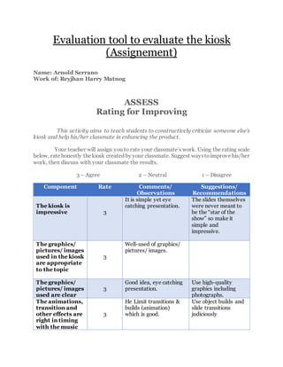
- 1. Evaluation tool to evaluate the kiosk (Assignement) Name: Arnold Serrano Work of: Reyjhan Harry Matnog ASSESS Rating for Improving This activity aims to teach students to constructively criticize someone else’s kiosk and help his/her classmate in enhancing the product. Your teacher will assign you to rate your classmate’s work. Using the rating scale below, ratehonestly thekiosk created by your classmate. Suggest waystoimprove his/her work, then discuss with your classmate the results. 3 – Agree 2 – Neutral 1 – Disagree Component Rate Comments/ Observations Suggestions/ Recommendations The kiosk is impressive 3 It is simple yet eye catching presentation. The slides themselves were never meant to be the “star of the show” so make it simple and impressive. The graphics/ pictures/ images used in the kiosk are appropriate to the topic 3 Well-used of graphics/ pictures/ images. The graphics/ pictures/ images used are clear 3 Good idea, eye catching presentation. Use high-quality graphics including photographs. The animations, transition and other effects are right in timing with the music 3 He Limit transitions & builds (animation) which is good. Use object builds and slide transitions judiciously
- 2. The video is clear and can be played easily 2 Make sure that the video is related to topic you chose. The button links are clickable and directs to the correct slide 3 Well-organized of hyperlinks. Don’t use hyperlink in playing video it can cause technical problem. The font style is appropriate with the lesson 3 The font style is simple and appropriate to the topic. Your slides should have plenty of “white space” or “negative space.” The text are clear and readable 2 Well-used of font color and font style but the font size is not appropriate. Maybe, because the text is large. Put important context only, or just keyword to emphasize the lesson. The effort in making the kiosk is highly evident 3 . Color evokes feelings. Color is emotional. The right color can help persuade and motivate. Studies show that color usage can increase interest and improve learning comprehension and retention. So use good font color. The kiosk made can help learners increase their knowledge about the subject matter 3 It can help students specially those who don’t like math. I can say that, continue to be realistic.
- 3. ASSESS I Can Make ET This activity aims to develop one’s own evaluation tool in using and evaluating educational software for classroom use. This activity will be done by pair. Going back to the activities of the previous chapter, create your own (original) evaluation tool to evaluate the kiosk earlier created. Consider, the content, use of multimedia, presentation, delivery of message/ content, effectiveness, and others. Use any productivity tool in producing your evaluation tool. Print and paste your work below. Name: Reyjhan Harry V. Matnog Evaluator: Arnold Serrano Criteria Point s 1 2 3 4 Backgrou nd Background makes it hard to distinguish text. Use of backgroun d is appropriat e in text or other graphics. Choice of backgroun d does not fit project Use of backgroun d is appropriat e in text or other graphics. Choice of backgroun d could have been better suited for the project. Use of background is appropriate in text or other graphics and in the whole project. 4 Content knowledg e (spelling and grammar) Content is typically confusing or contains more than one factual error. It has 2 and more grammatical/spel ling errors. The content is generally accurate, but one piece of informatio n is clearly flawed or inaccurate. It has 1-2 grammatic al errors Most of the content is accurate but there is one piece of informatio n that might be inaccurate. No grammatic All content throughout the presentation is accurate. There are no factual, grammatical and misspellings errors. 4
- 4. but no misspellin g. al error but has 1-2 misspellin gs error. Text – Font Choice & Formattin g Font formatting makes it very difficult to read the materials. Font formatting has been carefully planned to complime nt the content. It may be a little hard to read. Font formats have been carefully planned to enhance readability . Font formats (e.g., color, bold, italic…) have been carefully planned to enhance readability and content 3 Visuals (graphics) Student used no visual Student occasional used visuals that rarely support text and presentati on. Visual related to text and presentati on. Student used visuals to reinforce screen text and presentation. 4 Presentati on Students wasunable to complete presentation before the class. Students had many difficulties presenting materials. Students presented materials but could have been more confident. Student presented the material with full of confidence. 4 Total 19