
Recommandé
Contenu connexe
Tendances
Tendances (15)
En vedette
En vedette (17)
Similaire à Market research
Similaire à Market research (20)
Plus de jannesandoy
Dernier
Dernier (20)
Market research
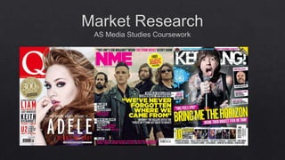
- 10. Plug- gives attention to the reader and make more people purchase the magazine. Masthead- uses a big Q in white with a red background. By doing this, the Q gets attention from the audience. The use of the colours red and white, the masthead stands out to the audience. The masthead is quite simple and sophisticated, and appeal to the age of the readers. Barcode- a convention used on the front cover, so the costumer can purchase the product. Dateline and price- the date the magazine got published and the price of the magazine, so the costumer can see how new released it is and how much it will cost. This is written very small, because the company doesn’t want it to stand out because it is not appealing to the audience. Puff- because of the white background the text gets more focus, and gives attention to the audience. We know it is an exclusive magazine of the ‘90s, and the audience understand that a musical expert have picked out the best albums from the ‘90s. Images- the front cover is a big collage of some of the best albums from the ‘90s, instead of the normal close ups that the front covers usually have. All the small images fit well with the magazines design and structure.
- 11. Dateline- the month and year the magazine got published. Main heading- “Contents” is written in white and because of the dark background it is easy to show. These pages are made to tell the audience what the contents in the magazine are and where they can find the different news and facts. Images- there are twelve images in these contents pages, and the images is of some of the artist that is represented in the magazine. Beside each image it says what page you can go to, to read about them. This is a kind of foreshadowing to what the audience can find in the magazine. Puff- the red background and the white text creates attention to the audiences. The audience know it is an exclusive magazine of the ‘90s, and the audience understand that a musical expert have picked out the best albums from the ‘90s. Text- all the small paragraphs of text are well structured and is easy to find and read. This gives the audience a more relaxing feeling while they are reading.
- 12. The sub images show the five bands that in this period is in the pipeline. Under each of the pictures the magazine tells the audience about the bands, and that gives attention to the audience. They want to know more about the band and listen to what music they have. A quote of what Jenny Beth has said in the interview has got a big and visible font. Because of that the quote stands out and gives attention. The main heading stands out to the audience because of the big font, which is written in black in a white background. It says “into the wild” and that draws attention, so the audience wants to read more of the article. The main image is of the band, and is taken in a full shot. Each member of the band has their instrument as a prop to show the audience where in the band they are positioned. The overall layout is quite tidy, and the use of the colours white, black and red gives the audience a sophisticated feeling. This box gives attention to the audience because of the red heading which says “in the pipeline”. It makes he audience want to read more and find out more about the bands in the pipeline.
- 13. Plug- gives attention to the reader and make more people purchase the magazine. Masthead- the masthead is written in white, and that gives a sophisticated view of the front cover to the audience, because it makes the colourful background not so dominated as much as it would. Headline- the band’s name, gives attention to the audience because of the big font. Barcode- a convention used on the front cover, so the costumer can purchase the product. Main image- the men from the band Twenty One Pilots are dressed in a “rocky” style and fit well in, in the overall magazine structure. They gives attention to the audience because of their fame, and people that is interested in rock wants to buy the magazine. Sub image- picture of what the audience can expect in the magazine. It gives a sneak peak, and catches the audience’s interests. Buss words- it draws attention to the audience, and make the audience want to buy it. The word special makes the audience feel that they are getting some special information that not many people know. Dateline and price- the date the magazine got published and the price of the magazine, so the costumer can see how new released it is and how much it will cost. This is written very small, because the company doesn’t want it to stand out because it is not appealing to the audience.
- 14. Dateline- the date the magazine got published. Main heading- this is written in white in a 3D font, so the shadows are black. Because of this the word stands out, and it gives attention to the audience. Main image- this is a medium shot, where the person in it wears black and looks “rocky”, so he stands out because of the red background and fit well in, in the theme of the magazine. Sub image- gives the audience an idea on what else they can read about in the magazine. The editor writes a paragraph to the readers, and then the audience feel welcome and special. Text and subheadings- what you can expect to see in the magazine is written very organised and is divided under the different subheadings which is written in black with yellow backgrounds and that creates attention to the audience.
- 15. A quote of something that has been said in the interview which often is important. The quote has got a big and visible font, and because of that it stands out and gives attention. The sub images are of the band in ”progress” and that gives a feeling that the audience get to know the band. The images are in real settings, and not in a photo studio. The main image is taken in e medium close up while the artists are in action. This gives a very realistic feeling, and the audience feel like a part of the picture as they feel they are there. Because of the capital letters and the yellow background, this stands out to the audience and creates a exciting tension. The text is placed in a tidy and clean way. It is easy to read and it makes the overall layout very tidy. This gives the audience a sophisticated feeling and they want to read it.
- 16. Masthead- uses big letters to write NME in white with a red background. By doing this, the text gets attention from the audience. The use of colors gets the masthead to stand out to the audience. The masthead is quite simple and sophisticated, and appeal to the age of the readers. Main image- the image is in “washed out” effect, so it looks kind of old. The band on the cover wear a “rocky” style, but within the rock theme, there is sort of hint of indie too. Because of the fashion and filter on the image, the cover tries to bring the old style back to this years fashion. The attitude of the band, that they don’t look into the camera, gives the audience want to know more about them, and then want to buy the magazine. Sub image- picture of what the audience can expect in the magazine. It gives a sneak peak, and catches the audience’s interests. This has also the “washed out” effect, and fits well in the overall layout. Dateline and price- the date the magazine got published and the price of the magazine, so the costumer can see how new released it is and how much it will cost. This is written very small, because the company doesn’t want it to stand out because it is not appealing to the audience.Barcode- a convention used on the front cover, so the costumer can purchase the product. Headline- the band’s name draws attention to the audience, and gives the audience a sneak peak on what they can find in the magazine. Anchorage- gives the audience a taste of the band in the headline, and that draws attention to the audience, because they want to read and learn more about the band.
- 17. Main heading- the text is written in black in a light grey background so it stands out and is easy to notice. It says “INSIDE”, which indicates what the audience can find inside the magazine. Layout- the page has the colours black, red, white and grey in it, and the use of these colours gives a tidy view of the overall contents page. The light grey background is sort of “washed out”, just as the front cover, and that shows that the whole magazine is made of that reason. Subheadings and text- what the audience can expect and see in the magazine is divided into sub headings and page number. The audience can easily find what they are looking for. Image- the image of Mac DeMarco is small and do not dominate as much as it would if it was bright and big. The image has a “washed out” filter and it gives the audience a calm and relaxing feeling. The image creates attention to the audience, because Mac DeMarco doesn’t look into the camera. This gives the audience want to know more about him.
- 18. The main heading is big and take almost ¼ of the first page. The white and black background makes the heading stand out to the audience. It is easy to notice, and gives a sophisticated feeling. The layout is very clean and sophisticated. The double page consist of the main image, the heading and a small paragraph of text. Because of this, the audience don't get overwhelmed, and wants to read. The main image is of the artist in a “washed out” filter. The artist`s face is looking another way than the camera, and that gives the audience a curious feeling. They want to know more about him, and then they will continue reading the double pages. The small paragraph of text gives the audience a feeling on what they can find on the next two pages. The audience get curious and want to read more. Because of the white background, the text is easy to read and it is set up in a tidy way. The people on the sub images is also kind of “away”, and does not look into the camera. Because of this the audience still feel that they get a connection to the people, because we want to know more about them. The images are also ibn a “washed out” filter, and that because all the pages should fit with the front cover, which seem to want to take the “old” back. The article is not to short and not to long. It is set in a tidy way and it is easy to read. Since the double page is quite clean, the audience get a more relaxing feeling reading the pages. A quote of something that has been said in the interview which often is important. The quote has got a big and visible font, and because of that it stands out and gives attention.