Music magazine evaluation
•Télécharger en tant que ODP, PDF•
0 j'aime•115 vues

Evaluation for my AS media studies magazine project

Recommandé
Contenu connexe
Tendances
Tendances (20)
En vedette
En vedette (15)
Similaire à Music magazine evaluation
Similaire à Music magazine evaluation (20)
Plus de Jordan Swan
Dernier
Dernier (20)
Music magazine evaluation
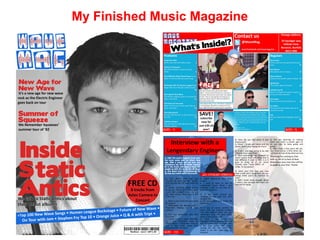
- 1. My Finished Music Magazine
- 2. In what ways does your media product use, develop or challenge forms and conventions of real media products? The genre of my music magazine was 'New Wave Rock' I chose this genre as the market for this type of magazine is less saturated than markets for other genres such as Pop, and Metal This also meant that I had to rely more heavily on my audience feedback and questionnaires, as there weren't many magazines, in publish, that focused heavily on New Wave Rock For my magazine I wanted a strong colour theme which would be evident and easily recognisable by the target audience. Britain was one of the world's leaders in the emergence, and development of New Wave Rock during the late 70's, and 80's (http://en.wikipedia.org/wiki/New_Wave_music) Because of this I wanted my magazine to have a certain British feel to it, I decided to try Red, White, and Blue as my colour theme (colours of the Union flag)
- 3. Colour Theme/House Style Like almost all magazines on the market, I wanted my magazine to have a unique and noticeable house style. I wanted to follow this common convention to add consistency to my magazine, and make it instantly recognisable to my audience I liked the Strong colours of the union flag, so for my magazine's house style I used a similar colour theme -> I conducted a survey to see which colours, my audience thought, best Digital Survey Results suited my magazine. And which colour theme fitted in best with the rest of the magazine's style and genre. From my survey I found that my target audience preferred the colour theme: red, white, and blue
- 4. Whilst designing my magazine cover, I followed common conventions from other magazine covers, so that I could emulate a real product which you could easily imagine being on sale in a store I achieved this by studying the layouts of other popular music magazine covers, such as 'Q magazine' and 'Record Collector' I liked the main Image of this front cover, as I found the close up very appealing and striking. The fact that he is looking straight at the camera instantly connects with the viewer, as they make eye contact and feel personally engaged Also following the common form and convention of Q magazine, I placed all of the cover lines in the 'left third' as this is where the viewer will look to first I tried to follow the common conventions of having all of my cover lines placed in the left third, and having my model look straight into the camera lens
- 5. Although I wanted to follow the conventions and practices of real media products out there, I also wanted to try and stretch some of the boundaries, and bend the rules a little in order to give my magazine a unique and rebellious feel. The extreme use of block colour breaks the conventions of the music magazines that I have studied. It gives the contents page a bold, unique standing I studied the contents pages of other magazines such as Q magazine, NME and Record collector. One obvious convention which these magazines had in common was the colour scheme used on the contents page. With all of these magazine, not much colour was used, mainly a plain white background with simple black text. I wanted to try and expand on this convention by adding a lot more colour
- 6. How does your magazine represent different social groups? My media product was aimed mainly at an older, male audience. The period in which New Wave was most popular in Britain was in the 70's and 80's, so original fans who were interested in New Wave would now form an older, more mature fan base. Taking into account all of the above, I did not want to single out younger fans of New Wave, who were not necessarily alive during the emergence of New Wave. I did not want to exclude this proportion of my audience, so I tried to adapt certain features of my magazine to appeal to a younger viewer. I added content which led viewers online (Facebook/Twitter address) as I thought this would appeal more to younger viewers who are commonly portrayed as more technologically capable By expanding the magazine onto the internet, I hoped to widen the fan base, and attract a younger audience. I also kept 'old' ways to contact the magazine though, as the target audience is primarily more mature
- 7. What kind of institute might distribute your product and why? Given that my target audience is mainly older males 40 – 60, I think that my only way of distributing the magazine would be in a hard copy, as studies show that older clients are much less likely to pay for something digital. However, in an attempt to widen the audience to younger customers I think that selling my magazine in a digital format online may increase sales and create a wider, more diverse fan base. I think that my magazine should be sold as a hard copy in independent newsagents, supermarkets, and high- street stores. The kind of high street stores that would stock my magazine are places that already distribute music, magazines, and music related products. For example HMV would be a suitable distributor as they already have a well established career in music distribution. In addition to this I think it would be wise to try and sell my magazine in specialist record shops, as this would give my magazine direct contact with my target audience.
- 8. In an attempt to appeal to younger viewers, (therefore widening my target audience and boosting sales) I would also prepare the magazine for sale on the digital market. Online distributors such as 'Issuu' could distribute my magazine digitally. This would also open up a gap in the international market. It would not be viable to prepare physical copies of my magazine for foreign markets, as the market would be too small, and would almost certainly make a loss. But with distributing the magazine digitally, foreign buyers would still be able to download the magazine without a risk to our profits In order to successfully market the magazine online, We would have to create a huge marketing campaign. We could advertise online, combined with use of other media formats (such as Facebook, and inside the magazine itself), for additional, low-cost advertising Online piracy could be a negative factor and dent sales, but with recent closures of illegal distributors such as 'LimeWire', and 'The Pirate Bay', I think that online distribution is still a good idea which will be positive for marketing the magazine
- 9. Who would be the audience for you media product? The target audience for my music magazine is working-class males, around the age of 40-60. I chose this as my target audience, as these people would have been young and free when New Wave emerged 30-40 years ago. I hoped that by marketing my magazine for this type of audience, I could simulate positive feelings from their youth which would instantly engage them into buying and reading my magazine. This is my audience profile, which shows the main views and interests of my target audience
- 10. How did you attract/address your audience? To attract my target audience I used a lot of images with faded quality, which had a more vintage feel, and would take the reader straight back in time to when these cameras were common place. The articles advertised were also mainly about past bands which had had their most success in the 70's and 80's. Most of the articles were somehow related to the previous few decades, as this is when New Wave was most popular. I digitally altered/enhanced many of the images to simulate an 80's look, in order to appeal to my target audience. As well as this, I also got my model to dress in typical 80's fashion during the photo shoot to emulate an authentic 80's feel Lots of the imagery used in the magazine is either in black and white, or faded quality, to simulate an authentic 80's camera. This would attract my target audience who spent their youth listening to music in the 70's and 80's
- 11. What have you learnt about technologies from the process of constructing this magazine? From the process of constructing my magazine I have learnt a lot about different technologies. In order to successfully create my magazine accurately, I had to use different technologies that I had never used before. It was vital for the aesthetic look of my magazine, and successful marketing, that I learnt how to use these technologies properly. Technologies I used whilst constructing my magazine: ● Photoshop ● Gimp ● Facebook ● Survey Monkey
- 12. Photoshop In order to create my magazine to a high standard, I used Photoshop. I used Photoshop as this is what is used by professional editors in the music magazine industry. This meant that Photoshop would help me to make my products as higher quality as I could. In the initial stages of development I did not know how to use Photoshop consistently. I did not want to go straight into development of my magazine with a weak grasp of the features of photoshop as this could compromise the quality of my design work. In order to further learn Photshop's capabilities, I did some mock design work of creating a music magazine 'pop splash'. Most of the techniques I used to construct my final magazine were based on practices that I gained throughout the constructing of my pop splash magazine.
- 13. Survey Monkey Another important technology that I had to learn to use for the construction of my magazine was Survey Monkey. I created various surveys to acquire knowledge from my target audience, about my magazine. From the responses that I analysed, I was able to make suitable changes to my magazine so I could better cater for the needs and expectations of my target audience
- 14. Looking back at you preliminary task what do you feel you have learnt from the progression of it to the full product? During the progression from my college magazine to my music magazine, I learnt a lot about content placement and creating a magazine with a specific target audience in mind This is my initial college magazine that I constructed. The layout is very basic, which I think worked well, and so I used it as a template for my music magazine. I am also happy with the model. She has the right expression and dress sense to accurately tie in with the lead line, so I decided to keep this similar in my music magazine. The only thing that I thought could have been improved with the model, was if the image was larger, in order to have a more immediate effect on the audience. I improved this on my music magazine cover. The main thing that I thought needed improving was the amount of white space that my magazine cover included. Although this gives it a clean look, I tried to avoid this in my music magazine cover, as I thought it would make the cover appear empty
- 15. Again, I was fairly happy with the clear and consistent layout of my contents page. I think the colour scheme really builds on the magazine's house style. One thing that I wanted to improve on this was adding more features that I saw in other music magazines. By adding these, and conforming to these conventions, I thought that it would give my music magazine a more realistic look Things I added to conform to common conventions ● Lead Image ● Page number ● Contact details ● Pre-order deal ● Editors note