Quick Doctor In Kuwait +2773`7758`557 Kuwait Doha Qatar Dubai Abu Dhabi Sharj...
Evaluation
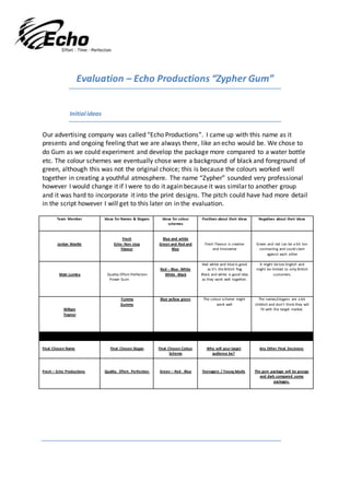
1. Evaluation – Echo Productions “Zypher Gum”
Initial ideas
Our advertising company was called “Echo Productions”. I came up with this name as it
presents and ongoing feeling that we are always there, like an echo would be. We chose to
do Gum as we could experiment and develop the package more compared to a water bottle
etc. The colour schemes we eventually chose were a background of black and foreground of
green, although this was not the original choice; this is because the colours worked well
together in creating a youthful atmosphere. The name “Zypher” sounded very professional
however I would change it if I were to do it again because it was similar to another group
and it was hard to incorporate it into the print designs. The pitch could have had more detail
in the script however I will get to this later on in the evaluation.
Team Member Ideas for Names & Slogans Ideas for colour
schemes
Positives about their ideas Negatives about their ideas
Jordan Wardle
Fresh
Echo- Non stop
Flavour
Blue and white
Green and Red and
Blue
Fresh Flavour is creative
and innovative
Green and red can be a bit too
contrasting and could clash
against each other
Matt Lumley Quality-Effort-Perfection
Power Gum
Red – Blue- White
White -Black
Red white and blue is good
as it’s the British flag
Black and white is good idea
as they work well together.
It might be too English and
might be limited to only British
customers.
William
Traynor
Yummy
Gummy
Blue yellow green The colour scheme might
work well
The names/slogans are a bit
childish and don’t think they will
fit with the target market.
Final Chosen Name Final Chosen Slogan Final Chosen Colour
Scheme
Who will your target
audience be?
Any Other Final Decisions
Fresh – Echo Productions Quality. Effort. Perfection. Green – Red - Blue Teenagers / Young Adults The gum package will be grunge
and dark compared some
packages.
2. Roles
Me/ Jordan:
In thisUnitI hadthe role of designer/editor.Ieditedthe entire Advertanddesignedboththe
website bannerandprintposter. Ienjoyededitingthe adverts,bothTV andprinthoweverIwould
like tohave had more time onthe TV/CinemaAdvertasitwas slightlyrushedwhichyoucouldtell in
the final productfromthe repetitionof the transitionsandmediocre matchingof the soundand
visual.Ialsohad an effectonthe filmingof the advert asI had an inputincamera angleswe filmed
like the close upof the wetfoot beingshaken.Mystrengthsdolie inthe designing sectionsoI
believethiswasgoodasI got to do thingsI wasconfidentindoing.
Matt: InthisunitMatt had the role of cameraman/directorwhohadthe ultimate decisionof
camera shotswe chose.We diddiscussas a group and Matt just finalisedthe ideasandfilmedthem.
Matt andI hadmost influence onthe TV advertand Will mostlyfocusedonactinginthe shots.Matt
alsomade the trainprintadvertwhichturnedoutwell.
Will:Will wasthe actor inthe TV advertand alsowrote the scriptfor the pitchwe Matt and I
eventuallychecked.The actinginthe Advertwasgoodbut couldhave beenimprovedhoweverthe
issuesare nothingmajorandnothingI would notexpectfromapersonas unexperiencedas us.Will
didattemptto make a Bannerhoweverwe came to the conclusionasa group that itwas nothigh
enoughstandardto presentthe productsoI decidedtoremake itusingthe same theme asthe
Posterprintadvert.
Team
As a teamwe workedquite well.There were noimmediateconflictsorargumentswithin the group
and we all managedto workinsync. Thisisillustratedfromthe pitchandworkwe managedto
achieve together.The onlyweaknesswithinthe groupwasthe actingof Will,whichIdonot blame
himfor as I knowhowhard it isto act in these circumstances.
Print adverts
The print advertsworkedreallywell inpresentedthe product;theylookedreally intriguing,
especially the magazine printadvertandthe banner.The textusedinthese printadvertswasalso
usedinthe cinemaadvertwhichlinkseverythingtogether.
3. The Banner andmagazine advertbothlinktogetherwiththe same theme andworknicelyhowever
the train advertlookstoosimple anddirty,whichisnotthe ideawe wantour gum associatedwith.
The colour scheme isokas it includeswhite (acleanfreshlook) howeverthe grunge inthe
backgroundrepresentsdirt,andinhindsight,thatisno wantwe wantedto achieve.
Pitch
The pitch went well as we spoke clearly and had a good script to go off. I managed to refer
to my script but not stare at it when speaking. The entire time was spent engaging with the
audience instead of just presenting. We managed to answer all the questions with
confidence and did not get caught out. If we could change anything I think the script could
have been improved as it was quite short and was not full of information.