VDIS10022 Advanced Graphic Design Studio - Lecture 5 - Fine points of the studio
•
7 j'aime•2,629 vues

You, the designer, have fulfilled the requirements of the design brief. After several iterations of the concept and actual design, the client has confirmed they are happy to approve the artwork and the job is done... but is it?.... What comes next?....

Recommandé
Recommandé
Contenu connexe
Tendances
Tendances (18)
Similaire à VDIS10022 Advanced Graphic Design Studio - Lecture 5 - Fine points of the studio
Similaire à VDIS10022 Advanced Graphic Design Studio - Lecture 5 - Fine points of the studio (20)
Dernier
Dernier (20)
VDIS10022 Advanced Graphic Design Studio - Lecture 5 - Fine points of the studio
- 1. VDIS10022 ADVANCED GRAPHIC DESIGN STUDIO Lecturer: Rachel Hawkins VIRTU DESIGN INSTITUTE LECTURE 5: THE FINE POINTS OF THE STUDIO ONCE ARTWORK IS COMPLETE
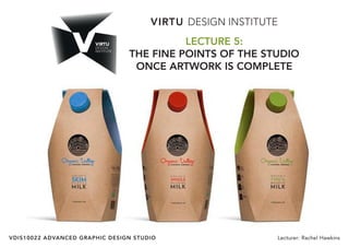
- 2. VIRTU DESIGN INSTITUTE: ADVANCED GRAPHIC DESIGN STUDIO - VDIS10022 2 The design brief focus in this subject is packaging design, so we are going to keep that focus in this lecture.
- 3. VIRTU DESIGN INSTITUTE: ADVANCED GRAPHIC DESIGN STUDIO - VDIS10022 3 You, the designer, have fulfilled the requirements of the design brief. After several iterations of the concept and actual design, the client has confirmed they are happy to approve the artwork and the job is done... but is it?.... What comes next?....
- 4. VIRTU DESIGN INSTITUTE: ADVANCED GRAPHIC DESIGN STUDIO - VDIS10022 4 At this point the client should have approved the stock and finishes as well as the associated printing costs and it is time to send the file to print. The fine points of the studio is what comes next - the final preparation of the file for print. For simple jobs like business cards, flyers and posters this is a quick and easy process however for more complex jobs with dielines and other finishes there is a fair bit of time spent in making the file print ready. You work on the dieline from the time it is supplied however prior to print you need to embed images, outline copy, check colours, neaten the file and make sure everything is 100% in order. The following pages sumerise these processes for you. Also review the video links and supplementary illustrator files for a better understanding.
- 5. VIRTU DESIGN INSTITUTE: ADVANCED GRAPHIC DESIGN STUDIO - VDIS10022 5 WHAT IS A DIELINE? A dieline is used in graphic design as a placeholder for assisting in the proper layout of a document that will be diecut as part of the finishing process. It is usually placed into the pdf or illustrator file as a separate layer for sizing and orientation purposes. A dieline is usually not printed on the final piece but is used to determine correct layout. Dielines are also known as knifelines are exactly the same thing, serving the same purpose. Dielines are traditionally used when designing: Envelopes, Pocket folders, Packaging, Stickers and any object where a custom shape is required. Printers usually develop the dieline to your brief, based on the dimensions and sketches you give them or provide you with a stock die. The printer will supply you with an Illustrator file (ai.) or a PDF which can be opened in Illustrator. The finished artwork file is usually provided back to the printer as both an Illustrator file (ai.) and a PDF. TRIM—The cut of the nal piece FOLD — This is where the card will be folded BLEED—Extend artwork to this line to bleed SAFETY—Keep important text and graphics within this line
- 6. VIRTU DESIGN INSTITUTE: ADVANCED GRAPHIC DESIGN STUDIO - VDIS10022 6 WORKING WITH DIELINES When working with dielines it is important to understand the visual conventions and line presentations to understand where the shape will be cut, scored, folded, glued and twisted. You will need to identify which panels will be upside down and right way up. It helps to print out the dieline and make a small model to help visualise during the design process. Making a rough hard copy proof model is also highly recommended for cartons where panels may be inverted. To get started using your dieline: 1. Open the dieline file in Illustrator 2. Put it on a new locked layer. 3. Then create the artwork on subsequent layers. Each new printing process should be placed on a new layer also. For example gloss/matt varnished, foiling or embossing should all be on their own layer. This is also the case for different colouring. PMS colours should be on a separate layer to CMYK colours. TRIM—The cut of the nal piece FOLD — This is where the card will be folded BLEED—Extend artwork to this line to bleed SAFETY—Keep important text and graphics within this line
- 7. VIRTU DESIGN INSTITUTE: ADVANCED GRAPHIC DESIGN STUDIO - VDIS10022 7
- 8. VIRTU DESIGN INSTITUTE: ADVANCED GRAPHIC DESIGN STUDIO - VDIS10022 8 WORKING WITH DIELINES - A CASE STUDY QuickSlim is a weightloss product sold on the Australian pharmacy market. It is a powder served in a foil sachet that mixes with water to create a fruit flavoured drink. The artwork for the product consists of two knifelines, one for the carton and one for the foil sachet. The carton has a spot silver badge (Metallic PMS) on the front and side. Take a look at the following screen grabs of the artwork in illustrator to understand how each finishing process is setup in the artwork and how it is set up for print. All colours are clearly labeled in the swatches tab. Images are embedded and all type is outlined. Download the Illustrator files from the Lecture Downloads to click through the file further.
- 9. VIRTU DESIGN INSTITUTE: ADVANCED GRAPHIC DESIGN STUDIO - VDIS10022 9 Spot silver badge (Metallic PMS) QuickSlim Carton
- 10. VIRTU DESIGN INSTITUTE: ADVANCED GRAPHIC DESIGN STUDIO - VDIS10022 10 The sachet artwork is printed on a foil substrate. For this reason it is required to print a Spot White layer onto the file behind the areas that require solid bright print. QuickSlim Foil Sachet
- 11. VIRTU DESIGN INSTITUTE: ADVANCED GRAPHIC DESIGN STUDIO - VDIS10022 11 File formats for print with Dielines The best formats to send a finished print ready piece of art with a dieline is an ILLUSTRATOR file and layered PDF. It is advised to talk to your printer and ask what their preference is for file delivery. If you are sending artwork that you need to have manipulated by a pre-press specialist before it is printed, send the raw file. This is specific to dielines and other complex finishes. .AI (best for files that need editing by the pre-press specialist) If you are providing artwork for a complex job that involves a dieline, you may be required to provide the raw file. This could be the case for product packaging. In this instance you would provide a layered Illustrator file with all fonts outlined and images embedded. In rare cases, a layered PSD may be appropriate. The only drawback to a PSD is the file size. Most likely the file will need to be written to a disk and mailed or uploaded to an FTP site. Therefore if time is a factor you may need to go with another format so that it can be e-mailed. If you have an option when saving your files to send to a printer try to avoid the JPG format. If you use the PDF, EPS or PSD formats your Images will print better and you will be happier with the results. Remember that each new printing process should be placed on a new layer. For example gloss/matt varnished, foiling or embossing should all be on their own layer. This is also the case for different colouring. PMS colours should be on a separate layer to CMYK colours.
- 12. VIRTU DESIGN INSTITUTE: ADVANCED GRAPHIC DESIGN STUDIO - VDIS10022 12
- 13. VIRTU DESIGN INSTITUTE: ADVANCED GRAPHIC DESIGN STUDIO - VDIS10022 13
- 14. VIRTU DESIGN INSTITUTE: ADVANCED GRAPHIC DESIGN STUDIO - VDIS10022 14
- 15. VIRTU DESIGN INSTITUTE: ADVANCED GRAPHIC DESIGN STUDIO - VDIS10022 15
- 16. VIRTU DESIGN INSTITUTE: ADVANCED GRAPHIC DESIGN STUDIO - VDIS10022 16 Outline Fonts In Illustrator - Type Create Outlines Select the type or type box and then go to ‘Type’ in the top menu bar and ‘Create Outlines’. Creating outlines means that the text becomes a shape and holds its integrity should the font be separated from the file. Embed Image In Illustrator - Links Embed Image Select the image and then go to the ‘Links’ tab on the side bar. Press on the tab ‘menu options’ to get the drop down menu. Select ‘Embed Image’. Embedding the image can make the file size very large so make sure the image is high res but the original file is only as big (dimensions) as it needs to be.
- 17. VIRTU DESIGN INSTITUTE: ADVANCED GRAPHIC DESIGN STUDIO - VDIS10022 17 When you design artwork for print, standard practice is to send a PDF to your printer once it has been approved by your client. There are several steps that lead to this point and things you need to do to ensure that the end result is exactly what you and your client are after. Sending files to your printer has lost a lot of its complexity, the universal adoption of PDF, improved software applications and automated checks have made life in pre-press a whole lot easier. There are still some errors, though, that persist even in PDFs, and that could ruin your print job. SOME QUESTIONS TO ASK ARE: Are you confident the size is correct? Have the colours been set to print standards or client brand guidelines? What about font usage? Does the printer have the font? Will the printer know what to do with my file? So many things can go wrong, costing you and your client money. Below are 12 Pre-press Tips that cover the major aspects for correction in your artwork. Follow the steps below to make sure your file will be in excellent shape for sending to print. 1. File names, filing of the job and version tracking. Every designer needs a clear tracking system for their files ensuring information about the client, job and document version number are precise. You should be systematic with how you file work for clients and always keep back up of that work. It is a good idea to include a job description, document dimensions, date and version number in the file name for easy identification. For example; JAdams_ BusCard_90x55mm_Feb14_ v3.indd 2. You are responsible for the design Before you start designing, make sure you have a clear purposeful design brief. What is the main purpose of the design? How will the finished product be used. What are the clients motivations? Who will source the printer and send the job to print? Understanding all these points will assist you in setting up the design file properly from the beginning. 3. Proofread have artwork approved as final The odd thing is that clients can be calm about minor errors in the design, like lines not being of same thickness or such. But errors in text are fatal. Use a good proofreader, it could be a family member, partner or colleague but you need someone with fresh eyes and good grammar. Once proofread and the artwork is signed off, get approval in writing from the client. An email is great confirmation. Unfortunately, even if artwork is signed off and there is an error, changes and re-print will be made generally as a shared cost. You must make sure your client is happy in the end for future and referred business. Get in writing (preferably email) final client approval of the artwork before the job is sent to the printer. Verbal communication cannot be relied upon if something goes wrong. 4. Make sure the artwork is the correct size. Does the design brief specify the size? Have you checked Document Setup again? Or the outmost frame in Illustrator? Double check the orientation! Is it 210×297mm (DL) as Width by Height? Is it portrait or landscape? Did the client say an A4 because it looks like an A4 or is it 220×286? For ads, contact the publication by phone, email or web. Check with the printers which is the most economical size and how many fit to a print sheet. Always double check if you aren’t sure. 5. Define bleed and trim marks in the file Bleed is the distance the artwork needs to extend beyond the final size of the artwork and it can vary. 3mm on each side is most common. In some cases it may not be needed at all, nor the trim marks, usually if there is no colour or image over the edge. Clarify with the printer before you Good Design Practice 12 Pre-press tips
- 18. VIRTU DESIGN INSTITUTE: ADVANCED GRAPHIC DESIGN STUDIO - VDIS10022 18 create your PDF, and open the PDF afterward to check inclusion. 6. Typefaces/Fonts Ensure the typeface(s) used correlates to the clients corporate identity manual. Are you using the correct typeface for your client? Are there any unnecessary fonts that shouldn’t be included the file? In Illustrator check Document Info or Find Font… and in InDesign Find Font… under Type in the menu. When delivering artwork as a PDF for print there is normally no reason to outline the fonts. For advertising however best practice is to outline the fonts. 7. Logo usage Using client logos is really important for brand recognition so it is really important the it prints correctly. Make sure the logo file is properly embedded or linked for clarity. Ensure the logo usage correlates to the corporate identity guidelines style guide. Make sure it is in perfect proportion. Keep the colour of the logo in the right format for the media used. For print, use the logo in vector format if possible (ai. eps. pdf.). Logos sent to you inside Word documents are no good as they will be low resolution. For print, the format should be CMYK, not Pantone unless the work is going to be printed with spot colours. 8. Colour - this is a big one Keep the colour of the artwork in accordance with the media used. There are two types of colour used for print. CMYK and Pantone Colours (PMS). For most digital or offset printing you will use CMYK printing. Therefore all images should be in CMYK. Photos will most often be in CMYK while logos may be printed in PMS. No colour profiles should be attached to the pictures. Your pictures should be jpg, tiff or psd format. Avoid eps. The reason: If you are using transparency in your artwork, like drop shadows or transparent type or colours, your PDF will most likely have torn the photos into strips. This can be avoided by using the pictures as native PSD. If you are including Pantone (PMS) colours, make sure only those colours used are in the file. In InDesign and Illustrator, go to the Swatch panel and in the fly-out menu choose: Select all unused and delete those colours. If in doubt, contact your printer. They will help you and will most likely send you the correct settings for programs that fit the jobs going to his printer. 9. Pictures sizes are big enough Pay close attention to the resolution of the pictures used. Most common minimum resolution for print is 300dpi. You should try not to enlarge pictures by more than 20% of the original size. This is just a thumb rule. When you change the size inside your document you will change the output resolution too. A 300dpi picture will be 600ppi if you minimise it by 50%. Way too high a resolution. Enlarging too much might get the resolution down resulting in pixelised/blurry images. You can adjust images sizes in photoshop to be exact. Properly managed image sizes will also keep your file size down. 10. Preflight the artwork Preflighting the artwork before sending to the print shop is a must. If you have done all the things mentioned above, you have manually preflighted a great deal of what is needed. InDesign has a preflight feature. Window Output Preflight. There you can see an overview of the document, check fonts, links etc. Also, you can see the red or green dots at the bottom of the window that indicates various errors you may have in your file. 11. Ensure the final PDF is high resolution Did you send your client a low resolution PDF earlier in the day? Did you remember to switch over to a high resolution output? Are you using the built in PDF settings of InDesign or Illustrator? Ask your printer for PDF job settings. The built in settings are usually not what is used for professional PDF output. Or at least know which of the built in settings you are supposed to use. High Quality Print and Press Quality settings are tempting to use if you want quality (because of the names), but in most cases you will have to use PDF/X- 1a:2001. Consult your printer here. 12. File size It is really important that your final file size is not overwhelming otherwise it will make file handling difficult and time consuming. Files that are too big without reason can slow the printing process with more time needed for the technology to read your file. It will also make transporting your file difficult via email, or ftp sites. Generally speaking around 10MB is an acceptable file size. If the artwork contains several large images and is a large file then it may be bigger. It is just important to not have images that are really large for no reason.
- 19. VIRTU DESIGN INSTITUTE: ADVANCED GRAPHIC DESIGN STUDIO - VDIS10022 19 PREFLIGHT CHECK LIST: Check your file for the following All artwork and images have been extended at least 3 mm bleed beyond the finished page size. Logos or graphics created in vector programs such as Illustrator, have all type converted to paths or outlines. The pasteboard surrounding all your design pages is empty. No overflowing text boxes or images. All images are correctly positioned and linked. Live type and vital images are at least 5 mm within the trimmed document edge. All fonts are either included, embedded or outlined. You have only used fonts that you intend to use for output. Colours and images are converted from RGB to CMYK or special and Pantone colours are specified as spot colours. All PMS colour swatches that will be printed in CMYK have been converted to CMYK values. All issues with duplicate Pantone colour swatches are resolved (eg. PMS 185C, 185U, 185CV) (Coated (C) vs Uncoated (U)) All unused PMS colour swatches should be deleted. All black text is 100% Black, not CMYK Black (Registration). Large black solids and backgrounds have been specified as a Rich Black mix. Varnishing and special treatment areas identified as SPOT colours. Total ink density is appropriate for the stock type: 300% coated, 280% uncoated, 250% newsprint The document dimensions are the right size for printing, folding and trimming. Trim, fold and registration marks are included. Overprint settings have been checked. All pages are supplied as single pages – not spreads! Finished artwork as a press-ready PDF with correct pagination. All documents have been thoroughly proof-read and double-checked before submission.
- 20. VIRTU DESIGN INSTITUTE: ADVANCED GRAPHIC DESIGN STUDIO - VDIS10022 20 Grab a cup of tea and find somewhere quiet You’ll need a print-out of your final approved PDF for reference as you check your printers proof. It’s easy to check what’s on the proof, but all too often, people don’t spot when an element has dropped off completely. Having both in front of you will help avoid this. Get a fresh pair of eyes After looking at the same job time and again, it’s good to get someone else to check, particularly when it comes to proofing text. When you know what’s coming next, it’s easy to skim over words or fill in the blanks if something’s missing. Reading the text out loud can help. This way, expression and punctuation errors become more obvious. Calling telephone numbers and typing lengthy URLs into your browser are simple ways of checking these details. Don’t get too hung up on colour As proofs aren’t printed on the specified stock, please bear in mind that there are bound to be some differences between the proof and the completed job. For example, using an uncoated paper will make a huge difference to the finished effect. If colour is critical, you can include Pantone colours or request a press-pass. Colour Offset: The printed proof for your offset job will not be printed on the same stock as your print job, due to setup cost prices. So therefore, please bear in mind that there are bound to be some differences between the proof and the completed job. If colour is critical, you should request a press check or an ISO proof. Digital: The colour in digital proofs is made up from the 4 process colours (CMYK), so if your job is spot colour (specified from a Pantone), you should use your Pantone swatch book as an indication of the final colour. If required, a printed proof on the stock your job is set to be printed on can be provided. Take plenty of time Checking is easier when you’ve stepped away from the job for a while. Usually, there’s a day or two between sign-off and receiving the printers proofs. It’s far better to wait a while to check a proof properly. Graphic Design Print Proof Checklist PROOF CHECKLIST: Before you sign off your proof, make sure that you and your colleague have ticked all the relevant boxes below. Mark any final edits clearly on the proof. Spelling and grammar. Watch out for words the spell check won’t catch, such as it’s/its, their/there, your/you’re, were/where, then/than, and to/too. Consistent and correct spelling of specialised words. Such as product or brand names, and terminology. Duplication. Check for two identical words or numbers that are next to each other. Contact details. Check that contact names, telephone, and fax numbers are correct. Also check email and web addresses. Product codes and reference numbers. Overall consistency with other materials. Logo. Check it’s the correct version, alongside consistency of size and positioning. General layout and colour/imagery. If it’s a product shot, make sure it’s the correct model and most up-to-date shot. Check any final retouching meets with your approval. Pagination. Is the document’s size, page numbering and ordering correct? Small print. Have you added this where relevant and checked the content to ensure legal compliance? Punctuation. Is it correct and consistent throughout? Has someone else read the proof and completed the checklist? Have you and a colleague signed the proof? Have you marked up and final amends on the proof and signed it? If there are extensive changes, you may need to resupply artwork. Proofed Approved by: Proofed Approved by: