Seal of Good Local Governance (SGLG) 2024Final.pptx
Front Cover Analysis
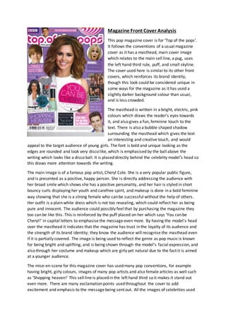
1. Magazine Front Cover Analysis
This pop magazine cover is for ‘Top of the pops’.
It follows the conventions of a usual magazine
cover as it has a masthead, main cover image
which relates to the main sell line, a pug, uses
the left hand third rule, puff, and small skyline.
The cover used here is similar to its other front
covers, which reinforces its brand identity,
though this look could be considered unique in
some ways for the magazine as it has used a
slightly darker background colour than usual,
and is less crowded.
The masthead is written in a bright, electric, pink
colours which draws the reader’s eyes towards
it, and also gives a fun, feminine touch to the
text. There is also a bubble shaped shadow
surrounding the masthead which gives the text
an interesting and creative touch, and would
appeal to the target audience of young girls. The font is bold and unique looking as the
edges are rounded and look very disco like, which is emphasised by the ball above the
writing which looks like a disco ball. It is placed directly behind the celebrity model’s head so
this draws more attention towards the writing.
The main image is of a famous pop artist, Cheryl Cole. She is a very popular public figure,
and is presented as a positive, happy person. She is directly addressing the audience with
her broad smile which shows she has a positive personality, and her hair is styled in short
bouncy curls displaying her youth and carefree spirit, and makeup is done in a bold feminine
way showing that she is a strong female who can be successful without the help of others.
Her outfit is a plain white dress which is not too revealing, which could reflect her as being
pure and innocent. The audience could possibly feel that by purchasing the magazine they
too can be like this. This is reinforced by the puff placed on her which says ‘You can be
Cheryl!’ in capital letters to emphasise the message even more. By having the model’s head
over the masthead it indicates that the magazine has trust in the loyalty of its audience and
the strength of its brand identity; they know the audience will recognise the masthead even
if it is partially covered. The image is being used to reflect the genre as pop music is known
for being bright and uplifting, and is being shown through the model’s facial expression, and
also through her costume and makeup which are girly yet natural due to the fact it is aimed
at a younger audience.
The mise-en-scene for this magazine cover has used many pop conventions, for example
having bright, girly colours, images of many pop artists and also female articles as well such
as ‘Shopping heaven!’ This sell line is placed in the left hand third so it makes it stand out
even more. There are many exclamation points used throughout the cover to add
excitement and emphasis to the message being sent out. All the images of celebrities used
2. are of them either smiling of pulling a funny face which would appeal to the target audience
as it shows their fun side.
Sell lines are used to entice the audience to open the magazine, and one way they do this is
by adding a lot of emphasis used to create excitement. One example of this is the
exclamation point used at the end of the article ‘Shopping Heaven!’ This particular article
has been placed on the left hand third of the cover as the reader’s eye is drawn to this area
first. The reason it has been placed there is because the magazine knows that their audience
have a strong interest in shopping and keeping up with the latest trends so by placing the
article in that spot it immediately grabs the reader’s attention and draws them in. This is
especially used in the numerous celebrity gossip sections, for example saying ‘The Wanted
open up to everything!’ and using emotive language calling Justin Bieber ‘lonely’. Buzz
words such as ‘Exclusive!’ are also used to generate excitement and interest. Mode of
address is used in the main sell line, telling the audience that they can be like Cheryl Cole
which will make them want to learn more about how to be like a poplar artist they like.
Particular sell lines stand out more than others because of the colour and font used. Most of
the fonts are doodled, in a small font so the sell lines which stand out most are bolder and
larger in size.
The magazine is laid out relatively similar in each issue to maintain brand identity, and
everything is placed in a particular place depending on how exciting the article will be for
the audience, for example Cheryl Cole’s article is placed in the centre in bright pink puff to
draw more attention to it, whereas the box saying ‘10 pages of’ is in more pale, contrasting
colours. This makes the main sell line stand out slightly more. The colours are pink and
purple which are two stereotypically ‘female colours’, so this is why they have been used so
heavily. The font used on the cover is kept the same, except for the name of the magazine
which is written in a fun, bubble type font and a few articles with doodled type font. This
gives the magazine a more relaxed, casual look. The elements which make this front cover
effective are the use of imagery and this makes the cover more interesting to look at, the
colour scheme as this catches the reader’s attention, and the overall layout is quite busy so
you feel as though you are getting value for many as there are many articles.
3. Magazine Front Cover Analysis
This is the front cover for the magazine ‘We Love
Pop’. It follows the conventions of standard
magazine front cover as it has a masthead, a main
cover image of a famous celebrity which also relates
to the main sell line, a puff and more. This particular
magazine is very similar in its design to other front
covers for the same magazine as the masthead is
kept the same in all magazines, and has been
presented in the unconventional, unique style of
being placed in the top left hand corner. This is
where the western eye is drawn to first according to
the ‘z’ formation pattern so it is very effective to put
the name of the magazine here. By keeping the
magazine’s presentation similar it reinforces brand
identity and helps the readership immediately
recognise the magazine when they see it. In some ways this magazine’s look is slightly more
unique to the other front covers of this magazine as the main cover image has quotes from
the interview placed coming out of her mouth so it gives the effect that she is exclaiming
them in an exciting way. This appeals to the target audience as they feel as though Ariana is
speaking directly to them in a friendly way therefore giving them a closer insight into the
artist’s personality.
The masthead suggests that the magazine is very girly and aimed at a younger reader as it is
written in a speech box and has a pink heart placed in the name to give it a unique, quirky
look, which is exactly what the target audience of this magazine would be drawn to. It is
placed inside a text box which is similar to those that appear when texting friends, which
links to how the readership have strong relationships with their friends which is
strengthened through social media. In addition to this, the pink heart used instead of writing
the word pop appeals to the reader’s colloquial language which would be used in texting
friends. This appeals to them on a more intimate social level. The font is in bold, black text
which makes it stand out more, along with the chunky writing and speech box. It is the
largest text on the page which makes it stand out even more. An italic style font has been
used on the ‘W’ on the masthead to make the text look slightly more quirky and interesting
to look at. The speech box and text is all placed on a pink box which reflects the gender of
the magazine, and draws more attention towards the masthead, making it stand out among
the sell lines.
The main image is of a popular pop artist Ariana Grande, wearing a bright pink dress and
lipstick, with her hair blowing away from her face to draw more attention to her flawless,
youthful, girly makeup. She is being represented as quite sweet and innocent, due to the
way she is doing a fun, posed position and the colours she is wearing. Her costume is a pink,
loose fitted dress which represents the care free characteristics the reader would have due
to their age. She is also a fairly young and pretty model to use which would make her an
4. inspiration to the young target audience, and therefore may feel that by purchasing the
magazine they can be like her. Ariana’s posture is fun and playful and she is directly
addressing the camera with her smile, almost calling to the audience. These all link to her
style of music which is bright and uplifting, and also slightly brings in her acting career as she
is an actress of a young teens programme in which she plays the role of an inspired, sweet
girl. The mise-en-scene contains a lot of feminine colours like baby blue, bright pink and
yellow. These colours are very common in pop magazines as they tend to be aimed at young
teen girls. The bright pink gives a feisty, feminine feel to the magazine representing the
gender, whereas the blue helps stop the magazine from being too overwhelming since it is
connoted to be quite a calmcolour. The colour yellow creates an eagerness for the reader
to read the article. There are also other images of different famous pop artists around the
frame which is again very popular for this type of magazine. In addition to this there are
other feminine articles on the cover like ‘Back to school cool’. This is sending out the
message to girls that you can also be fashionable and girly in school, and is directed at the
target audience. The feature article is all about the main image model which is titled ‘Ariana
Unleashed’. The magazine uses the artist’s first name to make it seem like they know her
more personally and the word unleashed is a more dramatic way of saying that she says a
lot about herself in the interview. This way it will make people want to know more and adds
appeal to the cover. Feature article photographs are used heavily on the front cover of ‘We
Love Pop’ as it is a fun way of breaking up the text and making it more digestible. It is also a
way of illustrating what the article is related to, for example the article about ‘Back to
school’ has an image of girly school accessories placed around it to show that this is how the
reader can make going back to school more fun. There are also two images of male pop
artists which reflects how the audience of this magazine are interested in young males so
the magazine uses this to draw them in.
The sell lines are being used to lure the audience in so they want to buy the magazine, as
there is a lot of emphasis used to create excitement, for example the main sell line ‘Ariana
Unleashed!’ is written in bold font with an exclamation mark to draw more attention to it.
The word unleashed suggests that there is nothing holding her back, so the audience will get
a lot of information included within the article. There are also three different puffs which
attracts a lot of attention to those particular articles. In addition to this, the names of the
pop artists used in the magazine are all put in eye catching fonts so it is immediately made
clear to the audience who is going to be featured inside. Some small examples of what she
will be discussing inside are quoted on the cover to create excitement. Particular sell lines
stand out more than others because of the colour and font used. Most of the fonts used are
written in bold writing to make it seem like everything written on the front is important.
The magazine is laid out relatively similar in each issue to maintain brand identity, as the
masthead is kept in the same place along with where the feature article is located. The
feature article photograph always has the celebrity’s name written across their body in bold
fonts, and everything else is placed depending on how important the article will is and what
will sell best for the audience, for example One Direction’s article is takes up the whole left
hand corner with bold fonts surrounding it. This is done so the article will grab attention
because it sits in one of the thirds and also the key, prominent left hand third. Also the
5. article about 5 seconds of summer is not as obvious as it is the top right hand corner.
Despite this it is placed next to Ariana’s face which attracts the attention towards it, along
with the band’s name being highlighted in black which makes it bolder and more prominent
which shows how all of the articles attract the reader’s attention in their own specific way.
The colours used are pink, blue and white which are quite feminine colours, and pink is
almost always used in pop magazines as it been revamped by the audience themselves to
make it appear more interesting and to appeal to them more. It also gives the magazine a
slightly more casual look to it.
The elements which make this front cover effective is the colour scheme used as it reflects
the genre and target audience. This is because the colours used represent the gender of the
readership and pink is stereotypically known for being a female colour and is heavily
featured on the magazine, and also the fun bright colours such as yellow and orange show
the audience’s personality. Another feature which makes this cover effective is how each
article is paired with an image so it makes it more interesting to look at and digestible for a
young reader. The overall layout is quite busy due to the fact it has an image with each
article, but it is effective as it makes the text easier to read for the target audience.