The document describes designs created for 6 words: add, jump, curve, bounce, and question. For "add" the letters were overlapped to look like a plus sign. For "jump" the "u" was made taller to look like jumping. For "curve" the letters were spaced and styled to appear curved. For "bounce" each letter was placed higher or lower to look like a bouncing ball. For "question" the word was copied and stacked to look like a question mark, but the author decides it looks messy and could be improved by shaping the letters into a question mark shape.
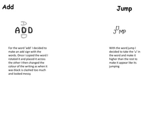
1. Add
For the word ‘add’ I decided to
make an add sign with the
words. Once I copied the word I
rotated it and placed it across
the other I then changed the
colour of the writing as when it
was black is clashed too much
and looked messy.
Jump
With the word jump I
decided to take the ‘u’ in
the word and make it
higher than the rest to
make it appear like its
jumping
2. Curve
For the word ‘curve’
I made all the letters
separate and than
placed them so they
appear to be
curved, I think the
font helped with
this one as, for
example of the ‘E’
the tail at the
beginning is slightly
curved round as
well.
Bounce
For the word bounce, I
thought of a ball bouncing
up and down along the
path, so therefore I decided
to take word and make is
appear like it was bouncing
by taking each separate
letter and placing it either
higher or lower than the
one before. I also made the
font rounded so it is
symbolic to the ball being
round as well.
3. Question
For the ‘question’ word I thought about
copying and pasting the word a few times
and positioning them in the form of a
question mark. For the full stop at the
bottom I though about getting each letter
from the word and placing them on top of
each other, I think out of all the words I do
not like this one as much because I think it
looks too messy and doesn’t really look like a
question mark. I think if I did this one again I
would take each letter and try and get them
to create the image of a question mark
because after creating this I think it would
look neater and overall just better.