Contents production
•Télécharger en tant que PPTX, PDF•
0 j'aime•159 vues
Contents Production
Signaler
Partager
Signaler
Partager
Recommandé
Evaluation - Question 3
The document discusses two potential media institutions that could distribute the author's media product: Bauer Media Group and Time Inc. Bauer Media Group publishes magazines like Q and Kerrang that target young adults, and they do not currently feature a magazine in the author's genre. Time Inc. publishes over 90 magazines including NME, has experience targeting young adults, and does not feature a magazine in the author's genre, so it could help the author's magazine succeed and capture a larger audience.
Evaluation - Question 4&5
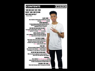
The target audience for the magazine is 18-24 year olds who are equally male and female and interested in hip-hop, R&B, and current artists. To attract this audience, neutral colors like black and white were used along with pink to appeal to females. Feedback from the target audience was incorporated into the magazine. The front cover uses big artist names and "exclusive" content. While the model is male, he is portrayed in a softer way. The contents page features a female artist quote. Features include stories on popular artists and sports to engage males and females. Double page spreads provide background on artists to create connection and exclusivity.
Evaluation - Question 2
The magazine represents young British and American adults. While all images feature male models in line with genre conventions, the document aims to be inclusive of both male and female readers. Models are posed and dressed to appear approachable and non-intimidating. Photos use direct eye contact and softer facial expressions to create connection. Layout and design features simple, easy to read text and bold colors to appeal to younger audiences. The goal is to relate artists to readers and build fan bases through a sense of personal relationship.
Conventions of magazines
The document discusses the benefits of exercise for mental health. Regular physical activity can help reduce anxiety and depression and improve mood and cognitive function. Exercise causes chemical changes in the brain that may help protect against mental illness and improve symptoms for those who already suffer from conditions like anxiety and depression.
Evaluation - Question 1
This document analyzes how the media production uses, develops, and challenges conventions of real music magazines. It summarizes the conventions found in magazines like VIBE and XXL for various elements like covers, mastheads, images, and text layout. It then explains how the media production complies with conventions like large mastheads and column text layouts, but also challenges conventions through elements like a landscape double page image and album promotion info. The analysis provides specifics on design choices and how they relate to conventions in other magazines and meeting the goals of the target audience.
Evaluation - Question 7
The student learned many improvements from their preliminary magazine task to their final production. For the final production, the student paid more attention to image composition, lighting, and editing. They also improved the text by using clearer fonts and formatting. The layout became more complex with layers and effects like shadows. Research taught the importance of an attention-grabbing masthead, which the student incorporated with larger, bolder text in the final production. Overall, the student was able to apply what they learned from creating the preliminary task to strengthen the images, text, layout, and design of the final magazine pieces.
Codes and Conventions of Magazines
The document discusses conventions used in magazine design. It provides examples from magazine covers and interior pages. Some key conventions discussed include using a bold masthead font to identify the magazine, prominent cover images of celebrities related to the magazine's genre, and consistent color schemes throughout the magazine content and covers. Interior pages also employ techniques like quotes and large images of celebrities to draw reader attention, while keeping body text in an easy-to-read font. The consistent application of design elements and celebrities tied to the magazine's topic help create recognition and attract readership.
Media language
This document introduces key concepts for studying media at A-Level, including representations, audiences, institutions, language, ideology, narrative, and genre. It focuses on the concepts of language, narrative, and genre. Language in media includes codes that construct meaning, such as visual codes, audio codes, and written codes. Narrative refers to the story elements of a media text. Genre describes the type or category of a media text, such as comedy or action. The document provides examples of analyzing images by describing what is seen (denotation) and interpreting what is happening (connotation). Framing techniques like camera angles, distances, and lens types are also discussed.
Recommandé
Evaluation - Question 3
The document discusses two potential media institutions that could distribute the author's media product: Bauer Media Group and Time Inc. Bauer Media Group publishes magazines like Q and Kerrang that target young adults, and they do not currently feature a magazine in the author's genre. Time Inc. publishes over 90 magazines including NME, has experience targeting young adults, and does not feature a magazine in the author's genre, so it could help the author's magazine succeed and capture a larger audience.
Evaluation - Question 4&5
The target audience for the magazine is 18-24 year olds who are equally male and female and interested in hip-hop, R&B, and current artists. To attract this audience, neutral colors like black and white were used along with pink to appeal to females. Feedback from the target audience was incorporated into the magazine. The front cover uses big artist names and "exclusive" content. While the model is male, he is portrayed in a softer way. The contents page features a female artist quote. Features include stories on popular artists and sports to engage males and females. Double page spreads provide background on artists to create connection and exclusivity.
Evaluation - Question 2
The magazine represents young British and American adults. While all images feature male models in line with genre conventions, the document aims to be inclusive of both male and female readers. Models are posed and dressed to appear approachable and non-intimidating. Photos use direct eye contact and softer facial expressions to create connection. Layout and design features simple, easy to read text and bold colors to appeal to younger audiences. The goal is to relate artists to readers and build fan bases through a sense of personal relationship.
Conventions of magazines
The document discusses the benefits of exercise for mental health. Regular physical activity can help reduce anxiety and depression and improve mood and cognitive function. Exercise causes chemical changes in the brain that may help protect against mental illness and improve symptoms for those who already suffer from conditions like anxiety and depression.
Evaluation - Question 1
This document analyzes how the media production uses, develops, and challenges conventions of real music magazines. It summarizes the conventions found in magazines like VIBE and XXL for various elements like covers, mastheads, images, and text layout. It then explains how the media production complies with conventions like large mastheads and column text layouts, but also challenges conventions through elements like a landscape double page image and album promotion info. The analysis provides specifics on design choices and how they relate to conventions in other magazines and meeting the goals of the target audience.
Evaluation - Question 7
The student learned many improvements from their preliminary magazine task to their final production. For the final production, the student paid more attention to image composition, lighting, and editing. They also improved the text by using clearer fonts and formatting. The layout became more complex with layers and effects like shadows. Research taught the importance of an attention-grabbing masthead, which the student incorporated with larger, bolder text in the final production. Overall, the student was able to apply what they learned from creating the preliminary task to strengthen the images, text, layout, and design of the final magazine pieces.
Codes and Conventions of Magazines
The document discusses conventions used in magazine design. It provides examples from magazine covers and interior pages. Some key conventions discussed include using a bold masthead font to identify the magazine, prominent cover images of celebrities related to the magazine's genre, and consistent color schemes throughout the magazine content and covers. Interior pages also employ techniques like quotes and large images of celebrities to draw reader attention, while keeping body text in an easy-to-read font. The consistent application of design elements and celebrities tied to the magazine's topic help create recognition and attract readership.
Media language
This document introduces key concepts for studying media at A-Level, including representations, audiences, institutions, language, ideology, narrative, and genre. It focuses on the concepts of language, narrative, and genre. Language in media includes codes that construct meaning, such as visual codes, audio codes, and written codes. Narrative refers to the story elements of a media text. Genre describes the type or category of a media text, such as comedy or action. The document provides examples of analyzing images by describing what is seen (denotation) and interpreting what is happening (connotation). Framing techniques like camera angles, distances, and lens types are also discussed.
Main task magazine analysis
The document discusses conventions for magazine design including:
- Using catchy sell lines and prominent mastheads to attract readers.
- Consistent color schemes and prominent covers featuring celebrities or iconic locations.
- Placement of barcodes and advertisements to maximize visibility without overcrowding.
- Varied layouts for contents pages with headlines, images, and concise summaries.
- Social media links to create connections between magazines and readers.
Imagery and easy navigation aid readers in deciding which articles to read.
Billboard Codes & Conventions
This document discusses different billboard advertisements. It notes that billboards specifically for magazines were limited, but one for a Sunday Times newspaper used only text and the company logo in the newspaper's style. It also describes three similar advertisements that feature a large product image, a solid color background, and a short catchline to promote brand recognition. Additionally, it analyzes a billboard that is missing part of its design due to brand strength, allowing audiences to recognize it without seeing the full name.
Webpage Codes and Conventions
The document outlines various codes and conventions used on a magazine website homepage. It describes elements like the masthead in a large, contrasting font to draw attention; links to make navigation easier; a focus on the latest magazine edition; social media links for interaction; advertisements to gain subscribers; a search bar and digital archive for navigation; and a newsletter sign-up to promote products. The purpose is to highlight key information about the magazine, engage readers, and encourage subscriptions through an accessible and visually engaging design.
Billboard Codes and Conventions
These three advertisements share common characteristics. They each feature a large image of the product or brand, placed against a solid colored background. They also keep the accompanying text brief and easy to read, with the goal of making the ad memorable. The third ad analyzed subverts expectations for billboards by leaving out part of the brand name, trusting that the brand is strong enough for audiences to recognize it without seeing it fully. This ad also follows conventions by prioritizing a large image over detailed text.
Main Task - Magazine Analysis
The document summarizes conventions for magazine design based on research. Key conventions include: using prominent images on the cover to attract readers; consistent color schemes across elements; prominent mastheads and sell lines; barcodes located unobtrusively; advertisements near the front with large images and short text; contents pages with bolded headings and brief descriptions to aid navigation. Variations exist but magazines generally aim to guide the eye, convey key information quickly, and establish a professional, cohesive brand identity.
Magazine analysis
The document discusses the codes and conventions commonly used in magazine design. It provides examples from XXL magazine covers and pages. Key conventions discussed include the masthead logo, taglines, coverlines, central images, cover models, color schemes, barcodes, and fonts. Consistency of these visual elements is emphasized to create a recognizable brand and attract the target audience. Images of famous rappers are often used as they are instantly recognizable to readers and signal the magazine's genre. Color palettes and masculine fonts also aim to appeal to the intended demographic audience.
Impact des Critères Environnementaux, Sociaux et de Gouvernance (ESG) sur les...
J'ai réalisé ce projet pour obtenir mon diplôme en licence en sciences de gestion, spécialité management, à l'ISCAE Manouba. Au cours de mon stage chez Attijari Bank, j'ai été particulièrement intéressé par l'impact des critères Environnementaux, Sociaux et de Gouvernance (ESG) sur les décisions d'investissement dans le secteur bancaire. Cette étude explore comment ces critères influencent les stratégies et les choix d'investissement des banques.
Iris van Herpen. pptx
Power-point sur une exposition qui a eu lieu dans le Musée des Arts décoratifs à Paris sur Iris van Herpen
Conseils pour Les Jeunes | Conseils de La Vie| Conseil de La Jeunesse
Besoin des conseils pour les Jeunes ? Le document suivant est plein des conseils de la Vie ! C’est vraiment un document conseil de la jeunesse que tout jeune devrait consulter.
Voir version video:
➡https://youtu.be/7ED4uTW0x1I
Sur la chaine:👇
👉https://youtube.com/@kbgestiondeprojets
Aimeriez-vous donc…
-réussir quand on est jeune ?
-avoir de meilleurs conseils pour réussir jeune ?
- qu’on vous offre des conseils de la vie ?
Ce document est une ressource qui met en évidence deux obstacles qui empêchent les jeunes de mener une vie épanouie : l'inaction et le pessimisme.
1) Découvrez comment l'inaction, c'est-à-dire le fait de ne pas agir ou d'agir alors qu'on le devrait ou qu'on est censé le faire, est un obstacle à une vie épanouie ;
> Comment l'inaction affecte-t-elle l'avenir du jeune ? Que devraient plutôt faire les jeunes pour se racheter et récupérer ce qui leur appartient ? A découvrir dans le document ;
2) Le pessimisme, c'est douter de tout ! Les jeunes doutent que la génération plus âgée ne soit jamais orientée vers la bonne volonté. Les jeunes se sentent toujours mal à l'aise face à la ruse et la volonté politique de la génération plus âgée ! Cet état de doute extrême empêche les jeunes de découvrir les opportunités offertes par les politiques et les dispositifs en faveur de la jeunesse. Voulez-vous en savoir plus sur ces opportunités que la plupart des jeunes ne découvrent pas à cause de leur pessimisme ? Consultez cette ressource gratuite et profitez-en !
En rapport avec les " conseils pour les jeunes, " cette ressource peut aussi aider les internautes cherchant :
➡les conseils pratiques pour les jeunes
➡conseils pour réussir
➡jeune investisseur conseil
➡comment investir son argent quand on est jeune
➡conseils d'écriture jeunes auteurs
➡conseils pour les jeunes auteurs
➡comment aller vers les jeunes
➡conseil des jeunes citoyens
➡les conseils municipaux des jeunes
➡conseils municipaux des jeunes
➡conseil des jeunes en mairie
➡qui sont les jeunes
➡projet pour les jeunes
➡conseil des jeunes paris
➡infos pour les jeunes
➡conseils pour les jeunes
➡Quels sont les bienfaits de la jeunesse ?
➡Quels sont les 3 qualités de la jeunesse ?
➡Comment gérer les problèmes des adolescents ?
➡les conseils de jeunes
➡guide de conseils de jeunes
Mémoire de licence en finance comptabilité et audit
Traitement comptable des cessions d'immobilisation dans les collectivités locales
Cours de conjugaison des verbes du premier, deuxième et troisième groupe
Conjugaison des verbes en Anglais
Iris et les hommes.pptx
Film français réalisé par Caroline Vignal et joué par son actrice favorite: Laure Calamy.
Contenu connexe
Plus de JordanLiddell
Main task magazine analysis
The document discusses conventions for magazine design including:
- Using catchy sell lines and prominent mastheads to attract readers.
- Consistent color schemes and prominent covers featuring celebrities or iconic locations.
- Placement of barcodes and advertisements to maximize visibility without overcrowding.
- Varied layouts for contents pages with headlines, images, and concise summaries.
- Social media links to create connections between magazines and readers.
Imagery and easy navigation aid readers in deciding which articles to read.
Billboard Codes & Conventions
This document discusses different billboard advertisements. It notes that billboards specifically for magazines were limited, but one for a Sunday Times newspaper used only text and the company logo in the newspaper's style. It also describes three similar advertisements that feature a large product image, a solid color background, and a short catchline to promote brand recognition. Additionally, it analyzes a billboard that is missing part of its design due to brand strength, allowing audiences to recognize it without seeing the full name.
Webpage Codes and Conventions
The document outlines various codes and conventions used on a magazine website homepage. It describes elements like the masthead in a large, contrasting font to draw attention; links to make navigation easier; a focus on the latest magazine edition; social media links for interaction; advertisements to gain subscribers; a search bar and digital archive for navigation; and a newsletter sign-up to promote products. The purpose is to highlight key information about the magazine, engage readers, and encourage subscriptions through an accessible and visually engaging design.
Billboard Codes and Conventions
These three advertisements share common characteristics. They each feature a large image of the product or brand, placed against a solid colored background. They also keep the accompanying text brief and easy to read, with the goal of making the ad memorable. The third ad analyzed subverts expectations for billboards by leaving out part of the brand name, trusting that the brand is strong enough for audiences to recognize it without seeing it fully. This ad also follows conventions by prioritizing a large image over detailed text.
Main Task - Magazine Analysis
The document summarizes conventions for magazine design based on research. Key conventions include: using prominent images on the cover to attract readers; consistent color schemes across elements; prominent mastheads and sell lines; barcodes located unobtrusively; advertisements near the front with large images and short text; contents pages with bolded headings and brief descriptions to aid navigation. Variations exist but magazines generally aim to guide the eye, convey key information quickly, and establish a professional, cohesive brand identity.
Magazine analysis
The document discusses the codes and conventions commonly used in magazine design. It provides examples from XXL magazine covers and pages. Key conventions discussed include the masthead logo, taglines, coverlines, central images, cover models, color schemes, barcodes, and fonts. Consistency of these visual elements is emphasized to create a recognizable brand and attract the target audience. Images of famous rappers are often used as they are instantly recognizable to readers and signal the magazine's genre. Color palettes and masculine fonts also aim to appeal to the intended demographic audience.
Plus de JordanLiddell (6)
Dernier
Impact des Critères Environnementaux, Sociaux et de Gouvernance (ESG) sur les...
J'ai réalisé ce projet pour obtenir mon diplôme en licence en sciences de gestion, spécialité management, à l'ISCAE Manouba. Au cours de mon stage chez Attijari Bank, j'ai été particulièrement intéressé par l'impact des critères Environnementaux, Sociaux et de Gouvernance (ESG) sur les décisions d'investissement dans le secteur bancaire. Cette étude explore comment ces critères influencent les stratégies et les choix d'investissement des banques.
Iris van Herpen. pptx
Power-point sur une exposition qui a eu lieu dans le Musée des Arts décoratifs à Paris sur Iris van Herpen
Conseils pour Les Jeunes | Conseils de La Vie| Conseil de La Jeunesse
Besoin des conseils pour les Jeunes ? Le document suivant est plein des conseils de la Vie ! C’est vraiment un document conseil de la jeunesse que tout jeune devrait consulter.
Voir version video:
➡https://youtu.be/7ED4uTW0x1I
Sur la chaine:👇
👉https://youtube.com/@kbgestiondeprojets
Aimeriez-vous donc…
-réussir quand on est jeune ?
-avoir de meilleurs conseils pour réussir jeune ?
- qu’on vous offre des conseils de la vie ?
Ce document est une ressource qui met en évidence deux obstacles qui empêchent les jeunes de mener une vie épanouie : l'inaction et le pessimisme.
1) Découvrez comment l'inaction, c'est-à-dire le fait de ne pas agir ou d'agir alors qu'on le devrait ou qu'on est censé le faire, est un obstacle à une vie épanouie ;
> Comment l'inaction affecte-t-elle l'avenir du jeune ? Que devraient plutôt faire les jeunes pour se racheter et récupérer ce qui leur appartient ? A découvrir dans le document ;
2) Le pessimisme, c'est douter de tout ! Les jeunes doutent que la génération plus âgée ne soit jamais orientée vers la bonne volonté. Les jeunes se sentent toujours mal à l'aise face à la ruse et la volonté politique de la génération plus âgée ! Cet état de doute extrême empêche les jeunes de découvrir les opportunités offertes par les politiques et les dispositifs en faveur de la jeunesse. Voulez-vous en savoir plus sur ces opportunités que la plupart des jeunes ne découvrent pas à cause de leur pessimisme ? Consultez cette ressource gratuite et profitez-en !
En rapport avec les " conseils pour les jeunes, " cette ressource peut aussi aider les internautes cherchant :
➡les conseils pratiques pour les jeunes
➡conseils pour réussir
➡jeune investisseur conseil
➡comment investir son argent quand on est jeune
➡conseils d'écriture jeunes auteurs
➡conseils pour les jeunes auteurs
➡comment aller vers les jeunes
➡conseil des jeunes citoyens
➡les conseils municipaux des jeunes
➡conseils municipaux des jeunes
➡conseil des jeunes en mairie
➡qui sont les jeunes
➡projet pour les jeunes
➡conseil des jeunes paris
➡infos pour les jeunes
➡conseils pour les jeunes
➡Quels sont les bienfaits de la jeunesse ?
➡Quels sont les 3 qualités de la jeunesse ?
➡Comment gérer les problèmes des adolescents ?
➡les conseils de jeunes
➡guide de conseils de jeunes
Mémoire de licence en finance comptabilité et audit
Traitement comptable des cessions d'immobilisation dans les collectivités locales
Cours de conjugaison des verbes du premier, deuxième et troisième groupe
Conjugaison des verbes en Anglais
Iris et les hommes.pptx
Film français réalisé par Caroline Vignal et joué par son actrice favorite: Laure Calamy.
Dernier (12)
Formation Intelligence Artificielle pour dirigeants- IT6-DIGITALIX 24_opt OK_...
Formation Intelligence Artificielle pour dirigeants- IT6-DIGITALIX 24_opt OK_...
Impact des Critères Environnementaux, Sociaux et de Gouvernance (ESG) sur les...
Impact des Critères Environnementaux, Sociaux et de Gouvernance (ESG) sur les...
Conseils pour Les Jeunes | Conseils de La Vie| Conseil de La Jeunesse
Conseils pour Les Jeunes | Conseils de La Vie| Conseil de La Jeunesse
Mémoire de licence en finance comptabilité et audit
Mémoire de licence en finance comptabilité et audit
Cours de conjugaison des verbes du premier, deuxième et troisième groupe
Cours de conjugaison des verbes du premier, deuxième et troisième groupe