CBIG June 20, 2013. Presentation by Michael Cristiani, Director of Visual Analytics, Empower MediaMarketing. “Using Tableau to Inform and Add Value - A Survey & Demo"

Mike will be discussing how Tableau is designed around the Cycle of Visual Analysis, a process anyone who needs to see and understand data uses and appreciates. His presentation will focus on showing, by example and hands-on demonstration, how Tableau's incremental, expressive, unified, and direct affordances support the Cycle, and relay built-in data visualization best practices. Michael W Cristiani is the Director of Visual Analytics in the Decision Sciences Practice at Empower MediaMarketing, an independent media agency engaged in planning, buying, creating, and proving the impact of media. He is an experienced market researcher/analyst, business geographer, and business intelligence application developer. Michael specializes in enterprise-wide platforms for distribution of market and customer information and actionable data analysis. His four decades of domain expertise include visual analytics, urban and regional planning, demographic forecasting and analysis, geographic information systems, spatial statistics, time-series analysis and forecasting, demand modeling, market analysis, and market segmentation.

Recommandé
Recommandé
Contenu connexe
Dernier
Dernier (20)
En vedette
En vedette (20)
CBIG June 20, 2013. Presentation by Michael Cristiani, Director of Visual Analytics, Empower MediaMarketing. “Using Tableau to Inform and Add Value - A Survey & Demo"
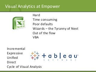
- 1. Visual Analytics at Empower Hard Time consuming Poor defaults Wizards – the Tyranny of Next Out of the flow VBA Incremental Expressive Unified Direct Cycle of Visual Analysis
- 2. Visual Analytics at Empower Hard Time consuming Poor defaults Wizards – the Tyranny of Next Out of the flow VBA
- 3. Visual Analytics at Empower Cycle of Visual Analysis Incremental Expressive Unified Direct
- 4. The Cycle of Visual Analysis
- 5. The Visual Information Seeking Mantra Overview first, zoom and filter, then details-on-demand Ben Shneiderman, University of Maryland, HCIL
- 6. Using Tableau to inform and add value Some examples of the VISM Sales Dashboard Profitability KPI Dashboard College Finder Music Festivals in Manhattan
- 7. Using Tableau to inform and add value We help clients plan / execute DM programs. This example shows target households based on demos and distance from a store. Direct Marketing Planning
- 8. Using Tableau to inform and add value This example, shows an improved version of a published visualization of Santana's no-hitter during the NY Mets 2012 season. Johan Santana's No Hitter
- 9. Using Tableau to inform and add value Simple data, sophisticated analytics, modeling and reporting Drew Robertson, RailFax Futures Railfax Operational Efficiency Interesting but Underused Forms
- 10. Using Tableau to inform and add value Using Parameters and Visual Filters My Thanksgiving Meal Survey Reporting Sales Supply Chain
- 11. Using Tableau to inform and add value Public Data Canadian Hospital Reporting Project Arrow Charts Infant mortality over time Bird Strikes Girls Education
- 12. C A S E Examples » Tableau Training Videos (on-demand, live webinars) » Tableau Product Manuals and Online Help » Tableau Knowledge Base » Tableau Visual Gallery » Tableau Community / Forums » LinkedIn, Facebook, Twitter » Thought Leaders’ Blogs and Web Sites
- 13. C A S E Examples Some Thought Leaders’ and Zen Masters’ Blogs • Joe Mako • Andy Kriebel (www.vizwiz.blogspot.com) • Applied Visual Analytics (http://appliedviz.blogspot.com) • Steve Wexler (www.datarevelations.com) • Interworks (www.interworks.com) • AlanSmithee Presents (www.alansmitheepresents.org) • Ben Jones (www.dataremixed.com) • Ryan Robles (www.ryrobes.com) • Jonathan Drummey (http://drawingwithnumbers.artisart.org/) • Craig Bloodworth (http://www.theinformationlab.co.uk/hub) • Kelly Martin (http://vizcandy.blogspot.com) • Richard Leeke (http://blog.equinox.co.nz/bloghttp://blog.equinox.co.nz/blog)
Notes de l'éditeur
- Incremental – The view builds and you can add items. You don't have to define everything at once but rather incrementally add new context to your question as patterns emerge Expressive – You can describe the data in lots and lots of different ways without limitations Unified – Some tools have plugins where you can add a bunch of chart types but they don't all work together, they don't support all of the functionality, etc. All of these elements need to work together. Direct – It's immediate. You click you get an action. You directly connect to your data sources so you can quickly answer questions.
- Direct Marketing Planning - We help a number of clients plan and execute direct marketing programs. This example shows how the client used a dashboard we developed to determine which households to target based on demographics and distance from a proposed new store location.
- It includes links out to MLB clips for selected key plays. For example, hover over the gray square for out 16 (the first out of the sixth inning) in the strip at the top of visualization. Then click on the hyperlink that appears. The point here is to show that other data sources, including "new media" can be embedded in analytical displays. In a business setting, these might be links to training videos that appear when financial performance is above or below certain thresholds.
- My Thanksgiving Meal This whimsical example demonstrates how marginally related data sources can be used together to solved an analytical problem. Here nutrition data on the variable ingredients for cooking a meal were mashed up with exercise metrics to help a user determine what to cook/eat and how to burn off the calories. The implementation shows a number of advantages of using Tableau for this kind of analytical task, including the ability to tell a story. Hover over almost any element in the dashboard to find additional information. Based on the ingredients, dishes and exercise the user specifies, the right side of the dashboard reports in narrative form what effort will be required to neutralize the feast. Survey Reporting Likert scales and multiple mark types. This example shows the use of visual filters, multiple mark types, and dual axis graphs to drive interactive deep-dives Sales An example of sales planning and forecasting, the impact of user specified parameters like churn rates commission rates, etc. Supply Chain This example shows how the use of parameters can be used to estimate forward looking sales, profit, and forecasted available quantity of manufactured goods. It is a simple example, visually, but a lot goes on behind the scenes.
- Arrow Charts This example is the result of a discussion on alternative ways to visualize BLS data on the change in household spending. To give you some sense of the aesthetic look and feel that is possible: Here is a recently published look at bird strike data from the FAA: Bird Strikes , One that allows for interactive examination of infant mortality over time around the world . The Girls Education example is deceivingly simple, but well planned. The “About Girls” tab shows how Tableau visualizations can help brands or scientists, educators, etc., communicate curated content that more completely informs their analytics and reporting. These are more graphic than tabular reports, but give some idea of the range of work that is doable by our team.