SlideShare une entreprise Scribd logo
1  sur  11
Evaluation for Music Magazine
In what ways does your media product use, develop or challenge forms and conventions of real media products? When thinking of my music magazine I tried to make it look like other similar professional magazines, for example the strip at the very top, like the one below it informs the reader what is on.; In some ways like a cover line. This makes the reader interested as sometimes you might get something for free when purchasing the magazine. I tried to make I tried to make the picture as good as I could, as I only had around 10 good quality pictures. Never the less I thought this photo suited the front cover. My picture is similar to the one below as there is two people, and in both pictures they are looking towards the reader to add extra effect. I thought of this while producing mine and thought it would add more effect if I did so.  The cover lines are similar too. Cover lines are used to inform the reader about what's included in the magazine and are often used to add extra effect.  As my main colour pallet was red white and black, I decided to stick to it and hence the reason the cover lines are this colour. The NME magazine includes cover lines on the actual picture, I did not want this as I wanted the picture to stand out and to be different. I do not think it would of suited my magazine if I added more cover lines especially over the picture, perhaps if I had different colour background maybe, but I liked the fact the background was black and it made the headline stand out. The NME background is white and i wanted to add this to my magazine, but I seemed to like the colour black and stuck with that. With white it made the picture stand out a lot more as it was a dark coloured effect, with bold white writing. I thought this looked good and was effective; also when someone picked it up if you liked that type of music you would be interested in buying it. There is a similarity between these two magazines and I looked for ideas, and I wanted my magazine to be like this one
In terms of the picture they both contain musicians or band posing.  The way they are dressed highlights the type of music presented in the magazine, as opposed  to stories that are not musically related.  Like I said the clothing is a convention I used to achieve my target audience. Both Musicians are wearing something that would appeal to the rock audience. The model I used is wearing a checked top with black jeans, this suggests that she is promoting rock music and perhaps is a rock artist. NME also used clothing to promote what their magazine was based on. They used dark colours such as brown and black and added a effect which makes their skin a little darker too.  Issue of NME My music magazine The pictures… I think it is important to try to promote what genre your magazine is on, such as rock in this case. People need to know what kind of magazine it is and has made me notice how important it is to get this through to people.  One main image -- This is the focus of the magazine, it is clear to the audience that this is the main story. This main image has to stand out from the rest. It is often bigger in size and a different colour too, but has to blend into the background.  (no rough edges!)
The pictures are very important and in need to do their main job they need to stand out . I tried to make mine stand out as much as possible. It was a pain though as I had to get rid of the backgrounds then smooth the edges down and place it onto the magazine. In many cases I had to add a certain glow, as the edges were too rough and it went into the magazine’s background too much… the background was black and so was some of our clothing.  As you can see the bottom half of us are dark colours. This is the problem I had while producing my magazine. As some of our clothing was dark colours I had to try to make it stand out a lot more then usual (more then I actually would of liked to). Getting the right glow effect was hard. You had to judge when to stop, and when it was to much. I didn’t want it looking unprofessional, and I figured if I added a lot of glow it wouldn’t look right. So in the end I ended up adding a little bit of glow and went on Photoshop to smooth it down again. I did this a few times just to get it right. Getting the pictures in the right place was a challenge. I looked at other professional magazines for various genres. This helped as most pictures were on the right hand side  of the front cover and the cover lines on the left. This is because when the reader picks up a magazine, the cover lines will be the first thing they will see.  This means that the cover lines had to be
How does your media product represent particular social groups?   My magazine is based on Indie rock/rock music. This represents this because of the colour plate. I used the colours Red, white and Black and I wanted this to be consistent throughout. These colours are normally used in rock magazines and this is what I was aiming for.  Also the cover lines show that my main target audience is fans of rock and Indie. ‘Kings Of Leon’ are a well known rock/Indie band and by listening to their music often, and reading about them in magazines, most fans seem to be interested about their music and gigs. This is why I have included them in my magazine as it would reach a lot of individuals.  As it a Indie magazine also I had to include other famous artists that may be involved in this genre. To do so I used my own imagination and made a band of my own up. I based it on me and my friend and just changed their names and the storyline of course. Even though I thought the magazine was hard to write it was soon produced and it was included. This also shows Indie/rock because the article’s about a rapper joining a rocker girl and her drummer. I have known other artists or famous people that have joined certain groups and have been successful, so I decided to do this. In addition, in my opinion I thought that the headline suited the social groups (Indie and Rock). It just seemed to suit the magazine. I think I could of made it a bit bigger so it stood out more but that could be something to improve on in the future. I also needed more text, like cover lines, but as I missed 2 weeks of media it was hard to play catch up.  I tried to make my Headline as believable as possible. Like the NME I tried to make it stand out from the black background. I think I did well as when I stood back I could see that it did in fact stand out with the main picture. The NME   Headline is Bold and simple. It is unique and can be remembered easily.
What kind of media institution might distribute your media product and why?   IPC is one of the United Kingdoms leading consumer magazine and digital publishers, selling over 350 million copies each year. Music magazines they own is:  •  NME and Guitar and Bass. I have chosen IPC because this is focused on NME based magazines and I have focused my magazines based on these certain type of magazines as my main genre is rock/Indie.  In addition they produce millions of copies each year in different  genres. The company have many different brands within them and publish over 80 magazines that are of various genres to attract all audiences.   These two headlines have various similarities; Big bold writing, with a black background to make it stand out. The colours have to match, and this is how I compared my music magazine with IPC! As IPC produce some NME magazines, I linked my magazine to them but made them my own way. IPC are well known and as they produce thousands of copies I decided to make my magazine about this institution.
Who would be the audience for your media product?   ,[object Object],[object Object],[object Object],[object Object],I have chosen this because I think it might link to young adults and teenagers and the type of music they might listen to or hear. Certain individuals may be able to link/relate themselves to the artist. Maybe they have went through the same problems and you  like their music because it’s talks about this.  Some others just simply listen to others music because they think it is ‘cool’ and sounds good. I have also decided to base my Magazine on both types of sex. The reason being is because rock is for both types of sex not just the one. Also I think it would be wrong to just make a magazine just aimed for one type of sex, it has to be mixed. It would be wrong to stereotype and say certain people can’t read my magazine because of who they are but in fact if they like the music and the magazine, there is no problem. Different people like different music types. For example posh people could be in heavy metal and children could be into classical music. I tried not to be stereotypical when producing my magazine as people would take offence.
How did you attract/address your audience?   To attract your audience you have to have interesting colours and make it different ( not to different) and it has to be eye catching.  Like this on the left it stands out and is different; because of it’s use of colours and what it is. This is what I wanted my magazine to be like, however I didn’t want it to be too different, as I didn’t want to lose marks, but I took risks where I could. As I wanted it to be creative I created my own   barcode; it was online as I couldn’t do it anywhere else and didn’t have the time else where. It didn’t take long at all and all I had to do was add the date and price. I had to be careful when doing this as it was hard to get the correct font and text.  When deciding on the price it was tricky. I couldn’t decide on a price range for my magazine and how much I thought it would have been worth if it was actually produced. I remembered that I had people fill out questionnaires, in which one question was about the price and the greatest range was between £1.50 and £2.00. Of course I want to make more profit so I decided on £2.30. To me this sounds like a possible price. The date was tricky too as I had to figure out a date that is in the future that’s not so far away. I couldn’t have a date that went. In the questionnaire I asked if people wanted to see more text or images. There reply was both, which is why I included one more picture on the front cover. Although I had the main front cover image, it seemed as if I needed one more. Also other music magazines have included more then one image on their front cover, so this also added to me to including one more.
Cover lines… Cover lines are used to inform the reader of what is included in the magazine. It was hard to think of cover lines that were suitable for my type of magazine. Like every magazine I thought I would include a little love story and this is shown on the bottom left.. For my Cover lines i used different magazines to get ideas of what I could do. Like   I said in every magazine there will always be a love story so I thought I would include on in my magazine, and show it by adding it as a cover line.. Deryck and Katy a item once again? This adds extra effect and makes the reader know there is a love story included. The cover lines are the first things the reader will be able to see as they pick it up so the over lines have to be good. In some cases, certain magazines have a picture with a cover line for effect and greater impact. I decided to include a picture of a boy who is in a band going on tour with his mates. I had to photo shop and filter it but never the less I think it suited the magazine. For my main article   I decided to make it on two friends coming together and performing for the first time. Because of the fact it is my main article it  HAD  to be on the front cover, and the main image had to relate to this too.  Cover lines can include quotes and this is what I decided to include in mine. I  even have a rhetorical question.  For my magazine I used these throughout to help produce my magazine and to give me ideas and to help improve in all areas. I also looked for inspiration in other magazines in real life. The little adverts at the top were great and helped me to include one in my magazine.
What have you learnt about technologies from the process of constructing this product?   I developed my understanding of how to use the software; such as Indesign. I found it hard as I never used it before, but in some ways it was similar to Photoshop so I could understand the basics of Indesign. On Indesign you have to place everything on a different layer.
Looking back at your preliminary task, what do you feel you have learnt in the progression from it to the full product?   I have learned that you need to have a lot of patience to work on Indesign. It is harder then Photoshop but is great quality to produce magazines and other work that you want for great quality. You need to have a different layer for everything. For example; the background on one layer, and then the picture on another. It can get very confusing at times. When doing my work I had trouble with the layers, and had to start again because everything was on only one layer. The Picture, the text, the colours was all as one.  So I had to start again from the very start and put everything one separate layer. I put all the pictures on one layer then text on another and sometimes I even locked them so they could not be deleted. I am used to photo shop so I did not have any trouble with it, there was times that it wasn’t responding and it was really annoying but I managed to do what I was wanting to do. I edited most of my pictures on here and was great help. Editing the pictures was easy it was the placing that was hard or tricky. You could say I had some difficulty with working with Indesign, it was hard to figure out at first but know I have a better understanding of it, I would like to use it in the future.

Contenu connexe

Tendances

Notorious Evaluation
Notorious EvaluationNotorious Evaluation
Notorious Evaluation
EllieSwan
 
Hatties evaluation
Hatties evaluationHatties evaluation
Hatties evaluation
hattie_clyde
 
Notorious evaluation
Notorious evaluationNotorious evaluation
Notorious evaluation
EllieSwan
 
My evaluation
My evaluationMy evaluation
My evaluation
emmaeglin
 
Media Evaluation Lewis Cooke
Media Evaluation Lewis CookeMedia Evaluation Lewis Cooke
Media Evaluation Lewis Cooke
guest8e34681
 
Music Magazine Survey: Analysis of results
Music Magazine Survey: Analysis of resultsMusic Magazine Survey: Analysis of results
Music Magazine Survey: Analysis of results
tashaay27
 
Media Presentation
Media PresentationMedia Presentation
Media Presentation
Jessica
 

Tendances (12)

Notorious Evaluation
Notorious EvaluationNotorious Evaluation
Notorious Evaluation
 
Hatties evaluation
Hatties evaluationHatties evaluation
Hatties evaluation
 
Media evaluation
Media evaluationMedia evaluation
Media evaluation
 
Notorious evaluation
Notorious evaluationNotorious evaluation
Notorious evaluation
 
Pitch Unit 13
Pitch Unit 13Pitch Unit 13
Pitch Unit 13
 
Unit 30 pitch
Unit 30 pitchUnit 30 pitch
Unit 30 pitch
 
Evaluation
EvaluationEvaluation
Evaluation
 
My evaluation
My evaluationMy evaluation
My evaluation
 
Media Evaluation Lewis Cooke
Media Evaluation Lewis CookeMedia Evaluation Lewis Cooke
Media Evaluation Lewis Cooke
 
Music Magazine Survey: Analysis of results
Music Magazine Survey: Analysis of resultsMusic Magazine Survey: Analysis of results
Music Magazine Survey: Analysis of results
 
Media Presentation
Media PresentationMedia Presentation
Media Presentation
 
Evaluation
EvaluationEvaluation
Evaluation
 

En vedette (7)

Dimmerman anotated-bibliography-10-17-10
Dimmerman anotated-bibliography-10-17-10Dimmerman anotated-bibliography-10-17-10
Dimmerman anotated-bibliography-10-17-10
 
1.+cartilla+dnp+para+formulación+del+plan+de+desarrollo
1.+cartilla+dnp+para+formulación+del+plan+de+desarrollo1.+cartilla+dnp+para+formulación+del+plan+de+desarrollo
1.+cartilla+dnp+para+formulación+del+plan+de+desarrollo
 
Durgaprasad
DurgaprasadDurgaprasad
Durgaprasad
 
Group 6 slides exploring web 2
Group 6 slides exploring web 2Group 6 slides exploring web 2
Group 6 slides exploring web 2
 
Dimmerman anotated-bibliography10-17-10-updated
Dimmerman anotated-bibliography10-17-10-updatedDimmerman anotated-bibliography10-17-10-updated
Dimmerman anotated-bibliography10-17-10-updated
 
Photots for magazine
Photots for magazinePhotots for magazine
Photots for magazine
 
Reese presentation
Reese presentationReese presentation
Reese presentation
 

Similaire à Evaluation For Music Magazine (20)

Evaluation
EvaluationEvaluation
Evaluation
 
Evaluation:
Evaluation:Evaluation:
Evaluation:
 
Evaluation
EvaluationEvaluation
Evaluation
 
Evaluation
EvaluationEvaluation
Evaluation
 
Evaluation
EvaluationEvaluation
Evaluation
 
Evaluation
EvaluationEvaluation
Evaluation
 
Evaluation
EvaluationEvaluation
Evaluation
 
Evaluation
EvaluationEvaluation
Evaluation
 
Evaluation Presentation
Evaluation PresentationEvaluation Presentation
Evaluation Presentation
 
Evaluation
EvaluationEvaluation
Evaluation
 
Evaluation
EvaluationEvaluation
Evaluation
 
Evaluation
EvaluationEvaluation
Evaluation
 
Evaluation
EvaluationEvaluation
Evaluation
 
Evaluation
EvaluationEvaluation
Evaluation
 
Evaluation
EvaluationEvaluation
Evaluation
 
Evaluation Presentation
Evaluation PresentationEvaluation Presentation
Evaluation Presentation
 
Media presentation
Media presentationMedia presentation
Media presentation
 
Media presentation
Media presentationMedia presentation
Media presentation
 
Media presentation
Media presentationMedia presentation
Media presentation
 
Evaluation Presentation
Evaluation PresentationEvaluation Presentation
Evaluation Presentation
 

Plus de 07tjames

Written Evaluation
Written EvaluationWritten Evaluation
Written Evaluation
07tjames
 
Pie charts for audience feedback
Pie charts for audience feedbackPie charts for audience feedback
Pie charts for audience feedback
07tjames
 
Similarities to Professional Products
Similarities to Professional ProductsSimilarities to Professional Products
Similarities to Professional Products
07tjames
 
Dvd audience feedback
Dvd audience feedbackDvd audience feedback
Dvd audience feedback
07tjames
 
Construction for Promotional poster
Construction for Promotional posterConstruction for Promotional poster
Construction for Promotional poster
07tjames
 
Music Video Construction
Music Video ConstructionMusic Video Construction
Music Video Construction
07tjames
 
DVD Cover Construction
DVD Cover ConstructionDVD Cover Construction
DVD Cover Construction
07tjames
 
My Own Skating Pictures:
My Own Skating Pictures:My Own Skating Pictures:
My Own Skating Pictures:
07tjames
 
Analysing music magazines
Analysing music magazinesAnalysing music magazines
Analysing music magazines
07tjames
 
Kris Allen [No Boundaries ]
Kris Allen [No Boundaries ]Kris Allen [No Boundaries ]
Kris Allen [No Boundaries ]
07tjames
 
Kris Allen [ No Boundaries ]
Kris Allen  [ No Boundaries ]Kris Allen  [ No Boundaries ]
Kris Allen [ No Boundaries ]
07tjames
 
Kris Allen [ No boundaries ]
Kris Allen [ No boundaries ]Kris Allen [ No boundaries ]
Kris Allen [ No boundaries ]
07tjames
 
More Analysing
More AnalysingMore Analysing
More Analysing
07tjames
 
Analyzing Music Video's
Analyzing Music Video'sAnalyzing Music Video's
Analyzing Music Video's
07tjames
 
Music Magazine Photo's :
Music Magazine Photo's :Music Magazine Photo's :
Music Magazine Photo's :
07tjames
 
Construction
ConstructionConstruction
Construction
07tjames
 
Audience demographic
Audience demographicAudience demographic
Audience demographic
07tjames
 
Audience demographic
Audience demographicAudience demographic
Audience demographic
07tjames
 
Questionnaire Results
Questionnaire ResultsQuestionnaire Results
Questionnaire Results
07tjames
 
Questionnaire Results...
Questionnaire Results...Questionnaire Results...
Questionnaire Results...
07tjames
 

Plus de 07tjames (20)

Written Evaluation
Written EvaluationWritten Evaluation
Written Evaluation
 
Pie charts for audience feedback
Pie charts for audience feedbackPie charts for audience feedback
Pie charts for audience feedback
 
Similarities to Professional Products
Similarities to Professional ProductsSimilarities to Professional Products
Similarities to Professional Products
 
Dvd audience feedback
Dvd audience feedbackDvd audience feedback
Dvd audience feedback
 
Construction for Promotional poster
Construction for Promotional posterConstruction for Promotional poster
Construction for Promotional poster
 
Music Video Construction
Music Video ConstructionMusic Video Construction
Music Video Construction
 
DVD Cover Construction
DVD Cover ConstructionDVD Cover Construction
DVD Cover Construction
 
My Own Skating Pictures:
My Own Skating Pictures:My Own Skating Pictures:
My Own Skating Pictures:
 
Analysing music magazines
Analysing music magazinesAnalysing music magazines
Analysing music magazines
 
Kris Allen [No Boundaries ]
Kris Allen [No Boundaries ]Kris Allen [No Boundaries ]
Kris Allen [No Boundaries ]
 
Kris Allen [ No Boundaries ]
Kris Allen  [ No Boundaries ]Kris Allen  [ No Boundaries ]
Kris Allen [ No Boundaries ]
 
Kris Allen [ No boundaries ]
Kris Allen [ No boundaries ]Kris Allen [ No boundaries ]
Kris Allen [ No boundaries ]
 
More Analysing
More AnalysingMore Analysing
More Analysing
 
Analyzing Music Video's
Analyzing Music Video'sAnalyzing Music Video's
Analyzing Music Video's
 
Music Magazine Photo's :
Music Magazine Photo's :Music Magazine Photo's :
Music Magazine Photo's :
 
Construction
ConstructionConstruction
Construction
 
Audience demographic
Audience demographicAudience demographic
Audience demographic
 
Audience demographic
Audience demographicAudience demographic
Audience demographic
 
Questionnaire Results
Questionnaire ResultsQuestionnaire Results
Questionnaire Results
 
Questionnaire Results...
Questionnaire Results...Questionnaire Results...
Questionnaire Results...
 

Dernier

Activity 01 - Artificial Culture (1).pdf
Activity 01 - Artificial Culture (1).pdfActivity 01 - Artificial Culture (1).pdf
Activity 01 - Artificial Culture (1).pdf
ciinovamais
 
Spellings Wk 3 English CAPS CARES Please Practise
Spellings Wk 3 English CAPS CARES Please PractiseSpellings Wk 3 English CAPS CARES Please Practise
Spellings Wk 3 English CAPS CARES Please Practise
AnaAcapella
 

Dernier (20)

Basic Civil Engineering first year Notes- Chapter 4 Building.pptx
Basic Civil Engineering first year Notes- Chapter 4 Building.pptxBasic Civil Engineering first year Notes- Chapter 4 Building.pptx
Basic Civil Engineering first year Notes- Chapter 4 Building.pptx
 
Making communications land - Are they received and understood as intended? we...
Making communications land - Are they received and understood as intended? we...Making communications land - Are they received and understood as intended? we...
Making communications land - Are they received and understood as intended? we...
 
Accessible Digital Futures project (20/03/2024)
Accessible Digital Futures project (20/03/2024)Accessible Digital Futures project (20/03/2024)
Accessible Digital Futures project (20/03/2024)
 
ICT Role in 21st Century Education & its Challenges.pptx
ICT Role in 21st Century Education & its Challenges.pptxICT Role in 21st Century Education & its Challenges.pptx
ICT Role in 21st Century Education & its Challenges.pptx
 
SKILL OF INTRODUCING THE LESSON MICRO SKILLS.pptx
SKILL OF INTRODUCING THE LESSON MICRO SKILLS.pptxSKILL OF INTRODUCING THE LESSON MICRO SKILLS.pptx
SKILL OF INTRODUCING THE LESSON MICRO SKILLS.pptx
 
Mixin Classes in Odoo 17 How to Extend Models Using Mixin Classes
Mixin Classes in Odoo 17  How to Extend Models Using Mixin ClassesMixin Classes in Odoo 17  How to Extend Models Using Mixin Classes
Mixin Classes in Odoo 17 How to Extend Models Using Mixin Classes
 
Sociology 101 Demonstration of Learning Exhibit
Sociology 101 Demonstration of Learning ExhibitSociology 101 Demonstration of Learning Exhibit
Sociology 101 Demonstration of Learning Exhibit
 
General Principles of Intellectual Property: Concepts of Intellectual Proper...
General Principles of Intellectual Property: Concepts of Intellectual  Proper...General Principles of Intellectual Property: Concepts of Intellectual  Proper...
General Principles of Intellectual Property: Concepts of Intellectual Proper...
 
Unit-IV; Professional Sales Representative (PSR).pptx
Unit-IV; Professional Sales Representative (PSR).pptxUnit-IV; Professional Sales Representative (PSR).pptx
Unit-IV; Professional Sales Representative (PSR).pptx
 
Micro-Scholarship, What it is, How can it help me.pdf
Micro-Scholarship, What it is, How can it help me.pdfMicro-Scholarship, What it is, How can it help me.pdf
Micro-Scholarship, What it is, How can it help me.pdf
 
This PowerPoint helps students to consider the concept of infinity.
This PowerPoint helps students to consider the concept of infinity.This PowerPoint helps students to consider the concept of infinity.
This PowerPoint helps students to consider the concept of infinity.
 
How to Create and Manage Wizard in Odoo 17
How to Create and Manage Wizard in Odoo 17How to Create and Manage Wizard in Odoo 17
How to Create and Manage Wizard in Odoo 17
 
SOC 101 Demonstration of Learning Presentation
SOC 101 Demonstration of Learning PresentationSOC 101 Demonstration of Learning Presentation
SOC 101 Demonstration of Learning Presentation
 
HMCS Max Bernays Pre-Deployment Brief (May 2024).pptx
HMCS Max Bernays Pre-Deployment Brief (May 2024).pptxHMCS Max Bernays Pre-Deployment Brief (May 2024).pptx
HMCS Max Bernays Pre-Deployment Brief (May 2024).pptx
 
Application orientated numerical on hev.ppt
Application orientated numerical on hev.pptApplication orientated numerical on hev.ppt
Application orientated numerical on hev.ppt
 
Key note speaker Neum_Admir Softic_ENG.pdf
Key note speaker Neum_Admir Softic_ENG.pdfKey note speaker Neum_Admir Softic_ENG.pdf
Key note speaker Neum_Admir Softic_ENG.pdf
 
Holdier Curriculum Vitae (April 2024).pdf
Holdier Curriculum Vitae (April 2024).pdfHoldier Curriculum Vitae (April 2024).pdf
Holdier Curriculum Vitae (April 2024).pdf
 
Activity 01 - Artificial Culture (1).pdf
Activity 01 - Artificial Culture (1).pdfActivity 01 - Artificial Culture (1).pdf
Activity 01 - Artificial Culture (1).pdf
 
Spellings Wk 3 English CAPS CARES Please Practise
Spellings Wk 3 English CAPS CARES Please PractiseSpellings Wk 3 English CAPS CARES Please Practise
Spellings Wk 3 English CAPS CARES Please Practise
 
Food safety_Challenges food safety laboratories_.pdf
Food safety_Challenges food safety laboratories_.pdfFood safety_Challenges food safety laboratories_.pdf
Food safety_Challenges food safety laboratories_.pdf
 

Evaluation For Music Magazine

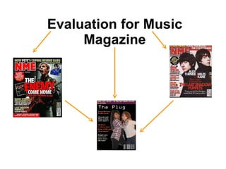
  • 2. In what ways does your media product use, develop or challenge forms and conventions of real media products? When thinking of my music magazine I tried to make it look like other similar professional magazines, for example the strip at the very top, like the one below it informs the reader what is on.; In some ways like a cover line. This makes the reader interested as sometimes you might get something for free when purchasing the magazine. I tried to make I tried to make the picture as good as I could, as I only had around 10 good quality pictures. Never the less I thought this photo suited the front cover. My picture is similar to the one below as there is two people, and in both pictures they are looking towards the reader to add extra effect. I thought of this while producing mine and thought it would add more effect if I did so. The cover lines are similar too. Cover lines are used to inform the reader about what's included in the magazine and are often used to add extra effect. As my main colour pallet was red white and black, I decided to stick to it and hence the reason the cover lines are this colour. The NME magazine includes cover lines on the actual picture, I did not want this as I wanted the picture to stand out and to be different. I do not think it would of suited my magazine if I added more cover lines especially over the picture, perhaps if I had different colour background maybe, but I liked the fact the background was black and it made the headline stand out. The NME background is white and i wanted to add this to my magazine, but I seemed to like the colour black and stuck with that. With white it made the picture stand out a lot more as it was a dark coloured effect, with bold white writing. I thought this looked good and was effective; also when someone picked it up if you liked that type of music you would be interested in buying it. There is a similarity between these two magazines and I looked for ideas, and I wanted my magazine to be like this one
  • 3. In terms of the picture they both contain musicians or band posing. The way they are dressed highlights the type of music presented in the magazine, as opposed to stories that are not musically related. Like I said the clothing is a convention I used to achieve my target audience. Both Musicians are wearing something that would appeal to the rock audience. The model I used is wearing a checked top with black jeans, this suggests that she is promoting rock music and perhaps is a rock artist. NME also used clothing to promote what their magazine was based on. They used dark colours such as brown and black and added a effect which makes their skin a little darker too. Issue of NME My music magazine The pictures… I think it is important to try to promote what genre your magazine is on, such as rock in this case. People need to know what kind of magazine it is and has made me notice how important it is to get this through to people. One main image -- This is the focus of the magazine, it is clear to the audience that this is the main story. This main image has to stand out from the rest. It is often bigger in size and a different colour too, but has to blend into the background. (no rough edges!)
  • 4. The pictures are very important and in need to do their main job they need to stand out . I tried to make mine stand out as much as possible. It was a pain though as I had to get rid of the backgrounds then smooth the edges down and place it onto the magazine. In many cases I had to add a certain glow, as the edges were too rough and it went into the magazine’s background too much… the background was black and so was some of our clothing. As you can see the bottom half of us are dark colours. This is the problem I had while producing my magazine. As some of our clothing was dark colours I had to try to make it stand out a lot more then usual (more then I actually would of liked to). Getting the right glow effect was hard. You had to judge when to stop, and when it was to much. I didn’t want it looking unprofessional, and I figured if I added a lot of glow it wouldn’t look right. So in the end I ended up adding a little bit of glow and went on Photoshop to smooth it down again. I did this a few times just to get it right. Getting the pictures in the right place was a challenge. I looked at other professional magazines for various genres. This helped as most pictures were on the right hand side of the front cover and the cover lines on the left. This is because when the reader picks up a magazine, the cover lines will be the first thing they will see. This means that the cover lines had to be
  • 5. How does your media product represent particular social groups? My magazine is based on Indie rock/rock music. This represents this because of the colour plate. I used the colours Red, white and Black and I wanted this to be consistent throughout. These colours are normally used in rock magazines and this is what I was aiming for. Also the cover lines show that my main target audience is fans of rock and Indie. ‘Kings Of Leon’ are a well known rock/Indie band and by listening to their music often, and reading about them in magazines, most fans seem to be interested about their music and gigs. This is why I have included them in my magazine as it would reach a lot of individuals. As it a Indie magazine also I had to include other famous artists that may be involved in this genre. To do so I used my own imagination and made a band of my own up. I based it on me and my friend and just changed their names and the storyline of course. Even though I thought the magazine was hard to write it was soon produced and it was included. This also shows Indie/rock because the article’s about a rapper joining a rocker girl and her drummer. I have known other artists or famous people that have joined certain groups and have been successful, so I decided to do this. In addition, in my opinion I thought that the headline suited the social groups (Indie and Rock). It just seemed to suit the magazine. I think I could of made it a bit bigger so it stood out more but that could be something to improve on in the future. I also needed more text, like cover lines, but as I missed 2 weeks of media it was hard to play catch up. I tried to make my Headline as believable as possible. Like the NME I tried to make it stand out from the black background. I think I did well as when I stood back I could see that it did in fact stand out with the main picture. The NME Headline is Bold and simple. It is unique and can be remembered easily.
  • 6. What kind of media institution might distribute your media product and why? IPC is one of the United Kingdoms leading consumer magazine and digital publishers, selling over 350 million copies each year. Music magazines they own is: • NME and Guitar and Bass. I have chosen IPC because this is focused on NME based magazines and I have focused my magazines based on these certain type of magazines as my main genre is rock/Indie. In addition they produce millions of copies each year in different genres. The company have many different brands within them and publish over 80 magazines that are of various genres to attract all audiences. These two headlines have various similarities; Big bold writing, with a black background to make it stand out. The colours have to match, and this is how I compared my music magazine with IPC! As IPC produce some NME magazines, I linked my magazine to them but made them my own way. IPC are well known and as they produce thousands of copies I decided to make my magazine about this institution.
  • 7.
  • 8. How did you attract/address your audience? To attract your audience you have to have interesting colours and make it different ( not to different) and it has to be eye catching. Like this on the left it stands out and is different; because of it’s use of colours and what it is. This is what I wanted my magazine to be like, however I didn’t want it to be too different, as I didn’t want to lose marks, but I took risks where I could. As I wanted it to be creative I created my own barcode; it was online as I couldn’t do it anywhere else and didn’t have the time else where. It didn’t take long at all and all I had to do was add the date and price. I had to be careful when doing this as it was hard to get the correct font and text. When deciding on the price it was tricky. I couldn’t decide on a price range for my magazine and how much I thought it would have been worth if it was actually produced. I remembered that I had people fill out questionnaires, in which one question was about the price and the greatest range was between £1.50 and £2.00. Of course I want to make more profit so I decided on £2.30. To me this sounds like a possible price. The date was tricky too as I had to figure out a date that is in the future that’s not so far away. I couldn’t have a date that went. In the questionnaire I asked if people wanted to see more text or images. There reply was both, which is why I included one more picture on the front cover. Although I had the main front cover image, it seemed as if I needed one more. Also other music magazines have included more then one image on their front cover, so this also added to me to including one more.
  • 9. Cover lines… Cover lines are used to inform the reader of what is included in the magazine. It was hard to think of cover lines that were suitable for my type of magazine. Like every magazine I thought I would include a little love story and this is shown on the bottom left.. For my Cover lines i used different magazines to get ideas of what I could do. Like I said in every magazine there will always be a love story so I thought I would include on in my magazine, and show it by adding it as a cover line.. Deryck and Katy a item once again? This adds extra effect and makes the reader know there is a love story included. The cover lines are the first things the reader will be able to see as they pick it up so the over lines have to be good. In some cases, certain magazines have a picture with a cover line for effect and greater impact. I decided to include a picture of a boy who is in a band going on tour with his mates. I had to photo shop and filter it but never the less I think it suited the magazine. For my main article I decided to make it on two friends coming together and performing for the first time. Because of the fact it is my main article it HAD to be on the front cover, and the main image had to relate to this too. Cover lines can include quotes and this is what I decided to include in mine. I even have a rhetorical question. For my magazine I used these throughout to help produce my magazine and to give me ideas and to help improve in all areas. I also looked for inspiration in other magazines in real life. The little adverts at the top were great and helped me to include one in my magazine.
  • 10. What have you learnt about technologies from the process of constructing this product? I developed my understanding of how to use the software; such as Indesign. I found it hard as I never used it before, but in some ways it was similar to Photoshop so I could understand the basics of Indesign. On Indesign you have to place everything on a different layer.
  • 11. Looking back at your preliminary task, what do you feel you have learnt in the progression from it to the full product? I have learned that you need to have a lot of patience to work on Indesign. It is harder then Photoshop but is great quality to produce magazines and other work that you want for great quality. You need to have a different layer for everything. For example; the background on one layer, and then the picture on another. It can get very confusing at times. When doing my work I had trouble with the layers, and had to start again because everything was on only one layer. The Picture, the text, the colours was all as one. So I had to start again from the very start and put everything one separate layer. I put all the pictures on one layer then text on another and sometimes I even locked them so they could not be deleted. I am used to photo shop so I did not have any trouble with it, there was times that it wasn’t responding and it was really annoying but I managed to do what I was wanting to do. I edited most of my pictures on here and was great help. Editing the pictures was easy it was the placing that was hard or tricky. You could say I had some difficulty with working with Indesign, it was hard to figure out at first but know I have a better understanding of it, I would like to use it in the future.