Basic Civil Engineering first year Notes- Chapter 4 Building.pptx
College magazine analysis 1
1. FIRST COLLEGE MAGAZINE ANALYSIS…..
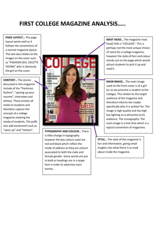
PAGE LAYOUT… The page
MAST HEAD… The magazine mast
layout works well as it
head/ title is “COLLEGE”. This is
follows the conventions of
perhaps not the most unique choice
a normal magazine layout.
of name for a college magazine,
The text also relates to the
however the style of font and colour
images on the cover such
stands out on the page which would
as “FASHION CEO, COLETTE
attract students to pick it up and
YOUNG” who is obviously
read it.
the girl on the cover.
CONTENT… The stories
MAIN IMAGE… The main image
discussed in this magazine
used on the front cover is of a girl
include of the “freshman
(or as we presume a student at the
fashion”, “spicing up your
college). This relates to the target
resume”, interviews and
audience of the magazine and
tattoos. These articles all
therefore informs the reader
relate to students and
specifically who it is written for. The
therefore capture the
image is high quality and has high
concept of a college
key lighting so is attractive to its
magazine meeting the
audience. The iconography- The
needs of students. The puffs
main image is a mid-shot which is a
also add excitement such as
typical convention of magazines.
“spice up” and “tattoos”. TYPOGRAPHY AND COLOUR… There
is little change in typography
however the key colours used are STYLE… The style of this magazine is
red and black which reflect the fun and informative, giving small
mode of address as they are colours insights into what there is to read
associated to both the male and about inside the magazine.
female gender. Some words are put
in bold or headings are in a larger
font in order to advertise main
stories.