
Recommandé
Contenu connexe
Tendances
Tendances (20)
En vedette
En vedette (11)
Similaire à Magazine cover annotation
Similaire à Magazine cover annotation (20)
Dernier
Dernier (20)
Magazine cover annotation
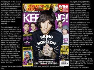
- 1. THE FONT of the KERRANG! Magazine cover matches its theme, it is capitalised and sharp, instead of having soft edges. The font of the masthead reflects this and hints at what sort of music KERRANG! Covers, so that those interested can buy it. THE TEXT on the cover lines tell you which bands are featured in the magazine, which will appeal to the target audience. To add to this effect the bands names are displayed in their own logos, which would help fans pick them out at a quick glance. The text also quickly informs you of contents and helps you decide whether or not to buy it. The COLOUR in this issue is quite bright, which would catch the target audiences eyes. The colours also represent other things that the target audience may be attracted too. For example, the colours red and yellow are associated with Reading and Leeds festivals. The main IMAGE links to the main cover story and is of Oli Sykes and the rest of the band - Bring Me The Horizon. This would draw in the target audience as they would most likely be into bands like bring me the horizon. His positioning at the front of his band show him as important. His posture shows confidence and is almost audience addressing, showing that he cares about his fans and has made a change for the better for them. The LIGHTING is high key, which helps the magazine look bright and stand out so that people will buy it. The composition is jumbled, giving it a messy punk look, while still showing Bring Me The Horizon, who themselves are overlapping the masthead. I believe the target audience are teenage + ,rock, punk metal and possibly alternative fans.
- 2. The target audience are likely to be metal fans, specifically metal-core fans. In this magazine the COLOURS used are typically black and yellow with a tan/dusty colour. This makes the black stand out and makes the magazine seem more mature and specific, to gain the attention of the target audience. The IMAGE used shows Oli Sykes gazing up at the sky. This could show he is contemplating the main cover line – saints or sinners? There are arrows photo shopped to his body, which show that many people may dislike him. He is also without the rest of the band which could mean that he is more recognised than them, and the main cover line may be specific to him. This would grab the attention of Metal- core fans as BMTH are widely recognised by those who like Metal-core. This means that the magazine is most likely to attract its target audience The FONTS on this cover are more varied – depending on the cover lines. The fonts that explain the bands included are one font, the features and competitions are in another, both of which fit the metal theme. The main cover line also has its own font in a large size, making the words “Bring Me The Horizon” stand out to the target audience. The masthead is at the top, overlaid by the image – typical of magazines. It also makes the main cover line stand out – but you can still recognise which magazine it is. The TEXT itself identifies the bands, competitions, features, in the magazine. The text in the main cover line leaves you wanting more – why are BMTH metal heretics? Why are they being accused of this? This draws the reader in. The COMPOSITION of the magazine is aesthetically pleasing as it is symmetrical. The lighting is high key, making Oli Sykes look almost god like.
- 3. I think the target audience would be varied as it covers many different types of music. The IMAGE on this cover, is of Gerard way from My Chemical Romance. Many people like this band, so this would attract a large target audience centred around their fan base. The image could also hint at what the cover line could contain. The main cover line itself is about My Chemical Romance, drawing the attention of the same audience. Other TEXT on the front tells you that it includes free posters and line ups of the NME awards tour, something that many people may want or want to know.. The text FONT is consistent and simple, perhaps helping the reader identify the magazine - the font for the cover lines is similar to the font used for the masthead in the top left corner making it more recognisable as NME magazine. The COLOURs used on this cover are quite soft – blue and white. This makes the main image stand out because Gerards hair contrasts with the background and is blues complementary colour – orange/red. This could help convey the music genre, which is quite dark – so it is almost like light and dark + good and evil. His black jacket has a similar effect as it contrasts with the white writing. This would catch the attention of somebody walking past. The COMPOSITION is simple and neat, the photos and text are almost listed. The image is central and text around the outside, highlighting the main cover story and drawing attention to it, captivating the target audience. The LIGHTING is very high key and makes the whole magazine look brighter, complementing the background.